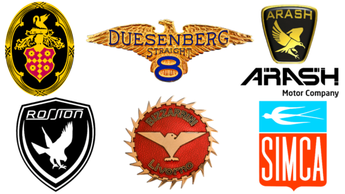
When designing logos, automakers are often inspired by images of animals and birds. In the selection below, we will look at examples of logos that feature a bird. But first, a little about the symbolism of such an image.
A bird on a car logo can mean:
- Freedom. This is very appropriate because having your own quality car makes a person more free and independent and opens up more opportunities.
- Peace. It would seem that this message has nothing to do with the automobile industry, as it is more associated with the humanitarian sphere. But to drive confidently on the roads, you need to know the rules and respect other road users. And from this position, the message of peacefulness becomes quite understandable.
- Happiness and life. Such a wide associative field is very suitable for the topic of cars. It is not for nothing that they often say: movement is life! A good car can give more opportunities for this movement and open new roads to happiness and adventure.
Thus, the bird on the logo of the car looks convincing and appropriate. Each company has already chosen the format to stylize this image.
Rossion
Many people consider it an American manufacturer of supercars. But not everything is so simple with this brand. The company originated in England. It so happens that Americans are quite cool with European cars. Especially since there are enough manufacturers there. Therefore, the British company Noble Automotive began to sell its cars as if from the “back door.” It has signed documents with the company 1G Racing to get the right to produce a mid-engine coupe Noble M12 in the States. Under the agreement, the Americans will assemble and sell the car under a different name, the Rossion Q1.
For both companies, this cooperation turned out to be favorable. The company from the USA received the technical documentation for the car and the finished chassis and saved it on customs duties. The British attracted additional investments, which allowed them to work on a new child – Noble M15.
The Rossion emblem resembles a shield in shape. The logo uses black as the basis of the composition, as well as a metallic color, within which the key elements of the emblem are depicted.
The centerpiece of the logo is a landing bird. It is already firmly on its feet but, at the same time, keeps its wings spread. This stance is very symbolic and perhaps reflects how the company sees itself in the marketplace, prioritizing practicality but with high aspirations.
Above the bird, the brand name is italicized. The duplicate “s” is stylized in a very interesting way. The lower element of the first “s” is stretched horizontally and serves as a base for the first part of the word. The upper part of the second letter, “s,” is elongated as if covering the second part of the word. This may indicate thoroughness and reliability to a certain extent.
Arash
This British company specializes in the production of sports cars. The founder of the company is Arash Farbood. He founded his brainchild in 1999 and originally gave the company the name “Farboud Limited.” In 2006, there was a change in naming, and the company got its current name.
The Arash logo is designed in black and yellow colors. A powerful bird with an elongated tail looks confident. In the context of the semantic meaning of the logo, it can be interpreted as the company’s great ambitions, its confidence, and its ability to produce such cars that meet the demands and needs of the target audience.
Indeed, the meaning of the logo and the work of the company are in harmony. The Farboud GT and Farboud GTS models, produced from 2006 to 2011, received many positive reviews. The cars produced by the company participated in races, which helped the technologists understand what needed to be improved and modernized. As a result, their developments were realized in the car Arash AF-10.
To date, the company continues to work actively and produce quality cars that are in demand among its customers.
Simca
This French car manufacturer has quite a solid history. The company was founded by such a giant of the industry as Fiat. This happened in the fall of 1934. From July 1935 until May 1963, the company was headed by Italian Henri Theodore Pigozzi.
The company logo is horizontally divided into two parts. The large lower part contains the company name in light-colored straight letters on a red background. The upper part shows a bird in a horizontal position on a blue background. Its appearance somewhat resembles the images of birds from ancient cave paintings and similar images of household items, which are sometimes found during archaeological excavations.
By the way, the meaning of this symbol can be very meaningful. This is not a typical, but a stylized bird, which also remotely resembles a fish in the water (given that it is depicted on a blue background). In the context of automotive themes, this composition can be interpreted as the versatility and functionality of the car, in which the driver feels “like a bird in the sky” or “like a fish in the water.” Although the company has long since ceased to exist, the logo is an interesting example of the brand’s visual identity.
Bizzarrini SpA
This Italian car manufacturer was famous in the 1960s. The company was founded by Giotto Bizzarrini, who had managed to work in senior engineering positions at Ferrari, Alfa Romeo, and Iso.
Despite a failure in 1969, the company produced some good racing and sports cars.
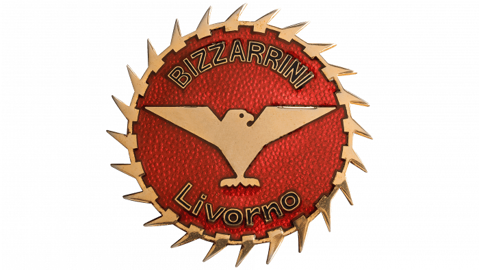
The logo, which combines the colors red and metallic, also features a bird. The logo itself looks like a wheel with spikes. The stylization of the bird looks very interesting. Spread wings, sharp angles, and clear contours look very confident and even a little defiant, given that the bird is depicted on a red background. This is not strange because such an experienced engineer, Bizziarrini, was confident in his knowledge, which he put into the basis of production. It’s a shame the company didn’t last so long.
Packard
These American cars are associated with luxury and high quality. The headquarters of the company is located in Detroit (this is the state of Michigan). The history of the company is quite solid. The first cars were produced in 1899. The last car was released in 1956 in Detroit. It was the famous Packard Predictor concept car.
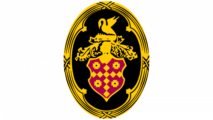
As an emblem, the company chose the figure of a graceful swan with raised wings. The bird looks very beautiful and elegant. The external chic of this swan, as best as possible, conveys the market segment in which the automaker worked. Just look at its design, and it immediately becomes clear that the company produced cars in the “luxury” segment.
In the context of today’s selection, this logo will undoubtedly be one of the most elegant.
Duesenberg Motors
The American company produced racing and luxury cars belonging to the “luxury” class. The company was founded by brothers Frederick and August Duesenberg in Minnesota in 1913.
Despite its successes, the company was forced to close in 1937. The reason was the impact of macroeconomic processes on production. The Great Depression hit the high-end segment hard, and the company did not survive.
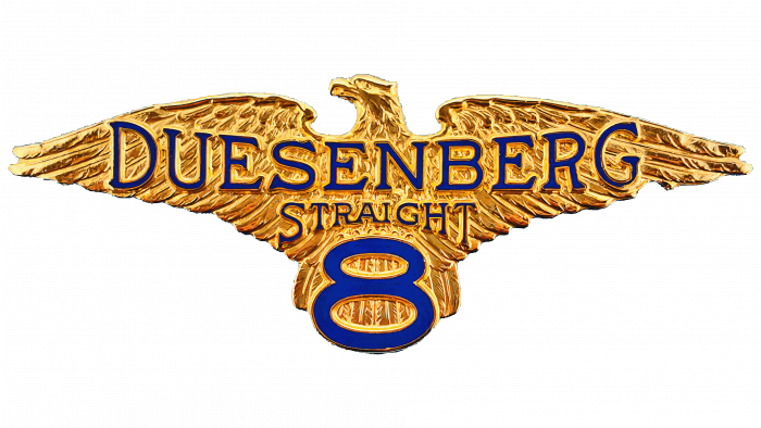
The company logo is stylish and beautiful. It looks very spectacular. You could even say that it is “timeless.” The beautiful golden eagle with outstretched wings demonstrates the scope of the company, as well as its ambition in the chosen direction of production. The golden hue blends well with the dark blue color chosen to represent the manufacturer.
To summarize, it should be noted that despite the fact that some of these companies have long ceased to exist, their contribution to the development of the automotive industry has not gone unnoticed. The logos of these companies allow us to understand, to a certain extent, the semantic field in which they worked and which they tried to convey to their audience.
