The Allied Universal logo represents the firm as a good friend and reliable ally that protects the interests of users. The emblem speaks directly to the viewer, evoking a sense of trust.
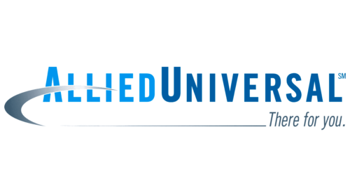
The phrase “Allied Universal” is written as one word, but the designers highlighted it with color, making the first part light blue and the second part dark blue. This color solution evokes associations with the sky. On the left, there is a silver stripe in the form of an inverted Nike swoosh, symbolizing speed – one of the main qualities of the air carrier. One end of the stripe crosses the word “Allied,” covering the horizontal stripe of the letter “A.” In the lower right corner is the gray “There for you” slogan written in italics.
This logo brings together various elements that collectively convey the company’s personality. The choice of blue color subtly hints at reliability and scale, which is in line with the scale of the company’s operations in the aviation sector. The silver stripe makes the logo dynamic, emphasizing speed and efficiency. The overlap with the letter “A” brings an element of complexity, suggesting attention to design details. The slogan, italicized in gray, adds personality and demonstrates the company’s commitment to customer service.
Allied Universal: Brand overview
Allied Universal is a large global security brand formed by the merger of two predecessors in 2016. The company’s services include security guards, risk management systems, and monitoring trackers. The company operates in 90 countries but is represented overseas under the G4S brand. It has 800,000 employees. The company’s total revenue exceeds $18 billion.
Meaning and History
Despite the relative youth of Allied Universal, the company has an impressive track record, as its founders, AlliedBarton and Universal Services of America, have been in the security business since the mid-20th century. To show customers the real age of the company, elements of the oldest of the companies, AlliedBarton (1957), were used in the corporate identity. Once a unified logo was developed, the symbolism remained unchanged to demonstrate reliability and consistency.
What is Allied Universal?
It is the third largest U.S. employer of security and monitoring services. Its price list includes HELIAUS risk management systems, security systems with video surveillance, alarms, fire safety, remote inspection, robots, drones, alcohol level, and location monitoring. It has two headquarters in Pennsylvania and California. The company provides 24/7 support.
2016 – today
The security company’s emblem consists of a compound name and a curl covering part of the word. The company name is formed from the founding words Allied and Universal. There is no space between the words to make the sign look more compact. Differentiation is achieved through color.
In this case, the name of the older company is put in the first place. Allied was originally an alliance of Security Systems and Barton Protective to form AlliedBarton Security. However, the name was later shortened to AlliedBarton, and only Allied was included in the new company.
Allied’s light tone represents the member as the mastermind behind the deal and the developer of the enterprise concept. This is no coincidence, as AlliedBarton originally operated as a security agency. At the same time, the second founder (Universal Services of America) started as a cleaning service and operated four lines of business, with security being only one of them.
The dark blue color of the word Universal from the old logo was carried over into the new Allied Universal logo. This hue indicates that the new company uses technical developments from the Universal Protection Security Systems division: alarms, cameras, and scanning modules. These have enhanced the new company’s capabilities and security.
The construction of the emblem is based on a logic that indicates:
- Order.
- Adherence to protocols and rules.
- Rigor.
- Attentiveness.
All qualities are very important to the security business.
Through the whole word, Allied runs a curl, which, bending, emphasizes the logo. It seems that the symbol embraces the emblem, protecting it. It resembles the curve of a wrestler’s arm straining his biceps. This choice speaks of the strength and good physical fitness of the guards.
The gray gradient conveys monotony and constancy. The end of the curl completes the inscription “There for you.” These words appeal to the client, convincing him that cooperation with the company is the best option. After all, it provides a whole range of services.
Font and Colors
The cold blue and gray tones of the logo correspond to reliability and professionalism. Impeccable operation of security systems and punctuality of employees are important trump cards of the company. The color palette shows that the company is not afraid of daily routine and does not lose vigilance at any time of the day.
The font of the lettering is close to ATF Alternate Gothic Condensed Bold. The capital letters emphasize the size of the company, which, after the merger is considered one of the largest in the world.
Allied Universal color codes
| Celestial Blue | Hex color: | #0295ec |
|---|---|---|
| RGB: | 2 149 236 | |
| CMYK: | 99 37 0 7 | |
| Pantone: | PMS 3005 C |
| Lapis Lazuli | Hex color: | #005da3 |
|---|---|---|
| RGB: | 0 93 163 | |
| CMYK: | 100 43 0 36 | |
| Pantone: | PMS 2945 C |
| Marengo | Hex color: | #3e5b70 |
|---|---|---|
| RGB: | 52 91 112 | |
| CMYK: | 45 19 0 56 | |
| Pantone: | PMS 7699 C |
