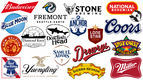
The American beer market boasts a plethora of famous brands, from the renowned Budweiser to the popular Miller Lite. On a nice day in the U.S., there is hardly any pleasure comparable to sipping on a cherished beer. However, the intricacies of bottle labeling are often unexplored by many.
The logos of these prominent American beer brands, comparable to those of other famous global companies, are finely crafted. Their purpose goes beyond simply representing the brand; they are strategic tools designed to influence preferences to encourage people to make a choice in favor of a particular beer among many options.
The focus will be on some of the most well-known American beer brands. The focus will be on the nuances of their logos and the skill with which they have won the trust of consumers and resonated with their aspirations and preferences.
The top American beer brand logos
The addiction to beer in the United States has deep roots, much deeper than commonly believed. Historical evidence suggests that this fizzy drink was loved by ancient civilizations, including Egyptian pharaohs and Babylonians. Some Egyptians went so far as to be buried next to the cherished beer, indicating its importance in their culture.
These days, the U.S., like many other parts of the world, boasts a dynamic variety of beer brands that are constantly expanding and diversifying. While some American beer brand logos remain unchanged, attesting to their long heritage, others have been altered by changing tastes and generational shifts.
This article will focus on a few of the most well-known American beer brands. The goal is to delve into their visual branding and unravel what sets their images apart in an ever-competitive marketplace.
Anchor Brewing
Established in California in 1896, Anchor Brewing Company is a testament to enduring American craftsmanship in the beverage industry. Over the decades, this California brewery has expanded its portfolio to include a range of alcoholic beverages that have been recognized across the country.
Among the Anchor brand’s diverse offerings, several beers stand out. Some of these include Anchor Steam, Liberty Ale, Anchor Porter, and Humming Ale. In keeping with industry standards, each beer proudly sports its logo on each variety, offering consumers a visual treat alongside the beverage itself.
At the head of the brand’s visual logo is the Anchor Brewing Company emblem. It depicts an anchor in deep blue, symbolizing the brand’s unwavering commitment to quality and rich nautical associations. Emblazoned above the anchor is the inscription “Since 1896,” a testament to the company’s heritage and its more than a century-long journey in brewing. The brand name “Anchor” is centered in the center, reinforcing its significance and reminder of the company’s roots.
Blue Moon
Originating in 1995 in the picturesque town of Golden, Colorado, Blue Moon beer is a testament to the rich tradition of Belgian beer brought to life under the auspices of MillerCoors. Among the varieties offered, Blue Moon Belgian White beer is particularly recognized. This famous beverage owes its appearance to Keith Villa, who originally called it “Belgian White.”
Blue Moon did not stop there, having released only one iconic beer. Over the decades, the brand has consistently expanded its range, adapting to the tastes and preferences of its audience. The evolution has resulted in refreshing summer ales, warm pumpkin spice ales, and other topical seasonal brews catering to a variety of tastes.
Blue Moon’s logo stands out noticeably from the competition. Dominated by a serene image of a glowing blue moon, the logo radiates tranquility. On top of this serene background is the brand name, elegantly embedded in a flawless white banner. This symbolic design, combining simplicity and elegance, evokes a sense of nostalgia and is timeless at the same time.
Budweiser
Budweiser’s popularity as a beer brand in the United States is undeniable and has been consolidated for nearly a century and a half. Having appeared in 1876 in St. Louis (Missouri), this brand has undergone a thorough path of development.
Over its long history, the Budweiser logo has undergone several transformations. As a distinctive feature of the brand, the slanted shape of the bow tie is used. This choice of design is not accidental; it is intended to convey the luxurious qualities associated with beer.
The italicized typography on the Budweiser emblem adds another level of complexity and appeal. This typeface is a stylistic and strategic choice designed to convey the brand’s commitment to indulgence and creativity. The lettering seeks to establish an emotional connection, reflecting the brand’s commitment to providing not just a beverage but an experience that resonates with consumers on multiple levels.
For decades, Budweiser has survived and thrived in part because of effective visual branding. Each element of its logo serves a specific purpose, coming together to capture the hearts and minds of consumers.
Coors
Originating in Colorado in 1873, Coors Brewing Company is a beacon in the American brewing industry. With a legacy that spans nearly a century and a half, it’s no surprise that the brand has made a strong foothold in the American and global marketplace. The Coors name adorns many beverages, each with its own flavor.
The basic Coors logo is minimalist and elegant. The wordmark, rendered in a rich navy blue color and accented with a flawless white outline, embodies both class and accessibility. The bold yet shapely typeface reflects the company’s desire to be creative without deviating from its long-standing traditions. The colors chosen, while seemingly simple, echo the essence of the brand, signifying reliability and the promise of a refreshingly cool beverage.
However, the brand is not limited to a single emblem. Each sub-brand or variant under the Coors umbrella boasts its own unique emblem. For example, the Coors Lite. This logo features a mountain motif in the background, a reference to the highlands of Colorado, symbolizing the invigorating chill that is associated with the drink. This image evokes a sense of refreshment, making the drink more appealing to those looking for a cool respite.
Coors Brewing Company conveys more than just the name of the beverage with its diverse and thoughtful logos. It paints a picture, tells a story, and invites consumers to join its longtime brewing journey.
Diamond Knot
Founded in the mid-1990s, Diamond Knot Craft Brewing has steadily risen to prominence in the burgeoning American beer scene. Founded in the picturesque state of Washington by a duo of professionals from Boeing, this brewery was born out of a desire to deviate from the norm and bring something of its own to the world of beer.
Over the years, prominent media outlets such as the Seattle Times have recognized and extolled Diamond Knot for its exemplary and innovative beers. Among its diverse range of beers, the India Pale Ale stands out and demonstrates a commitment to quality and flavor. Diamond Knot’s craftsmanship does not end there. There are other flavors and styles in their repertoire, notably brown ales and strong Industrial XIPA, each designed for a different taste.
As for the brand’s emblem, it radiates an aura of antiquity and exploration. Central to the design is an elaborate ship sailing on an ancient compass, symbolizing a journey into the unknown. Above this symbolic image flutters a banner with the brand name, further emphasizing the company’s heritage and journey in brewing. This emblem echoes the themes of age-old traditions, nautical adventures, and the relentless pursuit of uncharted territories, which is fitting for a brand that is constantly striving to redefine and expand the notion of craft beer.
Dogfish Head
A budding competitor among established American beer brands, Dogfish Head continues to carve a niche for itself in the United States. Founded in 1995, this brewing company has steadily increased its production capacity and boasts an impressive production volume of about 262,000 barrels per year.
Thanks to its growing reputation, Dogfish Head is fast becoming a leading modern brewing company around the world. In 2019, the company made a significant business move by acquiring The Boston Beer Company in a transaction valued at approximately $300 million.
Dogfish Head has shown a penchant for pushing boundaries, often venturing into the realm of extreme solutions. Among these offerings is a unique bottled malt liquor. The brand’s emblem emphasizes its symbolic image of a shark-like creature encased in a rugged black elliptical frame. The company’s trademark in a distinctive and playful font gives the brand a memorable character.
Drewrys
Drewrys Brewery, located in McHenry, Illinois, has been rooted in the American beer industry since its founding in 1877. The brand’s American identity is intertwined with its Canadian heritage, often illustrated by the Mountie image on labels and cans – a nod to Canada’s legendary Mounted Police.
An innovator in its approach, Drewrys played a key role in introducing Americans to light beer long before it became a widespread consumer preference.
Drewrys established its presence in its home country and made significant inroads into the Canadian market, making it a well-recognized brand throughout the North American continent. Over the decades, Drewry beer cans have had a wide variety of designs, from zodiac symbols to intriguing trivia and images of various sporting events.
The brand’s logo exudes an energy more reminiscent of a dynamic sports team than an ordinary beer brand. The name of the company, written in an upward-slanting bright red font, carries forward momentum.
Freemont
Fremont Brewing, located in Seattle’s West Woodland neighborhood, is a testament to the rise of modern breweries. Though relatively younger than many of the older brands, its importance cannot be understated. As Washington State’s third-largest craft brewery and a leading producer of barrel-aged beers, Fremont Brewing has quickly built its reputation.
Fremont Brewing’s rapid growth is due not only to its diverse range of beers but also to its sustainable brewing principles. This eco-friendly approach puts the company on par with well-known brands such as New Belgium and Sierra Nevada and makes it a prominent player in the organic brewing industry.
Fremont Brewing’s logo is filled with symbolism. At the center of the shield-shaped emblem is a crane, a bird often associated with longevity and wisdom. Around the crane are hops and barley, the main ingredients of brewing. This logo combines traditional and modern elements, reflecting the history of brewing.
Lone Star
With roots dating back to 1884, Lone Star Brewery pioneered brewing in Texas. Adolphus Busch of Anheuser-Busch fame and several San Antonio entrepreneurs played a crucial role in establishing this iconic brand in its early days.
Lone Star Brewery’s beers retain the honorable title of “the national beer of Texas.” Despite the company’s rich history, modern events have resulted in the ownership of the Lone Star brand being taken over by Pabst, another heavyweight in the American brewing industry.
In the annals of American brewing, Lone Star beer has consistently held a prominent place. Its cultural influence is also evidenced by its many media appearances. TV series such as True Detective and Friday Night Lights feature the beer, demonstrating its relevance in American popular culture.
Lone Star Beer’s logo combines simplicity with meaningful symbolism. The emblem is a pronounced star that clearly refers to the epithet of Texas, “the lone star state.” Against the background of the shield with the name of the company in a Western-style font, the imagery of the emblem is very large. The shield, in particular, serves as a visual metaphor emphasizing the brand’s historical heritage, while the star represents its deep Texas roots. These elements reflect the historical and cultural essence of Lone Star Beer.
Lost Coast Brewery
Founded in Eureka, California, in 1989, Lost Coast Brewing Company is a relatively young but influential player in the American brewing market. This brainchild of Barbara Groom and Wendy Pound is among a small number of breweries wholly owned by women.
In its short existence, the company has shown impressive growth in production capabilities. In 2011, it was producing about 60,000 barrels per year, and by 2014, it had reached an impressive 600,000 barrels. The company has expanded beyond the country and ships its unique beers to 21 U.S. states and 11 countries around the world.
The Lost Coast Brewery logo is an elaborate symbol that combines many elements. It depicts a golden triangle, which can be interpreted as a rising sun, possibly symbolizing the Lost Coast, which served as the basis for the company’s name. The graphic image is accompanied by textual elements, namely the name of the company and its place of origin. Together, these elements reflect the history and ethos of the brand.
Miller
Founded in 1855, Miller Brewing Company has firmly established its place in the American beer industry. While many are familiar with the iconic Miller Lite, the brand’s repertoire of beverages is very broad and includes a wide range of beers to suit a variety of tastes.
Each offering under the Miller umbrella has its own logo. For example, Miller Lite stands out with its crest design, signifying its unique place in the brand’s wide range of products. Another notable brand, Miller Genuine Draft, has a different design, but all of these variations emphasize the diversity of the range.
At the heart of all these varied designs is the Miller word mark. The stylized representation of the company name is angled upward and to the right, suggesting forward motion. This angular representation, combined with the brand’s italicized typography, is in keeping with the heritage of America’s most famous beer brands.
National Bohemian Beer
The rich heritage of the National Bohemian Beer brand, often affectionately referred to as “Natty Boh” by fans, spans more than a century. This renowned beer brand made its debut in 1885 in Baltimore, Maryland, marking its early contribution to the American beer epic.
Throughout its illustrious journey, National Bohemian Beer has partnered with renowned beer companies, one of which is Carling. Despite market fluctuations and changing consumer preferences, National Bohemian Beer remains one of the most recognized beers in the American market.
The National Bohemian Beer logo is an emblem of traditional design elements. Each element is a carefully crafted brand story. An indication of the year of its creation can be seen in the logo, as well as a prominent emblem that proudly bears the brand’s name. But the main thing that distinguishes the logo is its mascot: a unique character with a single eye arouses curiosity and adds mystery.
With its branding and quality products, National Bohemian Beer continues to solidify its position in the ever-evolving American beer brands.
New Belgium Brewing Company
Located in the heart of the United States, New Belgium Brewing Company defies expectations with its name alone. Contrary to expectations, it is not a European brand but a proudly American enterprise with deep roots in the country. The brainchild of Jeff Lebesch and Kim Jordan, it was founded in Fort Collins, Colorado, in 1991. Over the decades, the company has grown exponentially to meet the needs of beer lovers across the country.
New Belgium Brewing Company has diversified its beer portfolio with sub-brands that have garnered much attention, most notably Voodoo Ranger and Fat Tire. The evolution of the brewing company has seen major corporate changes, including its acquisition in 2019 by the Australian arm of a well-known Japanese beverage conglomerate.
New Belgium’s logo differs from traditional beer branding. Its bright orange hue refreshes the familiar color palette of beer. In addition, the central motif is not the usual image of hops or barley but a bicycle. This design choice is related to the famous “Fat Tire” beer, which emphasizes the uniqueness of the brand.
Pabst Blue Ribbon
Introduced in 1844, the famous Pabst Blue Ribbon (abbreviated PBR) beer holds a special place in America’s brewing history. Created by Pabst Brewing Company, this iconic brand traces its roots back to Milwaukee, Wisconsin. Despite being headquartered in San Antonio, the company’s legacy remains intact as it continues to produce a variety of beers.
The Pabst brand has undergone many transformations but has always emphasized the superior quality of its core beers. Historically, the brand is inextricably linked to the blue ribbons that adorned its bottles in the late 1800s and early 1900s. This distinctive touch formed the basis of the beer’s name and became synonymous with its excellence.
The Pabst Blue Ribbon emblem is a combination of tradition and recognizability. It features the official wordmark of the Pabst Company in combination with the emblematic blue ribbon, a universal symbol of excellence and early achievement.
Samuel Adams
Among the American brewing companies under the Boston Beer brand is the Samuel Adams Company, affectionately known as Sam Adams. This esteemed brand came into existence in 1984, and its name was a tribute to one of the main actors in the founding of the United States. Samuel Adams became the owner of his father’s brewery, which allowed many to recognize him as a patriot and brewer.
The beers offered by Samuel Adams are diverse and cater to a variety of tastes. Some of these include the Wicked Hazy and the stronger Wicked Double. To keep the range fresh and in line with the changing seasons, the brewery introduces a rotation of seasonal beers throughout the calendar year.
The Samuel Adams logo is characterized by originality. It clearly shows the name of the company enclosed in a shield-like outline. The emblem reinforces the brand identity and gives it additional significance.
Sierra Nevada
Founded in the second half of the 20th century, in 1979, Sierra Nevada Brewing Company has since dominated the American brewing industry. Born out of the vision of Paul Camusi and Ken Grossman in the sunny state of California, the brewery is ranked as the 7th largest brewery in the United States.
In 2010, Sierra Nevada was honored as the Green Business of the Year, a testament to its environmental awareness.
Sierra Nevada demonstrates an amazing ability to adapt and innovate by introducing a variety of beers. Among them, Pale Ale is the brewery’s flagship product. However, this does not cancel out other well-known beers, such as Sierra Nevada Porter. The company periodically releases seasonal beers to cater to consumer tastes and preferences.
The Sierra Nevada emblem is highlighted by intricate design elements. The dominant design is a banner scroll on which the name of the company is depicted in bold capital letters. Central to the emblem is an image of majestic mountains, symbolizing the inspiration behind the brand name and capturing the essence of the region’s natural beauty.
Stone Brewing
Located in the heart of Escondido, California, Stone Brewing is a testament to the growing craft beer movement in the United States. As the leading brewery in Southern California and the ninth largest in the country, it holds a significant place in the American beer market.
Stone Brewing’s first brew, Stone Pale Ale, is the foundation of the brand. It was this ale that was revered and celebrated as the brewery’s signature beer until it was finally discontinued in 2015.
As time went on, Stone Brewing introduced another gem, the Arrogant Bastard ale. This beverage with an original name captures the essence of the character, which resonates with craft beer lovers.
Stone Brewing’s emblem further emphasizes this image. It depicts a mischievous devil or demon merrily sipping a pint of beer. In addition to this image is the name of the brewery in bold serif font. This choice of font not only emphasizes the importance of the brand but also brings an element of elegance, positioning Stone Brewing as a brand that combines irrelevance and class.
Yuengling
With roots dating back to 1829, Yuengling has a long and storied history as one of the earliest American beer brands. Approaching its bicentennial, the company still ranks among the nation’s preeminent breweries.
Over the course of its existence, this family-owned brewery has undergone tremendous changes. Yuengling has expanded its product line beyond beer to produce unique products such as ice cream. The company’s diverse product lineup ranges from Yuengling’s time-honored traditional beer to a rich dark porter.
The Yuengling emblem is a distinctive hint of the company’s American heritage and unwavering history. The symbol of freedom and pride, an eagle perched on a beer barrel, represents the brand’s long-standing ties to the nation. Complementing this image is the brand’s name in an elegant font in keeping with the traditions of many respected breweries. This combination of elements results in a logo that is iconic and in keeping with the spirit of the American brewing tradition.
Famous American beer brands
The expanse of the United States is home to an impressive number of beer brands and logos, each of which tells the story of its unique brewing heritage. And while this selection does not include every famous American beer brand, it certainly includes many familiar emblems that many will immediately recognize.
There is a definite pattern in the design philosophy of American beer logos. Many of them gravitate towards a vintage aesthetic, utilizing classic motifs, symbols, and imagery. These elements evoke a sense of tradition, history, and a strong connection to the past.
A characteristic feature of many beer logos is the presence of a word mark, often in an elegant font or cursive script. This choice emphasizes the craftsmanship and sense of craft, as well as the meticulous detail that brewers put into their creations.
As the American beer industry continues to evolve dynamically, we can expect more innovative and diverse label designs to emerge. They will reflect both the ever-changing preferences of beer drinkers and the country’s rich brewing history. For now, the iconic brands and their logos featured in this review are a testament to artistic and brewing excellence and serve as a beacon for consumers and aspiring brewers.
