 American Cancer Society Logo PNG
Health must be protected – the American Cancer Society logo’s message. It concentrates on the main principles of medicine: protection, kindness, and care, expressed in the symbols of ancient times. The continuity of methods enriched by modern discoveries is the guardian of life.
American Cancer Society: Brand overview
The American Cancer Society is an organization whose primary mission is scientific research in the fight against cancer. It was founded in 1913 and expanded significantly during this time. Today, it has branches in all states of the United States. The company has achieved serious success. This is evidenced, among other things, by the fact that for more than 100 years, ACS has funded about 40 Nobel laureates.
Back in 1913, right in New York City, something big started. Many forward-thinking doctors and business folks got together to create what we now know as the American Cancer Society (ACS). Initially called the American Society for the Control of Cancer, they set out to shake things up in how people saw and dealt with cancer.
The story of ACS shows how much you can do with the right information and a drive to advocate. Early on, their main goals were to teach people about cancer and gather funds for important research. By the 1930s, they led the way, publishing scientific studies and running education campaigns to spread the word nationwide.
The 1940s and 1950s brought big changes, especially in catching cancer early. ACS played a huge part in making the Pap smear test common for spotting cervical cancer early, saving a lot of lives. They also put money into research, sparking new ways to treat and diagnose cancer.
Through the 1960s and 1970s, ACS didn’t slow down. They boosted their efforts to educate and advocate, even starting the Great American Smokeout to encourage folks to quit smoking. This showed they were serious about not just fighting cancer but also preventing it.
As time went on, into the late 20th century, ACS kept up its research support and started developing programs to prevent cancer. They also began helping patients and their families more directly, meeting a wide range of needs within the cancer community.
With the start of the 2000s, ACS focused even more on cutting down the number of deaths from cancer and making life better for those with cancer. They kicked off programs to ensure everyone got the treatment and prevention they needed, no matter their background.
Nowadays, the American Cancer Society is a major force in the U.S. health scene. They’re all about funding cancer research, giving people the information and support they need, and pushing for policies to fight cancer. From the beginning until now, ACS has been key in making progress in how we prevent, spot, and treat cancer, always working hard towards a world without cancer.
Meaning and History
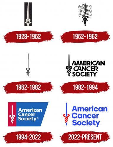
Not so many logos variants were presented during society’s entire existence. At the same time, the company’s visual recognition is at a high level, as the logo conveys the goals and objectives of the American Cancer Society. Redesigns in subsequent years resulted in minimal changes that made the visual impact more tangible. The inscriptions used the classic bold sans-serif type, where only the first letters in each society word were capitalized. The current version of the American Cancer Society logo uses a white-red-blue color palette. The contrast of colors makes the logo both strict and spectacular.
The “Sword of Hope” has become a hallmark symbol for the American Cancer Society, originating in the creative workshop of George E. Durant in Brooklyn, New York, back in 1928. This emblem, featuring a sword enveloped by a coiling snake, stands as a powerful sign in the battle against cancer, symbolizing the fight and the belief in victory over the disease. In this context, the sword represents a weapon in the crusade against cancer and a ray of hope for those facing the diagnosis. The snake, winding around the sword, carries an ancient meaning of healing and medicine, highlighting the importance of research and therapeutic approaches in this ongoing struggle.
What is the American Cancer Society?
First and foremost, it is an extremely important company on which the future of cancer research largely depends. The organization is popular far beyond the United States, and its achievements are relevant to many medical institutions.
1928 – 1952
This logo is simple but meaningful. It shows a straight, sharp sword for accuracy, bravery, and determination. The sword has a half-circle at the handle, with two curved lines coming out like wings or petals, making it look like an old symbol that people often link with trade, health care, and medicine. But, unlike that old symbol, no snakes are twisted around the sword here.
The sword stands for fighting, protecting, being strong, as well as being fair and powerful. The half-circle in the middle is about being whole, united, and lasting forever. The curved lines might mean movement, change, and balance, all together meaning a fight for harmony, health, and being complete. The mix of the still sword and the moving lines shows bravery and wisdom, making a strong picture. The contrast of the dark background with the bright, almost silver look of the sword and lines makes the logo catch your eye, simply showing its beauty and depth.
1952 – 1962
This black-and-white logo features a sword that reminds you of the Asclepius staff, a medicine symbol. A snake wraps around the sword’s handle, but instead of wings, there are three crossed banners labeled “RESEARCH,” “EDUCATION,” and “SERVICE.”
The snake symbolizes healing and renewal, as snakes can shed their skin. The sword-staff stands for support and leadership.
The banners “RESEARCH,” “EDUCATION,” and “SERVICE” show the organization’s goals: discovering new things, teaching people, and helping the community.
The classic font with small lines at the ends of letters shows a rich tradition and commitment to knowledge and healing. The black and white color makes the logo timeless, making its message clear and strong. This design’s mix of text and symbols shows a desire to improve society through science, education, and helping others.
1962 – 1982
This logo is simple, just black and white. It has a sword standing straight up, representing bravery and the fight. The sword’s handle is decorated with a caduceus, a sign often linked to medicine and healing, even though it originally meant something for traders and messengers. Сaduceus shows the organization’s focus on medicine, research, education, and helping people—key parts of what medical and charity groups do.
The logo doesn’t use fancy fonts or colors because it’s all about being clear and strong without distractions. The choice to keep it black and white focuses on what the symbol stands for, not how it looks, which helps gain trust and respect.
From 1962 to 1982, the time this logo represents, the American Cancer Society grew its research, education, and support services. It was a big time for medicine as new ways to treat cancer were being found, and people were becoming more aware of the disease. The logo sends a strong, clear message about the organization’s goal to be a leader in this fight.
1982 – 1994
The previous logo was updated in 1982. Although it used a black-and-white color palette, it looked stylish and modern. The company’s name was made in a three-tiered composition, each line responsible for a certain word. The inscription used a classic font without serifs. At the same time, the lines in the letters look interesting because some of them are connected. In addition, some of the letters seem to be incomplete. We are talking primarily about the letter “A,” where the horizontal line is incomplete. The upper semicircle of the “R” is also completed. To the left of the inscription is the society’s emblem, in the form of a vertically placed sword with the blade on top. The handle is stylized as two snakes that coil around the sword. This choice is unsurprising, as snakes are historically associated with the medical profession.
1994 – 2022
The redesign of the 1994 logo made it more vibrant and recognizable. The main elements remained unchanged: the coat of arms on the left and the verbal inscription on the right. However, this update led to the appearance of the background. It was conventionally divided into two parts: a red vertical rectangle, where the usual emblem was made in white with a sword and two snakes. On the right side was a bright blue trapeze, joined to the coat of arms by a left-hand line. The inscription was also written in three lines in modern bold sans serif type. Instead of black, white was used to contrast with the background. Thus, the society looks modern but also clearly conveys the message of the target audience, causing them to trust.
The so-called “Sword of Hope,” serves all of society’s emblems, was created in 1928 and has not changed fundamentally since then. The sword is associated with the fight against the world’s most deadly disease and the effectiveness and productivity of the American Cancer Society. The two snakes that entwine the sword’s hilt indicate the company’s medical nature.
2022 – today
The leading cancer organization decided to rebrand as early as 2021. Karen E. Knudsen, who recently became CEO, is rumored to have spearheaded the idea. By the end of the year, serious work began on a new brand that was supposed to convince today’s youth that the American Cancer Society helps people of all ages, not just grandparents. After all, cancer has become increasingly diagnosed in young people.
Havas New York created a modern logo for the charity while retaining traditional elements:
- two snakes – a symbol of health care;
- sword – the personification of the fight against cancer;
- company name – the main brand identifier.
When creating the emblem, the designers decided it should be visible on different backgrounds during ACS events. Therefore, the letters were enlarged. The geometric rm of a trap,ezoid, has disappeared. The sword and inscription became bright blue, and the snakes became deep red.
Font and Colors
The navy blue American Cancer Society logo is in bold geometric sans-serif. Each word in the brand name starts on a new line with a capital letter. This logo uses a font that looks very unique at first glance. But when you look closer, it’s similar to two famous fonts, Neue Frutiger World Black and Humanist 777 Std Black. Both are known for their clear, bold lines and expressive style, making them great for strong visual messages.
Neue Frutiger World Black builds on Adrian Frutiger’s classic Frutiger font from 1976. It’s easy to read and works well everywhere, from print to digital. This font supports many languages, making it perfect for international brands wanting to reach everyone.
Humanist 777 Std Black is a humanist font known for its elegant and natural shapes. It mixes the warmth of handwriting with the clarity of modern design. Its open shapes and contrast between thick and thin lines make the text expressive and emotionally rich.
Using a font similar to these two in the logo’s design makes it look good and easy to read. It shows a commitment to being universal, innovative, and human. These qualities are key to creating a strong, memorable brand image that communicates its values to a wide audience.
The emblem’s colors—em—red, blue, and—are—are the same as those on the US flag. This speaks to the organization’s patriotism and desire to help the American population. The bright shades of ACS Core Red (#FF0000) and ACS Core Blue (#2746F8) attract the attention of a caring society.
FAQ
What is the symbol of the American Cancer Society?
The American Cancer Society’s symbol is the “Sword of Hope.” It was created in 1928 by George E. Durant from Brooklyn, New York. The symbol features a sword wrapped by a snake, representing the fight against cancer and the hope for a cure. The sword symbolizes the crusade of the movement against cancer. At the same time, the snake is traditionally associated with healing and medicine, reflecting the dual focus of research and treatment in the fight against cancer.
What does the American Cancer Society stand for?
The American Cancer Society (ACS) fights cancer from all sides. It focuses on:
- Research: They invest money into cancer research to find cures and learn what causes cancer and how to prevent it.
- Education: They give information on how to prevent cancer, spot it early, understand treatment options, and live a healthy life, helping people lower their chances of getting cancer.
- Advocacy: They push for laws that beat cancer and help cancer patients and their families have better lives. This means asking for money for cancer research and ensuring everyone gets good care.
- Support Services: They help those touched by cancer, including those who have it, those who’ve survived it, and their loved ones. They offer emotional support, advice on what to expect and how to deal with it, and help with treatment-related issues, like getting to appointments or finding a place to stay.
The ACS’s goal is to save lives by leading the charge toward a world free of cancer with its work in research, education, advocacy, and support for patients.
What are the colors of the American Cancer Society logo?
The American Cancer Society logo incorporates colors that echo the patriotic essence of the US flag, showcasing a deep connection with national values and a commitment to the American populace. The emblem prominently features ACS Core Red (#FF0000) and ACS Core Blue (#2746F8), which are selected for their vibrancy and ability to draw the attention of a compassionate and supportive community. These colors symbolize the organization’s dedication to uniting people in the fight against cancer, fostering a spirit of hope, and rallying collective support for those affected by the disease.
Who is the CEO of the American Cancer Society?
Karen E. Knudsen, with an MBA and PhD, is the head of the American Cancer Society and the American Cancer Society Cancer Action Network. Known for her cancer care and research work, she’s a leader and advocate dedicated to helping cancer patients and their families. She focuses on research, fighting for patient rights, and supporting cancer survivors. Knudsen took over the role in June 2021, following Gary Reedy. She has a strong background in cancer research and has held top positions, making significant contributions to the cancer community nationwide.


