America is one of the top five world leaders in chocolate bar production. This is not accidental, as this country invented and produced the world’s first chocolate bar.
The birth of this popular treat occurred in the early 20th century (1923). Confectioner Franklin Clarence Mars, wishing to create a convenient and quick snack, decided to wrap a piece of chocolate with a filling in a wrapper. Franklin’s ingenious idea gave the world such well-known brands as the Milky Way, Snickers, and Mars, named after the confectioner himself.
Thanks to his invention, the chocolatier surpassed Milton Hershey, the second confectionery manufacturer in the top ten. He was the first to come up with selling small portions of chocolate and developed logistics, but he failed to develop a convenient wrapper and consistency for the treat. His chocolates were difficult to unwrap, and he got his hands dirty, giving Mars an advantage.
However, regardless of who first came up with the idea of dessert, the United States is undeniably its source. Today, this country produces the most popular chocolate bars in the world.
Today, we will consider the manufacturers that delight sweet lovers in America, Europe, and Asia with their masterpieces. Their products have a balanced composition and exquisite flavor combinations, which are the pinnacle of confectionery art. Which brand is better is a matter of choice and personal preference.
Mars, Incorporated
Interestingly, the world-famous giant could have been called Mars and not Mar-O-Bar. That was the name Franklin Mars gave his company when he incorporated the family business in 1920, which had originated nine years earlier in a millionaire’s home kitchen in Tacoma.
Franklin manufactured fudge and produced candy named after his daughter. In 1922, he first tried a chocolate bar recipe called Mar-O-Bar. The product turned out to be too fragile and unsuitable for transportation. However, the Milky Way recipe, born a year later, was much more successful and quickly gained popularity. The $700,000 income allowed the family to move to Chicago, build a large factory, and hire sales representatives. Since then, the business has grown even more.
The company is now called Mars Incorporated. It still sells candy bars and is owned by the Mars family. But it has expanded so much that it is now the world’s largest candy company and owns nearly 70 brands. Its Twix, Bounty, Mars, Snickers, and Milky Way brands are known on every continent. In addition to sweets, the company offers chewing gum (Juicy Fruit, Orbit), convenience foods (Uncle Ben’s), and pet food (Pedigree, Whiskas, Royal Canin). The company has subsidiaries in England and France.
The giant logo reflects the essence of the corporation in the best possible way. Big blue letters symbolize dreams and broad horizons. Franklin, a fragile boy with polio, dreamed of his own chocolate company from childhood. Legend has it that he started the business three times and failed twice, leading to a divorce from his first wife. Only the dream kept him moving forward and eventually led him to victory. Blue is the color of family, service to people, and hard work.
Bounty
One of Forrest Mars’ later creations, the Bounty Company, started in 1951. The name “Bounty” has a very romantic origin: the name of the ship on which British sailors arrived in Tahiti. The crew members were married to local women and refused to serve the British crown. Fleeing persecution by the authorities, they found an island not marked on British maps and settled in a coconut paradise.
A well-known advertisement for the treat depicted this fairy-tale paradise with perfect beaches and palm trees. The modern Bounty logo, with its slightly rough white letters, light blue border, and shadow, conveys the texture and color of the coconut chips. The shadow is associated with blue waves lapping against the shore.
The treat is manufactured in Europe and imported to America as a finished product.
Dove
When Chicagoans first heard the word Dove, they realized they were referring to the chocolate-covered ice cream that Greek Leo Stephanos had offered in his stores since 1956. His son, Michael, expanded sales. In 1984, he introduced the product at a national trade show, which caught the attention of Mars Incorporated, which bought the brand in 1986.
Chocolate ice cream is now available in dark and milk chocolate, mint, chocolate, and vanilla fillings. Fruit, caramel, and peanut butter options complement the ice cream.
The brand’s emblem immediately transports the user to the world of chocolate. The inscription, elegantly laid out with thin streams of sweetness, is just begging for a lick. Adding “silky smooth” emphasizes the smooth sheen of the chocolate coating on each bar. Dove translates to “dove” – a little messenger of peace. The name refers to the cozy store that gave immigrants from a faraway land a second life.
Mars
The recipe author is believed to be the son of the company’s founder, Forrest Mars, Sr. The name of the candy, echoing the name of the god of war, is not accidental. Father and son began working together in the company in 1929 and were constantly in conflict. Young Mars wanted to turn the company into an international conglomerate, which was at odds with the more down-to-earth ambitions of the older generation.
Ultimately, his father sent his son to try his luck in Europe, allocating a small budget for promotion. In the British town of Slough, where Forrest settled, in 1932, the future representative of the sweet kingdom was born. It consisted of caramel and chocolate-covered nougat.
Candy officially became part of Mars Incorporated only in 1964, when Forrest Mars finally won a lawsuit against the relatives of his father’s second wife. After the company’s founder died, they did not want to return control to the rightful heir. After the victory, the two companies (European and American) merged into a single corporation.
Interestingly, America’s original Forrest candy bar recipe is similar to the Milky Way candy, and Mars stands for chocolate candy with nougat and nuts.
The candy bar logo looks very impressive. The combination of black background and red-gold letters creates a feeling of exclusivity, and this is not accidental. Initially, candy bars were not cheap, and only people from high society could afford them.
The multilayered emblem indicates the layers of the product. The black oval is cocoa beans, the golden border is caramel, and the red inscription is nougat.
We should not forget that red is the color of Mars, the god of war.
The letters rising upwards symbolize the increased energy the bars provide. The first advertisement for the product emphasized the chocolate bar’s properties.
Snickers
This bar was the third candy bar to be introduced after Milky Way and Mar-O-Bar. The company’s founder developed its recipe in 1923, which combines peanuts, caramel, and nougat with chocolate. However, large-scale production began in 1930.
The product’s name has nothing to do with the food. The candy was named after a racehorse. Toward the end of his life, the chocolate king became interested in breeding horses. He built Milky Way Farms with stables and a riding arena. His favorite horse’s name was Snickers, meaning “quiet laughter.”
The Snickers candy bar logo is reminiscent of running during a horse race. The strong forward slant of the capital letters symbolizes momentum. The candy bar boosts energy and vigor as a jockey pushing a horse speeds it up. The military has long used this energizing ability to replenish strength.
The thin red border, resembling the candy bar’s shape, also indicates energy and a pleasant flavor.
The Hershey Company
The corporation’s founder, for which, in 2017, was offered 15 billion dollars and only graduated four grades. Perhaps this was the reason for five failed attempts to create a business. Only on the 6th attempt, when no one believed in the success of young Milton Hershey, did fortune finally smile on the confectioner.
One successful recipe made the 27-year-old caramelist the richest resident of the city. He earned a million dollars, which he spent to fill the gaps in his education. The young man traveled the world, studying confectionery and collecting ideas.
It was then that he realized – the future was in chocolate. He sold the caramel business and embarked on a new direction. By 1905, the Hershey chocolate bar was born. The next hit was Hershey’s Kisses, which is still produced at 70 million daily pieces. Other famous recipes include Hershey’s Tropical Chocolate Bar military chocolate bar, Mr. Goodbar with peanuts, and Krackel Crunch Bar.
Today, the company has a net income of $1.5 billion and owns 19 plants worldwide. The company’s portfolio includes many world-famous products thanks to lucrative deals and mergers with other companies. Since 1963, Hershey’s has owned Reese’s candies; since 1969 – the rights to distribute Kit Kat and Rolo by Nestlé in the U.S., and 1988 acquired the rights to produce Cadbury products.
The scale of a corporation that produces tons of products is reflected in its logo. The large dark brown Hershey’s lettering appears to be made of chocolate, and towers above the other elements symbolize an unshakable giant. The visual icon is Hershey’s Kisses candy, the most famous product developed by Milton. It provides recognizability and hints at an oriental sweet tale.
The entrepreneur spent all his business profits to help people. He built an entire city for his workers and estate and sent 31% of the company’s stock to an industrial school for orphans. Even after his death, Hershey created a true fairy tale for everyone who met him.
Almond Joy and Mounds
These two bars are the main competitors of Bounty, which was produced in America by Peter Paul, an immigrant from Armenia. He invented his hits before Mars did. In the 1930s, Mounds and Dreams (the precursor to Almond Joy) were among the top five best-selling candy bars in the United States. The bars were in such high demand that they allowed the company to survive the Depression and World War II without financial hardship.
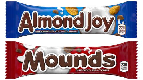
In 1978, Cadbury bought the production, and ten years later, it was acquired by Hershey. Now, candy Mounds (coconut in chocolate) and Almond Joy (coconut and almonds in chocolate) are produced at the factory in Virginia and differ only in the color of the packaging.
The logos of the candies are made in the same style and accentuate the consumers’ attention on the taste qualities of the products. They show a chocolate inscription on a white background. The white background hints at the sweet white pulp of coconut with sugar, and the letters symbolize the outer layer of chocolate.
Cadbury
The history of the world’s second-largest company after Mars Incorporated began with a small Quaker store in England opened by John Cadbury in 1824. The entrepreneur offered hot chocolate, among other items. The drink was so popular that after seven years, John switched completely to chocolate production and brought his brother into the business.
The company moved from liquid chocolate to solid confectionery, producing the first Cadbury candy in 1868. Today, Cadbury is no longer associated with the Quaker family. The company’s last representative left the board of directors in 2000. In 2010, the giant became part of Mondelez International.
However, despite the change of ownership, the company’s logo is imbued with the spirit of the founding family and contains the golden signature of Richard Cadbury. The company’s work reflects all the principles and views the family has held in life. As Quakers, the brothers chose chocolate to keep people from drinking. They built a factory and a natural village to bring their workers closer to God. Guided by their conscience, they created the best possible working conditions. The signature on the emblem represents the gold standard of business conduct that is still adhered to today.
Under license, Hershey’s produces Cadbury candy bars in America. Dairy Milk, Cadbury Caramello, and Cadbury Fruit & Nut are the most famous bars. The licensee has slightly changed the recipe. Therefore, the Cadbury variant of Hershey’s Cadbury, rather than the original, is presented on American shelves.
Reese’s Peanut Butter Cups
Invented in 1928 by milkman Harry Burnett Reese, the famous Reese’s cups were first made in the basement of his home and sold for one cent apiece. He was a very enterprising young man. Before entering the confectionery business, he was a farmer, raising frogs, shipping fish, and working as a laborer. His main incentive was the need to feed his 16 children.
Interestingly, the manufacturer left Hershey’s to start his own business. However, 30 years later, in 1963, his six sons sold the company, bringing it back into Hershey’s. By 1963, Reese’s Peanut Butter Cups had become the company’s best-selling product, and in 2012, they became the best-selling candy in the United States.
Yellow lettering on a brown background and the outline of the Reese’s logo display the cup’s structure. The brown chocolate base is filled with a yellowish peanut butter filling. The letters appear to be made from streams of the sweet dessert. The hues suggest the good mood and wonderful aftertaste left by chocolate products.
Nestlé
The story of this intercontinental brand began, as it should, in its infancy. Its very first product was infant formula. Later, the company’s portfolio expanded to include ice cream, chocolate, coffee, cereals and water. Two thousand brands are produced in 500 factories and sold in 189 countries.
Henri Nestlé, a young pharmacist, emigrated to Switzerland, changed his name to Henri, and began to seek his path in life, different from that of all his glassmaker ancestors. He conducted chemical experiments, developed a business producing mustard, lemonade, and liqueur, and finally, in 1867, found the best-selling product—a baby food mix consisting of milk powder, processed flour, and sugar.
His milk powder-making method greatly interested his neighbor, Daniel Peter, who owned a chocolate company. They agreed, and Peter, taking milk from Nestlé’s recipe and mixing it with chocolate, invented milk chocolate. The friends joined forces, formed a joint stock company, and then merged with their main competitors in Switzerland, the Anglo-Swiss Dairy Company, run by the Page brothers, who also sold infant formula. The merged company was named Nestlé, as Henri’s inventions made the products of both his partners perfect.
The surname of the company’s founder, Henri Nestlé, translates from German as “nest.” The family crest shows a bird in a nest. When Henri invented powdered milk for baby food, he turned the coat of arms into his trademark. There were now three chicks in the nest (in some versions, they represented the three founding brothers). Over time, one chick was removed to bring the nested model closer to the average family, which usually had two children.
Nestlé’s sweet products are available in America through other licensed manufacturers or imported ready-made from Europe.
Kit Kat
The chocolate-covered waffle bar is a story in which the name came before the product itself. The Rowntree Company registered the trademark in 1911, and the recipe for the candy bar was developed in 1935. The name and recipe were combined in 1937, and Kit Kat Chocolate Crisp was born. In the United States, the bar is produced by the Hershey Company under license from Rowntree. Even when Nestlé acquired it, Hershey retained the right to produce the candy bar in America.
The logos and advertising styles of the products in the U.S. and abroad have differed and have only recently become consistent with each other. In America, the name is depicted on the packaging as an ellipse. The letters are three-dimensional, and the elements of the letter “K” resemble the wafers of a candy bar. In the upper left corner of the figure is a modified heart that looks like chocolate with a wafer layer. Inside the heart is the brand name “Nestlé.” Overall, the composition reflects customers’ love and bright flavor, hinting at the quick, sweet snack that most people choose.
Lion
The modern recipe for the chocolate-covered waffle, rice cereal, and caramel candy bar differs from the original, developed by confectioner Alan Norman and launched by the British company Rowntree in 1976. Nestlé, having bought the brand in 1988, tested it and gathered the impressions of 650,000 customers. After that, the coating of the bar was updated, the peanut butter was removed, and the caramel was softened, which made the composition perfect.
When promoting the product, the company focuses on the male audience. Therefore, the logo was designed with strength in mind. The name of the chocolate bar, Lion, is associated with wildness and strength. In the logo, the crunch of the filling is represented as a lion’s roar, and the name itself bursts out of the mouth of a predator. The emblem demonstrates that the tile gives strength, confidence, and energy.
Tootsie Roll
This delicious bar, resembling a mixture of caramel, toffee, and chocolate, has been produced in America since 1907. Its creator, Leo Hirschfield, was a member of the Austrian Jewish community who emigrated to the United States for a better life. He developed the candy recipe for his daughter Clara and named it after her nickname, “Tootsie” (“sweetheart”).
Lacking funds for large-scale production, the businessman found a sponsoring company. This company produced Leo’s patented candies, and in 1917, he became vice president of the Sweets Company of America (then Stern & Stalberg).
In 1920, the confectioner decided to try to start his own business, opening the Mells Candy Company. However, he could not stand the “solitary voyage” and two years later took his own life.
Despite the death of its creator and owner, the recipe lived on. Joseph Rubin & Sons, the company that supplied the packaging for Tootsie Rolls, bought out Hirshfield’s company. Under the leadership of several generations of the Rubin family, the company prospered, changed its name to Tootsie Roll Industries (1966), and now produces up to 64 million candies daily.
The Tootsie Roll logo is a wrapper with white and red stripes at the ends, echoing the flag of Austria (the confectioner’s homeland). In the center is a brown Tootsie Roll candy bar with a white name. The emblem immediately evokes the image of a long, appetizing stick you want to taste.
Godiva
The company began as a joint venture between a father and his five children. In 1926, they opened a chocolate store in the central square of Brussels. However, things were not going well. If not for the name change, no one would have known about the sweets of the Draps family.
To attract attention, the chocolatiers turned to the famous legend of Lord Leofric’s wife. This woman made an unprecedented for 1040 and all subsequent years – traveled naked through the city to reduce the tax burden on the poor of his district. The lord set Such a condition, hoping his wife would never dare such an act. However, Godiva took the risk, and the lord had to cancel all levies. The city of Coventry became a tax-free zone.
Using the legend and placing the image of a lady with a horse on the logo increased the sales of Draps products several times.
After achieving wealth and spreading chocolate throughout Europe and America, the family sold the business to the Campbell Soup Company in 1966. Today, Godiva has two owners, Turkey’s Yıldız and South Korea’s MBK. Sales are made in 100 countries around the world. The company owns hundreds of specialized stores and cafes.
Godiva’s emblem is still an image of a lady, and her name is in brown chocolate lines. The company offers candies such as Milk Chocolate Caramel Bar (milk chocolate caramel) and Mint Dark Chocolate Bar (mint filling in dark chocolate).
Ferrero
Raffaello, Nutella, Tic Tac, Kinder Surprise, Ferrero Rocher—all these world-famous and favorite sweets are the work of the company founded by Italian Pietro Ferrero in 1946. Since then, the first confectionery company has grown to 50 countries and 12 billion euros in revenue but is still owned by the Ferrero family. The company is currently run by the founder’s grandson, Giovanni.
The first product that popularized the Italian house was Nutella paste, accidentally obtained from melted Gianduja candy. Later came Mon Chéri (1956), Kinder (1968), and Mint Candy (1969). Each new recipe became a masterpiece and brought multimillion-dollar profits.
The company’s emblem looks like it is carved from a solid bar of chocolate. The unique serif font resembles a newspaper font, hinting at the Italian origin and the company’s ability to make news from every new recipe.
Kinder Chocolate
Michele Ferrero, the son of the company’s founder, developed special chocolate bars with a high milk content, which allowed parents to control the amount of sweets consumed by their children and be sure of the product’s benefits. It is said that Michele did not like milk, so he figured out how to “hide” it in the chocolate composition. Each bar contains up to 40% milk. Later, in 1978, there was a version of bars with hazelnut cream filling – Kinder Bueno.
The logo combines the brand name in red and black colors and the soft blue inscription “chocolate” in a childish manner. This is matched by an addition on a blue background: ‘milk + cocoa.’ This message emphasizes the safe composition of the product. The first letter, in black, resembles a piece of chocolate peeking out of the package. The image demonstrates how you can eat at the bar without getting your hands dirty.
Lindt
Swiss confectioner Rudolf Lindt opened his factory in 1879. He was an inventor who figured out how to improve the quality and flavor of chocolate through conching. After 20 years, he decided to retire and sold the business to Johann Rudolf, a third-generation confectioner from David Sprüngli & Son. Johann Rudolf introduced the world to the first bars of solid chocolate.
The young owner Lindt & Sprüngli grew into a large company by acquiring less successful firms.
Lindt owns 12 factories, a museum, and 400 chocolate stores today. The company’s most famous products are Lindor truffles, Excellence bars, and Petits Desserts.
The company logo represents the firm in the form of a living person – a master chocolatier. A large message about it and the year the confectionery was founded are indicated at the bottom of the emblem. The italicized name at the top represents chocolate as molten gold, the precious substance that changed mankind. To the right of the inscription, the message is guarded by a composition of two heraldic elements: a knight’s head and a dragon. They pay homage to the family names of the two founding families. The dragon was believed to be depicted on the Lindt family coat of arms, so the knight is most likely an element of the Sprüngli symbolism.
Ghirardelli
America was the third country in which Italian Domenico Ghirardelli conducted his business. Initially, he went closer to where cocoa grows: Uruguay and Peru. But the real luck was waiting for him in America, where, in 1849, gold miners from all over the world came. There, the chocolatier registered his company and opened the first confectionery factory. Things went well, and the company began to expand.
However, the confectionery dynasty ended under his sons. In 1963, the company was sold and systematically changed owners until it ended up in the hands of Chocoladefabriken Lindt & Sprüngli AG. This Swiss firm took its products to an international level.
Bulk chocolate varieties are very popular among the range of bars. They have different fillings surrounded by a square chocolate base.
The company logo takes the viewer back to the days of the gold rush when Ghirardelli was born. The eagle symbolizes gratitude to the country that welcomed and enriched the immigrants. The emblem pays tribute to San Francisco, where the company was registered. But the first owner’s name, without whose ingenuity and persistence Ghirardelli chocolate would not have gained such popularity, attracts attention most. The gold and blue hues in the logo signify the combination of dreams and wealth, of hard work.
Milka
The Suchard family has been into confectionery since the early 19th century. After a small confectionery workshop (1825), the large company Chocolat Suchard was born, where the founder’s son-in-law developed the Milka brand (1901) and its purple packaging. Over the years, the range and production volume expanded.
Since 1990, the brand has been owned by Mondelēz International, which sells Oreo bars (chocolate-covered cookie and biscuit pieces) in America as a Milka-branded product.
The brand name is a compound name. It is formed from the first syllables of the main ingredients: Mil, from milk, and ka, from cocoa. The logo and advertising emphasized the tenderness of chocolate obtained from the milk of special Simmental cows grazing in the Alps. The purple color is an attempt to stand out from the competition. The lettering on the last emblem seems to flow from the milk spilled on it. The color of the letters is very delicate and airy. The upward rise of the inscription hints at mountain peaks.
