


![]() American Heart Association Logo PNG
American Heart Association Logo PNG
Stylish design can save lives. You can see it in the emblems of charitable organizations in the healthcare field. One of those marks is the American Heart Association logo. A kind heart becomes a guarantee of a healthy heart. The life-affirming colors give hope for recovery.
The American Heart Association grew from earlier cardiac work in New York. In 1915, doctors and social workers, including Bellevue nurse and social worker Mary E. Wadley, created the Association for the Prevention and Relief of Heart Disease. It focused on public education, patient support, and early efforts to organize medical knowledge of cardiovascular disease.
On June 10, 1924, six cardiologists met at the Drake Hotel in Chicago and formally founded the American Heart Association. The group included Lewis Conner, Robert Halsey, Paul Dudley White, Joseph Sailer, Robert Preble, and Hugh McCulloch. In its early years, AHA functioned primarily as a professional medical society. It launched the American Heart Journal in 1925 and adopted its first diagnostic standards for heart disease in 1926.
A major change came in 1948. AHA supported the Framingham Heart Study, which later shaped the idea of cardiovascular “risk factors.” That year, the association became a national volunteer organization involving physicians, researchers, and the public. It also issued its first research grant to Nobel laureate Albert Szent-Györgyi. By the end of 1948, a radio campaign called “The Walking Man” brought in $1.5 million, followed by a 1949 national fundraiser that raised about $2.7 million.
In 1961, AHA-funded research helped prove the value of CPR in cardiac arrest. In 1964, the association’s support helped fund the Starr-Edwards mechanical heart valve, developed by Albert Starr and Lowell Edwards. In 1965, pediatric cardiology pioneer Helen Taussig became the AHA’s first female president. Unlike the American Cancer Society or the American Diabetes Association, the AHA kept its main focus on heart and brain diseases. Since 1949, it has funded more than $6.1 billion in cardiovascular research.
Meaning and History
![]()
Throughout the organization’s existence, five logo designs have been developed. In fact, during this time, only the style has changed, while the basis has remained the same. It is a red heart, inside of which there is a torch. In this way, an association is made with life pouring into the heart and fighting various ailments.
What is American Heart Association?
First and foremost, it is a charitable foundation that funds and promotes many heart disease research efforts. It is known far beyond the borders of the United States.
1924 – the 1950s
![]()
The original version of the logo was introduced almost immediately after the project’s launch. It was a bright red heart, atop which was a black torch with black flames. Thus, the company indicated its business scope, and therefore, potential customers did not have to guess. At the same time, there are no verbal inscriptions on the logo.
the 1950s-1995
![]()
The first redesign concerned only minimal changes. Globally, it was a change of flame color from black to white.
1995 – 2010
![]()
The first professional American Heart Association logo was designed in 1994. Compared with previous versions, some changes were made. First, the emblem began to look more modern and progressive. The heart’s more pronounced red color made it more attractive. The torch remained white, while the flame became red. To the left of the emblem was the foundation’s name, arranged in two lines. The first had two words, and the second had one. The inscription was in classical serif type. Only the first letters in each word were capitalized, and black was the primary color.
2010 – 2018
![]()
The 2010 redesign made only minimal changes to the organization’s logo. These include a richer, brighter red color and a slight increase in image size. The latter was because the verbal inscription had already moved from two lines to three. At the same time, the company wanted both elements to seem equally important. Also, the foundation’s name and the emblem were reversed; now the word “inscription” is on the left. Overall, the font used for the American Heart Association name was identical to the previous version. However, it was bolder in the word “Heart,” which was considered the main one.
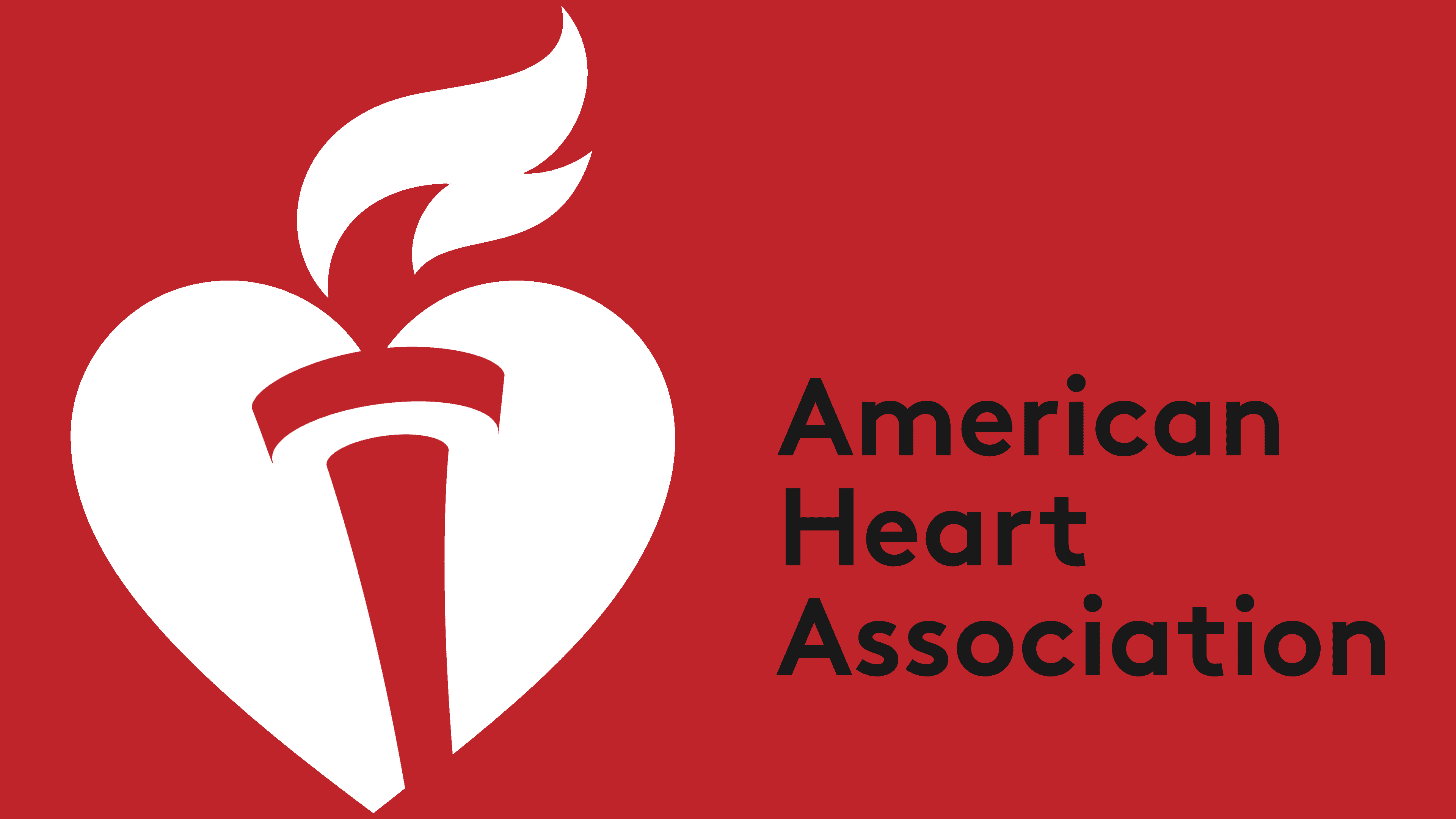
2018 – today
![]()
A rather bold redesign was done in 2018. The location of the element remained unchanged. At the same time, the emblem began to use a red gradient, creating a sense of three-dimensionality. The emblem highlights the torch and flame, which point to the right. In this way, the company demonstrates its profile and desire to fight heart disease.
In terms of size, the emblem dominates the verbal inscription at this stage. It’s also in three lines, but now a sleek sans-serif font was used to create it. At the same time, the black color contrasts with the emblem, giving the image a professional look.
Overall, the current version of the logo looks modern and clear. Brand recognition is high.
Font and Colors
The lettering is in a modern sans-serif font, which complements the emblem by making it more attractive. The company name first appeared on the logo in 1995, and the font remained unchanged until 2018.

A classic three-color palette was chosen for the logo, including red, black, and white. It is an interesting combination that simultaneously indicates the foundation’s strength, energy, and desire to help people.