 American Lung Association Logo PNG
The American Lung Association logo expresses hope for recovery. It is a sincere message that should go to the highest levels to support pulmonology patients. The bold logo represents faith in modern medicine’s power and innovative technology to keep people healthy.
American Lung Association: Brand overview
| Founded: | 1904 |
| Headquarters: | Chicago, Illinois, United States |
| Website: | lung.org |
Meaning and History
Although the foundation was founded in 1904, the first logo didn’t appear until 1973. Since then, only one redesign has been made, and therefore we can say that the visual recognition of the society is at a high level. The logo consists of two elements, namely the emblem and the foundation’s name on the right.
A French doctor Gilbert Cerciron suggested using a modified version of the Lorraine Cross in 1902 as a symbol of the “crusade” against tuberculosis. Such a cross was originally used in the coat of arms of Gottfried of Bouillon, Duke of Lower Lorraine, leader of the first crusade and elected ruler of Jerusalem after its capture in 1099.
What is the American Lung Association?
First and foremost, it is a society with a global mission to find effective ways to fight tuberculosis and other lung diseases.
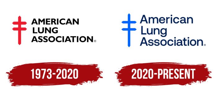
1973 – 2020
On the left side of the logo is society’s emblem, namely the red Christian cross. It has two horizontal lines. As an alternative, you can see the analogy with the sword as a symbol of the fight against a serious disease. It is equal in size to the three levels of the verbal name. Each line displays one of the words of the American Lung Association. A classic bold sans serif font was chosen for the inscription, made in uppercase black letters. The distance between the letters is small, which looks quite strict and professional. This is quite logical because such a society should not evoke positive emotions as it deals with a global problem.
2020 – today
The only, for the current time, redesign took place in 2018. The visual recognition of the foundation remained at the same level as before, thanks to minimal changes to the logo. It also consists of an emblem and a verbal inscription in three lines on the right. The color of the Christian cross has been changed from red to bright blue. At the same time, it became a little bigger in size since, even visually, you can see that it goes beyond the organization’s name. At the same time, the lettering has also been changed. At least, we are talking about the fact that now only the first letters in each word are capitalized. Also, the color of the inscription was changed from black to navy blue. The rounded bold font without serifs was taken as the basis. It should be noted that some variations of the logo also have the foundation’s slogan, namely “Fighting for Air,” below the emblem. Smaller and thinner letters were used for it.
As a basis for the logo of the American Lung Association was taken, Lorraine Cross was slightly modified directly for this foundation. Thus, the company pays tribute to the historic fight against tuberculosis, which began in 1902, when the first congress against the dangerous lung disease was held in Berlin.
The decision to use this particular symbol as the basis of the foundation is due to the thesis of a representative of the Lorraine region, in which he spoke about the French soldiers. They marched to the battlefield with flags depicting the Lorraine Cross.
Font and Colors
The rounded modern sans serif font looks effective and effective. It solves the main task of society, namely to attract the public to the problem of tuberculosis.
The main color in the logo is historically a red shade of Scarlett. With its help, the company manages to convey the energy and power of the foundation, its perspective, and its impact on research in the field. The sharp angles of the cross give it a rather powerful and militant look.
American Lung Association color codes
| Royal Blue | Hex color: | #002158 |
|---|---|---|
| RGB: | 0 33 88 | |
| CMYK: | 100 63 0 65 | |
| Pantone: | PMS 2757 C |
| Ultramarine Blue | Hex color: | #0064ff |
|---|---|---|
| RGB: | 0 100 255 | |
| CMYK: | 100 61 0 0 | |
| Pantone: | PMS 2728 C |


