Serious business requires a serious approach. That’s why the Amgen logo is strict and business-like, not tolerating any “objections” from the outside, as it has, like the company itself, few industry competitors. The corporation deals with an extremely important mission – saving people from the most severe and almost incurable diseases, which has led to a serious emblem. It is impressive, inspiring trust and hope.
Amgen: Brand overview
| Founded: | April 8, 1980 |
| Founder: | George Rathmann |
| Headquarters: | Thousand Oaks, California, U.S. |
| Website: | amgen.com |
Meaning and History
In 1980, entrepreneur William Bowes, who worked at Cetus Corporation, proposed that Winston Salser from UCLA assemble a group of scientists who would conduct innovative research for the production of progressive drugs within the Amgen company. The name was chosen accordingly – Applied Molecular Genetics, later transformed into an abbreviated version. Both versions are reflected in the corporate logos.
The company’s visual identity is built on the name so that interested parties can immediately recognize who it is, what it does, and what it produces. The logo is designed in a serious style, so it is characterized by practicality, business-like appearance, and minimalism. The color palette is optimistic and positive and instills hope for improvement in clients. The evolution of the emblem touched upon all aspects.
What is Amgen?
Amgen is a significant representative of the healthcare sector in the United States. It is the largest American pharmaceutical corporation, producing its own developed drugs based on progressive discoveries in the field of DNA. It was established in 1980 and was founded by a group of scientists with the support of William Bowes and Winston Salser. Its head office is located in the Californian city of Thousand Oaks.
1980 – 1983
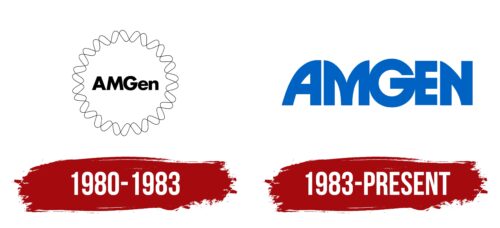
The Amgen logo was circular. It had the shape of a seal, along the edge of which was a double thin line. It represented human DNA, as the basis of research and production technologies was and remains a recombinant macromolecule containing the genetic code. Placed in a circle, it looked like a strict ornament with repeating elements.
In the center was the name of the biopharmaceutical corporation. To emphasize that it was an abbreviation of the phrase Applied Molecular Genetics, the designers retained the three capital letters – one for each word in the phrase. They formed a shortened version of the company’s name: AMGen. The inscription was executed in bold, blocky font. The glyphs were positioned very close to each other – the inter-character spacing was minimal.
1983 – today
After the official transition to the abbreviated version of the name, the biotechnology corporation undertook a logo redesign, which made it more concise. The wavy circle made of double lines disappeared, leaving only the inscription. However, it was modernized and given an individual font. The designers focused on the glyphs, turning them into a contemporary visual identity element.
The letters became massive, large, blocky, and capitalized. In some places, the distance between them was reduced so much that they almost merged. This is particularly noticeable at the junctions of the characters “M,” “G,” and “N,” which harmoniously transition into one another.
Font and Colors
The main typeface used in the Amgen logo is a member of the Helvetica family. It is a smooth, bold, and even font without serifs, reminiscent of Joya Sans Bold by Wiescher-Design. In another emblem, the inscription features unique glyphs created by individual order, making them hand-drawn elements. Three letters have peculiar elongations at the ends (“A,” “M,” “N”), while the remaining two (“G,” “E”) contain only straight bars of equal width.
The corporate color palette of the biopharmaceutical company is light blue. It has a corresponding name and expresses hope for the better: for recovery and for supporting the body’s strength to fight diseases. It is a color of faith, tranquility, and harmony. It reduces anxiety and balances the emotional background.
Amgen color codes
| Denim | Hex color: | #0063c3 |
|---|---|---|
| RGB: | 0 99 195 | |
| CMYK: | 100 49 0 24 | |
| Pantone: | PMS 2935 C |
