


![]() Anderlecht Logo PNG
Anderlecht Logo PNG
The Anderlecht logo features numerous symbols linked to its origins and a history spanning more than a century. Therefore, it comprises many components that form a symmetrical pattern. It reflects the national pride of the Royal Sporting Club Anderlecht.
The history of RSC Anderlecht began on May 27, 1908, in a Brussels café, where Charles Roos gathered local players to form Sporting Club Anderlechtois. The team started on a modest field and entered official competitions in 1909.
By 1912, Anderlecht had reached the second division, and in 1917, moved to a new ground at Astridpark. The club first entered the top division in 1920–21 but spent years moving between tiers before stabilizing in 1935–36, and has remained there ever since.
In 1947, Anderlecht won its first Belgian title. Under coach Pierre Sinibaldi in the 1950s, the club secured five consecutive championships, with Jef Mermans becoming its top scorer.
The 1960s brought further dominance, including five straight titles from 1963 to 1968, led by Paul Van Himst. In Europe, Anderlecht won the Cup Winners’ Cup in 1976 against West Ham United and again in 1978 against Austria Vienna, as well as the UEFA Super Cup against Bayern Munich and Liverpool.
In 1983, the club reached the UEFA Cup final, defeating Benfica. Under president Constant Vanden Stock, Anderlecht dominated Belgian football through the 1980s and early 1990s, ahead of Standard Liège and Club Brugge.
The modern name RSC Anderlecht was adopted in 1993. The club competed in early editions of the UEFA Champions League and had won 30 league titles by 2010.
In 2017, Marc Coucke acquired control. Vincent Kompany joined in 2019 as player-coach and later left for Burnley in 2022. The academy produced players like Romelu Lukaku.
Meaning and History
![]()
The football team’s emblem incorporates traditional symbols of Belgium and the commune of Anderlecht. It is multi-component, with each element intricately detailed and meaningful. The graphic symbol has changed several times, but its structure has remained the same since 1981.
What is Anderlecht?
Anderlecht (or RSCA) is an abbreviation for Belgium’s Royal Sporting Club Anderlecht. It is a professional football team playing in the First Division A, the country’s most successful club with 5 European trophies, 9 Belgian Cups, 34 championship wins, and a record number of consecutive championship titles. The club was founded in 1908.
1933 – 1981
![]()
In 1933, “Royal” was added to the club’s name, so a gold crown adorned with green and red stones was added to the logo. This symbol of authority is depicted at the junction of two interconnected white and blue rings. Inside are the letters “S,” “C,” and “A” from “Sporting Club Anderlechtois.”
1981 – 1989
![]()
A radical redesign in 1981 turned the emblem into a rectangular shield with a pointed base. At the top, in a separate rectangle, is the inscription “RSC ANDERLECHT.” The main part features a complex graphic composition of two black, yellow, and red Belgian flags, a motto ribbon bearing the Latin phrase “Mens sana in corpore sano,” a crown, two rings, the “SCA” acronym, and the coat of arms of the commune of Anderlecht. At the bottom are two golden wheat sheaves, with a large club flag in the background having three vertical stripes: one white and two purple.
1989 – 2001
![]()
With the shield’s complex shape, the club’s name moved to the bottom, and the central elements were reduced. The crown’s design changed, now with a red interior. The Anderlecht commune’s coat of arms also got a new look, resembling a real state symbol, purple replaced blue.
2001 – 2002
![]()
The heraldic shield disappeared along with the club’s name. Only the central composition of many small elements remained. The color palette was updated again: designers used violet instead of purple. The proportions also changed: the letter “C” in the “SCA” acronym now merges with the rings.
2003 – 2008
![]()
Logo designers reduced the letter “C” to fit between two intersecting rings. They also lightened the image, removing some black and adding more white.
2009 – 2010
![]()
In 2009, the colors of the Anderlecht logo became brighter, with violet taking on a distinct blue hue.
2010 – 2023
![]()
In 2010, three stars appeared above the complex graphic composition, one for every ten Belgian championships won.
2023 – today
Font and Colors
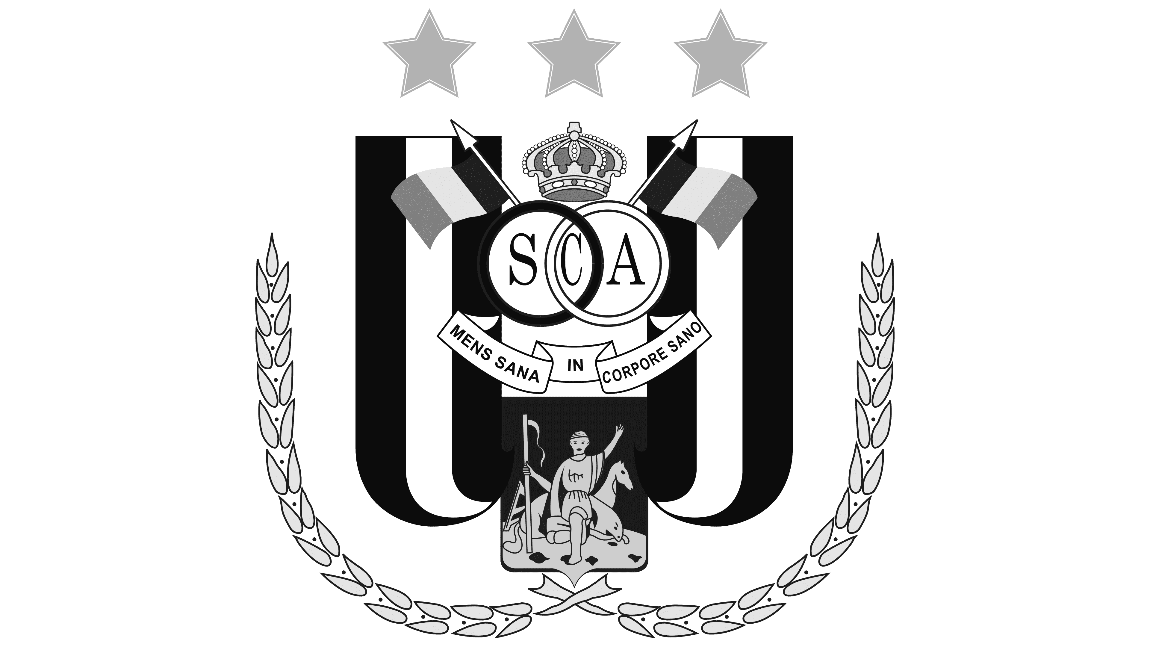
The Anderlecht emblem features four flags at once. Two belong to the club, and two resemble Belgian tricolors on flagpoles. The crown signifies the football team’s successes. Wheat sheaves symbolize prosperity, wealth, and well-being. The motto on the ribbon translates to “A healthy mind in a healthy body,” perfectly fitting the sports theme. The coat of arms of the Anderlecht commune is depicted with maximum accuracy.
The letters “SCA,” retained from Sporting Club Anderlecht, have large, acute serifs. The motto uses a completely different font and is written in a grotesque style.
The Belgian flags use three colors: Eerie Black (#18171A), Aureolin (#FCEC04), and Permanent Geranium Lake (#E92D2A). Additionally, Aureolin is shown on the Anderlecht commune’s mini coat of arms, combined with rich electric blue (#0091D0). The three stars are mustard yellow (#E0AA00), while the left ring and the vertical stripes in the background are Spanish violet (#4C2484).