The emblem of this fast food chain conveys the atmosphere of the Wild West because Arby’s logo consists of an imitation of a cowboy hat. It also resembles the headdress of Hispanics and the tip of a hot pepper. The restaurant’s identity is associated with well-seasoned dishes for lovers of simple and tasty food.
Arby’s: Brand overview
Arby’s fast-food restaurants are not as famous as Burger King or Mcdonald’s but have received their share of fame. Their signature dish was originally roast beef sandwiches, which was reflected in the first logo. Now, the assortment is much larger: customers can order hot turkey sandwiches, sweet tea, chocolate cake, mint milkshakes, spicy fries, and other popular fast food.
Launched by brothers Leroy and Forrest Raffel in 1964 in Youngstown, Ohio, the brand quickly distinguished itself in the fast-food world. Its name, a play on the founders’ initials (Raffel Brothers or “RB”), underscored a commitment to carving out a unique niche. Opting for roast beef sandwiches as its flagship offering, the company aimed to provide an appealing alternative to the typical fast-food fare of hamburgers.
Expanding rapidly throughout the 1960s, the brand introduced its franchise model and swiftly spread across the Midwest. By the 1970s, the menu diversified, including turkey and chicken sandwiches, propelling the chain past 1,000 restaurants nationwide.
Ownership transitions in the 1980s and 1990s, including acquisitions by Royal Crown Cola Company and Triarc Companies, mirrored the company’s ascent in the fast-food hierarchy. This period saw menu innovations like curly fries and the launch of iconic ad campaigns, notably “We Have The Meats… for Sandwiches.”
2011 marked a pivotal year with Roark Capital Group’s acquisition, spurring a brand overhaul focused on quality and modernization. The brand continued to innovate, introducing unique items like game meat sandwiches and generating buzz with bold marketing efforts.
The company boasts over 3,300 locations globally and is celebrated for its high-quality meats and creative menu. Despite stiff competition, its dedication to meaty sandwiches has earned a dedicated fan base. The brand has proven resilient over five decades, continuously adapting to meet changing consumer tastes and affirming its enduring legacy in the fast-food world.
Meaning and History
Arby’s company was founded in 1964. Many people assume that its name is composed of the first letters of the phrase “Roast Beef” (“Arby” can be considered the phonetically recorded sound of “RB”), but in reality, it is not. The possessive apostrophe “s” indicates that “RB” is an abbreviation for Raffel Brothers.
Leroy and Forrest Raffel were born business people. At first, they supplied restaurant equipment and then decided to open a fast-food chain, excluding popular hamburgers from the menu. Arby’s served sandwiches, salads, sauces, and soft drinks. In the second half of the 1970s, the family business was bought by RC Cola, which in the early 1980s was acquired by DWG corporation. Inspire Brands Inc. now owns the Arby’s trademark.
The sandwich restaurant chain stands out with its iconic cowboy hat logo, which has changed many times but remained true to the same concept.
What is Arby’s?
It is a US-based fast-food chain created for sandwich lovers. The restaurant menus have sandwiches with duck breast and cherry sauce, chicken and parmesan, meatballs, turkey, beef stew, crispy onions, tomatoes, and other fillings.
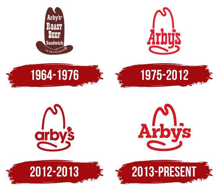
1964 – 1976
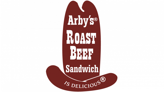
The first emblem was for road signs, so sign maker Peskin Sign Co. designed it. It was a giant hat in a classic Western style. The headdress consisted of two uneven brown fragments. The top half read “Arby’s Roast Beef Sandwich” in white letters and “IS DELICIOUS” on the bottom. For the first part, the designers used a block typeface with expressive rectangular serifs; the second was a thin typeface with short and sharp serifs.
1975 – 2012
In 1975, the full drawing was replaced with a red line depicting the outline of a ten-gallon hat. The text was shortened to a short and extensive “Arby’s,” the developers rounded all the corners and placed the word in the center, dividing the unbroken outline of the headgear into two winding stripes.
2012 – 2013
On the eve of its 50th anniversary, the fast-food chain decided to redesign. Many people associate this event with an attempt to divert attention from high-profile scandals that have spoiled Arby’s image. The most famous of these is the case when a client found a severed finger in a sandwich. The changes were timed to coincide with the Slicing Up Freshness marketing campaign. The designers stylized the apostrophe mark to interpret the new slogan as a circular, rotating blade that hung over the letter “s.” So, they wanted to show that cutting meat does not occur in a factory but directly in a restaurant.
The font has become lowercase and has lost the iconic serifs. He lost his individuality: no Western spirit was left in him, but cold geometric precision appeared. The cowboy hat was retained, but consumers did not like its three-dimensional sheen around the edges. It was unambiguously acknowledged that the design did not evoke an appetite among visitors, so the company was forced to change the logo again after a few months.
2013 – today
The Arby’s restaurant chain realized its mistakes and returned to the classic identity style. The developers used the 1975 logo as a base. They slightly changed the shape of the lines and used a block font with rectangular serifs for the inscription, a tribute to the brand’s long history.
Arby’s: Interesting Facts
Arby’s, famous for its sandwiches, especially roast beef, has made a notable mark in the fast-food world since its inception in 1964 by Forrest and Leroy Raffel in Boardman, Ohio. The name, derived from the founder’s initials (R.B.’s), often leads to the fun misconception that it stands for “roast beef.”
- Simple Beginnings: Starting with roast beef sandwiches, potato chips, and iced tea, Arby’s menu has grown to include various items.
- Health-Conscious Options: In the 1980s, Arby’s was ahead of its time with a “lite” menu that offered salads and lighter sandwiches.
- Beef ‘n Cheddar: This blend of roast beef, cheddar cheese sauce, and red ranch sauce on an onion roll has become a favorite.
- Curly Fries: Introduced in 1988, Arby’s curly fries quickly became a hit, setting the chain apart with their seasoned, spiral-cut fries.
- Signature Sauces: The chain is also known for Arby’s Sauce and Horsey Sauce, which have a strong fan following and add unique flavors to their sandwiches.
- “We Have The Meats®”: This slogan reflects Arby’s broad meat selection, including turkey, chicken, ham, and brisket, and emphasizes its diverse sandwich offerings.
- Vegetarian Support Line: As a playful marketing move, Arby’s once offered a “vegetarian support hotline” on Leap Day, highlighting their meat-focused menu with humor.
- Record-Breaking Advertisement: In 2017, Arby’s earned a Guinness World Record for the largest advertisement, a massive 212,000-square-foot logo in Nebraska, celebrating their commitment to using antibiotic-free chicken.
- Giving Back: Through Arby’s Foundation, the company is dedicated to ending childhood hunger in America and supports various youth initiatives.
Arby’s has secured its place in the hearts of fast-food enthusiasts through menu diversity, distinctive marketing, and a commitment to community involvement. It demonstrates that it’s much more than just a place for roast beef sandwiches.
Font and Colors
Since the Raffel Brothers originally wanted to call their business Big Tex, the ten-gallon hat on the logo seems very appropriate as it is the stereotypical headgear of the Texas people. As it evolved, it was simplified to a red outline. In some commercials, the hat symbolizes the desire to go to Arby’s. The logo appeared overhead like a cartoon light bulb, forcing people to visit a restaurant.
The closest font used for the modern Arby’s logo is Sanchez Black. However, the designers modified it to get a distinctive block typeface decorated with large serifs and rounded corners.
The typography of the previous brand name was completely different. It was based on sans serif line lettering. The letters were rounded like in Futura Bold but slightly different from the base font. Considering that such a design did not correspond to the cowboy style, the restaurant chain leaders returned to the classics.
But the color rarely changes. The red and white palette looks very emotional and conveys the atmosphere of the Wild West. Moreover, red symbolizes strength, energy, power, and hunger, which is why it can often be seen in the identities of fast food companies.
FAQ
What kind of hat is in the Arby’s logo?
The logo prominently features a cowboy hat, a choice beyond simple design to embrace American culture’s essence and the Wild West’s spirit. This choice of symbol is intentional, connecting the brand to the adventurous and rugged traditions of the American frontier. It signifies the company’s dedication to serving hearty American dishes rooted in the simplicity and robust flavor one might associate with cowboy fare. By incorporating a cowboy hat into its logo, the company sets itself apart from the competition, establishing a unique brand identity that resonates with customers looking for more than just a meal. This experience captures a piece of American tradition. This iconic hat is more than just a logo; it’s a declaration of the company’s commitment to its heritage and values.
What is the history of the Arby’s hat?
Arby’s chose a cowboy hat for its logo to bring the adventurous spirit of the Old West into the fast-food scene. This decision was made when the first location opened in 1964 in Boardman, Ohio, to stand out from the usual burger joints. The cowboy hat marked the brand’s distinctiveness and echoed the founders’ goal of providing a different fast-food experience. It tied the brand to American tradition and the cowboy lifestyle, highlighting the company’s dedication to hearty, meat-centric dishes. This iconic symbol helped the brand establish itself as a unique option in the fast-food market, known for its quality roast beef sandwiches and commitment to capturing the essence of American heritage.
What makes Arby’s unique?
The brand stands out in the fast-food world by focusing on freshly sliced meats and unique flavors. Instead of the usual burgers and fries, the company slow-roasts its meats, showing its dedication to quality and taste. This method makes special sandwiches for those wanting a break from standard fast food. The brand’s commitment to a broad selection of sauces and toppings makes it a preferred choice for anyone looking for varied and tasty options. The emphasis on fresh, high-quality ingredients and creative menu items makes the brand a hit with food lovers searching for something unusual.
What is Arby’s most famous for?
The brand is best known for its roast beef sandwiches, a key offering that defines the company. These sandwiches consist of slow-roasted beef, thinly sliced and served on a warm bun, making the brand stand out in the fast-food scene. Alongside the famous roast beef sandwich, the company’s menu also features a variety of items like gyros, wraps, chicken sandwiches, and milkshakes, catering to different tastes and attracting a broad audience. Despite the diverse menu, the roast beef sandwich remains the brand’s signature item, showcasing the company’s dedication to quality and taste that consistently draws customers.
Why did Arby’s stop selling ham?
The brand’s decision to stop selling ham mainly came down to poor sales. Like all fast-food chains, the company often reviews the performance of its menu items. Items that do not draw enough customer interest or sales get removed. This method keeps the menu aligned with what customers like and ensures that what’s offered is both popular and profitable. Unfortunately, despite its quality, the brand’s ham didn’t meet the sales targets to keep it on the menu. This move is part of a common practice in the fast-food industry to tweak the menu based on what customers want and trends in the market.
What does the Arby’s symbol stand for?
The logo, featuring a cowboy hat, reflects the chain’s Wild West theme. This emblem captures the adventurous spirit and robust American cuisine the brand offers. It sets the company apart from other fast-food chains by evoking the imagery of open plains and cowboy culture, along with the straightforward, bold tastes of the West. The cowboy hat logo is more than just a design; it’s a statement of the company’s dedication to providing a meal experience that combines great food with a distinct atmosphere and story, appealing to customers who appreciate this unique dining setting.
Is Arby’s logo a hat or an oven mitt?
The logo is a cowboy hat, not an oven mitt, although there was a bit of confusion due to an old advertisement featuring an animated potholder character. The cowboy hat is a deliberate choice that ties in with the brand’s Wild West theme, highlighting its adventurous spirit and focus on hearty American cuisine. This symbol sets the brand apart in the fast-food world, underlining its unique dining experience influenced by the American West’s imagery and culture.
What is the Arby’s logo supposed to be?
The logo combines a bold serif wordmark of “Arby’s” with an abstract emblem that together form the silhouette of a cowboy hat. This design captures the essence of the fast-food chain, linking it to the adventurous Wild West theme. The strong, reliable typeface and the cowboy hat silhouette make the brand instantly recognizable, underscoring its unique position in the fast-food industry. This logo reflects the brand’s dedication to providing a unique dining experience influenced by American culture and the spirit of adventure.
What is Arby’s current slogan?
The slogan, introduced in 2018, is “Arby’s. We Have The Meats… for Sandwiches.” This slogan underscores the company’s dedication to offering a variety of meats, making it stand out in the fast-food world. It’s not just about serving quality meats; it’s about filling their sandwiches with them, appealing to meat enthusiasts, and promising a satisfying dining experience. The slogan’s playful twist, “…for Sandwiches,” adds a touch of humor, reflecting the company’s fun and friendly marketing approach while highlighting its focus on meat-filled sandwiches. This clever slogan captures the brand’s essence, showcasing its commitment to quality and variety in its sandwiches.
Why is Arby’s logo a cowboy hat?
The logo, featuring a cowboy hat, is a nod to the Old West and the original theme of its first restaurant opened in 1964. The founders wanted the brand to stand out by creating an upscale atmosphere that differed from the typical fast-food places of that time, using cowboy themes and Wild West culinary traditions. The cowboy hat in the logo is more than just decor; it symbolizes classic American values and the type of hearty, meat-focused dishes the brand is known for. This choice effectively sets the brand apart, emphasizing its rich heritage and commitment to offering a distinctive dining experience that echoes the spirit of American culture and tradition.
When did Arby’s slogan change?
In 2014, the company shifted its branding focus to attract younger customers, especially millennials. The company’s leaders decided it was time for a refresh to keep the brand relevant and appealing. They replaced the old slogan “Slicing up Freshness” with “We Have the Meats,” aiming to showcase the company’s meat-based dishes. This change was a strategic move to modernize the brand’s image and emphasize its strengths in a competitive fast-food market. While the slogan changed, the company’s iconic logo remained the same, maintaining its well-known visual identity amidst its efforts to appeal to a broader, more diverse audience.
What was Arby’s old slogan?
The brand has gone through several slogans over its history, each reflecting its evolving focus and efforts to connect with customers. The brand highlighted its commitment to fresh ingredients from “Slicing up Freshness” until 2014. This approach shifted towards enhancing customer moods with “It’s Good Mood Food” until 2012 and emphasizing value with “Worth Every Penny” until 2011. The brand also used slogans like “I’m Thinking Arby’s,” “Every Day Tastes So Good,” and “What Are You Eating Today?” until 2009 to encourage customers to make the brand their choice for meals. “Satisfy your grown-up tastes” was used until 2003, targeting customers seeking more sophisticated dining options. The first slogan, “Roast Beef Sandwich Is Delicious,” directly promoted the brand’s key offering and was even incorporated into the brand’s logo, establishing the company as the go-to place for roast beef sandwiches. These slogans collectively showcase the brand’s journey from emphasizing product quality and value to fostering emotional connections with customers, all while reinforcing its identity in the competitive fast-food market.
What does the Arby’s logo mean?
The logo, symbolized by a cowboy hat, embodies the spirit of the Wild West and its hearty cuisine, which directly influences the company’s menu. Focused on meat and potatoes, the company’s offerings are inspired by the robust meals a cowboy might enjoy. The cowboy hat is a deliberate symbol reflecting the brand’s origins and dedication to serving fulfilling food. Additionally, the logo includes a subtle nod to the Raffel Brothers, the company’s founders, with the initials “RB” cleverly embedded within the name. This thoughtful design connects the brand’s rich history and culinary approach, highlighting its commitment to quality and honoring its founders.
Is Arby’s logo an oven mitt?
The logo features a cowboy hat, not an oven mitt, chosen to capture the essence of the Wild West. This design decision highlights the company’s commitment to offering an atmosphere and menu influenced by Wild West traditions. The cowboy hat symbol in the logo is more than just a nod to style; it represents authority, safety, respect, and nobility, integral to the company’s brand identity. By choosing a cowboy hat as its emblem, the company aims to offer more than just food; it invites customers into a world that values culture and history, making each dining experience unique and meaningful.
Why does Arby’s logo work?
- Simple: The logo is very modest. It doesn’t have many details to look at. Therefore, everything in the brand name is simple and clear: the name and a stylized cowboy hat symbolize high authority, trust, nobility, and positive moral qualities. As a result, visitors will instantly recognize the emblem, and extra design elements only confuse.
- Scalable: The badge adapts comfortably to any screen, small or large. This is explained: a universal image is easy to reduce or enlarge. It works equally well on websites, business cards, vans, streamers, banners, and other promotional media.
- Actual: The graphic specialists have ensured that the emblem with the famous cowboy hat is instantly associated with classic American cuisine. With well-done meat, French fries, and other Wild West delicacies from where the brand came. The reason is in red and in the unusual shape of the headdress, which resembles a steak. Therefore, at one glance at the logo, customers immediately salivate.
- Timeless: Legendary symbols are timeless. The logo is one of them. Like McDonald’s or Pizza Hut’s identities, it similarly meets the needs of the food industry and consumer demand. As a result, the logo has retained its graphic features for over half a century, thanks to which it has become recognizable and attracted many customers.
- Memorable: The key factor in a memorable sign is charisma. Clients transmit energy through it, subconsciously or emotionally, and this is how they begin to distinguish the logo from its competitors. The brand’s logo falls into this category. Due to its internal charge, it easily pops up in consumers’ memory, although they do not make any effort to do this.
