Aria, a company specializing in smart technology solutions, has unveiled a new logo for its rebranding. This new identity reflects the company’s growth and commitment to evolving in the market, aligning with its focus on innovative, high-tech solutions. The rebranding represents a shift towards a more modern visual language that mirrors Aria’s technology-driven ambitions.
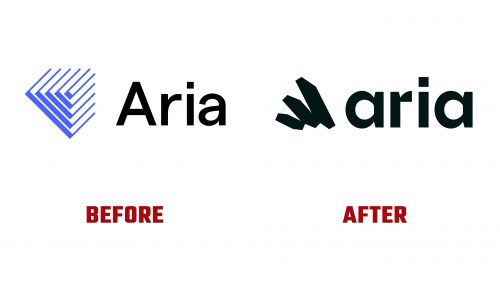
The previous logo was simple, focusing on functionality with a minimalistic symbol and clear font, highlighting the company’s dedication to innovation. However, as Aria expanded, the need for an updated style arose to communicate its forward-looking goals and growing influence better.
The new logo boldly departs from the old design. At its center is a geometric symbol of abstract forms that create a dynamic visual effect. These shapes, which resemble wings or flowing movement, reflect the company’s forward momentum and commitment to growth. The design captures the brand’s energy and adaptability, appealing to modern technology users.
The typography has been updated with smoother, more rounded letters that give the wordmark a modern and approachable feel. The refined, clean lines suggest ease of use and cutting-edge solutions, while black adds a sense of professionalism and reliability. This minimalist approach ensures the logo’s versatility, making it suitable for digital and print applications.
A key feature of the new identity is the “Kinetic Square,” which plays a central role in the brand’s visuals. This electric green square symbolizes the company’s focus on digital transactions and morphs into various shapes across branding materials. Whether in static images or animations, the square brings energy and fluidity, reflecting the smooth nature of digital payments. The bright green palette, inspired by the look of physical currency, highlights the future of financial technology.
The logo uses the F37 Lineca font, which adds to the modern, technical feel of the design. Paired with the headline font STK Bureau Sans, the typography ensures readability and practicality across print and digital formats. This careful combination of fonts enhances the brand’s cohesive and contemporary look.
The new logo, sleek typography, and vibrant colors create a visual identity that perfectly aligns with Aria’s mission to deliver innovative digital solutions, positioning the company for continued success in the competitive tech environment.


