![]() Ariat Logo PNG
Ariat Logo PNG
The Ariat brand logo consists of the word “Ariat” with a graphic often called a “figure of eight.” The graphic element of the Ariat logo resembles the number 8, but with some changes. The symbolism of the Ariat logo is related to equestrianism and the brand’s history. The graphic element, called the “eight,” is a symbol of the horse’s bridle, used to control the horse. And the “eight” symbolizes infinity, reflecting the brand’s desire for continuous improvement and development.
The Ariat logo embodies simplicity and minimalism, reflecting the functionality of the brand’s products. The emblem looks strong and energetic thanks to the brand’s strong font, which emphasizes confidence and reliability.
In general, the Ariat logo combines the symbolism of equestrianism, simplicity, functionality, and the desire for continuous development. It reflects the brand’s values and ideology, which focus on comfort, safety, and product style for people involved in outdoor activities.
Ariat began with Beth Cross, who grew up on a thoroughbred horse farm near Swarthmore, Pennsylvania. After earning an MBA from Stanford in 1988, she joined Bain & Company in San Francisco, where she met Pam Parker in 1990. Both worked on sports footwear marketing projects involving brands such as Reebok and Cross, and saw a gap in equestrian boots: saddles had evolved, but riding footwear still felt heavy, stiff, and outdated.
In 1992, Cross and Parker founded Ariat International. The name came from the middle of Secretariat, the 1973 Triple Crown winner. The logo, designed by Jay Vigon, used three horseshoes to represent the Kentucky Derby, the Preakness Stakes, and the Belmont Stakes. The idea was to bring running-shoe technology into riding boots through cushioning, arch support, and more ergonomic construction.
The first Ariat boots for English and Western riding went on sale in 1993. The company hired professional riders and biomechanics specialists, keeping the product close to real use in the saddle. Through the 1990s, Ariat sold mainly through equestrian stores across the United States.
In 1998, Ariat entered the work boot market for farmers, ranchers, and builders. The Fatbaby women’s cowboy boot followed in 2001, helping the brand reach a wider audience. Apparel arrived in 2006, including jeans, shirts, work vests, and flame-resistant gear. Ariat became a Professional Bull Riders sponsor in 2009, was acquired in 2012 by the Fisher family with management, signed with FEI in 2015, and in 2024 sponsored San Francisco 49ers quarterback Brock Purdy.
Meaning and History
![]()
The emblem was designed by Jay Vigon, a friend of Parker and Cross, after the company was founded. Its main elements have remained constant over the past thirty years: the trademark and the name.
The word Ariat is the idea of one of the business co-founders, Beth Cross. She grew up on a farm and has been passionate about horse racing since childhood. Ariat is short for the full name of the famous Thoroughbred racehorse Secretariat, dating back 20 years to the company’s inception. She got the Triple Crown, winning three of the most prestigious races among three-year-old thoroughbred horses.
As planned, the Ariat logo embodies the elegance and grace of the horse, which the creators aim to convey in their models. For people familiar with equestrian sports, the meaning of the name is clear and demonstrates the following:
- great love for horses,
- admiration for thoroughbred horses,
- the desire to create the most comfortable boots for winning,
- leadership positions in the market, and the desire to be the first to finish.
The capital letters of the inscription and the bold font convey primacy and confidence. They hint at the boots’ strength, stability, and a good fit in the saddle. Increasing the distance between the elements of the letters A and R demonstrates the horse’s movement, jumps, and jumps.
What is Ariat?
This premium apparel and footwear manufacturer specializes in active-lifestyle and equestrian-sports products. The range includes traditional cowboy boots and modern athletic footwear for horseback riding, designed for riders, cowboys, and fans of country style. The products combine advanced comfort technologies with classic Western design, making them popular among professional athletes and country fashion enthusiasts. The company also offers work boots, clothing, and accessories that are highly valued by ranchers, farmers, and others who need reliable gear for an active lifestyle.
1993 – 2005
![]()
The visual part of the emblem resembles a chevron with a number on the rider’s right sleeve. Instead of a number, the logo uses a composition of interlacing three horseshoes. They should bring triple luck to the firm.
Their combination forms a three-petal flower in the center. Its geometry resembles the elements of the Flower of Life, representing harmony and order. As the composition’s heart, he predicts the company’s harmonious development and long-term existence.
The horseshoes of a horse are associated with the boots of riders. The main function of both items is to protect during races. The number three alludes to the triple crown. It symbolizes an unconditional victory over competitors.
First, the chevron’s location in the logo indicates the dominance of the races. Ariat boots are just an addition to the spectator sport. The composition also hints at the rider’s leadership over the horse. Victory, as well as the animal’s health and safety, depends on the athlete’s skill. Therefore, in the emblem, the rider’s chevron is first located and then the horse’s name.
In addition to the standard emblem, other variations are used. For example, a large chevron with the name in small print is located in a semicircle above it. The composition looks compact and is suitable for use as a brand name on shoes and clothing.
2005 – 2015
![]()
The company has used a three-dimensional version of the logo for ten years. The designers used a gradient to add visual depth to the image. Thanks to this, the brown triangular shield became more voluminous and colorful. But the changes did not affect the three horseshoes, which remained two-dimensional. The badge was reduced to match the proportions of the inscription on the right. The black word “ARIAT” consists of bold capital letters without serifs. The easy-to-read font is roughly similar to Banker Square ExtraBold from FontSite Inc.
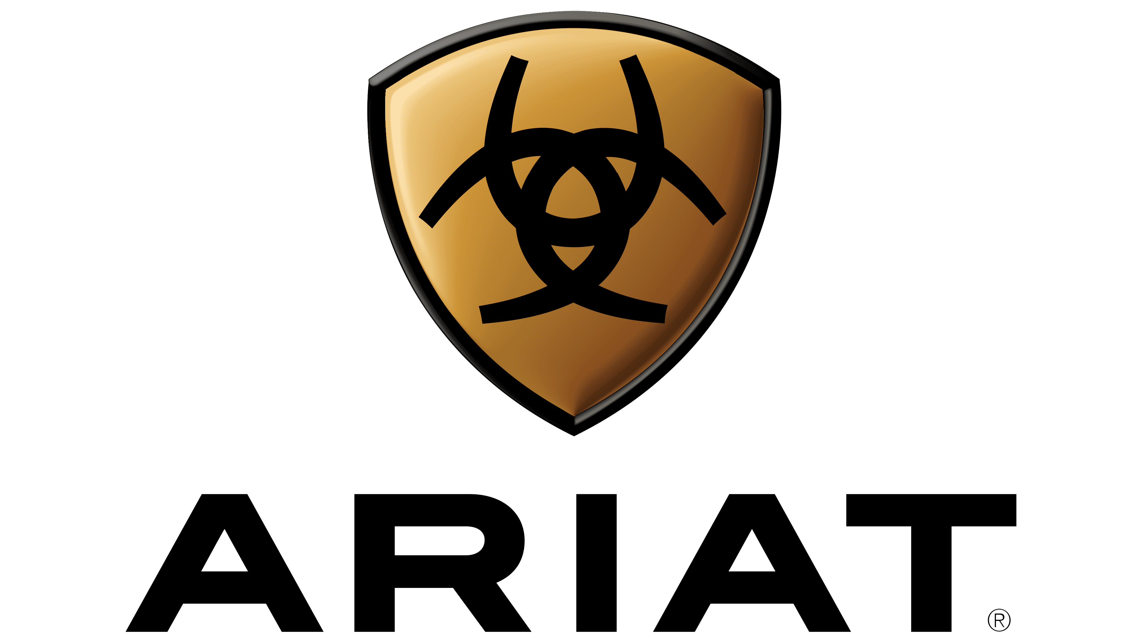
2015 – today
![]()
The 2015 redesign brought the Ariat logo closer to minimalist ideals. The inside of the shield is now white, so the black pattern of the four horseshoes is clearly visible. All other elements remain unchanged: the lettering is still large and expressive, and the triangular shield has a dark outline. The branding guide states that the sans-serif font used is called Din Black. It was created in 1936 for the German Standards Committee.
Font and Colors

The main color of the emblem is black. It is a symbol of stability and confidence. Indicates the basic coloration of equestrian boots. Sometimes the chevron on the logo is made of gold – the color of victory and leadership.
![]()
The font of the inscription, Organetto Ultra Bold Semi Ext, with an increased letter spacing, symbolizes a gallop during the races.