Support should be all-encompassing – that’s the message of an organization whose logo is familiar to everyone in the U.S. because dentistry is one of the most common services in the medical field. The Aspen Dental logo says it all, standing for quality patient care.
Aspen Dental: Brand overview
| Founded: | 1964 |
| Founder: | Robert Fontana |
| Headquarters: | DeWitt, New York, U.S. |
| Website: | aspendental.com |
Aspen Dental is an American organization that provides support to dental departments in the country. It is engaged in the complex administration of this business area in the United States; therefore, its full name is Aspen Dental Management, Inc. (ADMI). The year of its foundation is 1964. The founder is Robert Fontana. The head office is located in DeWitt, New York.
The predecessors of this company are several organizations that at one time had different forms of ownership: Upstate Dental, East Coast Dental, and Association of Dental Support Organizations (ADSO). ADMI has existed in its current status since 1994. Five years after its inception, it had over 50 offices across the country, and by the spring of 2007, the number of practices had increased to 106. At first, the headquarters was concentrated in Syracuse, New York, and in 2006 it moved to DeWitt and was significantly expanded to open a training center for employees.
Meaning and History
Throughout its existence, Aspen Dental has paid great attention to identity. Its logo is used as signage in more than 850 locations throughout the United States, making it highly recognizable in the community. Their logo is a working asset that explains what the organization is and what it does.
What is Aspen Dental?
Aspen Dental is a specialized organization in the field of dentistry. She oversees, manages, and manages dental departments across the United States. The company has existed since 1964 and is located in DeWitt, New York.
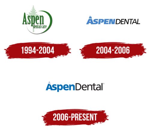
1994 – 2004
The Aspen Dental logo features a translucent silhouette of a tree. In this context, the plant symbolizes the health of the teeth, which also have roots. After all, teeth, like trees, receive nutrients from the roots. In addition, the emblem represents the growth and development of the dental company. In the foreground is the large word “Aspen” with a capital “A,” and below that is the phrase “dental care” in lowercase letters. An elegant half-ring of uneven thickness surrounds all elements.
The logo is made in green, which is associated with nature, health, life, purity, and freshness. In addition, the selected shade symbolizes calmness and relaxation, which is important for patients in dental clinics.
2004 – 2006
The name Aspen Dental is written together in this logo, but the two words are visually separated by a different design. In both cases, capital letters are used with a slight slant to the right; only in the first half are they blue and bold, and in the second, they are black and thinner. The initial “A” looks the most original, in which the top has sharp notches and is separated from the rest by a thin white stripe. It can have several meanings:
- this is an image of a diseased tooth that needs treatment;
- this is a mountain – a symbol of perseverance, reliability, and strength.
And the top of the rock represents a distant but achievable goal. In this case, oral health.
2006 – today
The visual identity mark consists of text based on the title in continuous spelling. It is composed so that it has good readability at any scale. Inside it is a modified letter “A”: it can be used separately as a graphic element.
When placing the logo on the surface, the only condition is that the space around it must be no less than the height of the capital “A.” Either a distance equal to it or more is allowed, which prevents the emblem from being cluttered. If there is not enough space, then, according to the manual, only the icon consisting of the first letter in the name of the dental organization is used. It is a basic reference for the degree of inclination when placing additional compositions and can act as a contour background or fragment.
It includes the name, composed of two words merged into one – “AspenDental.” Their beginning is highlighted in capital letters, which ensures optimal readability of the logo. The difference in design also contributes to better recognition of the parts: the first consists of bold characters of a streamlined shape, and the second consists of thin characters. The letter spacing is very compressed in both cases, but the semi-soft Frutiger font maintains good text recognition.
The first “A” is highlighted, which the designers turned into a graphic object. It has a non-standard spelling and acts as an icon. She has very wide lines, and on the legs below, there are one-sided roundings (on the outside). The top is similarly rounded, separated from the base by a smooth diagonal white stripe. Since the practice of this organization is related to dentistry, the letter schematically resembles a tooth. The negative white space in the middle almost follows the shape of the top.
Font and Colors
The inscription in the emblem consists of Frutiger Bold and Bold with some modifications. These are float letters in lower case, except for “A” and “D”: they are capital letters.
The corporate palette is represented by three shades of blue recommended by the company for logo design. These include Navy Navy (HEX 002855), Aspen Blue (HEX 008AD8), and Mid Blue (HEX B9DEFA). Also, let’s say Indigo (HEX 004BB9). Their background is white.
Aspen Dental color codes
| Cool Black | Hex color: | #002855 |
|---|---|---|
| RGB: | 0 40 85 | |
| CMYK: | 100 53 0 67 | |
| Pantone: | PMS 655 C |


