The oldest British football club in 1874 became “Aston Villa,” whose logo reflects elements of the Scottish royal coat of arms. It symbolizes bravery and strength and demonstrates commitment to the club’s rich history and achievements.
Aston Villa: Brand overview
| Founded: | 1874 |
| Founder: | Nassef Sawiris, Wes Edens |
| Headquarters: | Aston, Birmingham, England |
| Website: | avfc.co.uk |
The football club “Aston Villa” was founded in 1874 by members of the “Villa Wesleyan Cross” chapel, who were cricket players looking for a sport to train in during the off-cricket season.
It is one of the oldest and most titled clubs in England: Aston Villa has seven First Division titles and seven FA Cup victories. Aston Villa is also one of the five English clubs to have won the European Cup. Aston Villa is a team with a rich heritage, one of the twelve clubs that founded the Football League in 1888.
Aston Villa’s main rival is Birmingham City, with whom the Birmingham derby is played. The club’s traditional colors are claret shirts with azure sleeves, white shorts, and azure socks. The club’s emblem features a golden lion standing on its hind legs against a blue background, with the motto “Prepared.”
The most common nickname, “Villans,” comes from the club’s name. The football club “Aston Villa” got its name from the “Villa Cross Wesleyan” chapel, and it was the churchgoers who founded the club in 1874. The nickname “lions” is quite straightforward, as this predator is depicted on the club’s emblem, but compared to other nicknames, “lions” is used much less often.
Fans of other clubs contemptuously call Aston Villa “the village.” Another nickname is “seals,” which can be translated as “seals.” The appearance of this nickname is connected to the history of the club and the stadium. In ancient times, when normal roads were a rarity (in some places even today), getting to Villa Park was, to put it mildly, not very expensive, and fans slapped it like seals. As for the nickname “nasty game,” it’s just a play on the club’s name; it translates as “nasty game.”
Meaning and History
William McGregor, the club’s first president, played an important role in creating Aston Villa’s image. He was Scottish and saw the team’s connection with the Scottish community of Birmingham, so he decided that the emblem should have a lion from the Scottish royal coat of arms. It turned out that lions have always personified bravery, courage, and strength. This is why it was decided to choose a lion as the main symbol. But in the previous version of the logo, fans felt the lion lacked fierceness. Therefore, it was decided to redraw the lion. The silhouette of the new lion changed, adding claws and teeth.
What is Aston Villa?
Aston Villa is one of the oldest professional football clubs in Britain. It was founded in 1874 and is part of the Premier League. The team is based in Birmingham. The team has won many prestigious trophies and awards: 7 First Division titles of the Football League, 7 FA Cups, 5 League Cups, 1 European Cup, and 1 UEFA Super Cup.
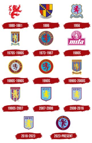
1880 – 1881
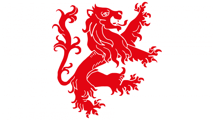
The debut emblem depicts a real heraldic lion – large, menacing, with a long tongue and sharp claws. The red beast is depicted on a white background.
1886
In 1886, Aston Villa had its first and only emblem without the Scottish lion. It looks like a rectangular advertising shield of four segments, supplemented with a FORWARD ribbon. Each segment has its own pattern: a chain of yellow diamonds on a blue background or a black zigzag line dividing the space into two halves – red and yellow.
1956
The artists returned the lion but turned it in another direction and changed the style of painting. The beast is depicted inside a figured blue coat of arms. Below is the same blue ribbon with the old motto “PREPARED.” A light brown border surrounds large elements.
1970s – 1980s
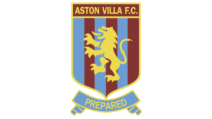
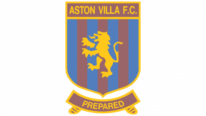
The team adopted an emblem in the form of a rectangle with a pointed base. The lion again resembles a traditional heraldic symbol, but now it is completely yellow. The claret and blue stripes in the background duplicate the color of the uniform. At the top of the rectangle is the club’s name (“ASTON VILLA FC”), and at the bottom of the ribbon is the motto (“PREPARED”).
1973 – 1987
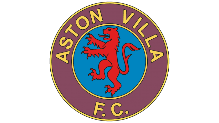
In 1973, a round logo with a red lion on a blue background was introduced. The inscription “ASTON VILLA FC” remained but was moved to a wide purple ring used as a frame. This emblem adorned the players’ uniforms in the League Championship (1981), the European Cup (1982), and the European Super Cup.
The 1980s
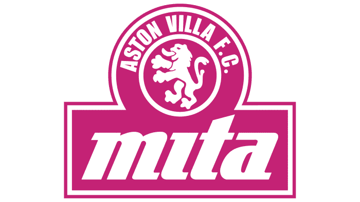
In 1984, the copier manufacturer Mita Copiers became the sponsor of Aston Villa. The partnership lasted nine years, during which the team used the Mita logo, typed in italics. But even then, the Scottish lion did not disappear: the designers left it along with the circle and the club’s name, slightly reducing them and making them white and purple.
1980s – 1990s
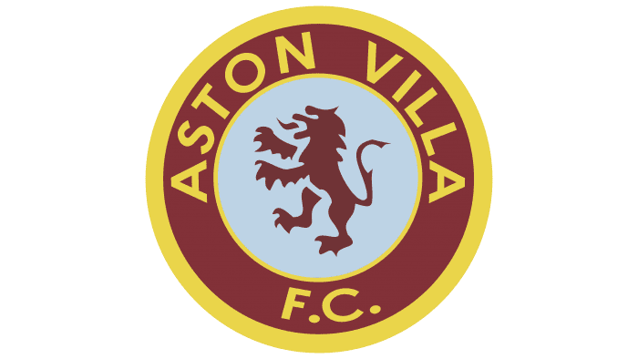
When Mita Copiers ceased to sponsor Aston Villa, the old logo used from 1973 to 1987 returned, the lion became brown, the circle – blue, the ring – claret, and the outer contour – wide and bright yellow.
1990s
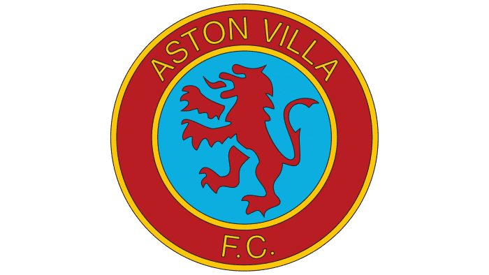
There was another color change. The font of the inscription “ASTON VILLA FC” was also updated.
1990s – 2000s
In 1992, the club introduced a modernized version of the 1970s emblem – a yellow lion on a striped shield. Only the ribbon is now not blue but light brown, like the rectangle at the top.
1990s – 2007
With the advent of the new millennium, the designers detailed the lion, removed the ribbon, and moved the slogan “PREPARED” inside the shield. They also removed “FC” and chose a serif font for the club’s name.
2007 – 2008
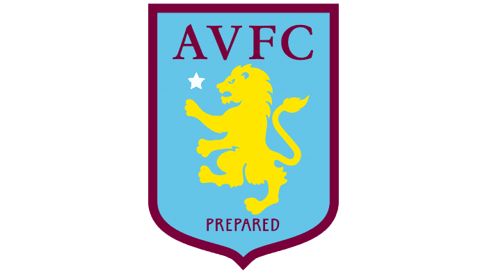
In 2006, American businessman Randy Lerner became the owner of Aston Villa. To mark this event, the football team introduced a logo that was to herald the beginning of a new era – a shield with a raspberry outline filled with blue. At the top in blue is a lion standing on its hind legs. At the bottom of the emblem is the club’s motto: “Prepared.” The club management approved this emblem on May 2, 2007; it largely retains continuity with the previous emblem. Traditional elements of the emblem are blue and raspberry colors and a golden lion. The image of the lion refers to the coat of arms of Scotland, where the club’s founders, George Ramsay and William McGregor, came from. The full name of the club, “Aston Villa,” now features the acronym AVFC (Aston Villa Football Club). On the left is a white five-pointed star dedicated to winning the European Cup (1982).
2008 – 2016
The designers chose a different shade of blue and used claret instead of raspberry.
2016 – 2023
2016 was a particularly unfortunate year for Aston Villa: the team was thrown out of the Premier League and then paid £100,000 for a new logo similar to the previous one. The designers just removed the word “PREPARED,” slightly enlarged the lion, and added claws.
2023 – today
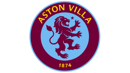
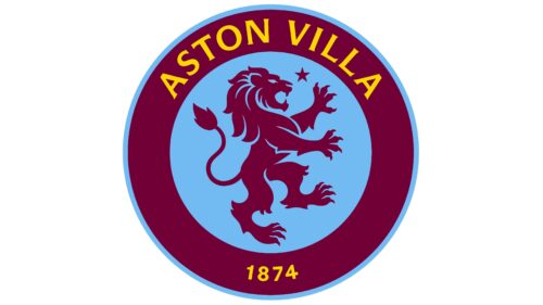
Aston Villa Football Club introduced its updated logo in November 2022, but its official debut was planned for the 2023-2024 season. It cannot be said that the badge is completely new: attentive fans will find familiar elements in it.
- The lion – a cunning and dangerous predator, has become the main symbol of the club. In most of the old emblems, it looked to the left and was not detailed enough. Now, the designers have turned the animal to the right and made its silhouette more expressive, adding additional contours to the paws and mane. This allowed the logo to be as close as possible to the original 1878-1886 version.
- The five-pointed star is a symbol of pride. It has been reduced and moved to the upper right corner so that the animal’s gaze is directed straight at it. The star is a reminder that the footballers won the European Cup in 1982.
The base has also changed. If previously the shield depicted a lion, now it is placed inside a blue circle with a wide purple frame. 77% of fans who participated in the survey voted for the round emblem.
The color ratio has also changed. Now, the logo has a lot of purple and blue, and yellow is used only for inscriptions. One of them is the phrase “ASTON VILLA,” located at the top and made in the usual bold font with short serifs. Below is the number “1874”, indicating the year the club was founded.
Aston Villa: Interesting Facts
Aston Villa Football Club is an old and successful soccer team from England. They started way back in 1874.
- How It Started: A group from the Villa Cross Wesleyan Chapel in Birmingham created the team.
- Early Days in Football: They helped start the first football league in 1888, a major development for soccer worldwide.
- Big Win in Europe: In 1982, they won the European Cup (now called the UEFA Champions League) by beating Bayern Munich.
- Winning at Home: Aston Villa has won the top English league seven times and several FA and Football League Cups.
- Villa Park: Their stadium, Villa Park, has been their home since 1897 and is famous for being one of the oldest soccer stadiums.
- Lots of Fans: In 1946, 76,588 people watched a game there.
- Team Colors: They were the first team to wear claret and blue, which many other teams now wear too.
- Helping England: Many players have played for the England national team and even provided all the forwards for a game against Scotland in 1899.
- Ups and Downs: They’ve had some tough times and were relegated to lower leagues, but they’ve always managed to come back, like when they returned to the Premier League in 2019.
- Growing New Talent: Aston Villa is good at training young players in their academy, many of whom have become professional soccer players.
- New Owners: In 2018, new people bought the club, bringing in money and stability that has helped them do well in the Premier League.
Aston Villa has a long history of being important in English soccer. It has many wins and a famous stadium, and it helps to grow the game.
Font and Colors
The lion became the main symbol of “Aston Villa” originally and has since remained on the logo. This is a tribute to the royal coat of arms of Scotland and Birmingham’s Scottish heritage. Designers have only changed the animal’s color, style, and position and experimented with the visual context.
The heraldic lion was most often depicted against the background of round or rectangular shields with a pointed base. It was complemented by the motto “Prepared,” which has been used by the team since 1878. Now, the motto is absent: the developers simplified the logo to fit the trendy minimalism.
The abbreviation adorning the top of the shield is done in a serif font. The font is called Stempel Garamond Bold and belongs to the French Oldstyle group. It was created by Parisian printer Claude Garamond in the first half of the 16th century.
The logo reflects the official colors of “Aston Villa”: burgundy (#670E36) and blue (#95BFE5). These are complemented by bright yellow (#FEE505), which has been used for the lion since 1992.
Aston Villa color codes
| Blue | Hex color: | #95bfe5 |
|---|---|---|
| RGB: | 167 30 49 | |
| CMYK: | 5 100 71 22 | |
| Pantone: | PMS 2905 C |
| Burgundy | Hex color: | #670e36 |
|---|---|---|
| RGB: | 103 14 54 | |
| CMYK: | 0 86 48 80 | |
| Pantone: | PMS 208 C |
| Bright Yellow | Hex color: | #fee505 |
|---|---|---|
| RGB: | 224 229 5 | |
| CMYK: | 0 10 98 0 | |
| Pantone: | PMS 803 C |
