


![]() Athletic Bilbao Logo PNG
Athletic Bilbao Logo PNG
The Athletic Bilbao logo represents the football team’s autonomy and its defense of the interests of a specific territory. Outsiders are not allowed in the club. The players form a cohesive team, united by a love for their homeland and football.
Meaning and History
![]()
The club’s emblem includes regional symbols, another aspect of its patriotism. It reflects opposition to the regime of dictator Francisco Franco, which suppressed any expression of Basque national identity. Franco ruled the state from 1939 to 1975, which did not affect Athletic Bilbao’s visual identity.
What is Athletic Bilbao?
Athletic Bilbao, a Spanish professional football team, is also known as Athletic Club or Athletic Club de Bilbao. Founded in 1898 and based in the Basque Country, it ranks just below Barcelona in terms of league titles and prestigious awards. The club is one of the three founders of the Primera Division.
1901 – 1903
![]()
The first emblem combined a football and the initials “AC” (originally “Athletic Club”), artistically rendered in blue, gold, and white.
1903 – 1910
![]()
The monogram evolved, and the ball became a roundel surrounded by a blue-and-white belt.
1910 – 1912
![]()
Coach Juan Elorduy, inspired by Southampton’s red and white uniform while traveling in England, decided to use these colors in Athletic Bilbao’s emblem, as they were also on the Basque Country flag.
1912 – 1922
![]()
The second version of the pennant logo featured a large brown football.
1917 – 1922
![]()
The first emblem with regional symbolism appeared in 1917. The top of a triangular shield displayed the Gernika Tree, San Anton Bridge, and Saint Anton Church, enclosed in a blue frame with five-pointed stars. The white and red vertical lines at the bottom resembled the US flag.
1922 – 1930
![]()
The prototype of the modern graphic sign appeared: a triangular shield with a wide white border, two crosses, and “ATHLETIC CLUB BILBAO.” Basque symbols have remained part of the emblem since 1917.
1922 – 1936
![]()
The emblem from 1917-1922 returned, now in the form of a rectangular shield with a round base. The red and white horizontal lines widened, and the black “CA” monogram enlarged.
1930
![]()
Club symbols (two wolves and Bilbao landmarks) were placed within a blue circle centered on a red-and-white triangular shield with vertical stripes.
1930 – 1941
![]()
The 1922 logo was returned, identical to the original, but with a green oak crown, brown bridge, and cathedral.
1941 – 1942
![]()
Francisco Franco’s ban on foreign names forced the club to change its name to “Atletico Bilbao,” which is reflected in the logo. The inscription and outlines were gold, with a blue background behind the Basque symbols.
1942 – 1970
![]()
Designers simplified the graphics again, returning to black outlines and a white background. The “Atletico Bilbao” font also slightly changed.
1970 – 1973
![]()
After Franco’s regime ended, the club reverted to its original name and logo. However, the Basque symbols were depicted schematically with simple black lines.
1973 – 1980
![]()
The new version of the logo was identical to the 1942-1970 version, except for a blue triangle and a slight shift in the red-and-white lines.
1980 – 1983
![]()
The outlines were gold, the Basque symbols were black, and their background was blue.
1983 – 1995
![]()
Minor changes were made to the color palette, making it more diverse, though all shades remained light.
1995 – today
![]()
The current logo has black outlines and a completely white background.
Font and Colors
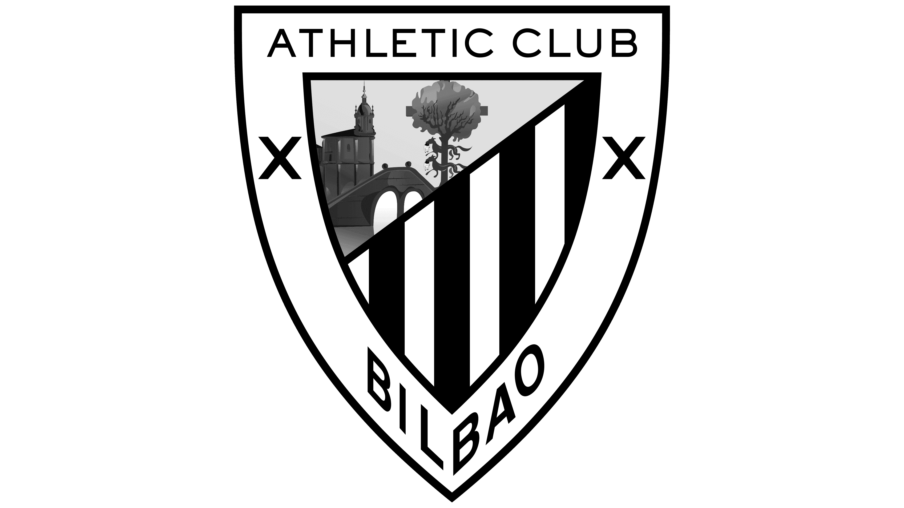
The team openly displays its nationality by using an emblem featuring Basque symbols: the Gernika Tree, Saint Anton Church, and San Anton Bridge. The tree symbolizes the Basque Country’s autonomy, and the architectural structures are among Bilbao’s landmarks. Two wolves from the city’s coat of arms are depicted next to the tree. Two crosses on the shield are borrowed from the coat of arms of the Biscay province, with Bilbao as its administrative center.
The phrase “ATHLETIC CLUB” is written in a sans-serif font, with a distinctive shortened stroke at the center of the letter “E.” The word “BILBAO” is at the bottom of the deformed shield. The main colors are red, white, black, gray, shades of green, and rich brown.