From the very beginning, the Atkins logo has included a red ribbon because it symbolizes the harmony that the healthy food manufacturer promotes. The dietary style is conveyed in the curved band that replaces the central bar of the “A.”
Atkins: Brand overview
Atkins is a popular American food brand founded in the 1980s. The company specializes exclusively in healthy food products that can be used throughout the world-famous Atkins diet.
Dr. Robert Atkins changed the dieting world in 1972 with his groundbreaking book, “Dr. Atkins’ Diet Revolution.” Introducing a low-carb approach to weight loss, the book quickly became a bestseller and established Atkins as a key figure in diet and nutrition. His method wasn’t just about shedding pounds; it introduced a new lifestyle centered around low-carb eating.
Atkins didn’t stop there. He continued to spread the word about his diet through more books and TV appearances, making the low-carb approach a significant part of the American diet scene. To support those following his diet, Atkins and his wife Veronica founded Atkins Nutritionals in 1989, initially offering low-carb supplements and snacks by mail.
The company grew in the 1990s, adding bars, shakes, and meals that fit the Atkins diet. These products hit store shelves across the U.S., bringing the Atkins approach to a wider audience. The early 2000s saw a boom in the diet’s popularity, with Atkins’ books topping sales charts again and the company’s products flying off the shelves.
However, the mid-2000s brought challenges, including diet criticism and changing consumer tastes, leading to financial struggles for Atkins Nutritionals and a bankruptcy filing in 2005. The company found new life under North Castle Partners, which restructured and refocused on a broader range of health-conscious products, moving beyond weight loss.
Today, Atkins is back as a lifestyle brand, emphasizing a low-carb, high-protein approach to eating rather than just a diet for losing weight. The company’s range of snacks, bars, shakes, and meals caters to today’s health-focused consumers, offering options for a low-carb lifestyle.
Meaning and History
The brand’s visual recognition today is high. This is possible thanks to the promotion of a healthy lifestyle. For all the time the company has been operating on the market, the logo has changed only once. Moreover, the changes were local, and many buyers did not notice them.
The company’s logo consists of the letter “A” emblem, which is the first character in the word “Atkins.” The direct name of the brand is displayed on the horizontal line of this letter. According to the target audience’s reaction, the emblem looks modern and attractive.
What is Atkins?
First of all, these are products that allow buyer to monitor their health. The products produced under the presented brand are based on exclusively natural ingredients. The company’s active customers are hundreds of thousands of US citizens who daily purchase Atkins products.
Before 2017
Information about the year when the first version of the logo was created is not publicly available.
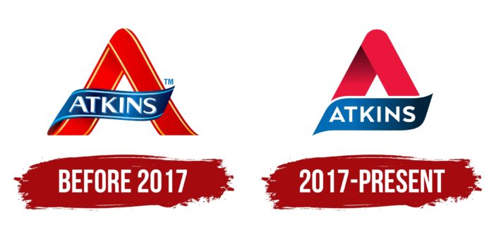
Initially, the emblem in the logo looked like a stylized letter “A.” She was depicted in red with a significant rounding at the top. Thanks to the contours made with a yellow gradient, the buyers felt the three-dimensionality of the image. A blue stripe was used as a horizontal line, which continued the lines from the lower left top of the letter. It has the brand name “Atkins” in white letters. For the word inscription, a classic bold sans-serif font was used. The blue shadow created a sense of three-dimensionality.
2017 – today
The redesign of 2017 led to a significant simplification of the logo, but its writing style remained identical to the previous version. Only the upper part of the letter “A” is visible to the company’s client. The red color has become more saturated, and the work with the gradient is also felt on the left side. The lower part of the letter “A” is closed here by the same horizontal line with the inscription “Atkins.” A more simplified version of the font was used to create it. The style of writing letters is identical, but no shadow gives the effect of volume. Minimalism only gives confidence and strength to the logo.
Font and Colors
The company logo’s calm, classic, bold sans-serif looks modern and progressive. The company does not try to surprise its customers with many effects that only distract from the essence. While the Atkins brand cherishes its history, it also wants to leave a legacy behind. The gradual redesign of the logo, including minimal changes in the font, plays an important role in this task.
Traditionally, the company uses a red, blue, and white color palette in the logo. All shades presented on the emblem and wordmark are bright and confident. They evoke positive emotions and a desire to get acquainted with Atkins’s products. Also, in both versions of the logo, there is a logo that creates a sense of the volume of the image.
FAQ
Is Atkins a brand?
Atkins is a well-known brand created by Atkins Nutritionals Inc., which offers a variety of nutritional bars and shakes. These products are designed based on the Atkins Diet™ principles, focusing on low-carbohydrate and high-protein content to support weight management and a healthier lifestyle. The brand targets a wide audience, including men and women keen on maintaining their health and weight management. Atkins has become closely associated with the low-carb, high-protein diet movement, providing delicious options for those looking to lower their carbohydrate intake while still enjoying satisfying and flavorful foods.
What is Atkins famous for?
The Atkins Diet, created by Dr. Robert C. Atkins in the 1960s, is famous for its unique approach that limits carbs while emphasizing proteins and fats. This diet aims to switch the body’s energy source from burning sugars to burning fat, known as ketosis, which can result in weight loss. The Atkins plan includes several phases, beginning with a strict reduction in carbs to kickstart the weight loss, then a gradual reintroduction of carbs to maintain weight and support a healthy lifestyle. This method has made the Atkins Diet popular for those seeking to lose weight through a low-carb lifestyle.
What are the cons of the Atkins diet?
While the Atkins Diet is well-known for helping people lose weight by cutting carbs, it’s not without risks, especially due to its high protein content. One issue is hyperuricemia, where too much uric acid in the blood can cause joint pain and gout, an extremely painful type of arthritis. Also, eating a lot of protein might lead to hypercalciuria, meaning too much calcium is passed out in the urine. This could raise the chances of kidney stones, lower calcium levels in the blood, and increase the risk of osteoporosis, making bones fragile. If you’re considering trying the Atkins Diet, weighing these potential drawbacks and talking to a doctor or nutrition expert to ensure it’s the right choice for your health is crucial.
Does the Atkins diet sell food?
Yes, the Atkins Diet offers a range of food products, including nutrition bars, shakes, snacks, and quick-to-prepare meals. These items are crafted to fit the low-carb Atkins Diet guidelines, focusing on a balanced mix of protein, fiber, carbs, and fats. This range is designed under the guidance of medical and nutrition experts to help those on the Atkins Diet maintain their eating plan with ease, providing convenient options that support weight loss and health objectives within the diet’s low-carb framework.
What is the meaning of the Atkins Logo?
The Atkins logo captures the essence of the low-carb Atkins diet, promoting health and weight loss. Its design centers on the letter ‘A’ for Atkins, uniquely using a ribbon instead of a straight crossbar to encircle the letter. This creative twist resembles a measuring tape around the waist, symbolizing the diet’s focus on slimming down and living healthier. The logo’s simplicity mirrors the diet’s direct and uncomplicated approach to eating well, highlighting the effectiveness and straightforwardness of Atkins’s way of eating.
What does the logo symbolize Atkins Logo?
The Atkins logo, featuring the letter ‘A,’ encapsulates the diet’s goal of promoting health through a low-carbohydrate lifestyle. Offering products like snacks, smoothies, and bars, Atkins encourages managing one’s weight and health effectively. The ‘A’ represents the brand and its dietary approach and pays tribute to its founder, Dr. Robert Atkins, who closely ties the brand to its origins. This logo symbolizes the diet’s focus on well-being, weight management, and a structured approach to achieving a healthier life.
