Many considered the “Aunt Jemima” logo racially discriminatory, featuring a Black woman, leading the breakfast manufacturer to discontinue its use recently. Although the emblem conveyed a sense of heartfelt kindness, family comfort, and home warmth, it was time for a change. The designers did a great job emphasizing the company name, turning it into a filigree visual identity element. The new logo and name of the Pearl Milling Company mark a significant rebranding from the previous image, which had faced criticism for perpetuating racial stereotypes.
Aunt Jemima: Brand overview
In the late 19th century and until the mid-20th century, name logos were widespread in America and were “tied” to personalities. Companies grew by leaps and bounds and took their names from literature or folklore, opting for representatives of other nationalities or indigenous populations. During this period, from 1888 to 89, the Pearl Milling Company, the first company to offer a ready-made pancake mix, whose trademark was Aunt Jemima, appeared in American food service offerings. The advertising poster, brochures, and packaging depicted a smiling, burly black woman, “Aunt Jemima,” who embodied the archetype of all older black slave women called “Mammy.” The character herself resulted from a collaborative effort by the mix makers, Chris L. Rattom and Charles J. Underwood.
During its 133 years of existence, the company has changed its name several times, has been involved in disputes and lawsuits under U.S. trademark law, and has defended the advertising face of its company against claims that try to accuse it of displaying racism. But all the while, it remains faithful to its historical past, constantly using Aunt Jemima as its trademark. In the process of the development of advertising technology, printing, and changes related to the peculiarities of the psychology of the visual impact on the consumer, the company has modified the logo, always keeping the image of an African-American woman – a housewife.
In 1889, Chris Rutt and Charles Underwood created a pancake mix that changed breakfasts. They wanted their product to stand out, so they hired Nancy Green, a formerly enslaved person with a powerful presence, to be the face of “Aunt Jemima” at the 1893 World’s Fair in Chicago. Green showed how easy and tasty the mix was, winning over many people.
Aunt Jemima’s image was based on the “mammy” stereotype, a problematic view of a happy black servant. This stereotype was used to sell the pancake mix as genuine Southern cooking. Despite societal changes, Aunt Jemima’s image hardly changed for a long time, even as the brand grew to include more products under The Quaker Oats Company since 1926.
As people became more aware of racial issues, Aunt Jemima’s image was criticized for being racist and offensive. The brand made small changes, like removing her headscarf, but the core image remained unchanged.
PepsiCo, which bought Quaker Oats in 2001, was slow to change the brand. It wasn’t until 2020, after widespread protests for racial justice, that PepsiCo decided to rebrand Aunt Jemima, acknowledging its problematic roots.
In February 2021, PepsiCo renamed Aunt Jemima Pearl Milling Company after the original mill. By June 2021, products with the new name and no Aunt Jemima image hit the shelves. This change is a larger move towards more inclusive and respectful marketing. The rebranding was a big step in addressing racial stereotypes and creating a brand that values diversity and respect.
Meaning and History
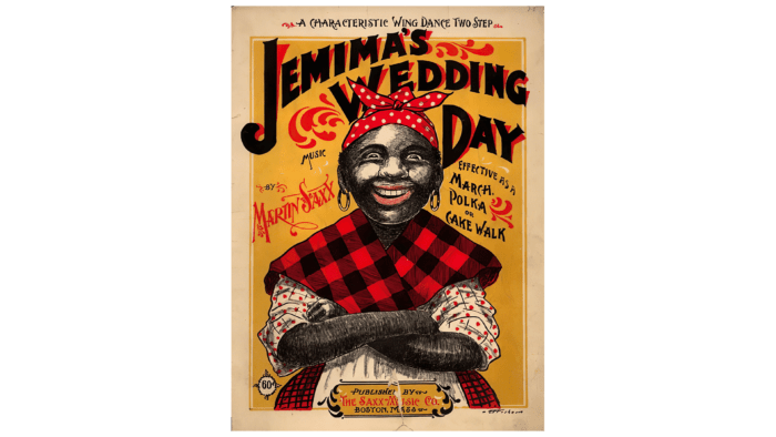
In 1888, Pearl Milling was founded when Chris L. Rutt and Charles J. Underwood teamed up to buy a flour mill. However, this decision proved reckless, as the sales market was oversaturated with similar offerings. To justify their costs, the owners began an intensive search for options, of which only a bagged pancake mix called “Self-Rising Pancake Flour” sparked consumer interest. To create an image for his product and ensure its distinction from similar offerings on the market in late 1889, L. Ratt decided to use the face of Aunt Jemima, a popular vaudeville character at the time, to promote his mix, the posters for the production of which were hung all over St. Joseph.
However, a lack of additional funding prevented the owners from developing their production. In 1890, the company was sold under the hammer to the Randolph Truett Davis Milling Company, the largest flour mill in St. Joseph. The new owner took the recipe of “Teti Jemima” as a basis and brought its taste to perfection, which subsequently became the reason for the huge and longstanding popularity of the pancake mix. He introduced an additional innovation – powdered milk, which simplified the process of making pancakes only to the need to introduce a mixture of water to create the desired consistency before frying.
The popularity of pancake flour became so high that the company decided in 1914 to change its name to Aunt Jemima Mills. However, the trademark received official registration only in 1937, 11 years after the company was sold to Quaker Oats, a producer of pancake syrups. TM Aunt Jemima.
The company and its brand have undergone several changes over the years. The face of the brand and its models at different times were – Nancy Green – the face on the packaging from 1893 to 1925; Lillian Richard – the face of the brand from 1925 to 1948; Anna Robinson – who episodically appeared in brand commercials from 1933 to 1951, Rose Washington Riles (on packaging 1930-1948), Anna Short Harrington (from 1935 to 1954), Edith Wilson – from 1948 to 1966 performed the role of Jemima in TV commercials, on radio and several others.
After the events of 2020, the murder of African American George Floyd by police officers, the company announced a complete name change and rebranding that left no room for the historical image of Aunt Jemima for the sake of racial equality. In February 2021, the company became the Pearl Milling Company, launching a new brand name in June.
What is Aunt Jemima?
It is a manufacturer of pancake mixes, syrups, and other breakfast foods. Under this name, the brand existed from 1889 to 2021 and then received a new name. It is now known as the Pearl Milling Company. The main contingent of its buyers lives in the USA and Canada, where it is most popular. PepsiCo now owns the Aunt Jemima trademark and logo.
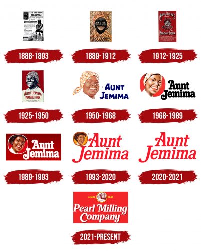
1888 – 1893
The company’s renaming, its success in the market for the sale of convenience foods, and the desire to slightly improve the visual perception of the brand by abandoning cartoonishness led to a change in the previously accepted image of Aunt Jemima. She became Nancy Greene. She made her debut in 1893 at the World Columbian Exposition in Chicago. As a former servant slave, she delighted her masters with various delicious pancakes she baked into her recipes. Her appearance best matched the spirit and style of the company.
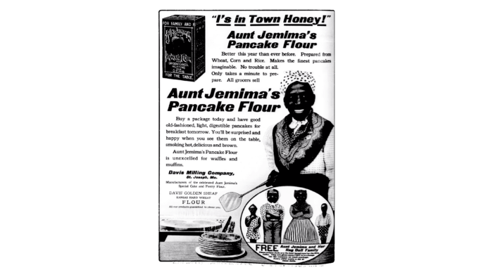
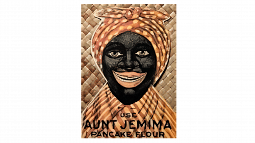
There was another version of the logo during this period. It was a vaudeville image taken from an advertising poster for the vaudeville show “Old Aunt Jemima,” made with lithographic appliqué. A cartoon image of an “auntie” in a scarf with a tie on her head at the top of the poster for packaging was the inscription “For the Restaurant Family.” Above the head was the brand name Aunt Jemima. To the left and right of the image was the address of the manufacturer’s main office. At the bottom were the name of the product and its application. Underneath this text was the inscription “For the table.” Considering the technology of that time, packaging advertising was created using lithographic methods, using black and yellow colors.
1889 – 1912
The first Aunt Jemima logo, created in 1889, lasted over twenty years. It showed a black woman with a red and yellow headscarf, adding a vivid touch to the design. Famous American artist Haddon Sandblom was the first to image only the model’s head and shoulders, which would become permanent in subsequent logo revisions. She wore checkered clothes that matched the background pattern of woven straw, giving the logo depth. The brand’s name was written in a modern, black sans-serif font, which complemented the traditional feel of the image. This mix of contemporary and classic styles made the logo memorable and helped establish Aunt Jemima’s presence in the market. This redesign was needed to demonstrate the company’s changes and ability to keep up with the times.
1912 – 1925
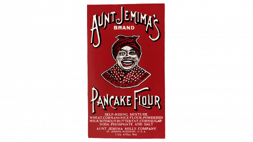
In 1912, the Aunt Jemima logo was redesigned, adopting a bold red, black, and white color scheme. The updated logo focused on the woman’s portrait, which now displayed a wider, more inviting smile, giving the brand a friendlier feel. Above the portrait, the logo included elegant, custom lettering in a white outline to draw more attention to the image. White uppercase letters added extra details to the logo, creating a unified and attractive design that helped establish the brand’s identity more clearly in the market.
1925 – 1950
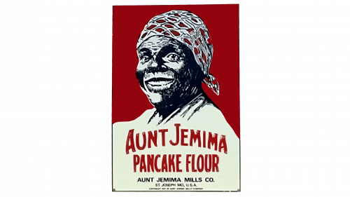
1925, the emblem was redesigned, keeping the same color scheme but with smaller text. The most significant change was the enlargement of the portrait, making it the logo’s centerpiece. This made the portrait more prominent. The text was updated to bold red capital letters that were placed across the cream-colored clothes of the woman in the portrait, making it stand out and blend well with the main image.
1950 – 1968
In 1950, the brand was updated to reflect a more modern look. The portrait of Jemima received a complete makeover, featuring deeper, more natural colors. This new image was placed on a white banner to the left of a two-tiered blue inscription. The text was in a bold, custom font with wave-like curves on several letters, making it unique. This redesign improved how it stood out and was recognized in the market.
1968 – 1989
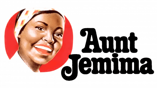
In 1968, the logo was redesigned, with an updated portrait centered inside a solid red circle to boost the logo’s visual impact. The “auntie” changed his image according to the demands of the times. The logo depicted an older, middle-aged African-American woman, visibly thin, with a white collar and a modern headband. The designer kept it as a tribute to the historical image, recalling the constant presence on Jemima’s head of a headscarf tied at the top of the head. The logotype was completely reworked to include a bold, slightly condensed serif typeface with smooth, friendly-looking characters. This made the logo more appealing and easier to recognize. The text color was changed to black, which contrasted sharply with the red background, enhancing the overall look.
1989 – 1993
In 1989, the Jemima brand underwent a significant visual update. Designers improved the logo by adding a white outline around the portrait, making it stand out against a new gradient-red background. They kept the traditional typography for continuity but changed the text color to white to blend better with the updated background. This redesign aimed to make the brand look more cohesive and visually appealing while maintaining its iconic features.
1993 – 2020
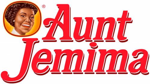
In 1993, the Aunt Jemima brand underwent a redesign, introducing a new color scheme of white, orange, and red. The update focused on the logo’s symbol, featuring a gradient-orange background with a red outline, making the logo stand out more. The text on the logo changed to a bright red, matching the outline. A new, cleaner, and italicized font was used, making the text easier to read and giving the logo a modern look with crisp lines. These changes refreshed the brand’s appearance while keeping its classic appeal.
2020 – 2021
In 2020, due to concerns about racial insensitivity, the brand launched a major redesign with a minimalist style. They removed all graphical elements from the logo, marking a major change in the brand’s look. The new logo kept a two-tiered inscription but used a lighter shade of red and a finer typeface. This simpler logo differed from the brand’s traditional imagery and aimed to present a more modern and sensitive image. This logo was short-lived and used only for a few months. It was the final logo for Aunt Jemima before the brand was completely reimagined, ending a significant chapter in its history.
2021 – today
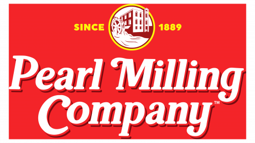
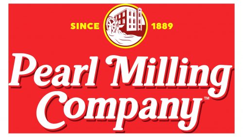
In 2021, the brand, recognized as Aunt Jemima, rebranded to Pearl Milling Company, featuring a completely revamped logo. The new logo kept the old typeface but made some bold changes: the brand name is now white with a dark red shadow against a red background. The logo features a new yellow-outlined roundel with a building image in the center, surrounded by the phrase “Since 1898” in matching yellow, split into two parts.
The logo’s introduction of the mill image emphasizes the company’s flour and pancake mix production heritage, underscoring its origins and expertise in milling rather than any personality or character.
Aunt Jemima: Interesting Facts
The Aunt Jemima brand, famous for its pancake mix and syrup, has a history that ties into America’s racial issues.
- Creation of Aunt Jemima: In 1889, Chris Rutt and Charles Underwood developed the character for their pancake flour mix. Aunt Jemima was based on a song from a minstrel show, a form of entertainment that used racial stereotypes for laughs.
- Nancy Green’s Influence: Nancy Green, who was formerly enslaved, became the first face of Aunt Jemima in 1890. At the 1893 World’s Columbian Exposition in Chicago, she played a key role in making the brand popular by cooking pancakes and storytelling. Her character was based on the “mammy” stereotype.
- Changing the Image: Aunt Jemima’s image was updated several times to separate it from its racist beginnings. The most significant changes were modernizing her appearance, including removing her headscarf.
- Ownership Transfers: The brand changed owners a few times, eventually owned by Quaker Oats in 1926 and PepsiCo in 2001. Despite these changes, Aunt Jemima remained the main product of breakfast foods.
- Criticism and Controversy: The brand faced backlash for using racial stereotypes. Despite attempts to modernize Aunt Jemima’s image, criticisms continued until it was decided to change the brand.
- Rebranding: In 2020, following George Floyd’s death and the resulting discussions on race, PepsiCo decided to retire Aunt Jemima’s name due to its background. In 2021, it was renamed Pearl Milling Company, paying homage to the place where the pancake mix originated.
- Cultural Significance: Despite the controversies, Aunt Jemima became a well-known brand in America, reflecting shifts in how race and representation are viewed.
- The Takeaway: The transition from Aunt Jemima to Pearl Milling Company shows how companies can change to reflect cultural understanding and sensitivity towards racism better.
Aunt Jemima’s story highlights the long-lasting effects of racial stereotypes in American culture and the steps being taken to correct historical wrongs in the business world.
Font and Colors
The latest rendition of the Aunt Jemima brand mark was one of the particularly attractive ones. Jemima’s appearance had undergone significant changes. She was no longer a maidservant, meekly enduring humiliation. Even her gaze had lost its sadness. Now, she was a free and even wealthy woman, as evidenced by her carefully traced earrings with expensive, large pearls. The color shade used in the depiction of the earrings suggests that they are made of gold. The change in the status of the brand’s face is evidenced by the abandonment of headgear, which reveals her meticulously executed hairstyle. The wavy hair is created using a brown color, slightly darker than the shade chosen for the face. A light application of gray on the side of the light’s incidence informs the luster of the hair. The face is drawn in an element – a stretched circle with a light yellow background. The circle’s outline is brown, with its inner and outer borders edged with a darker shade of yellow. All colors of the silhouette image are in a gradient pattern that gives shadows and highlights.
This part of the logo is located on a bright red attractive background. To the right of the image, Aunt Jemima’s inscription is done in white to create the volume of each letter using shadows. The two words are below each other and centered relative to each other. The letter J, the upper part, extends slightly beyond the lower right edge of the image, not reaching the middle of the outline. The typeface is left-slanted.
The Pearl Milling Company, which replaced the Aunt Jemima brand, features a logo with elegantly styled lettering. This bold and detailed typeface is similar to Hallen Regular or FF Marselis Serif Pro Black, though it has been uniquely altered to fit the brand’s new look. The letters are set in the title case, enhancing the badge’s sophisticated design.
Originally, the Aunt Jemima brand used a red and white color scheme to symbolize passion, warmth, and love—emotions closely linked to the brand’s legacy. A recent update added bright yellow to the logo, injecting energy and freshness into the design. This addition complements the existing colors and makes the logo more captivating and relevant for today’s audience. This evolution in design carefully bridges the brand’s historical roots with a modern visual style.
FAQ
Why did Aunt Jemima change its name?
Quaker Oats changed Aunt Jemima’s name to show their commitment to racial equality. This change came because the Aunt Jemima brand, which was over 130 years old, used racist images and ideas. Quaker Oats knew that Aunt Jemima’s character was a problem for a long time. It was based on the “mammy” stereotype, an offensive image of a black woman who was overly loyal to the white families she served. This idea ignored the real harm and pain of slavery and racism.
The decision to change the name happened when people in the United States were deeply looking at racial injustice, especially after George Floyd died in 2020. This event made many rethink racial stereotypes, including the Aunt Jemima brand.
Changing the name to Pearl Milling Company was Quaker Oats’ way of dealing with the brand’s past and helping build a fairer society. It showed they knew companies could help fight racism. The new name aimed to focus on the product’s quality without using racist stereotypes. This move is part of a bigger effort to make sure brands support diversity and respect for all people, showing how important it is for names and images to avoid harmful stereotypes.
What has replaced Aunt Jemima?
The Aunt Jemima brand is now called Pearl Milling Company. This change is part of an effort to remove racial stereotypes and support equality. Quaker Oats, which owns the brand, wanted to separate from the racist images linked to Aunt Jemima. The new name, Pearl Milling Company, honors where the original pancake mix was made. It shows a return to the brand’s roots and a step towards being more inclusive and respectful.
Albertsons Company told CNN Business that the new Pearl Milling Company products are being introduced slowly. This process depends on how fast the old Aunt Jemima products sell out. So, customers will see the change at different times.
Food Lion is working fast on this change. They expect Pearl Milling Company products to be in all their 1,102 stores by a certain Sunday. This quick rollout means people will soon see the new name on products. It’s part of a big push to make sure everyone can keep enjoying these products under a more respectful name.
This name change shows that companies like Quaker Oats and PepsiCo are serious about supporting diversity, equity, and inclusion. By changing the name from Aunt Jemima to Pearl Milling Company, they’re trying to fix past mistakes and make a future where everyone feels respected.
What is in Aunt Jemima’s syrup?
Aunt Jemima syrup, loved for pancakes and waffles, is made with several ingredients that give it a sweet taste and smooth feel. The main ingredients are corn syrup and high fructose corn syrup, both sweeteners from corn. These syrups make the base, adding sweetness and the right thickness.
- Water is mixed in to get the consistency right so it pours easily without being too thick or thin. Cellulose gum thickens the syrup, keeping its texture consistent.
- To get its golden-brown color, similar to maple syrup, caramel color is added. This is a common way to make food look more appealing.
- Aunt Jemima syrup’s taste comes from natural and artificial flavors, making it taste great with breakfast foods like pancakes and waffles.
- Preservatives sodium benzoate and sorbic acid keep the syrup fresher longer. They prevent harmful microbes from growing.
- Sodium hexametaphosphate clears the syrup and prevents bits from forming by sticking to minerals.
All these ingredients work together to make Aunt Jemima syrup’s familiar taste and texture, making it a favorite for breakfasts.
Is Aunt Jemima and Mrs Butterworth the same?
Aunt Jemima and Mrs. Butterworth are two different syrup brands with a unique history and brand identity. Aunt Jemima has been around since the late 1800s and was originally based on a racial stereotype from minstrel shows, depicting a Black woman as a “mammy” – a role that has been widely criticized for its racist undertones. Because of this, Quaker Oats, which owns Aunt Jemima, decided in 2020 to change the brand’s name and image to move away from these stereotypes.
Mrs. Butterworth’s, however, presents itself differently. The brand features a grandmotherly figure and typically uses a white woman’s voice in its commercials. The brand’s bottle, shaped like Mrs. Butterworth’s figure, has sparked debate over whether it reinforces stereotypes. However, the company has stated it was not meant to represent any race or ethnicity.
Both brands have faced scrutiny over their images and the messages they send. This has led them to reconsider how they market themselves, aiming to be more inclusive and respectful. The ongoing discussions around race, stereotypes, and branding have prompted these and other brands to ensure they welcome everyone.
What is the meaning of the Aunt Jemima Logo?
The Aunt Jemima logo was meant to represent care, kindness, and the warmth of cooking for loved ones, aiming to make people feel at home. It suggested that Aunt Jemima products could help bring these feelings into consumers’ homes.
However, this logo and the Aunt Jemima name were based on an outdated racial stereotype from the 1800s. Aunt Jemima was portrayed as a “mammy,” a stereotype of a Black woman serving white families, often neglecting her own. This image ignored the reality of slavery and oppression, making the logo controversial. It tried to combine a message of domestic warmth with a stereotype that many saw as racist and demeaning.
Due to criticism and a growing awareness of racial justice issues, Quaker Oats decided in 2021 to retire the Aunt Jemima name and logo. They rebranded the products as Pearl Milling Company, moving from racist symbols to more respectful representations. This change was part of a larger effort to make brands more inclusive and respectful towards all people.
What does the logo symbolize Aunt Jemima Logo?
The Aunt Jemima logo was meant to stand for kindness, devotion, and caring, especially when making food, like the brand’s famous pancake flour. Aunt Jemima products were a favorite in many homes across the U.S. and Canada, often chosen for breakfast. The logo tried to bring out feelings of nurturing and love, implying that using Aunt Jemima was about cooking with affection for one’s family.
However, the brand needed a major change when it became clear that Aunt Jemima’s image was rooted in racism. The character came from the “mammy” stereotype, an outdated view of a Black woman as overly loyal and submissive, mainly to white families. This image ignored the harsh truths of slavery and racism.
To move past these racist implications, the company decided to change its name to Pearl Milling Company. This was to tackle racial sensitivity and ensure the brand stood for inclusivity and respect. Pearl Milling Company, the new name, pays tribute to where the original pancake mix was made, clarifying any stereotypes. This change aims to keep the brand’s legacy of loved breakfast options without racial prejudice.
When was the Aunt Jemima logo invented?
The Aunt Jemima logo, created in 1889, was launched simultaneously as the brand’s ready-made pancake flour. Founders Chris Rutt and Charles Underwood wanted their product to stand out, so Rutt suggested using an African-American woman’s image inspired by a character from a popular musical of that time.
This choice was influenced by the cultural and social norms of the late 1800s, which included widespread racial stereotypes. The logo aimed to represent the “mammy” stereotype, a notion that depicted Black women as loyal and submissive domestic workers for white families. This stereotype was common in entertainment like minstrel shows, which often presented African Americans in a way that reinforced racial biases.
As Aunt Jemima became known for its pancake mix and breakfast items, its logo became iconic. However, the logo’s connection to racial stereotyping faced criticism as time passed. The use of the “mammy” image was a decision that mirrored the racial attitudes of the time and the use of racial stereotypes in marketing. Despite the brand’s success, the logo’s implications have sparked discussions and calls for reevaluation, leading to significant changes in recent years.
