The Autism Speaks logo emphasizes the diversity of people with autism. The emblem points to the organization’s primary goal of helping children with the condition reach their full potential and lead fulfilling lives.
Autism Speaks: Brand overview
Autism Speaks is an American organization dedicated to autism research and awareness. Founded by businessman Robert Wright, who held senior positions at General Electric and NBC, its awareness campaigns have reached 26 million people. The organization educates parents on child care, provides research grants ($215 million) and scholarships ($15.9 million), and supports 11 autism medical centers.
Meaning and History
The logo, dubbed the “puzzle piece,” was first used in 1963. It belonged to the National Autistic Society. The organization Autism Speaks has been using the logo since 2005. The organization changed the image slightly, removing the crying child who seemed trapped and constrained inside the puzzle. This image drew significant criticism from the public because it represented autistic people as limited and epitomized the suffering experienced by children with the condition. Autism Speaks distanced itself from the negativity by giving the logo a different meaning.
What is Autism Speaks?
Autism Speaks is an American non-profit organization dedicated to autism research and awareness initiatives. Like many other advocacy movements, it was founded on a personal tragedy – the grandson of the organization’s founder was diagnosed with autism. The organization has successfully secured government funding for clinical research and trials, launched DNA collection and research programs, held awareness events such as Light Up Blue, and sponsored the 2006 film Autism Every Day 2006.
2005 – 2020
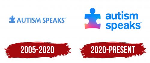
The logo shows a puzzle piece and a bright blue lettering in capital letters.
The puzzle is shaped like a child, which symbolizes children with autism. Because of their unique characteristics, they often feel separated from others.
Because the puzzle piece is part of a bigger picture, these children need to be integrated into society. Assembling the puzzle emphasizes the idea of communication. The main goal of the organization is to increase the knowledge about autism, to create a societal understanding of the characteristics of these children, and to provide advice and mechanisms for their social interaction.
Solving the puzzle requires logic, concentration, and imaginative thinking. Using a game element as a metaphor for a child with autism allows us to talk about the developed logical thinking that such children often possess. They communicate with the world not through words but through mathematical operations, objects, and drawings. Understanding them, like a puzzle, can be difficult, but it is always worth the effort.
The puzzle serves as an invitation to solve the mystery. It is an invitation to learn to understand and communicate with these children.
Currently, there is no cure for autism, and Autism Speaks’ concept of the “puzzle” suggests that a treatment for the condition is the missing piece that could help thousands of children. The organization is actively searching for such treatments and ways to facilitate communication and improve the quality of life for those with autism.
Following the puzzle drawing is an inscription made in capital letters. The use of capital letters is an attempt to draw attention to the problem. Since its inception, Autism Speaks has been loudly proclaiming the need for autism research. In nine years, they have invested half a billion in research and received 3 billion in government funding. In partnership with Google, they have begun building a DNA database of 10,000 families affected by autism. The capital letters resemble a loudspeaker trying to get information to the masses.
2020 – today
In 2015, the organization had a new leader who influenced a change in its mission to exclude “curing” autism. For the organization’s 15th anniversary, the logo was reimagined to reflect a more liberal stance.
The new logo uses a gradient where the blue at the top flows seamlessly into other colors. This change is a nod to neurodiversity advocates in the autism movement. Not all participants agree that autism is a disease that requires treatment. They suggest using an infinity symbol that shimmers in different colors as an alternative to the puzzle. This approach illustrates that there are many different people in the world, and autistic people are part of that spectrum.
According to the company’s explanation, the multicolored puzzle reflects the different perspectives on autism and the experience the company has gained over its 15 years in business. The gradient emphasizes the full spectrum of autism, which for some is a strength and for others is the source of their suffering. Autism Speaks represents the interests of all groups.
The change from uppercase to lowercase letters speaks to equality, a desire to be closer to people with autism, and an inclusive approach.
Font and Colors
The Autism Speaks logo is dominated by the color blue. This color palette emphasizes logical thinking and a penchant for order and consistency that many people with autism possess. This color indicates scientific research sponsored by the organization, such as the Autism Genetic Resource Exchange or the Autism Tissue Program. The hue hints at little-known facts and presents autism as a disorder that requires in-depth study.
Interestingly, the organization chose blue because boys are five times more likely to be diagnosed with autism. Autism Speaks originally intended to support boys with autism.
The logo font is a sleek FF Real Head Pro Demibold font that emphasizes loyalty and inclusivity.
Autism Speaks Logo Color Codes:
- Blue: Hex code: #00AEEF; RGB code: (0, 174, 239)
- Red: Hex code: #D50000; RGB code: (213, 0, 0)
- Yellow: Hex code: #FDD835; RGB code: (253, 216, 53)
- Multicolored: Represents diversity across the autism spectrum
FAQ
Why did Autism Speaks change its logo?
The organization updated its logo to include the iconic blue and a range of hues. This striking transformation reflects the diversity of experiences and perspectives of individuals with autism, highlighting the organization’s increased focus on inclusivity.
What does the Autism Speaks logo stand for?
The transformation begins with the well-known blue puzzle piece. Now, along with the original blue, it incorporates a variety of colors to signify the wide range of experiences and perspectives related to autism spectrum disorders. This underscores the organization’s commitment to inclusivity.
What will the autism symbol be in 2023?
Typically the infinity symbol, usually represented in multiple colors, symbolizes the wide range of experiences and symptoms associated with autism. It is often depicted with other symbols to emphasize its significance.
What does the infinity symbol represent in autism?
This multicolored infinity symbol stands for neurodiversity, which reflects the many ways people perceive and interact with the world. This approach recognizes that different cognitive styles and behaviors are variations, not deficits.
What is the official autism logo?
There is no single universally accepted symbol for autism. People with autism, medical professionals, and awareness groups often associate certain symbols, such as puzzles and the color blue, with the disorder.
Where did the Autism Speaks logo come from?
The puzzle as a symbol of autism originated in 1963 in the UK with the National Autistic Society. Over time, the symbol was adopted by Autism Speaks in the United States.
When did Autism Speaks change its logo?
After extensive research, the organization decided to move to a more comprehensive representation of the autism spectrum. In February 2018, they transitioned from a puzzle piece to a multi-colored infinity symbol designed to convey the concept of diversity and the spectrum of experiences.
