Aviva: Brand overview
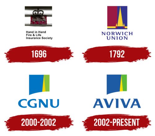
In 2000, the UK insurance world underwent a significant change when two giants – Norwich Union and CGU plc – decided to join forces. While Norwich Union boasts a rich heritage dating back to 1797, CGU was the result of the recent merger of Commercial Union and General Accident in 1998. The merger created a new company, initially named CGNU plc. However, two years later, in 2002, the company opted for a fresher style and rebranded as Aviva.
At the beginning of the twenty-first century, Aviva showed an irrepressible appetite for expansion. This appetite manifested itself in the acquisition of other insurance companies, including RAC plc in the UK and AmerUs Group in the US. However, with the onset of the late 2000s, the company underwent a strategic shift, and Aviva focused on key markets such as the UK, Ireland, France, Canada, Asia, and Turkey. This led to the sale of several regional subsidiaries that did not fit with its core market strategy.
Today, Aviva is a global insurance titan serving around 33 million customers. Its strongholds are in the UK, Ireland, and Canada. As a diversified insurance company, Aviva offers life, general, and health insurance, as well as asset management services. With around 30,000 employees, Aviva operates from its head office in London. Its significant market influence is also recognized in the financial arena, with the company having been a member of the FTSE 100 index on the London Stock Exchange since 2002.
Meaning and History
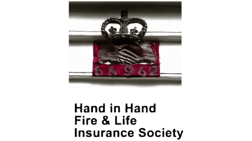
1696
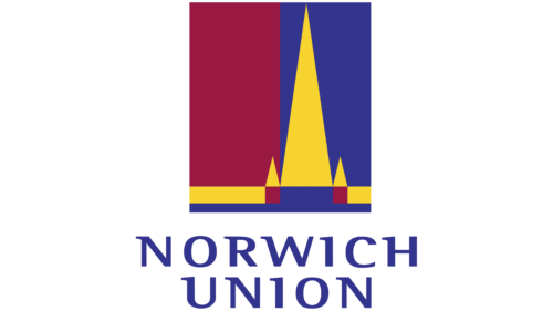
1792
2000 – 2002
2002 – today
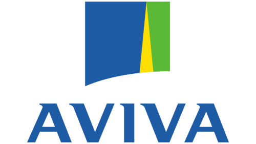
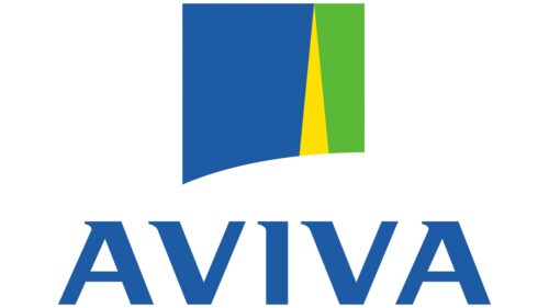
The logo is a square with one beveled corner; it is elongated and pointed in the lower left corner. The uniqueness of the logo also lies in the presence of three color zones: blue, yellow, and green. After the renaming of the company, a new text appeared under the geometric figure: “Aviva .”The text is made in upper case. The letters are big and bold, with small spikes at the top pointing to the left. There is a lot of empty space between the letters, and in the empty space between the letters “A” and “V,” a clear diagonal can be seen as their edges are beveled.
The small spikes on the letters resemble arrows indicating where to look. The beveled corner of the square makes it more dynamic than a regular square; it is as if it is in motion. Wide spaces between the letters make it easier to read, and the blue, yellow, and green zones give the whole logo a bright, lively character without overloading it.
Aviva color codes
| Medium Sapphire | Hex color: | #1d5ba4 |
|---|---|---|
| RGB: | 29 91 164 | |
| CMYK: | 82 45 0 36 | |
| Pantone: | PMS 2945 C |
| Golden Yellow | Hex color: | #ffde01 |
|---|---|---|
| RGB: | 255 222 1 | |
| CMYK: | 0 13 100 0 | |
| Pantone: | PMS 108 C |
| Kelly Green | Hex color: | #5ab937 |
|---|---|---|
| RGB: | 90 185 55 | |
| CMYK: | 51 0 70 27 | |
| Pantone: | PMS 802 C |
