“The establishment offers food and drink,” reads the A&W logo. Everything you need for a hearty snack is on the counter.” The emblem is concise and compact, just like the menu and the time it takes to prepare an order. The sign evokes a sense of completion and satisfaction.
A&W: Brand overview
A&W is an American franchise of fast-food restaurants with more than a century of history. It offers its customers hamburgers and fries, as well as the very popular non-alcoholic and low-alcoholic sweet root beer. The royalty pool includes 1,000 restaurants in the United States, Canada, and Asia. The franchise is owned by the A&W Franchisee Group, which acquired the franchise in 2011.
Meaning and History
A&W was originally a beer stand. The first emblem of the company is dedicated to this very drink. Since 1971, it has become a label for bottled beer. For 46 years of existence, the concept of the logo, developed in 1922, practically did not change. They are mainly concerned with the color.
Since 1968, the emblem has undergone significant changes. The new image was no longer developed for a popular beer but for a chain of restaurants that sold beer in addition to fast food. The round shape was replaced by an oval one, and all inscriptions and symbols related to beer were removed. Only the name A&W remained.
What is A&W?
A&W is the name of an American chain of restaurants offering hamburgers and draft beer made in-house. It was founded in 1923 in the United States and began as a beer kiosk opened by entrepreneurs Roy Allen and Frank Wright. The A&W logo used to refer only to beer, not fast food. It is now a trademark and adorns the signage of more than 1,000 branded food outlets. It is also part of the name of Root Beer, a beverage released in 1919.
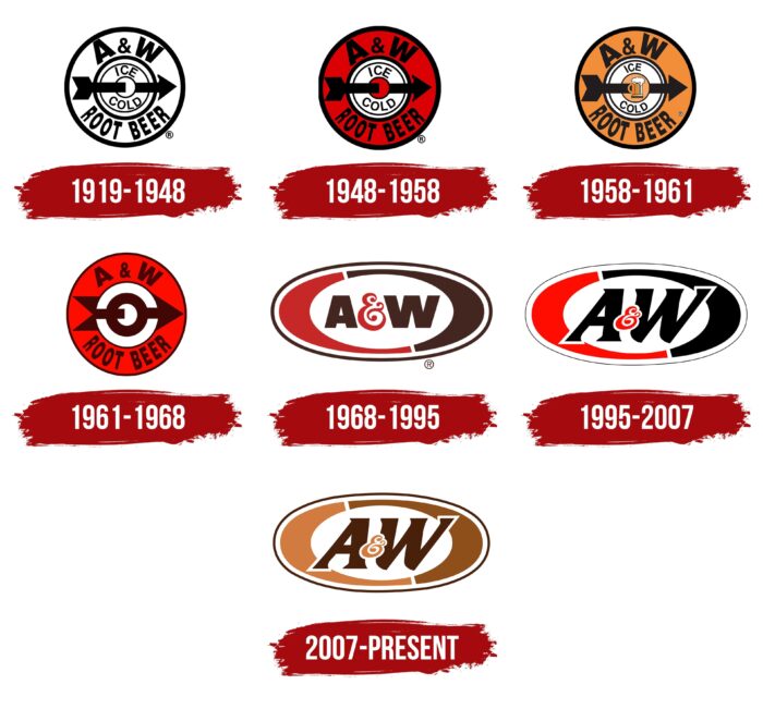
1919 – 1948
In 1919, Roy Allen was selling root beer made from a special, previously unknown recipe in his small roadside stall. Customers loved the drink, and in ’22, Allen decided to expand the range, taking his employee Frank Wright as a partner.
It was then that the beer received the name A&W Root Beer and its first logo. It was in the form of a symbolic image of a wheel pierced by an arrow into a “ten.” The emblem showed that this root beer recipe was really hitting the mark. And the wheel and the arrow turned to the left symbolized dynamics and development. The wheel didn’t appear by accident, as the drink was sold on the road to passing cars. The name of the drink on the logo is divided into two parts. The first, A&W (capitalizing the last names of the partners), is located at the top of the emblem. The second, Root Beer, is located at the bottom. They are written in a large font.
In the center around the arrow is a smaller inscription: ice cold. This was the “trick” of the companions. Root beer has been sold cold in America since the days of its first seller and propagandist, Charles Hires. The drink is a good thirst quencher. But Wright and Allen took it a step further. They served the beer in special mugs frozen in the freezer, making the drink ice cold.
A year after the restaurant opened, Allen bought out Wright’s share. However, the letter of his last name remained in the logo forever. In 1925, A&W Root Beer became the first franchised automobile restaurant in America. All stalls had a logo that became as recognizable as the beer itself.
1948 – 1958
By the early fifties, the chain was growing strongly due to the prosperity of the credit system. There were 450 beer stalls in America. The logo changed towards energy, acquiring a red background. This indicated the rapid development and great potential of the franchise. In 1950, Roy W. Allen sold the business to A&W Root Beer Co. of California and retired.
1958 – 1961
In 1956, A&W entered the world market by opening a restaurant in Canada. This led to a change in the logo. The old design did not tell customers much about what the company offered. So, for overseas customers, A&W’s most popular product, float beer, was added to the center of the logo at the point where the arrow enters. The background changed from red to orange, evoking warm, pleasant emotions in consumers and inviting them to get to know the new brand. The color change also increased the legibility of the lettering, which was now clearly visible to passing cars.
1961 – 1968
During the 60’s, franchising was very active. Restaurants opened in several Asian countries at once. And their total number reaches 2000. The menu of the roadside restaurant expands. A series of family burgers (dad, mom, teenager, baby) are created, different in size and popular. The symbol of the burgers becomes a plump chicken. Therefore, the new emblem loses the beer mug image but brings back a red background, more in line with the fast pace of the chain’s development. The arrow has also changed, which now looks more like a road sign. However, it still symbolizes moving forward to new goals. In addition, the central circular line is thickened and, together with the arrow, forms the Mars icon – a symbol of conquest and conquering new heights.
1968 – 1995 (restaurants)
By the year 68, the brand concept had finally changed. Beer is no longer the main item on the menu, but only a small part of it. In ’71, the drink was sold in containers, added to takeaway orders, and delivered to stores. It was marketed by a subsidiary of A&W Beverages. There was a need for a new logo for fast-food restaurants.
The arrow and circle on the updated mark “molded” into an oval, extending from right to left, as a prototype of striving forward. In addition, the oval resembles the outline of a burger, one of the main dishes on the menu. In the center rise the massive letters A&W – a symbol of stability. The color scheme is red-brown, where colors alternate each other in a circle. This combination should show a time-tested, reliable, and at the same time constantly developing company.
1995 – 2007
In 1995, the company had a new owner, Sidney Feltenstein. He merged A&W with Long John Silver’s and in partnership with Yum! Brands began promoting a new concept – multi-brand restaurants serving not only A&W products but also KFC, Taco Bell, and John Silver’s, owned by Yum! Brands. The business grew successfully. In 2002, Yum fully absorbed A&W, and the brand was owned by that company until 2011.
The change of concept and owners was reflected in the emblem. It became more stylish thanks to the combination of red and black colors, typical for the KFC network. The letters slanted to the right and went beyond the usual boundaries, overlapping the oval lines. They became a symbol of change and going beyond the usual menu.
2007 – today
The general appearance of the emblem has not changed. The color scheme became closer to light brown tones: the main colors of beer, toasted buns, French fries, and chicken. This option is more in line with the restaurant’s menu. Besides, it is very family-friendly, warm, and cozy.
Font and Colors
In the emblem of different years, white, red, orange, brown, and black lines prevailed, which gave clarity to the image, emphasizing the company’s offer. This color scheme perfectly reflected the different stages of A&W’s existence. The novelty, then the energetic push forward to tap the market, and then the quiet years of stability and family comfort.
The typeface on the beer logo was different thicknesses of smooth, clear Impact letters. Since 1995, the font has changed. The letters acquired the serif and italicized Friz Quadrata Pro.
A&W Logo Color Codes:
- Brown: Hex code: #4F2400; RGB: (79, 36, 0); CMYK: (44, 75, 91, 62); Pantone: PMS 732C
- Tan: Hex code: #D28816; RGB: (210, 136, 22); CMYK: (16, 51, 100, 2); Pantone: PMS 7569C
- Orange: Hex code: #F15D22; RGB: (241, 93, 34); CMYK: (0, 78, 98, 0); Pantone: PMS 1645C
- White: Hex code: #FFFFFF; RGB: (255, 255, 255); CMYK: (0, 0, 0, 0)
FAQ
What does the A&W logo stand for?
The A&W logo is a monogram made up of the last names of the business partners who founded the brand. The letter “A” stands for Allen, and the “W” stands for Wright. And the ampersand denotes their entrepreneurial alliance. Although the cooperation was short-lived (Roy Allen bought all the shares from Frank Wright), the abbreviation took root and survived. Now, its owner is the company A Great American Brand, LLC.
What does the A&W Logo symbolize?
The A&W logo symbolizes the names of the business partners who first started selling Root Beer and renting racks to sell it. This is how they launched a franchise that today has spread to 15 countries around the world. The business alliance of Roy Allen and Frank Wright quickly dissolved, but the name survived and became legendary.
What is the A&W mascot?
The mascot of A&W is the Big Rooty Bear. The shortened version of his name is Roots. He first appeared in 1947 in a Canadian fast-food restaurant chain. Two years later, his name was adopted by American fast-food establishments. This character does not use the A&W logo. The brand name is only depicted on the mug with a beer in the bear’s hand, which is necessary for advertising purposes.
What does the A&W slogan represent?
Currently, the slogan of this brand is “Bring Home the Root Beer.” It encourages you to not only buy the sweet foamy treat but to bring it home and introduce it to your loved ones. The franchise’s other slogan, ‘That frosty mug sensation,’ refers to the fact that the mugs were stored in a freezer from where they were taken out before the beer was served. None of these slogans are used in the A&W logo.
What do the letters A and W stand for?
The A&W logo is monogrammed. These are the first letters of the last names of the founders of the fast-food restaurant chain that serves Root Beer. The letter ‘A’ stands for Roy Allen, and the ‘W’ stands for Frank Wright. Roy and Frank founded the beer kiosk later when the owner offered him a share in the joint business that turned into a fast food empire. Allen subsequently bought the shares from Wright, and their partnership dissolved. The name, however, survived.
What animal is A&W’s mascot?
A&W’s mascot is called “Ruthie the Big Root Bear.” Created in 1963, Ruthie caused a lot of talk due to his lack of pants, which was recognized by the company.
Why is the A&W logo brown?
The A&W logo has brown and yellow hues to reflect the company’s main product, root beer. These colors are meant to convey the quality of the ingredients and the cozy, inviting atmosphere that this beverage is known for.
What is A&W known for?
Known as America’s oldest fast food restaurant chain, A&W Restaurants specializes in hamburgers, freshly brewed root beer, and root beer. The chain was founded in 1919 by Roy W. and has maintained its specialties since its inception.
