The Subway logo is an ode to youth, freshness, and goodness. The emblem invites you to visit the restaurant and order a couple of sandwiches, promising that it won’t take long. The sign’s smooth lines guarantee maximum comfort.
Subway: Brand overview
| Founded: | August 28, 1965 |
| Founder: | Fred DeLuca, Peter Buck, Carmela DeLuca |
| Headquarters: | Milford, Connecticut, U.S. |
| Website: | subway.com |
Subway is an American fast-food restaurant franchise with a main course of sandwiches and salads. Emphasizes the benefits and freshness of fast food. The Subway logo can be seen on 36,000 establishments in 100 countries worldwide.
The famous food chain that has made its owners rich was originally conceived to raise money for medical school. Born into a low-income family, Fred DeLuca raised money for his studies by moonlighting wherever he could. After hearing about his dream, a family friend offered Fred to earn money by making sandwiches and gave him $1,000 to open it. Nine years later, the successful business grew by selling franchises and spreading worldwide.
Meaning and History
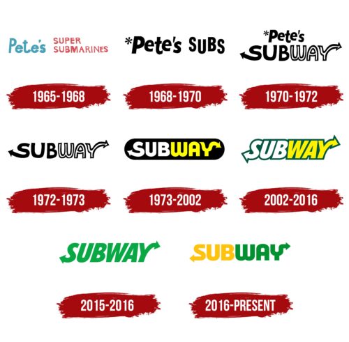
In 1965, Pete’s Super Submarines was opened. This name, derived from Peter Buck, became the star of the red and blue text logo. But it was only used for three years: in 1968, the company changed its name to Subway, and the logo had to be changed. Here you can see an obvious pun:
- On the one hand, that’s the name of the subway in New York City;
- On the other hand, the prefix “sub” is a reference to the restaurant’s signature sandwich, the Submarine Sandwich.
The designers added two arrows to the logo to play up the semantic connection with the subway. One of them comes out of the letter “S” and looks to the left, and the second extends from the “Y” to the right. These elements symbolize quick service and forward movement. The arrows continue to be used in the restaurant chain’s brand identity. Only the design of the inscription changes: font, background, color, and shape.
For example, in 2002, as part of the “Eat Fresh” campaign, the emblem acquired a refreshing green outline, which was associated with nature. In 2016, the sign became more minimalist and was visually divided into two parts: an orange “SUB” and a green “WAY.” This simplification reflects the trend toward modern and versatile design and emphasizes the company’s reliability and professionalism.
What is Subway?
Fast food restaurants opened in America in 1965 and were owned by the DeLuca family. The main difference – is specialization on healthy products (fresh salads, gluten-free bread, sandwiches from natural ingredients). The franchise generates revenues of more than $10 billion a year.
1965 – 1968
The first sandwich shop was named Pete’s Super Submarines, which is reflected in the logo. The name was given in honor of Reteg Vzska, without whose money the business would not have started. The word “submarine” refers to the shape of sandwiches placed in buns that resembled a submarine.
The emblem had two parts. The first part of the inscription was in blue and large font, showing deep respect for the sponsor, and Super Submarines in thin red letters in two lines. The variant represented the young enterprise. The red hue spoke of cooking with love and great speed.
The symbols had elements of varying thickness, showing different slicing and filling options for sandwiches.
1968 – 1970
In 1968 the name of the diner was changed to Pete’s Subs. This shortened the long second part, encrypting it into an abbreviation that later became iconic for the restaurant’s products. The emblem looks like a whole since the difference in font and color was removed. The growth and confident position of the startup on the market was shown by the black letters of the visual sign.
1970 – 1972
Companions began to think about expanding the business and opening other outlets. Since the diner referred to fast food places, the name was changed to Subway (Subway). An arrow pointing in different directions was added to the first and last letters. The composition had several meanings.
- The opening of outlets in crowded places, perhaps near subways.
- Speed of service. Walked in, got your order quickly, and walked out.
- Distribution. Increase in the number of restaurants.
- The pace of life in which customers live. Because the restaurant served natural and wholesome food, active and athletic customers and employees rushing to do business visited there.
The word “way” was stripped of its coloring, leaving it white, in honor of healthy living.
1972 – 1973
Customers often heard the name “pizza,” which confused them. So the word Pete’s was completely removed from the logo.
1973 – 2002
Companions came up with the idea of franchises. Before the new phase began, they rebranded the company. The updated logo turned out chic and evoked more positive emotions than the previous one.
The oval backing created a sense of harmony and a focus on maximizing customer satisfaction. The black color made the lettering stand out, creating a strong contrast.
The uppercase and bold letters of the lettering were given a coloring to show the vivid emotions evoked by visiting the restaurants.
- The first part of the word became white as an indication of the ingredients used in the preparation immediately upon delivery.
- The second part, “the way,” has turned yellow. It’s a hue of joy, showing the pleasure the user and their body get from the chain’s food.
The gamma shows: by choosing Subway restaurants; the customer becomes on the right path of healthy and delicious food.
The arrows echoed the curves of the background, enhancing the perception.
2002 – 2016
The black background that marred the image was removed from the logo. Instead, a green backing was added, repeating the contours of the letters. The color increased the emphasis on naturalness.
The visual sign has been used for a long time and was only changed to the new design of 2016 when the outlet was renovated. Therefore, even in 2021, you could see the emblem on the signs.
2015 – 2016
In 2015, several important events happened at once: an anniversary, a change in management, and the death of the restaurant’s founder. DeLuca’s sister Suzanne Greco took over as general manager. Already under her leadership, the company rebranded to celebrate its 50th anniversary. It’s an attempt to celebrate the legacy that the founder left behind.
An interim logo, which only lasted a year, was proposed to infuse a new flavor and to keep up with the competition. The design agency BBDO Worldwide worked on it. The variation was designed for a new slogan communicating cooking “based on fresh” ingredients. The all-green delicate color represented this freshness and youthfulness. He said, “Despite its venerable age, the company is keeping up with the times, making changes in its work and menu. That’s why it stays forever young.”
2016 – today
The company’s sales began to decline. Therefore it was decided to revise the visual identity and make it more modern, counting on young customers. To work on the interior of the café, the American design firm FRCH, which created creations for Hilton hotels, Tiffany jewelry company, and Liverpool department stores, were invited. Turner Duckworth agency worked on the logo.
The designers retained the historical identity and brought freshness to the familiar mark. They took the backing off the image, which symbolized openness and simplicity. They made the letters smooth and harmonious in size, showing consistency and loyalty to the company values. The first half of the “Sub” turned yellow, showing that the company cared about consumers’ well-being and good humor. The “way” part turned green as a natural nutrition and growth symbol.
The arrows were given a clear direction and smooth-cranked curves. They seem to say: the company, leaving the past behind, chooses the way forward. It is also a symbol of the choices the firm offers its customers.
When the letters were removed and the arrows connected, the letter S appeared, which was used for the short sign.
Font and Colors
The main colors are yellow, green, and white. All shades emphasize the healthy menu, created for active people who care about their health.
The final sign font was specifically designed for Subway by IB TYPE Inc, with whom the restaurants began partnering in 2015.
Subway color codes
| Golden Poppy | Hex color: | #ffc20e |
|---|---|---|
| RGB: | 255 194 14 | |
| CMYK: | 0 24 95 0 | |
| Pantone: | PMS 7549 C |
| Forest Green | Hex color: | #009131 |
|---|---|---|
| RGB: | 0 145 49 | |
| CMYK: | 100 0 66 43 | |
| Pantone: | PMS 354 C |
