The positive Zaxbys logo conveys a comfortable atmosphere of the fast-food chain, mainly serving chicken dishes. The laid-back atmosphere, affordable cost, modern menu, and tasty food have drawn so much attention from customers that the restaurant has gradually transformed into a franchise, constantly improving its product range and visual identity.
Zaxby’s: Brand overview
| Founded: | August 1990 |
| Founder: | Zach McLeroy, Tony Townley |
| Headquarters: | Athens, Georgia, U.S. |
| Website: | zaxbys.com |
Meaning and History
Another less popular fast-food chain inspired the concept for Zaxbys with fewer locations called Guthrie’s, which also specializes in chicken tenders. Zach McLeroy and Tony Townley wanted to make these dishes accessible to students, so they opened their establishment near a university in Georgia.
The young entrepreneurs expanded the menu by adding other chicken dishes and a signature Zax sauce of various kinds, from very mild to super spicy. The basis for its name came from the surname of one of the founders. Eventually, this became the foundation for naming the chain and its logo. After some time, a chicken appeared on the signs, representing the main ingredient in almost all dishes. The ending “s” with an apostrophe was added later as the chain expanded.
What is Zaxbys?
Zaxbys is an American franchise chain of fast-food restaurants with over 900 locations. It was founded by Zach McLeroy and Tony Townley in 1990. The first establishment was opened in Statesboro, Georgia. The chain first appeared outside the state in Bowling Green, Kentucky, gradually expanding from the southeastern region where it was especially popular. Its main menu consists of chicken sandwiches, chicken tenders, and wings, served with salad or various appetizers.
1990 – 1994
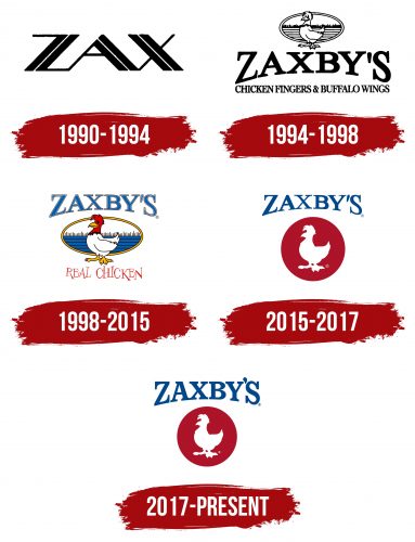
The logo consists of a single inscription – “Zax,” which designates a dipping sauce emphasized by the new fast-food point. Several types of this sauce were served to cater to various tastes, from mild to spicy. The chain’s name is set in a custom striped font, as broad sections of the letters are intersected by a thin white line, dividing them into two halves. All the glyphs are connected and are in black. The font is in uppercase and lacks serifs.
1994 – 1998
The emblem featured a chicken. It is positioned in the foreground and stands full-length in front of an oval with a rural scene. The scene shows a field divided into stripes with low vegetation. A double border frames the oval. Below the bird, the restaurant chain’s name is displayed in an arch. Yet, only the bottom parts of the letters are curved, while the tops are flat. The tallest glyphs are at the edges, while the shorter ones are in the middle.
The main feature of this logo is the new name of the fast-food establishment, “Zaxby’s,” which indicates an increase in order points. The second line contains marketing information about the menu: “Chicken Fingers & Buffalo Wings.” All inscriptions are in uppercase and feature classic serifs.
1998 – 2015
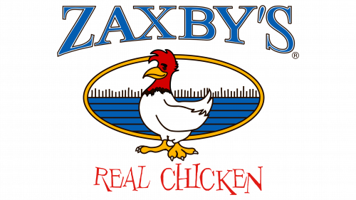
During this period, a multicolored logo was used. It consists of the same elements as before, only in a different style—more realistic and vibrant. For instance, the field behind the chicken is colored blue and white, although the stripes remain black. The border around the oval turned yellow, exactly like the bird’s feet and beak. The head, comb, and neck are now red. The lower inscription in the emblem, “Real Chicken,” is made with uneven, jumping letters of different widths and heights, creating a sense of dynamism, informal atmosphere, lightness, and playfulness. The upper line, by contrast, is formal and business-like. It is colored blue and has a curved shape, large serifs, and a double outline.
2015 – 2017
After the redesign, Zaxby’s emblem lost its three-dimensionality—it became two-dimensional for easier display on digital media, as signs are no longer the only important medium but various displays. The oval in the background vanished, replaced by a red background circle where a white silhouette now resides. The chicken remains recognizable by its distinct contour features, including the beak, comb, tail, and feet. The chain’s name is left at the top, while the lower inscription has disappeared. The letters are now solid, lacking a double outline.
2017 – today
The ratio of elements in the logo has been slightly modified. For example, the circle has become smaller, and the font has gotten bolder. Additionally, the letters have lost their squashed look: they are much taller than before, making the semi-circular shape at the bottom almost unnoticeable. Designers enlarged and raised the apostrophe.
Font and Colors
The inscription in the Zaxby’s logo uses a bold version of the NCT Larkspur SC Regular font. Only the comma between “y” and “s” is different—it’s rounder and larger than in previous versions. The name was set in a unique typeface in the earlier emblems that combined bold and narrow lines.
Over the years, the brand’s color palette has ranged from monochrome (black and white) to colorful. The scheme includes red, blue, and yellow, absent in the modern emblem.
