![]() Red Lobster Logo PNG
Red Lobster Logo PNG
The Red Lobster logo is conceptual and clear, much like the restaurant chain it represents. The emblem directly indicates both the menu on offer and the primary style. With a simple design, the designers conveyed the main idea of fast-food owners in a single image. Yet, they managed to make it as appealing and appetizing as possible to maximize its impact on visitors and marketing returns.
Red Lobster grew out of Bill Darden’s extensive experience in casual dining. In 1938, at age 19, he opened The Green Frog in Waycross, Georgia. After buying Gary’s Duck Inn in Orlando with partners in 1963, he saw demand for affordable seafood beyond coastal cities. On January 18, 1968, Darden and Charley Woodsby opened the first Red Lobster Inn in Lakeland, Florida.
The location was inland, which made it a test of Darden’s idea: seafood could work in ordinary American towns if the price and setting were accessible. The menu included seafood, steaks, and chicken for family dining. Darden also insisted that the restaurant serve all guests equally at a time when many Florida restaurants still practiced racial segregation.
By 1970, Red Lobster had five restaurants and was bought by General Mills, known for Cheerios and Gold Medal flour. Darden stayed on as manager, and new investment helped open a central office in Orlando. During the 1970s and 1980s, the chain expanded across the United States and into Canada. Popcorn Shrimp arrived in 1974, Lobsterfest began in 1984, and Cheddar Bay Biscuits appeared in 1992.
In 1995, General Mills spun off its restaurants as Darden Restaurants, named after Bill Darden. Red Lobster later lost ground to Olive Garden, and in 2014 it was sold to Golden Gate Capital for $2.1 billion. Thai Union bought a 49 percent stake in 2016 and later led a full buyout. After the “Endless Shrimp” losses in 2023, Thai Union exited, and Red Lobster filed for Chapter 11 bankruptcy on May 19, 2024.
Meaning and History
![]()
The restaurant’s inception was aimed at attracting seafood lovers and delighting them with remarkable dishes. Hence, both the menu and the future franchise’s identity were designed to emphasize this feature. The search led to the establishment of four more fast-food points. By the time the company was acquired by General Mills (which acquired the chain in 1970), there were already five outlets. The new owner tried to increase the number of Red Lobster establishments, which soon sprang up in the USA, Canada, and other parts of the world.
What is Red Lobster?
Red Lobster refers to fast-food establishments in the USA and Canada. The chain also has branches in several other countries, including the United Arab Emirates, Turkey, the Philippines, Thailand, Mexico, Malaysia, Japan, India, Ecuador, and China. The franchise began in Lakeland, Florida, where businessmen Bill Darden and Charley Woodsby opened their first restaurant in 1968. Gradually, the business hub shifted to Orlando, evolving into a vast structure. By 2023, it encompassed almost 720 fast-food outlets.
1968 – 1969
![]()
The logo, of course, features a lobster. It is large, hefty, and appetizing because it’s red, akin to the hue crustaceans take on during cooking. This shade also resonates with the name of the fast-food establishment placed at the top. The text is rendered in black characters in an Old English style, emphasizing that this is a cuisine for the select few, for seafood enthusiasts. To add authenticity to the lobster’s depiction, shadows and light reflections have been added as if reflecting off a smooth, moist surface. Both the text and the image below are framed in a rectangle.
1969 – 1974
![]()
The signage with the red lobster became even more magnificent. Against a white backdrop, even the name sparkled in vibrant colors, now painted in red as well. The Gothic letters look stylish and captivating, bearing Old English motifs. They are elegant, ornate, and expressive, and harmonize well with the lobster, which has similar spikes, curves, and irregularities on its shell and claws. The promotional poster contains numerous textual additions, not only to attract potential visitors but also to explain the essence of the offer. The rectangular frame has been rounded at the bottom.
1974 – 1984
![]()
Preserving the old logo style, designers recolored the name from red to black. This traditional sign greeted visitors at the entrance of the chain restaurants for a decade.
1984 – 1988
![]()
The owners revisited visual identity elements and settled on a different design, calm, modern, and less realistic. The image became flat but with a storyline. The artists placed the lobster in an aquatic setting to show customers it is ultra-fresh. They depicted it swimming through waves, adding four thin, curved lines and one broad one to simulate the sea. The text also underwent significant modernization: it now sports a different font with small, sharp serifs. The only thing that remained unchanged was the large lobster. It’s portrayed in the same position and color as before. Naturally, the wave-like elements are colored blue.
1988 – 1995
![]()
During this period, the Red Lobster restaurant chain’s logo dropped the wave-like background. The name was doubled in size and positioned in two lines. To the right of the word “Red” is the lobster, but now it’s not dark red but light red, matching the inscription.
1995 – 2011
![]()
An architectural style update of the branded buildings housing the seafood chain restaurants prompted a logo change, essentially the sign that greets visitors at the entrance. Because of the gabled roofs, the lobster was moved to the very top of the emblem, set against a blue semi-oval backdrop. The designers kept its position unchanged, darkened its color, and added black strokes to its sides. Meaning the lobster gained detailed features. The name was placed in a horizontally elongated rectangle with rounded corners and a triple border. It’s white and three-dimensional; each letter has shadows, visually elevating the inscription above the dark blue surface.
2011 – today
![]()
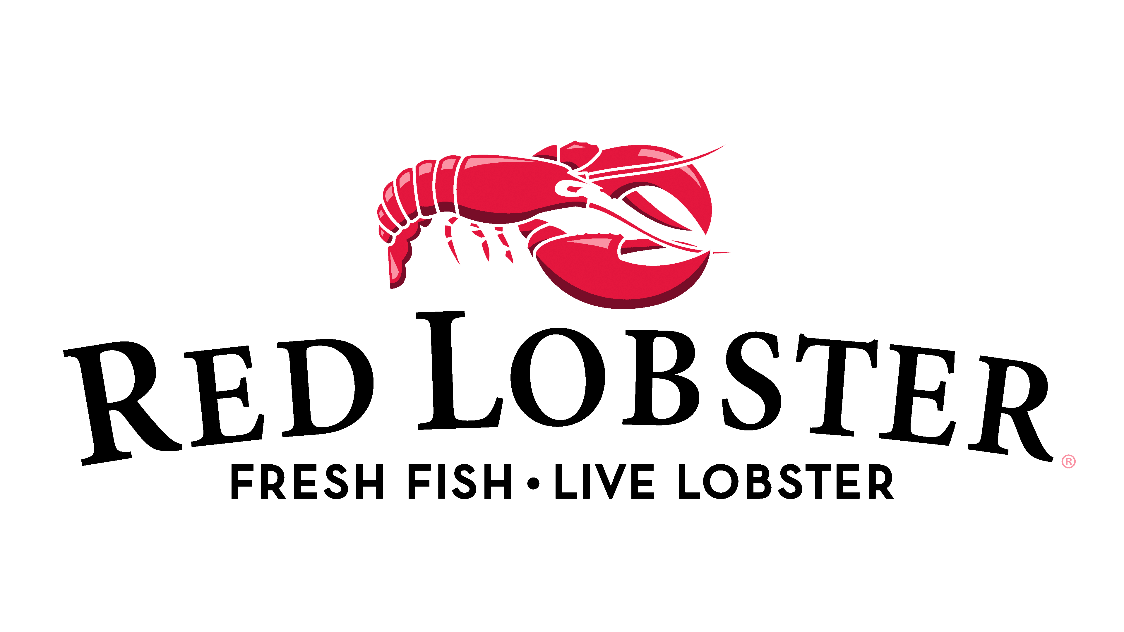
The refreshed logo underwent a radical design transformation. The background turned black, and in white uppercase font, not only is the franchise’s name stated, but also client-attracting information: “Fresh Fish. Live Lobster.” All letters are in capital form. Inscriptions are set on two levels: the first line is arch-shaped and large, and the second is horizontal and small. In the top row, the beginning of each word is denoted by a large glyph, although the rest are also in uppercase. Even though the lobster’s colors are softened, they still stand out vividly against the dark backdrop. This emblem is used on new and revamped restaurant buildings with flat roofs; the sign is positioned on the gable from different sides.
Font and Colors
Depending on the era, the logo’s inscription is set in a typeface with spike-like serifs in Old English, Minion SemiBold Small Caps (by Robert Slimbach), and a modern font with tiny serifs. The emblem’s primary color is, of course, red, resonating both with the name and the depiction of a boiled lobster. Additionally, there are black, blue, and white hues.