


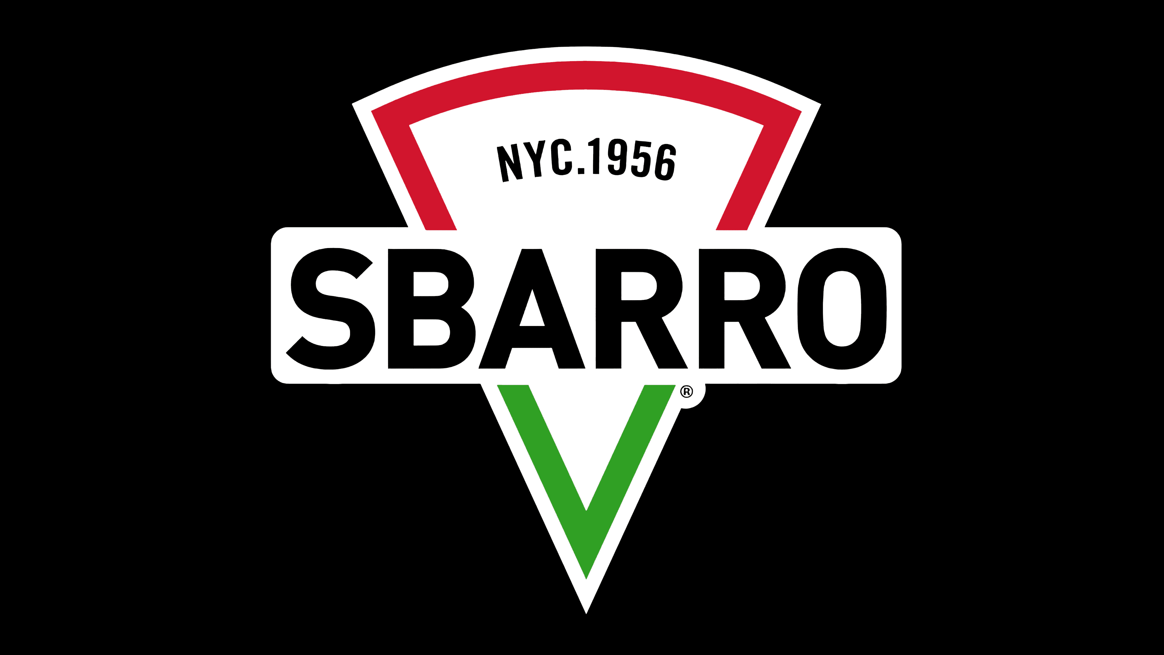
![]() Sbarro Logo PNG
Sbarro Logo PNG
The Sbarro logo is like a piece of Italy transferred to America. The logo celebrates the homeland of the brand’s founders and the recipes that made the pizzeria so popular. The sign invites everyone who wants to feel sunny Naples for a while.
Sbarro began after Gennaro and Carmela Sbarro moved from Naples to the United States in 1956 with their sons Joe, Mario, and Anthony. Gennaro and his eldest son worked in other delicatessens, while Carmela sewed doll clothes to save money. In 1959, the family opened a small Italian salumeria in Bensonhurst, Brooklyn, serving sandwiches, pasta, and Carmela’s cheesecakes.
Pizza became the product customers wanted most, especially among workers eating near the counter rather than taking food home. The family opened a second location focused on pizza, and by 1964, operated four restaurants in north Brooklyn. Gennaro avoided franchising at first, keeping control within the family. Products came through one wholesaler, and Carmela still baked the cheesecakes.
A turning point came in 1970, when Sbarro opened in the Kings Plaza mall in Brooklyn. The format matched the rise of American shopping malls: hot pizza slices, fast service, and steady foot traffic. In 1977, the restaurants were incorporated as Sbarro, Inc., and franchising began. In 1985, the company listed on the American Stock Exchange, raising $8 million for expansion. The chain grew from 97 locations to 220 by 1987.
In 1990, Sbarro entered the European market with a location in England. By the mid-1990s, it had expanded to 800 restaurants across Canada, Australia, Kuwait, Israel, France, and the Philippines. Unlike Pizza Hut and Domino’s, Sbarro relied on malls and airports rather than delivery. The family took the company private in 1999 and sold it to MidOcean Partners in 2007 for $450 million. After bankruptcies in 2011 and 2014, Sbarro moved its headquarters to Columbus, Ohio, closed weak stores, and shifted toward airports, campuses, casinos, and service areas.
Meaning and History
![]()
When Sbarro first appeared, it used a plain text logo consisting of its name. The black-and-white lettering adorned the facade of the debut restaurant. In the 1970s, the logo became more complex and recognizable. It was supplemented with an image of the Italian flag, set within a rectangle with rounded corners. This figure served as a background for the black word “Sbarro.”
In the 1990s, the designers changed the shape of the tricolor, presenting it as three wavy stripes. And after a few years, the brand name was set against a triangular shape resembling a pizza slice. Only the color scheme preserved a hint of the Italian flag. In general, throughout the history of logos, you can trace the evolution from simple verbal signs to multi-component emblems featuring national symbols.
What is Sbarro?
A chain of privately owned pizzerias opened by the Sbarro family. It franchises outlets in Europe, Asia, Australia, Russia, and Canada. The restaurants feature Italian menus and fast service.
1956 – 1970s
![]()
The first Salumeria was designed for workers. Going to or from a shift, they could buy a quick snack without delay. It took no more than 3 minutes to prepare.
Therefore, the company’s first logo is simple and uncomplicated: the name is in thin lowercase black letters.
However, a slight slant in the inscription revealed the young restaurant’s special pretensions, its desire to raise its level. Only fresh products were used, the food was prepared carefully, and the service was high-quality. Therefore, even a customer of low social status felt he had entered a worthy establishment where he was given special attention.
The distances between the letters hinted at comfort and the availability of tasty meals throughout the day.
1970s – 1997
![]()
In 1970, Sbarro began to expand and opened additional outlets. The second of them, like the first one, was located in the most populous district of New York, Brooklyn.
The place served very tasty dishes for Americans: cheeses, salami, and homemade sausages, as well as special pizza slices, which could be rolled up and eaten as a sandwich. Everything was prepared according to homemade recipes and attracted customers. Those who wanted to eat out deliberately sought eateries with Italian menus.
To ensure customers were not confused and reached their destination, the logo emphasized Italy by featuring the country’s flag. It is placed on a rectangular shape with rounded corners, demonstrating loyalty and the adaptation of Italian recipes to the preferences of American residents.
The large, italicized inscription in the center was well remembered and reflected a desire for development.
Overall, the logo epitomized the following:
- Italian food.
- The owners’ Italian roots.
- Love for the Motherland.
The sale of stock on the stock exchange facilitated the additional expansion.
1997 – 2015
![]()
Business for the pizzeria is going great. And the Sbarro family intends to buy the business back into full private ownership, as it was in 1999.
The logo of that time even more glorified Italy and its national cuisine through the company’s restaurants. A real flag was developing on the emblem. However, the name came first in this version, becoming larger and getting a white border. This demonstrated the scale of the business. About 800 restaurants were opened. The company was considered one of the largest employers in the country. This made the Sbarro name significant in the restaurant industry, as the logo showed.
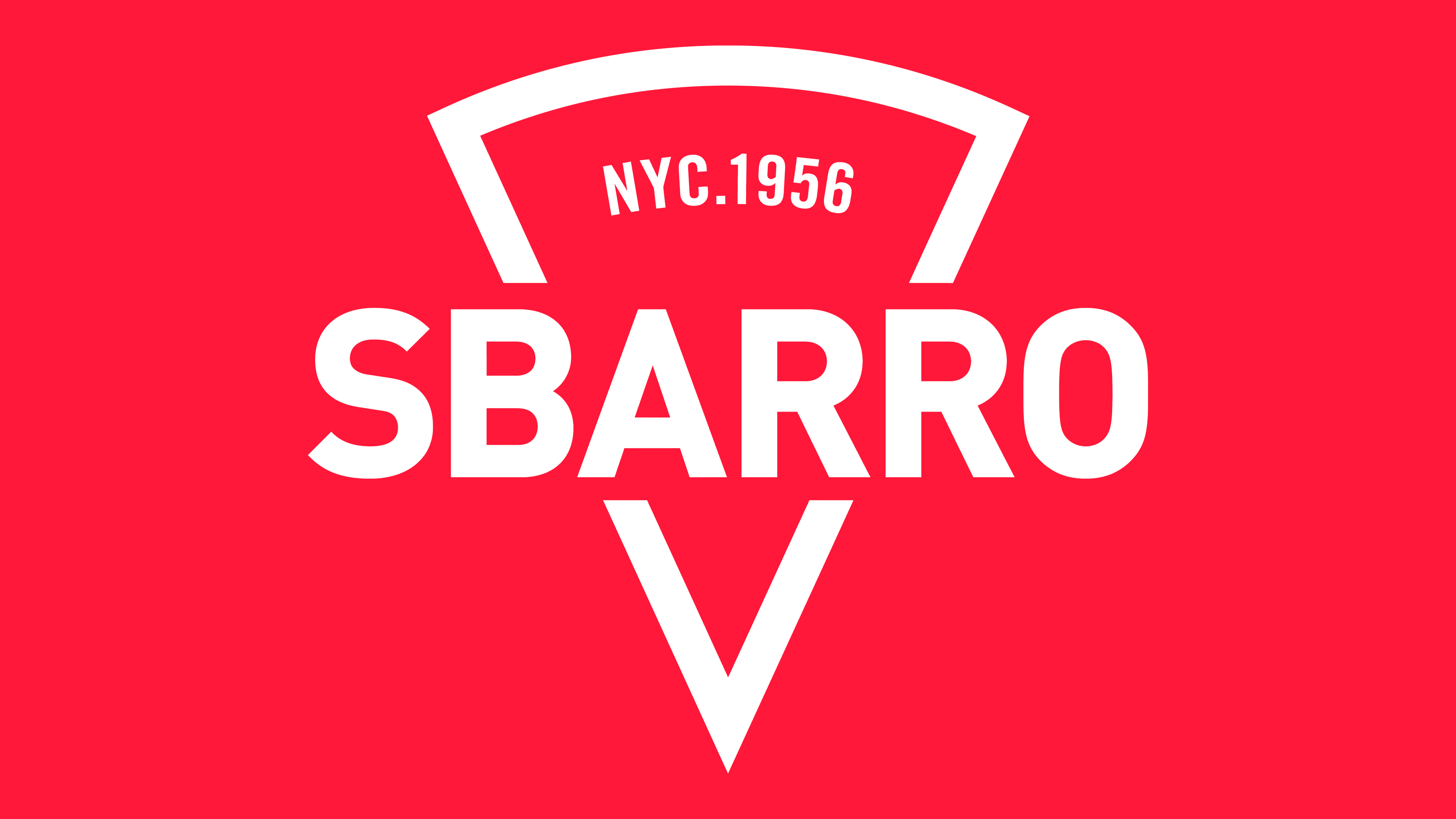
2015 – today
![]()
After two bankruptcies, the company went through a major reorganization. Some locations closed, and the headquarters moved to Ohio. A new director, David Karam, set about revitalizing and rebooting the pizzerias. The first step was a major rebranding.
The logo finally featured that famous pizza slice that is universally loved. The pie has been sold in slices since its inception, as indicated by the inscription “from New York since 1956” on the slice. So the choice of image is very iconic.
The love of Italy has been preserved in the new emblem as a green-and-red image border. The white stripe of the flag is the white coloring inside the slice. The lack of ingredients indicates that customers customize their pizzas by choosing their favorite toppings.
The company name appears in large print in the center of the pie slice. The capital letters convey that the franchise intends to regain its market position and will not give up; the firm plans to build on Sbarro’s past fame and popularity.
By 2022, the company had partially regained its position, mostly by placing outlets in convenience stores, which remained popular even during the pandemic.
Font and Colors
The logo’s main colors are red, green, white, and black. The country’s flag conveys love, hope, and faith. In the emblem, their meaning does not change. The Sbarro family pinned all their hopes on the success of their business. In addition, the colors carry additional meaning.
- Red is passion, typical of the Italians. They approach the business with all their energy. Love for delicious food. Speed of service. Cooking pizza in a hot oven.
- Green is the naturalness of the products. Simple ingredients fuse to create a dance of flavor. Green is also the development and growth of an enterprise.
- White is perfect for purity and transparency in cooking. Pizzerias have open kitchens, so everyone can watch their order being cooked. Symbolizes the color and dough the chef works with.
- Black symbolizes growth and a confident position in the market.
The font of the inscription is Bahnschrift.