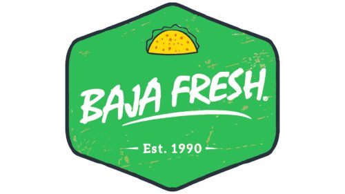
At Baja Fresh, the logo reflects the specialization of this restaurant chain. After all, the tortilla pictured above is an important part of Tex-Mex cuisine, which combines Texan and Mexican culinary traditions. At the same time, the juicy green color of the emblem whets the appetite.
Baja Fresh: Brand overview
| Founded: | August 1990 |
| Founder: | Jim Magglos and Linda Magglos |
| Headquarters: | Scottsdale, Arizona, U.S. |
| Website: | bajafresh.com |
Meaning and History
The name Baja Fresh comes from the Mexican region of Baja California. This is probably how the creators of the brand wanted to show the connection of their dishes with the authentic cuisine of the state that occupies the upper half of the Baja California Peninsula. There, great attention is paid to fresh seafood and vegetables, which is facilitated by the mild Mediterranean climate, combined with the advantageous location of the peninsula – between two reservoirs. The food service chain has adopted these traditions and added the word “Fresh” to its name to emphasize the consistently high quality of the ingredients.
The brand’s logo also reflects Baja Fresh’s relationship with Tex-Mex. A thin flour cake with filling is the main feature of this cuisine. It is depicted at the top of the green hexagon above the inscription. But this symbol has been used not so long ago – since 2017. Until then, the restaurant chain had a word mark, supplemented with various elements not related to cooking.
What is Baja Fresh?
Baja Fresh is a chain of restaurants serving American cuisine with a predominance of ingredients and culinary techniques of the Texas Techno people. The first establishment was opened in 1990, and over time there have been more than 160. The trademark is owned by Kahala Brands, which, in turn, is owned by MTY Food Group Inc.
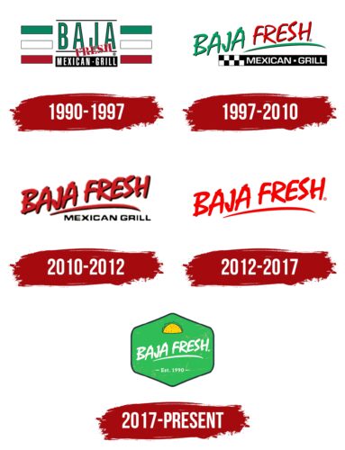
1990 – 1997
The debut logo of Baja Fresh contained the name of this brand. The first word consisted of large green letters stretched vertically, while the second was written in stencil type and arranged diagonally like a seal. At the bottom, against the backdrop of a black rectangle, was the white phrase “MEXICAN GRILL,” separated by a dot. To the right and left of the inscriptions were green, white, and red rectangles – three on each side. It is easy to guess that they corresponded to the colors of the flag of Mexico.
1997 – 2010
In 1997, a centralized network was formed from all the Baja Fresh franchise restaurants. She received a logo with a sloppy handwritten inscription, where the first word (“BAJA”) was green, and the second (“FRESH”) was red with a green underline. The line went up, which was supposed to show the relaxed atmosphere of the establishments. At the bottom, as before, was the phrase “MEXICAN GRILL” in a black rectangle; the letters had balanced proportions only in this version. On the left, a pattern of alternating squares, the so-called “checkers,” adjoined the dark base.
2010 – 2012
To make the brand name stand out, the designers made it completely red. They also repainted the underline in the same color and moved it a little to the left – closer to the word “BAJA.” At the same time, the phrase “MEXICAN GRILL” went from white to black and lost its dividing point, and its base and all other rectangles disappeared.
2012 – 2017
In 2012, the developers of the Baja Fresh logo made it more concise, retaining only the restaurant chain’s name. The font, as before, was stylized as handwritten. Both words and the line below them remained red. But at the same time, they lost thin black shadows, which is why the emblem became visually flat.
2017 – today
In 2017, the company carried out a global rebranding, which was reflected in its logo. The iconic wordmark is all white and sits in the middle of a green hexagon with rounded edges. Under the name Baja Fresh, the year of the opening of the first restaurant is written – 1990. And on top is a traditional dish of Tex-Mex cuisine – a flour tortilla with fresh filling. The emblem is outlined in a thin dark gray stripe.
Font and Colors
A tortilla wrapped in what looks like a lettuce leaf is the main graphic symbol of Baja Fresh. The restaurant chain wanted to show its connection to Tex-Mex cuisine with this visual sign. As a result, the logo turned out to be bright and appetizing.
The brand name has always used an individual set of glyphs stylized as a cursive font. All letters in the inscription are capitalized. The text below (“Est. 1990”) is in a serif typeface.
The color scheme is chosen in such a way as to be calm and appetizing at the same time. The pleasant yellow hue of the tortilla attracts attention, while the green base with an uneven texture is associated with freshness. There is also a dark gray border that completes the emblem. The inscription is specially painted in white color – so it is better visible.
Baja Fresh color codes
| Squid Ink | Hex color: | #28323c |
|---|---|---|
| RGB: | 40 50 60 | |
| CMYK: | 33 17 0 76 | |
| Pantone: | PMS 7546 C |
| Bice Green | Hex color: | #2ebc57 |
|---|---|---|
| RGB: | 46 188 87 | |
| CMYK: | 76 0 54 26 | |
| Pantone: | PMS 354 C |
| Spanish Orange | Hex color: | #e06b17 |
|---|---|---|
| RGB: | 224 107 23 | |
| CMYK: | 0 52 90 12 | |
| Pantone: | PMS 1585 C |
| Gold | Hex color: | #fed906 |
|---|---|---|
| RGB: | 254 217 6 | |
| CMYK: | 0 15 98 0 | |
| Pantone: | PMS 109 C |
