


![]() Red Robin Logo PNG
Red Robin Logo PNG
The Red Robin logo encapsulates the laid-back ambiance of the burger joint, decorating its façade with a striking inscription. It embodies the restaurant chain’s high activity, powerful internal energy, and distinct personality. The emblem acts as a magnet, drawing onlookers’ attention and hinting at a delicious snack in a comfortable setting, since casualness is the franchise’s key characteristic.
Red Robin’s roots go back to a Seattle building from 1916, near the University Bridge at Furman Avenue and Eastlake. Around 1942–1943, Sam Caston opened Sam’s Tavern there. Company lore says he later renamed it Sam’s Red Robin after the 1926 song “When the Red, Red Robin (Comes Bob, Bob, Bobbin’ Along).” The small bar became popular with University of Washington students and nearby houseboat residents.
In 1969, Jerry Kingen bought the tavern. At first, he kept its bar format, then gradually added burgers to the menu. The selection grew from a few options to 28 versions with different toppings. Kingen described the idea as “burgers and booze” and “McDonald’s for adults.” The name was shortened to Red Robin, and sales began to rise.
After a decade of refining the concept, Kingen began franchising in 1979. The first franchisees were Mike and Steve Snyder of Yakima, Washington, through The Snyder Group Company. A Portland restaurant opened in 1980, marking expansion beyond Washington. In 1983, the mascot Red was introduced, and by 1985 the chain had grown to 175 restaurants.
In 1985, Kingen sold a controlling stake in Red Robin Corp. to Japan’s Skylark, and headquarters moved to Irvine, California. After financial problems, Kingen and Mike Snyder returned in 1995 to stabilize the company. The 150th restaurant opened in 2000, and headquarters moved to the Denver Tech Center. Red Robin went public on NASDAQ in 2002, after building its identity around gourmet burgers, Bottomless Steak Fries since 1994, and, later, the Red Robin Royalty program in 2011.
Meaning and History
![]()
Once the fast-food venue incorporated “Red Robin” into its name, it became marketing gold. Such distinctiveness sets it apart, emphasizing its uniqueness. Thus, the second owner, who launched the chain in 1969, entirely dropped the first part of the old name and kept only the two words from the song “When the Red, Red Robin (Comes Bob, Bob, Bobbin’ Along).” They became so deeply rooted in the brand’s identity that they were used as the foundation for the logo. The original signage attracted patrons anticipating the signature menu, and they found it, surrounded by the eatery’s easygoing vibe.
What is Red Robin?
Red Robin is the abbreviated name of the fast-food chain “Red Robin Gourmet Burgers and Brews.” It debuted in 1940 as “Sam’s Tavern” and only adopted its current moniker in 1969. The founder of the burger joint was Sam, who had a fondness for the song “When the Red, Red Robin” by Harry Woods. Its fame was further expanded by Gerry Kingen, who revitalized the brand. The first establishment was in Seattle, Washington, but the main office was later relocated to Greenwood Village, Colorado. The restaurants specialize in various hamburgers.
1969 – 1984
![]()
The Red Robin logo is unique, with one horizontal edge (bottom), one vertical (right), one diagonal (top), and several notches on the left. Triangle-shaped indentations form uneven protrusions. The brand name is split across two levels in the dark red space. The large white letters are visible against this background, even from a distance. The font is uppercase, Roman, and sleek. Below, there’s a small area designated for the additional tagline “Burger & Spirits Emporium,” indicating the establishment’s offerings at that time.
1984 – 1997
![]()
After an overhaul of its menu and visual identity, the restaurant chain introduced its mascot: an anthropomorphic bird holding a large hamburger. It sports a blue bow tie, white collar, and red plumage. Essentially, the fast-food management presented this character as the iconic Red Robin. The mascot is centered within a white circle, separated by a wide beige-pink band featuring two inscriptions: the brand name is at the top in a bold serif font, and the word “Lager” and the establishment year are at the bottom in semi-bold letters. The logo is encircled with a fine red ring. Visually, it resembles a large donut or a seal, given its classic rondel appearance.
1997 – 2009
![]()
The logo transformed, reverting to a two-tier design with small subscript text. The brand name is tilted, and below are diagonal black bands with white inscriptions: under “Red” is “America’s,” and under “Robin” is “Gourmet Burgers & Spirits.” Each element has its unique style. The brand name is in a large red font with tiny serifs. The additional information at the bottom uses a blocky typeface with slender glyphs. Serving as a backdrop is a yellow ellipse angled in the opposite direction.
2009 – 2015
![]()
After its modernization, the Red Robin logo became more vibrant, colorful, and discernible from a distance. Designers achieved this effect by enhancing the colors (like the background ellipse) and brightening the area intersecting with the inscription. As a result, white patches appeared on the yellow oval, making the red letters pop elegantly. Another artistic touch was the contrasting shadows near the glyphs. Moreover, most of the additional inscriptions were removed, leaving only “Gourmet Burgers.” The text’s structure and style remained consistent.
2015 – today
![]()
The latest visual identity upgrade yielded a unique result: the logo was completely reformed. The primary element remained the color, given its mention in the restaurant chain’s name. The name is set in lowercase, a bespoke font. The only capital letter is the “R,” as it’s the word’s first letter. However, even this letter underwent a significant transformation: it now has a casual style with an elongated stem and an open upper loop.
Both words are now on a single line. The rounded letters emanate a friendly vibe, while the overhead arch from “d” to “i” connects the two parts, creating a unified whole. Below, there’s a clarifying note for visitors: “Gourmet Burgers and Brews.” This line is in yellow.
Font and Colors
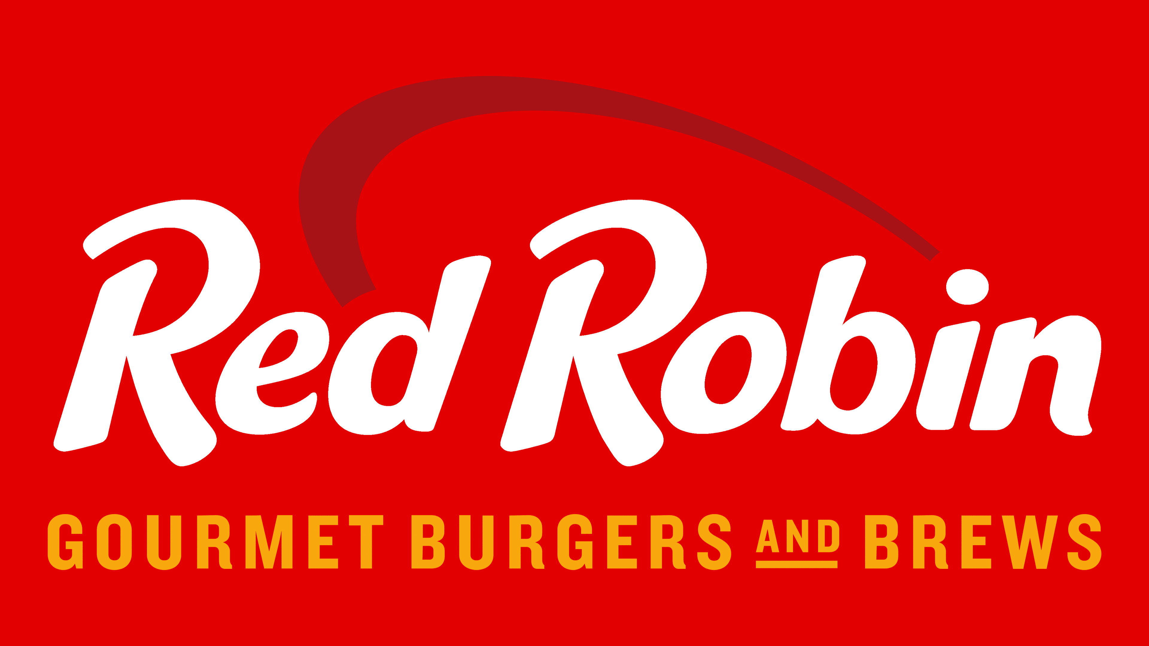
The brand’s logo colors were chosen considering the ambiance of a dining environment. Red and yellow tones form the foundation of the palette, evoking associations with food, warmth, and hospitality. This color combination is widely used in the fast-food industry to create a positive, inviting atmosphere.
The logo’s typography has undergone a notable evolution. Designers opted for a more relaxed approach than the earlier formal, classical style. The lettering comprises soft, slightly slanted characters resembling handwritten forms, giving the overall composition a sense of friendliness and simplicity.
A secondary inscription beneath is set in a more neutral grotesque typeface with clean, even edges, similar in style to Concert One Regular but with less rounded shapes. This pairing results in a harmonious and easily readable presentation of the text.