


![]() Waffle House Logo PNG
Waffle House Logo PNG
The Waffle House logo demonstrates the company’s deep commitment to traditions. These traditions are evident not just in visual branding but also in the dishes that form the core of the menu. Designers crafted a succinct emblem, charging it with dual responsibilities: to display the brand name and its field of operation.
Waffle House was founded on September 5, 1955, in Avondale Estates, Georgia, by chef Joe Rogers Sr. and real estate agent Tom Forkner, who envisioned a simple, affordable diner featuring waffles served around the clock—a rarity at the time. Originally occupying a small space with just four tables, the restaurant quickly became popular among travelers, truckers, and locals, leading to steady expansion along the developing U.S. interstate highway system. The founders divided their territories to facilitate growth, establishing separate but complementary operations under the same brand. Known for its consistent menu and reliable 24-hour service, the chain gained attention for its resilience during emergencies, with FEMA informally using its operational status as an indicator of disaster severity. Through decades of steady expansion, Waffle House has reached nearly 2,000 locations across 25 states, becoming a cultural icon of Southern hospitality and tradition.
Meaning and History
![]()
Few people know, but the modern Waffle House logo evolved from a wavy black script meant to emulate the flow of syrup. Still, it ended up looking more like Halloween decor. The logo had to change when the company started placing it on tall buildings to attract drivers’ attention. The brand name needed to be in bold, clear letters, visible to everyone traveling interstate highways.
Around the early 1960s, Tom Forkner asked a friend to design a straightforward, clear wordmark. This led to a version with yellow squares and a strict sans-serif font. The restaurant chain used this for the next several decades. Mark Miklos justified such conservatism by stating that companies that frequently change their logo cannot find their identity. Waffle House has no problem; they’re fully confident in their brand and how customers perceive them.
What is Waffle House?
Waffle House is a restaurant chain where one can order waffles with various fillings, omelets, pancakes, bacon and eggs, and other classic American breakfasts. Established in 1955, it mainly operates in the southern US. Its founders were neighbors Joe Rogers Sr. and Tom Forkner. The main headquarters is located in Norcross, Georgia.
1955 – today
![]()
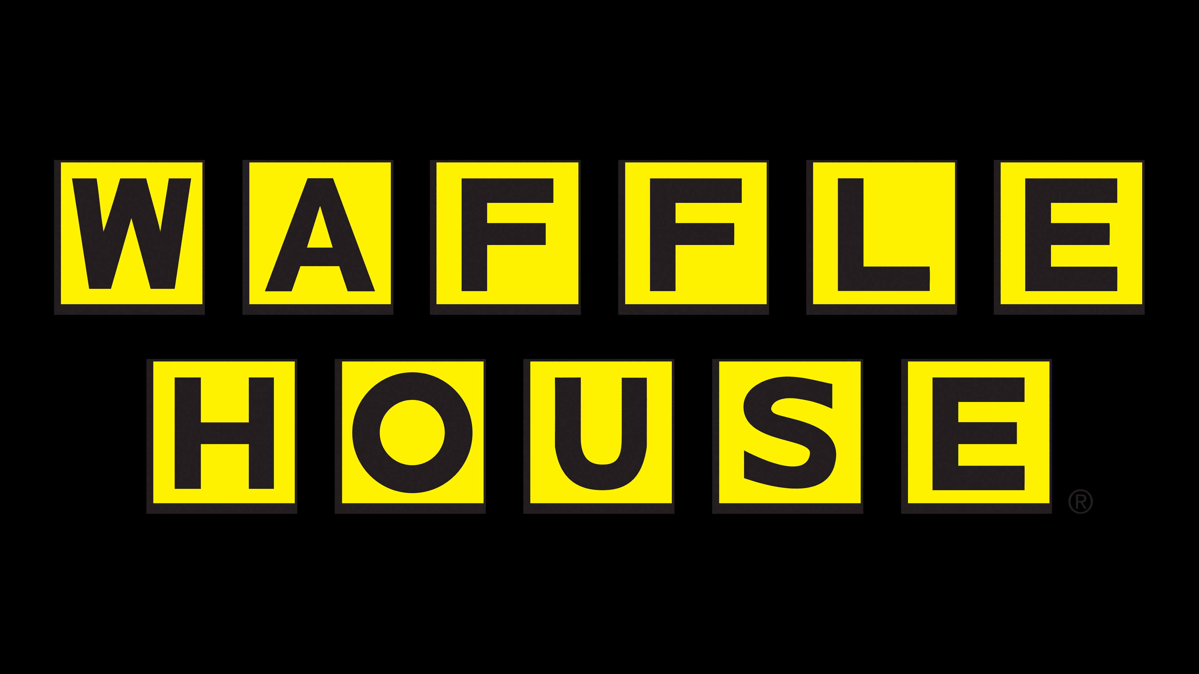
The primary brand emblem contains eleven yellow squares with dark outlines, creating a depth effect. Each rectangle contains a black letter: the first row spells “WAFFLE,” and the second “HOUSE.” Both words are written in capital sans-serif letters and are center-aligned.
Although the logo resembles Scrabble letter tiles, it’s unrelated to the board game. Instead, it’s a stylized representation of a waffle’s surface imprint. This brilliant design not only showcases Waffle House’s primary product but also conveys the restaurant’s friendliness and warmth.
![]()
The brand has an additional icon with the initial letters from its name: “W” and “H.” They are diagonally placed inside a yellow circle with a double black border. The monogram is also colored black. The italicized font with long, slender serifs embodies speed, which is crucial for customer service in fast-food establishments.
Font and Colors
The logo features a bold typeface with geometric contours characterized by smooth, precise lines and simple character endings. It appears modern and confident, resembling well-known fonts such as Wendy’s Waffles or Galaxie Polaris Heavy. Certain letters have unique features that distinguish them from similar styles.
The yellow-and-black color scheme was introduced by the company’s founder, Joe Rogers Sr. His idea was to evoke associations with the familiar colors of a school bus, making the design noticeable and easily recognizable. Another version links the color choice to his son’s university, though this is not factually accurate.

Thanks to the yellow’s brightness combined with deep black, the emblem appears friendly yet assertive, clearly conveying the company’s identity without unnecessary elements or complexity.