


![]() Pizza Planet Logo PNG
Pizza Planet Logo PNG
The bright Pizza Planet logo is well-known to Pixar fans. It’s a recognizable element of the animated universe that first appeared in “Toy Story” and later became an “Easter egg” in the studio’s other animated films. The emblem belongs to a fictional restaurant chain and is part of a concept inspired by space.
Pizza Planet first appeared in 1995 in Pixar’s Toy Story as a fictional family restaurant with a space theme, pizza counters, arcade machines, and alien-inspired décor. In early drafts, the scene centered on a mini-golf venue, but Buzz Lightyear shifted the idea in a different direction. The final version became a playful launch-base setting, where he could confuse a pizzeria with a real spaceport.
The building was shaped like a cartoon planet with rings, resembling Saturn, and had a large sign above the entrance. Inside, the restaurant combined fast food, electronic games, prize machines, and sci-fi props. Its yellow delivery truck, marked by a rocket on the roof, became one of the best-known objects from the film after Woody and Buzz used it while trying to find Andy.
After 1995, the Pizza Planet truck turned into a recurring studio reference. It appeared in later films including Monsters, Inc., Cars, Ratatouille, and Up, usually as a short cameo. In Monsters, Inc., it appears near the trailer where Randall is sent, while in Cars it’s reworked into a vehicle-shaped race fan.
The fictional brand later reached Disney parks. Toy Story Pizza Planet Arcade opened at Disney’s Hollywood Studios on December 15, 1995, and Disneyland Paris added its version in 1997. Both closed in 2016. In California, Redd Rockett’s Pizza Port was rethemed as Alien Pizza Planet for Pixar Fest on April 13, 2018, and the change became permanent in 2019.
Meaning and History
![]()
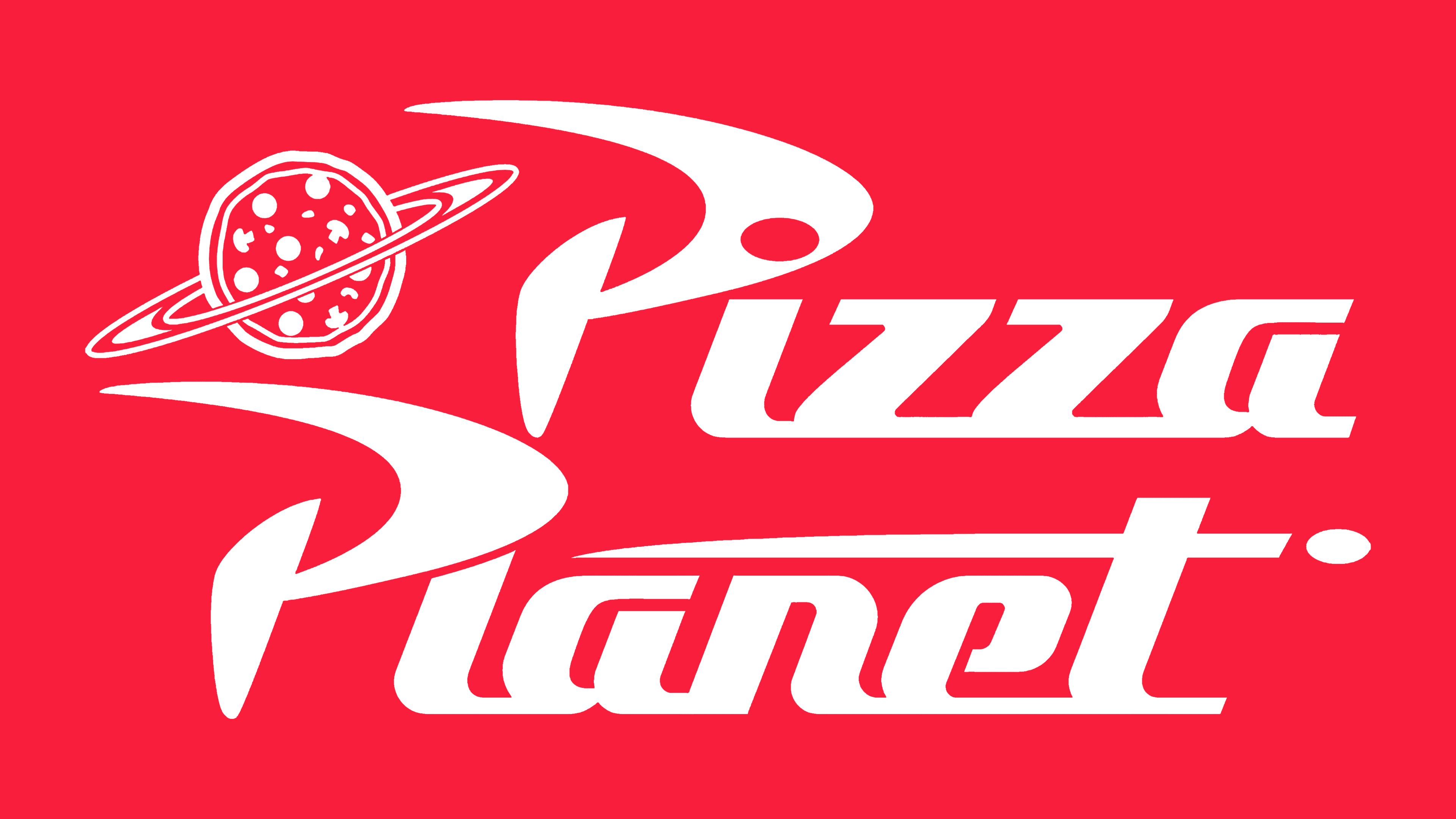
Although Pizza Planet is a fictional brand, fans of animated films know it, as well as the international franchise Pizza Hut (the one, along with Chuck E. Cheese’s, that inspired the “Toy Story” development team). The logo of the nonexistent chain of restaurants became famous because its branded trucks, yellow Toyota Hilux pickups, often appear in different Pixar animated films. The roof of each vehicle features a white rocket figure, with the inscription “Pizza Planet” on the side and a ring like Saturn’s.
The space theme was chosen to reflect the sci-fi concept of pizzerias. It fits into the plot of “Toy Story,” where one of the main characters is a toy space ranger. Initially, the cartoon’s creators wanted to name the golf course Pizza Putt, but then they changed their minds and turned it into a restaurant, replacing the second word with “Planet.” This allowed for a moment in the cartoon when Buzz Lightyear decided to go home.
In real life, the emblem of the fictional restaurant chain is used by Alien Pizza Planet – a food service establishment known by this name since 2018, and was previously known as Redd Rockett’s Pizza Port. Its building is in Disneyland Park next to Space Mountain, so the symbol with the ring of Saturn fits perfectly into the surrounding ambiance. The same logo appears on various franchise merchandise and is a popular graphic among Pixar studio fans.
What is Pizza Planet?
Pizza Planet has been an integral part of the Pixar universe since 1995. It’s a fictional restaurant chain linked to many plot twists in “Toy Story.” It adheres to a science fiction concept, offering visitors delicious pizza and exciting arcade games. The company is known for its trucks, which appear in various cartoons.
1995 – today
![]()
The creators of the Pizza Planet emblem presented the brand name not only in written form but also as an illustration. They depicted a pizza with mushrooms, which underscores the connection with the restaurant’s main dish, and turned it into a planet by adding a ring like Saturn’s. The space theme emerged because it was required by the “Toy Story” plot: the toy astronaut had to mistake the pizzeria for another planet to embark on a journey.
The nearby inscription harmoniously fits the concept, as the letters look futuristic. Two capital “P” s, one on top, the other on the bottom, pierce the space like flying rockets. Their curved parts indeed remind one of rocket tips, but they also resemble boomerangs. This is a symbol of breakneck speed.
The logo’s creators have connected all glyphs in both words, except for the initial ones. However, they brought the “P” so close that the dot over the “i” became a hole in the previous letter. A similar circle is depicted after the “t” in the word “Planet.” In this case, it is a flying object, and the elongated horizontal line of “t” should be viewed as a speed line.
Font and Colors
The inscription in the Pizza Planet logo is a unique design created specifically for the fictional restaurant. Since we are talking about an emblem from cartoons, the font is playful, and, given the space theme, the letter elements resemble fragments of rockets, comets, and planets. Overall, this style can be characterized as an atomic-age design when space-age motifs were in vogue.
The Pixar Universe brand colors are red and white. In pizzerias, the first is associated with tomato sauce, and the second is with cheese. Additionally, red looks hot and stimulates the appetite, which helps explain its use. The designers have thoughtfully conceived the Pizza Planet concept despite it being a fictional restaurant chain.