The AZ Alkmaar logo is full of dynamism, which no sports game can do without. With the help of such a symbol, a football club from the Netherlands wants to emphasize its uniqueness, originality, and right to leadership. A stylish emblem, like a talisman, leads athletes to victory.
AZ Alkmaar: Brand overview
| Founded: | 10 May 1967 |
| Founder: | Molenaar brothers |
| Headquarters: | Netherlands |
| Website: | az.nl |
AZ Alkmaar is a Dutch Premier League football club. The club plays in the “Honorary Division” of the Netherlands. Twice national champion (1981,2009). The AZ Alkmaar logo is famous in Europe for reaching the quarter-finals and semi-finals of the UEFA Cup and the Europa League.
AZ Alkmaar – was formed with the assistance of the Molenaar brothers, who coached FC Zaanstreek, whose players wanted to participate in professional sports. The path to the club’s glory is connected with Cees and Klaas Molenaar (1972-1985) and Dirk Scheringa (1993-2009). Their participation and financial injections allowed the club to break through to the top and stay there for the next years.
Meaning and History
What is AZ Alkmaar?
One of the 18 Eredivisie clubs in the Netherlands. Founded in 1967. Twice Eredivisie winner, twice Dutch champion, and four times KNVB Beker Cup winner.
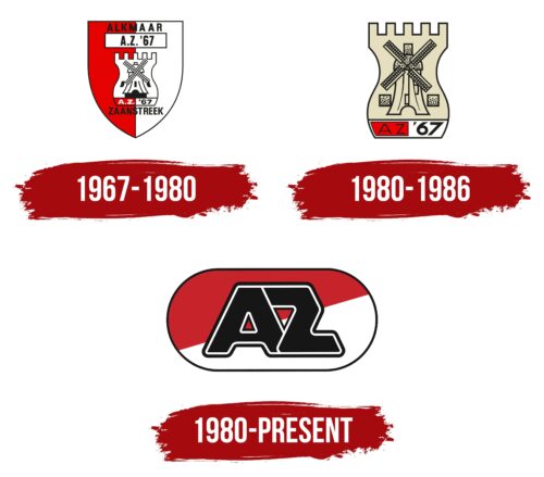
1967 – 1980
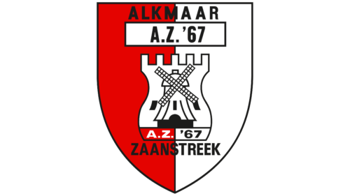
The first logo traces the history of the club. It is made in the form of a heraldic shield. Its shape corresponds to the main attribute of the Dutch city of Alkmaar, where AZ appeared. Inside the shield, the visual elements of two clubs are combined: Alkmaar ’54 and FC Zaanstreek, which became the progenitors of AZ Alkmaar.
The tower was taken from Alkmaar ’54. It is also the symbol of the city where the club is located (originally, Alkmaar was built as a fortress). Therefore, the figure in the logo occupies a dominant position. Mill taken from FC Zaanstreek. Its image is connected with the city’s past, where in ancient times, barley was grown, and flour was made from it. There were more than 1000 windmills in the region.
The windmill in the logo is smaller and inscribed inside the tower. This shows the association of clubs and indicates that Alkmaar ’54 came before Zaanstreek.
The shield is divided into two parts – red and white, which pays tribute to the homeland of the club, as it corresponds to the striped flag of the city of Alkmaar. The form players received the same shades.
The name of one club is written on top of the shield, and the name of the second is written on the bottom. The inscription A.Z.’67 is in a white rectangle in the middle of the emblem and at the bottom of the turret. It is an abbreviation of the full name of the combined team Alkmaar Zaanstreek, plus the year of formation – 1967.
1980 – 1986
In 1979, major changes took place. Cees Molenaar, who owned the club with his brother, died, and at the end of the year, the club’s team qualified for the championship.
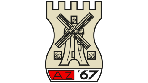
In the visual sign for home matches, all unnecessary details in the form of a shield and repeated inscriptions were removed, leaving only a tower, a windmill, and an abbreviated team name.
In this version, the details of the city symbols are drawn more carefully. Grain is loaded into the dome of the mill to the top. Two windows on the tower’s facade also show grain filling the structure. This is a symbol of abundance, fruitful work, and victories that have accompanied the club in recent years. The grains allude to the many goals scored.
The logo ceased to be used in 1986 when the last of the Molenaar brothers left the club. The historical details of the distant past have ceased to be relevant in modern realities and have left a simpler and more understandable option as a visual sign.
1980 – today
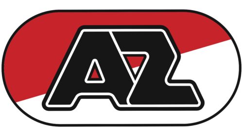
The modern logo is concise and easily recognizable. It includes the most basic details that allow you to identify the club – the attributes of the country and the name.
The inner space of the logo is divided obliquely into white and red parts, pointing to Alkmaar, the city where the club is located. Its flag and rowing are in red and white. There are also colors in the Netherlands’ flag and coat of arms.
In the center of the emblem are large black letters A and Z with a white border. The abbreviation stands out and is visible from afar. The interlocking of letters alludes to the unification that marked the beginning of the club’s history. White outlines are a symbol of fair play.
The emblem’s oval shape echoes the ball’s flow and looks perfect on football jerseys.
Font and Colors
The permanent colors of the club are red and white. They demonstrate the patriotic spirit of the team. In addition, red is an indicator of energy, drive, and dynamic play throughout the match. White is a symbol of faith in the best, compliance with the rules, and the ability to revive after failures. It shows the ability to start every year with a clean slate.
The AZ font is streamlined, with rounded ends, which is a nod to a round ball. The inscription features an unusual style of the letter Z with a cropped top corner.
AZ Alkmaar color codes
| Fire Engine Red | Hex color: | #c7232a0 |
|---|---|---|
| RGB: | 199 35 42 | |
| CMYK: | 0 82 79 22 | |
| Pantone: | PMS 485 C |
| Eerie Black | Hex color: | #151515 |
|---|---|---|
| RGB: | 21 21 21 | |
| CMYK: | 0 0 0 92 | |
| Pantone: | PMS Black 6 C |
