


![]() Bad Boy Logo PNG
Bad Boy Logo PNG
Seriousness, brutality, courage, beauty, and originality: these are the qualities the Bad Boy logo embodies. It not only embodies the brand’s name but also reflects its connection with active sports. It has hidden aggression softened by an informal style.
Bad Boy began in 1982 in San Diego, California, far from gyms and fight promotions. A small team made T-shirts and shorts for local surfers, skaters, and motocross riders, selling them through youth-focused coastal shops. The label operated under Life’s A Beach, a brand tied to California beach culture. In 1988, Robin Offner became involved in the business.
In 1991, the partnership with Life’s A Beach ended. Offner and his partners bought Bad Boy, while former associates went on to create No Fear. The brand still had roots in surfing and skateboarding. Still, in 1992, Offner signed a licensing deal with Brazilian entrepreneur Marco Merhej, who was connected to extreme surfing and Brazilian jiu-jitsu. That agreement changed the brand’s direction.
In 1992-1993, Merhej arranged for Rickson Gracie to wear Bad Boy gear at a seminar in Rio de Janeiro. A photo from the event reached the cover of a national Brazilian magazine, placing the brand next to the Gracie name. Bad Boy soon became tied to Brazilian jiu-jitsu and Vale Tudo through athletes such as Wallid Ismail, Vitor Belfort, Antonio Rodrigo Nogueira, Wanderlei Silva, and Mauricio “Shogun” Rua.
In the mid-1990s, Bad Boy’s Brazilian operation created Vale Tudo shorts from nylon with elastane, reinforced for ground fighting. They debuted at Mundial de Vale Tudo 3 in São Paulo and became standard gear for many fighters. While Tapout later pushed a louder street image in the U.S. MMA market, Bad Boy relied on exposure in fights. In the 2000s, UFC and Pride FC broadcasts carried the logo worldwide, and the brand later expanded into casual wear and sponsorships outside combat sports.
Meaning and History
![]()
What is Bad Boy?
This clothing and gear brand has become integral to the mixed and mixed martial arts (MMA) communities. Its recognition is driven by the emblem featuring an eye, symbolizing the fighting spirit and unwavering strength within this community. The product range includes streetwear, professional training equipment, fight gloves, shorts, and protective gear. Additionally, the brand develops sports nutrition and supplements for athletes and active lifestyle enthusiasts.
Old
![]()
The first logo features hand-drawn facial elements – scowling eyebrows, eyes, nose, and twisted mouth. The face belongs to the animal; at the same time, the animal’s image does not matter, since the main thing is the emotion conveyed by the drawing. All features, from bushy eyebrows to the curve of the lips, convey anger.
The use of animal traits shows that in moments of anger, a predator’s energy and strength can appear in a person. It is this pressure that helps to conquer the fear of sports peaks. Only an athlete who knows how to let his bestial essence out can achieve the best results. At the time of achieving records, the faces of desperate athletes look similar.
The drawing conveys the brand’s style of clothing.
Things include:
- Adventurism.
- Going beyond the generally accepted framework.
- Pressure and drive.
- Leadership.
The brand uses only natural materials or high-quality hypoallergenic synthetics. Designers are not afraid to experiment to create the most comfortable and safest products that keep you on top.
A neat italic inscription of rounded letters complements a non-standard, disproportionate pattern. The lower part of the “Y” forms a line that underlines the whole name, further streamlining the ideal name. Such a contrast suggests there is little animal energy. It takes discipline and persistence to win. A harmonious combination of labor and inner strength indicates an outstanding personality and athlete.
The name “Bad Boy” is synonymous with the expression “not like everyone else.” The logo conveys the brand’s main goal: to allow athletes to express their individuality, stand out from the crowd, and go beyond generally accepted standards. The company implements it through specially designed clothing. There is a certain rebelliousness inherent in the “bad” boys in the firm’s style.
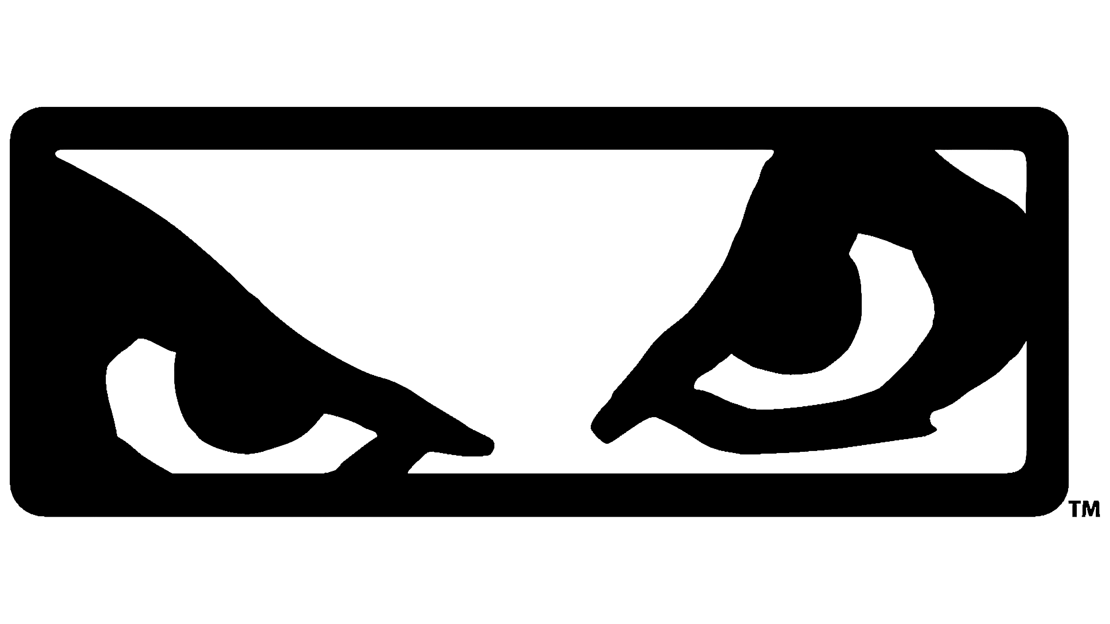
New
![]()
In general, the idea and message of the modern logo have not changed. But updating the visual part made it easier to read.
From the face of an indefinite creature, only eyes remained, which looked with concentration and evil through protective glass. This is the look of a fighter before an attack and an extreme before performing a dangerous stunt.
The glass is an oval with rounded corners outlined by a thick black line. The trait demonstrates the ability to control animal nature. Shows inner anger that does not go beyond.
The glass also demonstrates reliable protection. The company’s products help reduce the likelihood of injury. Therefore, her fans are well-known professional athletes.
The title font has changed significantly. It acquired an angularity that echoed the energy of unrestrainedness. All letters are capitalized, which gives the inscription strength and power. The disappearance of smoothness aligns more closely with the brand name’s essence.
Font and Colors
The main color of the logo is black. It is a symbol of leadership, self-confidence, and overcoming difficulties.
The font is unique. It matches the Outlander Nova Black as closely as possible, but with sharper corners, making it more “extreme.” The protruding lower rings of the Bs are reminiscent of boxers’ jaws, for which the brand produces mouth guards and helmets with chin protection for wrestlers.