The emblem demonstrates an unusual approach to creating fashionable looks. The Balenciaga logo breaks all stereotypes about what beauty and style look like. The elements allude to the connection between past and future from which the house collections are born.
Balenciaga: Brand overview
| Founded: | 1917 |
| Founder: | Cristóbal Balenciaga |
| Headquarters: | Paris, France |
| Website: | balenciaga.com |
Meaning and History
The Balenciaga brand was not a high fashion house, although everyone calls it that. It was not a member of the Parisian organization Chambre Syndicale de la Couture Parisienne because its owner broke all the rules and firmly refused to comply. Most of all, Cristobal was outraged by copying original ideas: he believed that Christian Dior was stealing his cut and silhouettes.
The greatest couturier ended his career in 1968 as if anticipating his imminent death. This was a complete surprise even for the company’s employees. The house of Balenciaga was inactive until 1986. It only resumed operations when it became part of Jacques Bogart S.A. A little later, it was bought by the Kering holding.
Unlike clothing, Balenciaga’s logos have never been varied, either during Cristobal’s lifetime or since. The new owners were in no hurry to experiment with the identity: they kept the original word mark and changed only the font.
What is Balenciaga?
Balenciaga is one of the most prestigious fashion brands in the world. It has influenced the popularity of natural leather and lightweight fabrics, offering many innovative design solutions. The brand’s history dates back to 1919 when couturier Cristóbal Balenciaga opened his first boutique in Spain. Today, the fashion house is owned by the French corporation Kering, which also owns Yves Saint Laurent, Alexander McQueen, and Gucci.
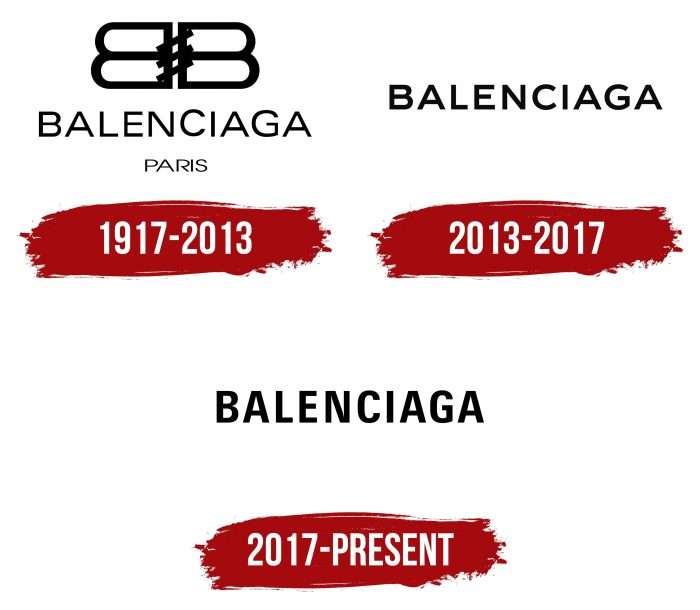
1917 – 2013
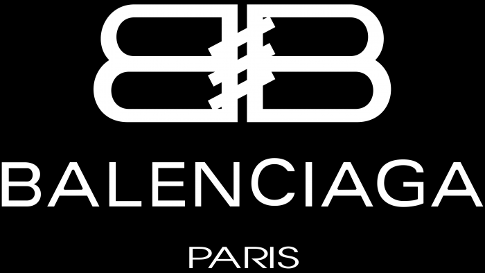
One of the first emblems contained two capital letters, “B” facing each other with flat sides. They were connected by three parallel diagonal lines that looked like stitches that held the garment together. At the bottom was the brand name in black sans serif letters. Even below was the word “PARIS,” which denoted the location of the fashion house.
2013 – 2017
The company that bought the Balenciaga trademark ditched the trademark monogram. She decided to use only the wordmark with the brand name, making the font bolder.
2017 – today
After another update, the letters were squeezed at the edges. Changing the proportions didn’t affect the style because, otherwise, nothing changed. The creators of the logo tried to modernize the design while maintaining its recognizability.
Previously, the Balenciaga company had a traditional mark, which consisted of two letters, “B.” Diagonal lines symbolized the stitches connecting the pieces of fabric. Now, this monogram is no longer used. The owners limited themselves to a short inscription without additional graphic elements.
Balenciaga: Interesting Facts
Balenciaga is a famous luxury fashion brand known for its innovation and deep impact on fashion.
- Beginning: Spanish designer Cristóbal Balenciaga started the brand in 1919 in Spain, then moved to Paris in 1937 because of the Spanish Civil War. His Paris fashion house quickly became world-renowned.
- Haute Couture Mastery: Cristóbal was called “The Master” for his exceptional tailoring and design innovation. He was greatly respected in the fashion world and set high standards that many followed.
- Iconic Designs: He created several groundbreaking styles, such as the tunic dress, sack dress, balloon jacket, and baby doll dress. These designs challenged the then-popular hourglass figure, significantly changing fashion.
- Fabric Innovation: Balenciaga was known for using unique, sometimes heavy materials. The brand worked on developing new fabrics, contributing to its forward-thinking designs.
- Celebrity Appeal: Historically, celebrities and style icons like the Duchess of Windsor, Grace Kelly, and Jackie Kennedy wore Balenciaga. It remains a favorite on the red carpet today.
- Ready-to-Wear Shift: After Cristóbal Balenciaga closed the fashion house in 1968, the brand eventually shifted towards ready-to-wear fashion, reaching a wider audience.
- Embracing Technology: With creative directors like Nicolas Ghesquière and Demna Gvasalia, Balenciaga has incorporated technology into fashion, including 3D printing and digital fashion shows.
- Sustainability: The brand is working on becoming more sustainable using eco-friendly materials and aiming to lower its environmental impact.
- Cultural Discussions: Balenciaga often finds itself at the heart of fashion debates due to its avant-garde and sometimes controversial designs, showing its significant influence on modern culture.
Balenciaga combines superb craftsmanship, innovative design, and a strong cultural influence, securing its status as a key player in the fashion world.
Font and Colors
Balenciaga’s typography comes in a variety of fonts. In one of the earliest versions, it was an analog of Urbano Expanded from FontSite Inc. A typeface was used, vaguely similar to Bw Modelica Expanded Bold from Branding With Type and Ultine Normal Demi from Insigne Design. The modern wordmark is in the Utah Condensed Bold font, inspired by lettering on public transport. Designer Demna Gvasalia changed it slightly to adapt it to the logo of the fashion house.
The color scheme, in turn, was not so varied. It always contained black as the foreground and white as the background. A simple combination emphasizes the aristocracy and good taste of the brand.
Balenciaga color codes
| Black | Hex color: | #000000 |
|---|---|---|
| RGB: | 0 0 0 | |
| CMYK: | 0 0 0 100 | |
| Pantone: | PMS Process Black C |

