The Barilla logo of the Italian company is bright: it is red, with a contrasting white inscription in the middle. Such a design helps attract buyers’ maximum attention to make them fans of the “pasta empire.” The elliptical background is ideal for a long title and does not narrow the professional scope of its owner.
Barilla: Brand overview
Barilla is one of the most respected Italian canned food and pasta producers. The company was created by Pietro Barilla in 1877 and named after the founding. Today, in terms of sales, it is considered the largest pasta producer globally. Barilla opened the first bakery in Parma, Italy.
In 1877, Pietro Barilla started a small shop in Parma, Italy, selling bread and pasta. This small beginning was the birth of Barilla, now a global brand known for Italian food.
Pietro’s sons, Riccardo and Gualtiero, modernized the pasta-making process with new technology, starting Barilla’s growth beyond Parma. They set up factories across Italy and began selling in Europe.
In the 1930s, Barilla got creative with its marketing, using artists to make eye-catching ads for its pasta.
After World War II, a new generation led by Pietro Barilla Jr. pushed the company into rapid growth and international markets. In the 1950s and 1960s, Barilla entered the U.S., where Italian food became popular. The company built a plant in New York and worked hard to introduce Americans to its pasta.
In the 1970s, Barilla expanded to Japan, Australia, and more, diversifying its products to include sauces and bakery items due to the rising demand for Italian food worldwide.
The 1990s and 2000s saw Barilla investing in new manufacturing tech and sustainable farming. It also focused on health, offering whole grain and low-carb pasta.
However, Barilla faced backlash over its CEO’s comments about not featuring same-sex couples in ads, leading to a boycott call from the LGBTQ+ community. Barilla responded by focusing more on inclusivity and diversity, including setting up a Diversity and Inclusion Board.
Today, Barilla is the largest pasta brand in the world, selling in over 100 countries and still family-owned. It stays true to its Italian roots, focusing on ingredient quality and sustainable production. Despite facing challenges, Barilla remains a leader in the pasta market, continually adapting to consumer tastes and preferences.
Meaning and History
The first company logo appeared in 1910. Since then, it has been redesigned 11 times. Today’s version appeared in 1936, and only minimal changes have been made.
We can produce a curious result if we comprehensively analyze the Barilla logo and combine all the findings. It is based on three semantic meanings that, at first glance, have nothing to do with each other.
The first is trust. The emblem reflects the “father” code of values: continuity, continuity, and the historical thread that connects the company’s roots with family significance. The general background of the brand is woven from this, inspiring seriousness, reliability, and trust. These are calming psychological factors.
The second is love, which constitutes the key value of the “mother” code. In this case, it manifests in generosity, inimitable taste, kindness, smooth and rounded lines, tenderness, and fertility. These psychologically influence the emotions associated with attitudes, in this case, brand attitudes.
The third is dynamics. This includes the values of the “baby” code. This is mobility, growth, evolution, development, lightness, playfulness, simplicity, incentive, and unwillingness to be in a static state. They give rise to a positive attitude towards the brand in the subconscious and cause a feeling of something lively, energetic, and cheerful.
These conflicting trends form a harmonious picture of visual identity, which is why the Barilla logo is very well received. This flexibility is probably the reason for the emblem’s uniqueness and durability. Distant, in some ways, even incompatible aspects perfectly balance it.
What is Barilla?
First of all, this is a cult brand if we talk about real Italian pasta. Only with the help of natural ingredients and recipes with a long history does the company maintain the status of a leader in the market.
1910 – 1918
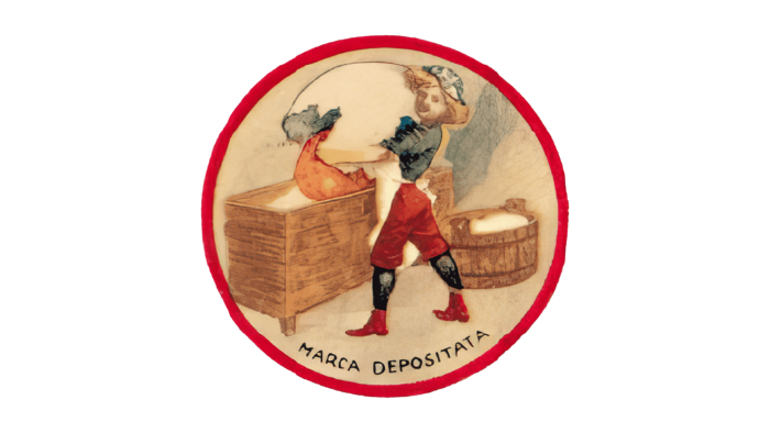
In 1910, the company decided to expand the number of manufactured goods seriously. For example, it was then that the mass production of egg paste was launched. For the brand to be recognizable throughout Italy, it was decided to create a logo. Its author was Ettore Vernizzi. The logo is an emblem, reflecting the procedure for creating egg paste. An apprentice of a noble baker holds a large egg from which the yolk flows into a kneader, where there is already flour. This image was used for marketing purposes by the company until the early 1930s. Below the image is the verbal inscription “Marca Depositata.” However, the company name is missing.
1918 – 1921
The logo, introduced in 1918, was the brand’s name in massive black letters. The classic bold sans-serif with cutouts in the letters “B,” “A,” and “R” looked professional and authoritative. Naturally, he did not give the potential buyer-specific information about the field of activity, but it motivated him to get more information.
1921 – 1924
Three years after the second logo’s completion, another redesign was completed. The brand name was presented in bold capital letters. The main color was still black, and changes were made directly to the style of writing letters.
1924 – 1949
The logo, introduced in 1924, significantly changed previous designs. Now, the brand name was not written but drawn. It looked stylish and elegant and made Barilla stand out from the competition. Different colors were used for the inscription in different variations, but red became the main one. At the same time, the original emblem in the form of a baker’s apprentice was also actively used.
At this stage, Giuseppe Venturini becomes the author of the new logo. Also, the company decided it was time to abandon the emblem that had become boring to many. At the same time, an actual frame as an ellipsoid appears today. The brand name is made in the same style as on the previous version of the logo, but at the same time, it seems somewhat smaller due to the presence of a frame. It had a red outline and the color of the title block, which looked quite impressive on a white background.
1949 – 1952
At this stage, the drawing style of the brand name remained similar to the previous versions. At the same time, the color of the inscription became white, while red was used as the background. If the frame was made earlier as an ellipsoid, now it was a rectangle with rounded corners. The frame had a double outline – white and red.
1952 – 1954
The company decided to return to the frame as an ellipsoid. The new redesign was handled by a professional architect, Erberto Carboni. For the first time in a long time, significant changes were made to the style of the word inscription, which was done in neat handwriting. Thus, the new logo has become more refined and sophisticated.
1954 – 1969
Two years after the release of the previous logo, Carboni decided to make small changes. Until now, the emblem has been asymmetrically located inside a large oval. Many people associate this logo with egg white and yolk.
1969 – 2003
This option, among all, lasted the longest. The company used it in advertising campaigns for 34 years. It was redesigned by Lippincott & Margulies. The ellipse has become longer and narrower, and the wordmark has moved from cursive to classic bold sans-serif in white letters.
2003 – 2015
The wording remained unchanged at this stage, but the logo was more modern, thanks to a red color gradient that gave it depth. In addition, the effects of white highlights and dark shades were used.
2015 – 2022
The new Barilla logo almost completely repeats the previous version. However, the gradient was removed from it; instead, the bright red shade became the main one. At this stage, the logo has become more simple and minimalistic, but at the same time, it clearly shows the ambitiousness of the project and its readiness to develop in the future.
2022 – today
In the current version of the logo, an additional outline was removed, which made it even more minimalistic. A darker shade of red has now been used for the oval frame. The verbal name completely repeated the previous version, but at the same time, an additional “dal 1877” appeared on top, indicating the date the company was founded. It is in thin white capital letters.
Font and Colors
Throughout the company’s development, it has used a variety of typefaces for wordmarks. The current version is in italics and looks modern thanks to smooth, neat lines. It is closest to such fonts as Neuropa Medium and FF Signa Round Bold Italic.
The red and white color palette was the main one at almost all company development stages. In this way, the company indicated its passion, purpose, and values for interacting with customers.
FAQ
Did Barilla change their logo?
Barilla recently updated its logo. This update is not a complete makeover but a modern refresh. The logo still features the same image representing the brand for over 60 years, keeping its classic elements easy to recognize. The most noticeable change is removing the white outline surrounding the logo, simplifying the design, and giving it a modern, cleaner look. Also, the logo’s red color remains, but it’s now a darker shade. This change makes the logo more visually striking and adds a contemporary edge while keeping the brand’s traditional feel. These adjustments show Barilla’s commitment to staying current and attractive to consumers by updating its logo to a more sleek and modern design.
What are the colors of the Barilla logo?
The Barilla logo uses three main colors: red, white, and blue, each chosen to highlight the brand’s essence and values. Red symbolizes Barilla’s passion for Italian cooking and its dedication to high-quality pasta and foods, drawing attention to the logo. White represents purity and simplicity, reflecting the quality and straightforwardness of Barilla’s products and providing a clean background that makes the logo more visible. Blue signifies trust, reliability, and a calm demeanor, reinforcing Barilla’s reputation as a dependable brand with a rich Italian tradition and pasta-making expertise. These colors make the logo visually attractive and meaningfully express what Barilla stands for: a commitment to delivering authentic, top-quality Italian food worldwide, reminiscent of the Italian flag’s colors.
Who owns Barilla?
The Barilla company is still owned by the Barilla family, who are now in their fourth generation of leadership. Since its start over 145 years ago, the family’s dedication to making high-quality and innovative products hasn’t changed. The company began with Pietro Barilla in Parma, Italy, in 1877, and from a small shop, it has become a well-known global brand for Italian food. Despite its growth, the Barilla family has always kept control, ensuring their long-standing values of quality and innovation guide everything they do, just like when they started.
What makes Barilla special?
Barilla stands out because of its dedication to choosing the best grains every harvest to make a superior semolina blend. They ensure only the best grains are used, which sets the standard for their pasta’s quality. But it’s not just about picking top-notch grains; Barilla also focuses on improving how they turn durum wheat into pasta. They’ve got this process down to fine art, always working on their methods to keep the wheat’s natural goodness, which means their pasta tastes great, feels right, and is good for you. This combination of choosing excellent raw materials and constantly updating their production techniques makes Barilla’s pasta unique and loved worldwide.
How long does Barilla pasta last?
Barilla’s Ready Pasta is a fully cooked product made through a special process where the pasta is cooked in its pouch. This smart cooking technique means there’s no need for food preservatives, keeping the pasta free from artificial additives while ensuring its high quality. Thanks to this production method, Barilla Ready Pasta has a shelf life of 14 months at room temperature. Its long shelf life and ease of preparation make it a handy option for quick, high-quality meals without preservatives. This shows Barilla’s dedication to providing convenient and quality food products.
Is Barilla pasta not made in Italy?
Most Barilla Pasta sold in the United States is made in the company’s plants in Ames, Iowa, and Avon, New York, meaning it’s not made in Italy, except for a few exceptions. Products in Italy will clearly say “Made in Italy” or “Product of Italy” on their packaging, helping consumers know where their pasta comes from. Barilla also makes some pasta in Canada. This approach lets Barilla efficiently meet the needs of different markets without compromising the brand’s well-known quality and authenticity.
What is the meaning of the Barilla Logo?
The Barilla logo, created by Ettore Vernizzi, features a baker’s assistant pouring egg yolk into flour, highlighting the pasta-making process. This design underscores Barilla’s focus on traditional Italian baking and pasta production. Additionally, the logo includes the name of Barilla’s founder, Pietro Barilla, linking the brand closely with its family origins and honoring its heritage. This blend of imagery and the founder’s name in the logo showcases Barilla’s dedication to craftsmanship, family legacy, and the authenticity of its products, reflecting the company’s commitment to quality and tradition in the food industry.
What does the logo symbolize, Barilla Logo?
The Barilla logo beautifully captures the essence of the brand’s passion for baking and pasta-making. Its elliptical shape is a nod to a loaf of bread, connecting the logo to Barilla’s roots in the bakery business. Thin lines in the design resemble spaghetti strands, highlighting Barilla’s expertise in pasta. The white logo reflects flour, a key ingredient in baking and pasta-making, symbolizing purity and simplicity.
The logo also features red, which grabs attention and symbolizes Barilla’s love for its customers and commitment to quality. These elements together showcase Barilla’s heritage in Italian culinary traditions and its dedication to excellence. The design effectively communicates Barilla’s values and identity, making it more than just a logo—it symbolizes the brand’s enduring commitment to quality and tradition.
