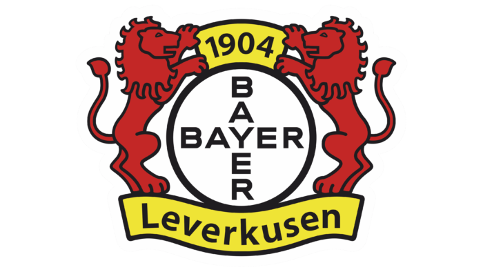
The emblem immediately shows that it represents a strong player in the world of sports who never gives up. The Bayer 04 Leverkusen logo is filled with power. Club players fight for victory like lions and don’t give up the initiative to anyone.
Bayer 04 Leverkusen: Brand overview
| Founded: | 1 July 1904 |
| Founder: | Bayer AG |
| Headquarters: | Leverkusen, Germany |
| Website: | bayer04.de |
Bayer 04 Leverkusen Football Club has received the playful nickname Neverkusen from fans due to sports failures. People remember more, not how he won the German Cup or UEFA Cup, but he did not manage to get a single title. Since 1906, the team was only second in the Bundesliga.
However, Bayer has an excuse: it is located in Leverkusen’s small town and is forced to compete with neighboring clubs that have multimillion-dollar support. So he is only holding on to the money of his sponsor, the pharmaceutical company Bayer AG.
Meaning and History
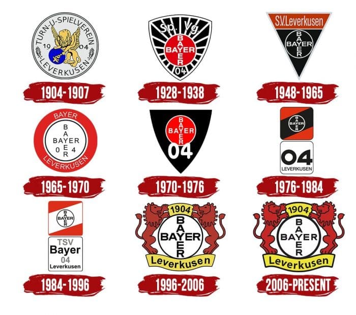
All team logos are divided into four groups. The first contains only one graphic sign: a shield with symbols traditional for Bayer AG. The second includes visual identification elements with the so-called “Bayer cross,” located inside the circle. The third category is unusual split emblems consisting of two squares with text. The last, fourth group contains logos with red lions.
What is Bayer 04 Leverkusen?
Bayer 04 Leverkusen is a German professional soccer team from North Rhine-Westphalia. The team competes in the Bundesliga and plays its home games at the BayArena. The club was founded by Bayer AG (a pharmaceutical company) in 1904.
1904 – 1907
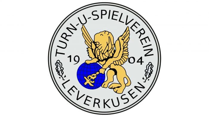
As the club’s sole creator is Bayer AG, the first emblem features its symbols: a blue globe and a golden-winged lion with a staff. Moreover, the artists depicted a staff, but Kaduce – an attribute taken from ancient mythology. This is an occult sign that is used in the heraldry of many countries.
Graphic elements are placed in a ring from the inscription “TURN-UND SPIELVEREIN BAYER LEVERKUSEN.” This was the name of the first sports organization of a pharmaceutical company. Nearby are the numbers “19” and “04”, indicating the year of its foundation. The football department, which became the progenitor of Bayer 04 Leverkusen, was opened a little later – in 1907.
1928 – 1938
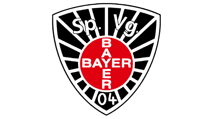
In the 1920s, the club split: footballers, boxers, athletes, fistball players, and handball players split from gymnasts and formed an association called Sportvereinigung Bayer 04 Leverkusen. In doing so, they retained their red and black color scheme, using it in the new logo.
The Bayer Cross, a symbol that dominates Leverkusen’s city center, has become an element of the football team’s visual identity. The designers placed it in the middle of a red circle and placed it on a black triangular shield. The circle is adjoined on all sides by white lines symbolizing the sun’s rays. Above it says “Sp. Vg. “, And below it is” 04 “.
1948 – 1965
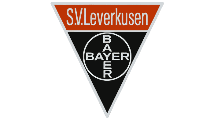
In 1948, a simplified version of the logo appeared: an inverted black triangle with a Bayer cross in a white ring and the words S.V. Leverkusen on an orange stripe.
1965 – 1970
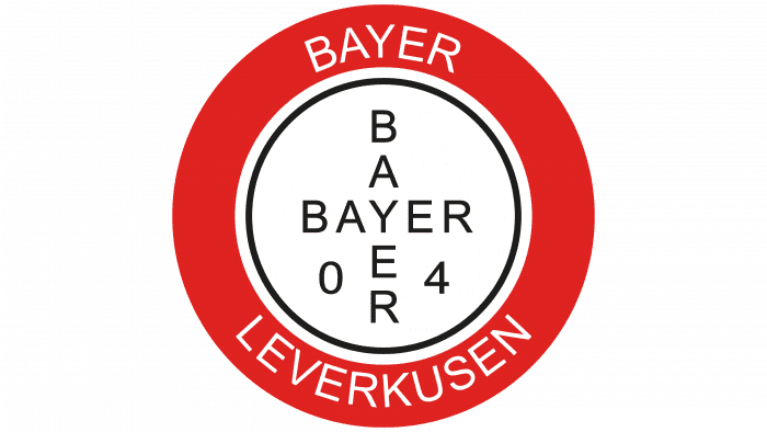
Another version of the emblem is a white circle with two crossed words, “BAYER” and the numbers “0”, “4”. The inscriptions are enclosed in a ring, and the circle is enclosed in a red frame on which is written “BAYER” (above) and “LEVERKUSEN” (below).
1970 – 1976
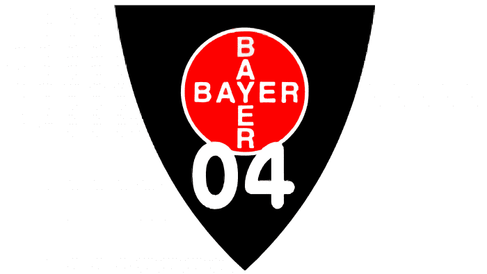
The black triangle with rounded sides is a red circle surrounded by a thin white ring. It traditionally houses the “Bayer cross.” There is also a new element – the connected numbers “04”, which are noticeable thanks to the enlarged font.
1976 – 1984
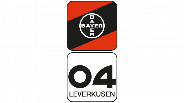
The appearance of the split logo marked the mid-1970s in the history of Bayer 04 Leverkusen. It consists of two squares with cut corners. The first is red and black, striped, with a Bayer cross. The second one is white with a black outline and the inscription “04 LEVERKUSEN”.
1984 – 1996
The colors, shape, and content of the squares have changed. The top one is now not red-black, but red-white. The lower one has the inscription “TSV 04 Bayer Leverkusen”.
1996 – 2006
At the end of the 20th century, the team returned the lion, featured on the first emblem. And not one, but two at once – so that they are mirrored to the right and left of the “Bayer cross.” Lions are not yellow as they used to be, but red circled in black lines. In turn, yellow is used for the two ribbons located at the top and bottom. They indicate the year of creation and the hometown of the club.
2006 – today
The colors are much brighter, and the legibility of the inscriptions is improved. The designers did not change anything else.
Bayer 04 Leverkusen: Interesting Facts
Bayer 04 Leverkusen, often just called Leverkusen or Bayer, is a soccer team from Germany with a special story.
- Started by a Company: The team was created in 1904 by workers at Bayer AG, a big company that makes medicines. This company has helped the team grow and become professional, which is pretty different from other soccer teams.
- Nickname—Die Werkself: They’re called “The Company’s Eleven” because of their connection to Bayer, which is a fun way to remember their origins.
- Always in the Bundesliga: Since 1979, Leverkusen has been playing in Germany’s top soccer league. They’ve come close to winning it several times but haven’t yet, which got them the nickname “Neverkusen.”
- Almost Champions of Europe: In the 2001-2002 season, they reached the final game of the UEFA Champions League but lost to Real Madrid. It was a huge deal for them.
- Great Youth Program: Leverkusen is known for training young players well. Lots of them have become big stars in soccer.
- BayArena: Their stadium is called the BayArena. It’s modern, cozy, and can hold about 30,000 fans. It was built in 1958 and has been updated a few times.
- Famous Players: Some famous soccer players, like Michael Ballack and Lúcio, used to play for Leverkusen.
- Good in Europe: They’ve also done well in other European tournaments, including the Champions League. They even won the UEFA Cup (now called the Europa League) in the 1987-1988 season.
- Supports Women’s Soccer: Leverkusen’s team plays in the top German women’s soccer league, showing that they care about soccer for everyone.
- Smart Soccer Strategies: The team is known for developing new soccer strategies and has helped some coaches succeed.
Bayer Leverkusen is unique because of its company roots, dedication to training young players, and strong German and European soccer competition.
Font and Colors
The Bayer 04 Leverkusen football team played their first match in 1907. They had a slightly different name and had a different emblem: a large white circle, a globe, and a lion with a staff. In the current graphic sign, only lions have survived, but they are assigned a secondary role. The centerpiece is the “Bayer cross”: two words “BAYER” with a common letter “Y.” It is the famous symbol of the pharmaceutical company of the same name.
For the inscriptions on the arms’ coat, the Gothic font, the so-called Sans Serif, was used. The colors are bright and saturated:
- Lions are red (Lust, # E32221)
- Rectangular ribbons are yellow (Titanium Yellow, # F3E500)
- Lettering and outlines are black (Eerie Black, # 1A171B).
- All elements are placed on a white background (Lotion, #FBFBFB).
Bayer 04 Leverkusen color codes
| Lust | Hex color: | #e32221 |
|---|---|---|
| RGB: | 227 34 33 | |
| CMYK: | 0 85 85 11 | |
| Pantone: | PMS Bright Red C |
| Titanium Yellow | Hex color: | #f3e500 |
|---|---|---|
| RGB: | 243 229 0 | |
| CMYK: | 0 6 100 5 | |
| Pantone: | PMS 3965 C |
| Eerie Black | Hex color: | #1a171b |
|---|---|---|
| RGB: | 26 23 27 | |
| CMYK: | 4 15 0 89 | |
| Pantone: | PMS Black 6 C |
