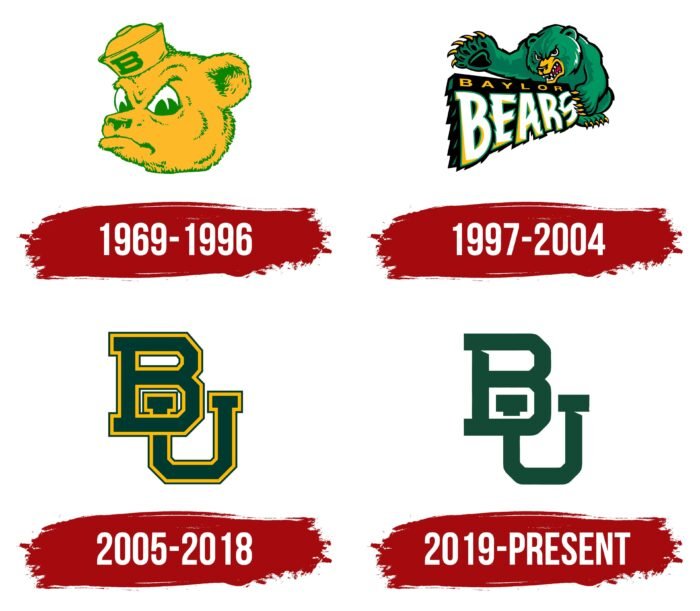
The Baylor University logo was created by creative designers who managed to combine the iconic Baylor Bears monogram with a serious word mark. The combination of bright yellow printed letters “BU” and sophisticated dark green lettering proves that the emblem of an educational institution can be both strict and informal at the same time. The use of the monogram symbolizes the university’s close association with its sports teams.
Baylor University: Brand overview
Baylor University is a private, research-based institution of higher education in the United States. It is the largest Baptist institution of higher education in the world, producing bachelor’s and master’s degrees. The university also offers doctoral and professional degrees as it is an R2 institution. In addition, the university has many fraternities that started as local fraternities and joined international movements in the 1970s. The university also has its own athletic department called the Bears. The teams are members of the Big 12 Conference and compete in NCAA Division I. The university is located in Waco, Texas, and the year of its founding is believed to be 1845.
Meaning and History
The university is named in honor of its founder, R.E.B. Baylor, a county judge and former member of the U.S. Congress. In 1841, he, along with Pastor William Milton Tryon, proposed the establishment of a local university in Texas. Thirty-five delegates of the Union Baptist Association voted in favor of the idea. Three years later, the leadership petitioned for a higher organization, and in the winter of 1845, Anson Jones, president of the Republic of Texas, signed an executive order to that effect.
Missionary James Huckins was the organizer of the construction of the campus, so he is considered the third founder of Baylor University. Land in Independence was set aside for the university. And this educational institution became the first in Texas to teach subjects such as law, medicine, and math. In 1851, the administration made the university all-male but then returned it to coeducational. The first female graduate left its walls in 1855.
Interestingly, one of the heads of the university was the great-grandfather of the future president of the United States – George Washington Baines. Throughout its existence, the university has preserved authentic symbols, so it has one seal and one academic emblem.
The emblem of the university is much simpler than the seal. It consists of two parts: text and graphics. On the left is the monogram formed from the abbreviation of the university. It represents the intertwined letters “B” (above) and “U” (below) with triangular notches under the serifs. A vertical line separates the yellow letters from the full name of the university in a different font. Above both “i” letters are miniature rhombuses, not dots. The “y” has a shortened tail, and the “t” has a serif on the crossbar, which is not typical of the classical style.
The Seal
The seal is made of concentric circles of different sizes assembled into a whole. Among them, there are thin and wide strips containing important information. In the center, there is a five-pointed star. Thanks to one-sided shadows, it looks voluminous. It is surrounded by a motto in Latin: “Pro Ecclesia, Pro Texana.” It is executed in a classic serif font and is separated by four bold dots, two on each side.
It is followed by a thin delimiting ring of dark green color. Behind it is a wide margin with the date and place of the founding of the university. This word combination is executed in a grotesque style. Then follows a double line and the name “Baylor University.” In font, it echoes the inscription in the center of the seal. The frame looks like a tightly twisted rope. This seal is used to mark documents, orders, diplomas, and everything related to the academic and administrative process.
Baylor Bears Logo
The Baylor Bears is the name of 17 teams at Baylor University, which has been in existence since 1845 in Waco, Texas. The faculty is headed by Mack Rhoades. The athletes are members of the Big 12 Conference and compete in NCAA Division I. Among the university’s most successful teams are soccer, baseball, track and field, tennis, and two basketball teams, men’s and women’s.
The author of the first Baylor Bears logo is artist Arthur Evans of the Disney movie company. This explains the cartoonish style of the bear, which, according to the concept, represents a mascot named Sailor Bear. However, the athletic department was later forced to change the logo because Evans had drawn the same bears for several other teams. Later, another option was suggested by Elmer Fisher and Joey Taylor. Then came the idea of Fuzzy Green Bear, developed by SME Branding.
1969 – 1996
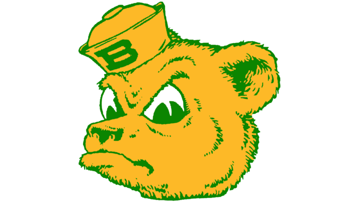
The logo depicts a bear or, rather, its head. The logo shows a cartoonish grin on its funny face as if the animal is challenging its rivals. This is also evidenced by the stern gaze and frowning eyebrows. The character’s eyes are large, semicircular, and expressive. The ears are slightly pulled back as if the animal is listening to something. On the bear’s head is a sailor’s cap (visor), on which is written the capital letter “B” with serifs. It stands for both words of the university’s team name, the Baylor Bears. The fur, nose, and shadows are rendered in thin monochrome strokes.
1997 – 2004
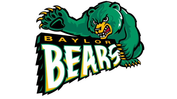
Gradually, the management decided to move away from the cartoon style of the emblem and approved a new version. It depicts a large angry bear with a thick paw, directed forward to intimidate the enemy. The fearsome beast has powerful teeth and huge claws, highlighted in yellow, and the angry look confirms his bad intentions. In front of the beast, positioned on the floor in full face, is the name of the university’s department.
2005 – 2018
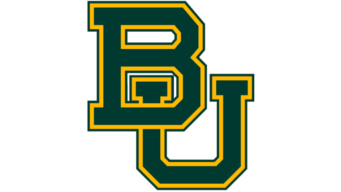
In 2005, after a redesign, the team adopted a fundamentally different logo, consisting only of text. The name of the university to which the sports department belongs was taken as a basis. Therefore, the emblem has only two letters – “BU” from “Baylor University.” They are located diagonally and are made in the form of a monogram. Their elements are partially intertwined: the left serif “U” is in the lower space of the “B.”
2019 – today
The modern variant is based on the previous one and completely repeats it in form. But otherwise, they are different. In the logo approved in 2019, the green color is lighter by several tones. Thin letters do not have a border, and triangular notches complement the constituent lines at the top. The “U” piece, located in the lower “B” space, is separated from the rest.
The university soccer team has been in existence since 1898. It competes in FBS Division I as a member of the Big 12 Conference. Since 2014, home games have been played at McLane Stadium. The head coach of the team is Matt Rhule.
The women’s basketball team is coached by Kim Mulkey. In 2005, the women’s team won the NCAA Division I women’s basketball championship. The men’s team suffered a scandal in 2003 but still won three straight games (2008, 2009, and 2010).
Baylor University: Interesting Facts
Baylor University is a private Christian university in Waco, Texas, known for its strong academics, vibrant campus, and excellent athletic programs.
- Early Beginnings: Founded in 1845 by the Republic of Texas, Baylor is the oldest university in Texas and is still running. It was named after Judge R.E.B. Baylor, a significant figure in its establishment.
- Unique Mascots: Baylor’s mascots are two live American black bears, Judge Joy and Judge Lady. They’re a big part of events and live in a campus habitat that draws visitors.
- The Baylor Line: A tradition where freshmen wear yellow jerseys and run onto the football field before home games, symbolizing their welcome into Baylor’s spirit and traditions.
- Colors: Since 1897, Baylor’s colors have been green and gold, chosen to symbolize growth and prosperity.
- Distinguished Graduates: Baylor’s alumni include leaders in politics, business, and sports, like Heisman Trophy winner Robert Griffin III and actress Angela Kinsey from “The Office.”
- Academic Reputation: Baylor offers diverse programs across 12 academic divisions and is known for excellence in business, law, science, and music. Its research is nationally recognized in cancer, renewable energy, and water quality.
- Armstrong Browning Library: This library, dedicated to poets Robert and Elizabeth Barrett Browning, holds the world’s largest Browning collection and is noted for its beautiful Italian Renaissance-style building.
- Original Location: Baylor was first in Independence, Texas, before moving to Waco in 1886 after merging with Waco University, reflecting growth and demographic changes.
- Community Service: Baylor is committed to community service, encouraging students to participate in local and international projects.
- Sports Success: A Big 12 Conference member, Baylor has excelled in athletics, with the men’s basketball team winning the 2021 NCAA National Championship and the women’s team achieving multiple national titles.
Baylor University stands out for combining academic excellence with Christian values and rich traditions, making it a nurturing and dynamic place for students. Its commitment to education, research, and service has earned it respect nationwide.
Font and Colors
All three of Baylor University’s marks of identity (seal, academic emblem, and athletic logo) are uniform in color: they use the color green. In addition, the athletic department emblem and the university-wide symbol include the same acronym on the diagonal.
The word logo uses lettering in the traditional American Goudy Oldstyle font. The university’s signature colors are green and gold.
The university’s soccer team has been in existence since 1898. Competes in Division I FBS as a member of the Big 12 Conference. Since 2014, it has played its home games at McLane Stadium Arena. The team’s head coach is Matt Rhule.
The coach of the women’s team is Kim Mulkey. The women’s basketball team won the NCAA Division I Women’s Basketball Championship in 2005. The men’s team suffered a scandal in 2003 but still managed to win three straight series (2008, 2009, and 2010).
Baylor University color codes
| Brunswick Green | Hex color: | #154734 |
|---|---|---|
| RGB: | 21 71 52 | |
| CMYK: | 70 0 27 72 | |
| Pantone: | PMS 7729 C |
| Selective Yellow | Hex color: | #ffb81c |
|---|---|---|
| RGB: | 255 184 28 | |
| CMYK: | 0 28 89 0 | |
| Pantone: | PMS 7549 C |


