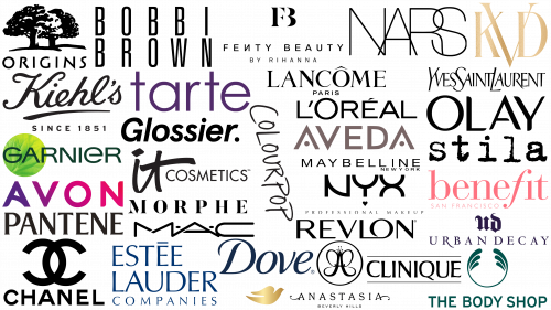
In the vast branding space, beauty industry logos hold a special place. These emblems are not just visuals; they embody a brand’s essence, philosophy, and promise of transformation. Given the ubiquity of beauty products and the brands behind them, these logos are imprinted in the collective consciousness of consumers, even if they are not avid followers of cosmetic trends.
The global cosmetics sector is booming, with the market projected to reach $758.4 billion by the mid-2020s. This rapid growth is reflected in an influx of fresh, inventive logos looking to leave an indelible mark on potential consumers.
Diverse in design, cosmetic company logos range from minimalist to extravagant. Luxury cosmetic brands often choose logos that exude elegance, sophistication, and timelessness, using strict fonts and muted colors. Casual beauty brands, on the other hand, prefer more vibrant, recognizable, and dynamic designs that resonate with a wide audience.
For example, the logos of well-known brands such as Body Shop or Clinique. It can be seen that such emblems often have a certain universality, which makes them easily recognizable in any country. Their designs strike a balance between brand heritage and modern aesthetics.
As more and more new players enter the beauty arena, the importance of a distinct and memorable logo cannot be overemphasized. These symbols serve as a visual representation of the brand in a crowded marketplace, providing an instant connection between the product and the consumer. Whether one is a beauty expert or a casual observer, the ubiquity of these logos in everyday life is undeniable. Their designs, colors, and fonts tell stories, evoke emotions, and make brands memorable in a sea of competitors.
L’Oréal
The globally recognized L’Oréal logo is a testament to the brand’s strong identity in the beauty industry. The centerpiece of the emblem is the distinctive enlarged letter “O,” which gives the word mark a whimsical and charming feel that sets it apart from the rest.
The intricate details in the word “L’Oréal” subtly take us back to the brand’s origins. Created in the enchanting city of Paris, the design elements reflect the timeless sophistication and artistic flair of French culture. These subtle touches give consumers a sense of Parisian elegance, encouraging them to associate L’Oréal with the unrivaled charm and sophistication of France.
As a brand, L’Oréal aims not just to sell products but to create experiences. Its logo encapsulates the essence of Paris, a city known for its fashion, art, and beauty, allowing the brand to resonate with a global audience.
Maybelline
Founded with a commitment to innovation, Maybelline has consistently been at the forefront of the beauty industry. The brand is committed to introducing new products on a regular basis, ensuring that its customers have access to the latest beauty trends. This progressive approach is reflected in the brand’s logo.
Maybelline’s visual uniqueness primarily relies on the word mark, which is a common approach among beauty brands. The choice of a clean sans-serif font emphasizes the brand’s focus on modernity and minimalism. Such a design is quite appropriate for a brand that seeks to embody both timeless elegance and modern aesthetics.
The simplicity of the logo, devoid of unnecessary elements, emphasizes the brand’s commitment to clear, uncompromising ideals of beauty. It subtly makes it clear that the brand understands the changing standards of beauty and strives to produce products that meet these ever-changing demands.
Chanel
For over a century, Chanel has been synonymous with elegance, luxury, and splendor. Established in France in 1909, the prestigious brand offers a wide range of products, from exquisite accessories to alluring perfumes and cosmetics.
The centerpiece of the brand identity is the iconic logo. Adorned with the brand name “Chanel” in bold sans-serif capital letters, it radiates modernity and is timeless. But what really stands out and has gained worldwide recognition is the emblematic monogram: the intertwined letters “C” symbolizing the brand’s founder, Coco Chanel. Over the years, this emblem has gone beyond mere branding to become a symbol of fashion and elegance for connoisseurs and admirers around the world. The intertwining “C” not only reflects Coco Chanel’s legacy but also carries an enduring sense of luxury and class that the brand has consistently maintained.
Dove
Dove, a global titan of the beauty industry, is a model of storytelling and expressive advertising. Recognized by many branding and marketing experts, the brand skillfully harnesses the power of story to connect deeply with its audience.
In a departure from typical cosmetic branding traditions, Dove chooses to use sentence case in its logo instead of the usual uppercase. This choice gives the brand a touch of familiarity and accessibility. The blue color in the design echoes the themes of calmness and reliability, reinforcing the brand’s commitment to genuine care and health.
An emblematic feature of the brand is the image of a golden dove beneath the word mark. This icon, which is both a mascot and a representative symbol, reflects the essence and values of the company. The golden dove symbolizes purity and peace and is a visual anchor that makes the brand instantly recognizable in any setting.
Estée Lauder
Estée Lauder, one of the most famous cosmetic brands, exemplifies the quintessential iconic imagery of beauty brands. This multinational company, hailing from the United States, has a diverse range of cosmetics, skincare, fragrances, and hair products to satisfy a wide variety of consumer needs.
Since its founding in 1946, the Estée Lauder brand has continued to thrive and is highly respected in today’s beauty market. The brand’s logo, an example of minimalist elegance, uses capital letters to create an aura of luxury and sophistication. The choice of dark blue shade in the design is not just aesthetic but also symbolic, embodying the concepts of reliability and trustworthiness. The combination of these design elements confirms Estée Lauder’s status as a brand that consistently demonstrates excellence in the beauty industry.
Lancôme
Founded almost 90 years ago, in 1935, Lancôme has cemented its reputation as a leading luxury brand in perfume and cosmetics. Hailing from France, a country known for its rich history in beauty and fashion, the brand ensures that its French heritage remains an integral part of its identity. This is evidenced by the inclusion of the word “Paris” in the logo, emphasizing its deep connection to French elegance.
The Lancôme badge is the epitome of understated luxury. Despite its straightforward design, the chosen serif font exudes refined sophistication and timeless charm. The font subtly conveys the brand’s commitment to offering classic and high-quality products. Even without flashy graphic elements or complex design, the brand’s logo remains iconic and instantly recognizable. Lancôme’s strength lies in its ability to intertwine heritage and modernity.
MAC Cosmetics
The renowned MAC Cosmetics brand, part of the Estee Lauder conglomerate, has made significant strides in the beauty industry since its founding in 1984. Due to its global reach, the company, although based in New York, has found its place in many parts of the world.
MAC Cosmetics’ visual style perfectly reflects its innovative and avant-garde spirit. The designs used in the logo are in line with the current perception of the core demographic – the younger generation.
With its distinct font, the MAC logo creates a sense of movement, which speaks to the brand’s rapid development and sensitivity to the latest beauty trends. Such design nuances subtly hint at the brand’s desire to keep up with the times, offering fresh and modern cosmetic solutions to its customers around the world.
Olay
Under the name Oil of Olay or Oil of Olaz, Olay has established itself as a well-known skincare brand under the umbrella of Procter & Gamble. The brand has chosen a specific marketing strategy for itself, often shrouding the functionality of its products in mystery, arousing the curiosity of consumers.
Over time, the Olay emblem has undergone changes, but its essence remains unchanged. The design of the emblem is characterized by a rectilinear lettering of the word mark, made in capital letters, which emphasizes its clarity and legibility. The accompanying underline under the brand name “Olay” further emphasizes the design.
Olay’s minimalist design reflects the brand’s confidence and commitment to producing quality products without unnecessary embellishments.
Pantene
Under the leadership of Procter & Gamble, Pantene has become a leading figure in the field of hair care products, widely represented on different continents. The company’s image is reminiscent of its numerous counterparts in the beauty industry.
Over the course of its existence, Pantene has tried many design variations, from elaborate embellishments to more modest approaches. The company’s symbolic representation has evolved to more closely resemble well-known names reminiscent of brands such as Revlon.
The modern Pantene logo is elegant in its simplicity. It utilizes a serif font typed in upper case, giving it an aura of sophistication and timelessness. This design, often rendered in a monochromatic black palette, provides versatility and compatibility across platforms and media. Simplicity enhances Pantene’s brand recognition and allows the products to speak for themselves.
Clinique
Clinique Laboratories is a beacon in a vast sea of cosmetic brands with a reputation that is virtually unrivaled. Since its founding in 1968, this respected brand has remained steadfast in its commitment to providing high-quality cosmetic solutions to its customers.
The brand’s global reach is evidenced by its more than 22,000 consultants worldwide, underscoring its influence and authority in the beauty industry. Clinique’s significance is evidenced by its recognition as one of the world’s leading beauty brands.
The logo, in a serif font, is framed by two horizontal lines – above and below the brand name. This design not only creates an atmosphere of sophistication but also inspires a sense of stability and reliability. The logo conveys the essence of the brand through its minimalist but effective design.
Yves Saint Laurent
Yves Saint Laurent, often abbreviated as YSL, is a beacon of sophistication and luxury in the beauty industry. Created in 1961, the brand has stood the test of time and set several benchmarks in the industry. The emblematic monogram, consisting of the intertwined initials of the brand name, has become synonymous with elegance and is now instantly recognizable around the world. The abbreviation “YSL” has become more than just a logo – three concise letters encapsulate the essence and ethics of the brand.
Directly under the Yves Saint Laurent logo is the full name of the brand, typed in elegant sans-serif font, which emphasizes its modernity. The design chosen by Yves Saint Laurent resonates with a wide audience. The logo gives the feeling that they are part of a world that values elegance, luxury, and timeless style.
Avon
Originating from the UK, Avon has gained worldwide recognition over the years. This world-renowned brand specializes in cosmetics, skincare, and personal care products and employs over 30,000 people worldwide.
Avon branding has undergone several metamorphoses. The modern emblem is a bright and dynamic word mark, shimmering with bright colors. The vibrant pink-purple color of the logo speaks of warmth, accessibility, and femininity, perfectly blending with the brand’s core offerings. The bold design epitomizes Avon’s progressive business model. This model utilizes a diverse group of commission-based sales representatives to become brand ambassadors and engage directly with customers, reflecting the company’s innovative beauty ethos.
Fenty Beauty
Fenty Beauty, a newcomer to the world of beauty brand logos, is rapidly carving a niche for itself in the market. Headed by the famous Rihanna, this brand boasts a modern logo that embodies the idea of creating an unrivaled customer experience.
The choice of sans-serif font emphasizes the brand’s commitment to keeping up with modern aesthetics. At the same time, the inverted letter “N” serves as a distinctive touch, adding an avant-garde twist to the brand identity. Further enhancing brand recognition is the use of the “by Rihanna” tagline, which not only emphasizes the celebrity’s direct involvement but also leverages her global recognition, instantly resonating with consumers familiar with her authority in the entertainment industry. This strategic engagement with a celebrity ensures that Fenty Beauty is clearly positioned in a saturated marketplace, emphasizing its fresh and innovative approach to beauty.
NARS
NARS holds a prominent place in the global elite of cosmetics, beauty, and skincare brands. The peculiar design of the logo, consisting of capital letters, reflects the essence of the brand’s modernity.
The intertwining of letters in the logo is not accidental. It is not just an aesthetic appeal but also the brand’s penchant for creativity and unconventional approaches. This intertwining subtly hints at the depth and complexity of the NARS product range. This emblem embodies the brand’s ethos and reflects its commitment to creating products that resonate deeply with its audience. In a world filled with countless beauty brands, NARS has successfully created its own unique identity, and its logo plays a key role in this.
Kiehl’s
Kiehl’s is a testament to the timeless elegance and tradition of cosmetic brand identity. With more than 150 years of history, the brand has firmly established its position as one of the pillars of the beauty industry.
The Kiehl’s logo is a harmonious blend of tradition and craftsmanship that captures the essence of the brand’s rich history. The inclusion of the phrase “Since 1851” attests to its reliability and decades of experience. This detail also emphasizes its proud pedigree.
Its design, reminiscent of hand-drawn calligraphy, evokes a sense of craftsmanship and attention to detail. The intricate swirls and deliberate curves of the letters are decorative in nature and serve as an indication of the meticulous craftsmanship that defines the company. Kiehl’s logo effectively conveys the richness of its past and the elegance of its present.
Aveda
Founded in 1978, Aveda has become a pioneering cosmetic brand that consistently showcases products of exceptional quality and uniqueness. Under the ownership of Estee Lauder, the brand has expanded its horizons to include not only skin and body care products but also exceptional hair care solutions.
Aveda’s commitment to excellence is not limited to creating products. The brand has dedicated part of its activities to nurturing future talent by providing cosmetology training, ensuring that its legacy continues.
The Aveda emblem is a testament to its pioneering spirit. The design of the emblem is emphasized by exciting geometric elements intertwined with the word mark. Of particular note is the modern rendition of the letter “A,” which translates into a sleek and contemporary design that reflects the brand’s forward-thinking approach to beauty innovation.
Urban Decay
Urban Decay has confidently positioned itself as an avant-garde force in the world of cosmetics. Drawing from urban culture and contemporary aesthetics, its brand identity is distinct from traditional beauty norms. The choice of a gothic font for the monogram is bold and original, hinting at a rebellious spirit and a desire to challenge the status quo.
The intertwining of the letters “U” and “D” anchors the brand name in the minds of the audience. It evokes a sense of unity and suggests that the brand combines multiple influences in its products, be it modern, urban, or classic.
While many brands in the cosmetics industry lean towards understated elegance, the Urban Decay logo loudly proclaims its individuality. It is aimed at a demographic that values individuality, dares to be different, and is not afraid to make unconventional decisions. This fearlessness is reflected in the brand logo, product lines, and advertising campaigns.
In a world where standing out is paramount, Urban Decay’s branding strategy is a master class in social visibility. It targets a niche audience.
Tarte Cosmetics
Hailing from the bustling streets of New York City, Tarte Cosmetics is making strides in the beauty industry. Founded in 2000, this relatively young brand has quickly carved a niche for itself among the recognized giants of the industry.
Refusing harmful chemicals, Tarte Cosmetics’ commitment to natural and organic ingredients sets it apart and aligns with the preferences of increasingly environmentally conscious consumers. The Tarte Cosmetics logo epitomizes modern minimalism – clean lines and discreet design. The unadorned, sleek typeface is eye-catching, conveying both elegance and accessibility. It demonstrates the brand’s desire to produce authentic products while staying within the boundaries of modern design aesthetics. With this combination of principles and design elements, Tarte Cosmetics remains a relevant and sought-after brand in today’s beauty world.
Benefit
Benefit, one of the leaders in the cosmetics industry, has an impressive history spanning more than four decades. Born from the entrepreneurial spirit of twin sisters Jane and Jean Ford, this iconic brand has transcended borders and is present in more than 30 countries.
In cosmetics logos, simplicity often resonates the most. The Benefit logo is a harmonious combination of minimalism and attractiveness. The name of the brand is executed in a lowercase font with serifs, which creates an aura of restrained sophistication and accessibility. Especially intriguing is the stylized letter “f” – a subtle hint of elegance and sophistication. An additional addition to the corporate style is the inscription “San Francisco,” located below the main word mark. It indicates the brand’s origins and gives it a distinct regional charm that resonates with locals and those who appreciate the city’s cultural vibrancy.
Bobbi Brown
Bobbi Brown, founded in 1991, is a kind of pillar of the Estee Lauder conglomerate. Despite being part of a larger corporation, the brand has earned a unique identity and reputation in the beauty industry. The centerpiece of this uniqueness is the Bobbi Brown emblem, exuding a modern style emphasized by the sans-serif font.
The careful crafting of the logo’s thin, balanced letters enhances its visual appeal. The emblem testifies to the uniqueness of the brand’s elegance and, at the same time, indicates the perspective of its vision of the world of cosmetics.
Anastasia
Anastasia Beverly Hills, a well-known cosmetics brand, is steadily gaining popularity, standing out among other cosmetics brands with a distinctive emblem. In contrast to the widespread trend of minimalism, characteristic of many cosmetic brands, Anastasia Beverly Hills makes a choice in favor of intricacy.
The central motif of the Anastasia Beverly Hills emblem is the captivating fusion of the letter “A” and the silhouette of a butterfly – symbols filled with meaning. While the letter “A” is an affirmation of the brand name, the butterfly often symbolizes transformation and beauty, suggesting the transformative power of makeup. Around the emblem is a loop, evoking a sense of unity.
The character of the emblem is further enhanced by the brand name – “Anastasia,” written with artistic precision. Located under it, the inscription “Beverly Hills” indicates the origin of the brand and its connection with the glamor and sophistication of the famous Californian city. Overall, the logo seamlessly blends elegance and creativity in the beauty industry.
NYX
Created within the L’Oreal family, NYX is a modern brand aimed at a youthful audience. Among the many cosmetic brand logos, NYX stands out for its undeniably modern aesthetic. Adhering to the common cosmetics industry trend of using word marks in branding, the font choice for NYX is striking.
The use of sans-serif capital letters in the “NYX” emblem demonstrates a harmonious design. The emblem sought to create a soft and approachable aura, avoiding hard and sharp edges. The use of semi-circular elements in the letters gives the emblem an element of openness that shows the uniqueness of the brand. The heart motif is subtly integrated into the NYX emblem. This heart, despite its diminutive size, carries a powerful message, symbolizing the brand’s desire to establish a heartfelt connection with its consumers. With this thoughtful design, NYX not only stands out visually but also resonates emotionally with its audience.
Revlon
Originally from the United States, Revlon is a world-renowned manufacturer of cosmetics, skincare, personal care, and fragrances. The founders launched the company in 1932, during the hard times of the Great Depression. In the decades since, Revlon has not only endured but thrived, cementing its position as a pioneer in cosmetics.
The symbolic Revlon logo, although it repeats some common features inherent in famous cosmetic brands, nevertheless has its own unique personality. The sans-serif logo chosen for the design exudes a sense of modernity and clarity. Particularly intriguing is the merging of the letters “L” and “O,” which subtly hints at the brand’s penchant for artistic taste. This subtle intertwining of letters symbolizes the fusion of art and science, the two main pillars on which the cosmetics industry stands.
The simplicity and elegance of the Revlon logo make it instantly recognizable, confirming its status as a leading and progressive brand in the beauty industry.
Origins
In the vast world of logos for cosmetics, the most successful ones often echo the core values and distinctive features of their brands. The Origins logo is a prime example of this. The logo exudes a sense of modernity while being eye-catching through the use of a modern sans serif font for the lettering.
Above this mark, twin oak trees stand out prominently. These trees adorn the design and emphasize the brand’s continued commitment to using natural and organic elements in its products.
The color palette, dominated by green, reinforces this idea. It’s not just a hue; it’s a reflection of the brand’s ethos. Green is a symbol of nature, purity, and sustainability, further emphasizing Origins’ commitment to creating products that are in harmony with nature. With this combination of imagery and colors, the logo effectively communicates the essence of the brand, setting it apart in a competitive market.
ColourPop Cosmetics
ColourPop Cosmetics has established its brand identity in the competitive cosmetics market with a dynamic logo that matches the spirit of the brand. Featuring a playful handwritten style, the logo features different-sized letters that skillfully emphasize the “pop” essence of the brand.
Despite using the British spelling of the word “Colour,” the brand has a significant place in the American cosmetics market, being one of the leading cosmetics brands in the US. This slight nuance in spelling further emphasizes the uniqueness and global appeal of the brand.
IT Cosmetics
IT Cosmetics is an independent brand that is part of the world-renowned L’Oreal conglomerate. This brand, the brainchild of Jamie Kern Lima, decided to create its own identity rather than follow the tail of a well-established parent company.
At the heart of IT Cosmetics’ visual uniqueness is its iconic logo. The initial hand-drawn portion of “IT” resembles the brush strokes of an artist, hinting at the brand’s craftsmanship and creative nature. This skillful image flows seamlessly into the straightforward “cosmetics” font, embodying a combination of artistic taste and modern minimalism. This design choice echoes the brand’s mission: to unite the art and science of beauty while providing simplicity and elegance. The combination of these elements emphasizes the brand’s modern essence in the vast world of cosmetics.
The Body Shop
In the beauty industry, people often gravitate towards sleek, minimalistic designs. The Body Shop chose a symbol that embodies a broader vision. The emblem, which is circular in shape, suggests a global perspective, showing the universality and inclusiveness of beauty.
The resemblance to a laurel wreath lends elegance and evokes feelings of victory, achievement, and prestige, hinting at the brand’s superiority and dominance in the field. This time-honored symbol is a nod to ancient traditions and craftsmanship, subtly reminding consumers of the age-old rituals and beauty practices the brand can inspire.
The prominent green hue in the logo emphasizes the company’s commitment to environmental sustainability and ethics. Green is a color often associated with nature, showing The Body Shop’s desire to use responsibly sourced ingredients and create products that are effective and planet-friendly.
The Body Shop emblem symbolizes more than just beauty. In a market full of brands, this distinctive logo serves as a beacon for those who prioritize natural ingredients and social responsibility when choosing cosmetics.
Morphe
Launched in Los Angeles in 2009, Morphe, often referred to as “Morphe brushes” or “Morphe cosmetics,” has made its mark in the beauty industry. An important factor in its success has been the adoption of digital retail channels and strategic partnerships with high-profile beauty personalities.
The Morphe logo stands out from the crowd and epitomizes the brand’s ethos of combining tradition and modernity. The design evokes a sense of luxury and exclusivity, with a serif font used for the lettering. This design choice reflects the company’s commitment to offering the highest quality products. The synergy between business strategy and visual style undoubtedly contributes to Morphe’s prominence in the cosmetics industry.
Glossier
Glossier has become a well-known beauty brand not only in the United States but around the world. Founded in 2014, the brand is the brainchild of Emily Weiss, whose visionary approach has been the key to the company’s success.
At the core of the brand’s ethos is a desire to emphasize the innate beauty of people around the world. This refreshing and sincere stance on cosmetics has played a significant role in bringing Glossier to the limelight. The company’s laid-back attitude is reflected in its logo: a clean, sans-serif font. This design choice emphasizes the brand’s desire to offer simple, authentic products without excessive frills or pretense. The minimalism of the logo testifies to Glossier’s transparent approach, symbolizing purity and an unbiased attitude toward the world of beauty.
Stila
The epitome of ideas and craftsmanship in the cosmetics industry, Stila stands out for its uniqueness in creating modern products. Not just limited to cosmetics, the company embodies ethical values, advocating for cruelty-free offerings and transparency in all its endeavors.
The Stila wordmark exudes familiar features, balancing modernity and nostalgia. Hard lines and severe angles are absent, replaced by a fluidity that reflects the brand’s ethos. Notably, the design has a playful yet refined feel, evoking memories of words neatly printed on a classic typewriter. This design evokes a sense of authenticity and trust, reminiscent of a time when every keystroke mattered, as did every Stila product. This combination of creativity positions Stila as a brand that values tradition in an ever-evolving beauty industry.
KVD Vegan Beauty
In the realm of beauty brands, the influence of a company’s founder often casts a long shadow and resonates deeply in the design elements of a brand’s logo. Such was the case with the brand created by the famous pin-up icon and tattoo artist Kat Von D.
The logo of this brand symbolizes the Kat Von D style and serves as a beacon of the brand’s core values. The products proudly bear the label “Cruelty-Free,” and the logo is a testament to this uniqueness. The logo is based on the subcultures of heavy metal and gothic, giving it a unique and bold aesthetic.
Delicate yet bold calligraphy defines the brand, offering a combination of elegance and a rebellious touch. This combination – beauty with a twist – perfectly captures the essence of the brand, promising products that are as unique and individual as the consumers they are aimed at.
Garnier
Garnier, a well-known cosmetic brand on the market, presents a logo that vividly reflects its essence. Central to its design is a circle, which speaks to the brand’s holistic approach to its offerings.
Strategically important is the inclusion of a leaf motif in the circle, which shows that the brand relies on ingredients of natural origin. This element suggests that consumers are prioritizing natural products in their beauty practices, which is in line with Garnier’s ethos of using nature’s bounty.
The typographic elements of the logo further emphasize the uniqueness of the Garnier brand. The predominance of uppercase letters lends authority, while the lowercase ‘e’ is a deliberate departure that demonstrates the brand’s innovative spirit. This subtle design choice subtly conveys the brand’s commitment to creating products for a diverse audience, ensuring inclusivity and broad appeal.
The Aesthetics of Cosmetic Brand Logos
In the diverse world of branding, cosmetic industry logos have carved a niche for themselves. These visual symbols are more than just aesthetic design; they reflect a brand’s ethics, values, and commitment to transforming its consumers.
The global beauty market and logos are evolving with it. As brands strive to stand out in an oversaturated market, their logos are becoming a key element of brand memorability and consumer loyalty.
One notable trend is the gravitation towards minimalism. This manifests itself in the increasing use of clean lines, neutral colors, and straight fonts. The intent is clear: to convey sophistication and authenticity without excessive embellishment. Minimalist logos often embody a modern and clean aesthetic, aiming to resonate with consumers looking for authenticity and transparency in the products they use.
Some brands lean toward complex designs, weaving intricate patterns or using bolder colors. This variety of design approaches targets different market segments, from luxury brands looking to emphasize luxury and exclusivity to more mainstream brands targeting a broad audience.
Regardless of the design approach, the intent behind these logos remains the same. Each one is created precisely to tell a story or convey a brand’s philosophy. They act as silent ambassadors, subtly conveying the brand’s values and promises each time they appear on a product or in an advertisement.
While there are a myriad of logos on the market, from the luxurious to the most ordinary, their purpose remains the same: to imprint the brand in the consumer’s mind to ensure brand recognition and loyalty. Thus, the art and science behind these logos play a key role in the brand’s presence and success in the market.
