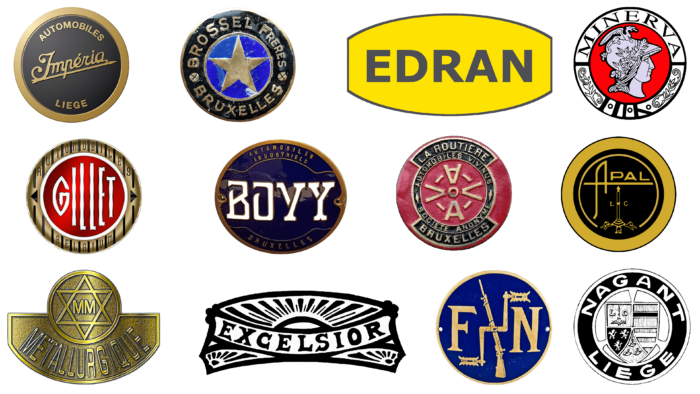
Although Belgium is not a leader in the automobile industry, it was once a founding member. Some Belgian companies entered the specialized market in the mid-1850s, others in the early part of the past. But both have made huge contributions to the global automotive industry. Some of them still exist, pleasing car enthusiasts with good European products. Each brand has or has its own insignia, which aptly characterizes branded cars. We have selected 12 legendary brands, having arranged them according to the time of their existence.
Edran
This company has been operating since 1984, offering two types of cars – with 4 and 8 cylinders. The power of the former is 150-180 hp (depending on the equipment), the latter – 800 hp. Each model has a well-recognized Edran logo: an oval with cut ends and the name of the company manufacturer. The background is a rich yellow. On it – bold grotesque inscription in graphite with narrow inter-character intervals. The letters are even, geometric, uppercase. A thin black stripe surrounds the ellipse on the edge, making the emblem clearer and more expressive.
APAL
This company still exists today, but the APAL logo is better known in Germany since it moved there in 1998. The immediate time of the foundation was 1961. The main model range includes sports cars, SUVs, and racing cars. For them, the manufacturer came up with an interesting emblem, similar to a classic speedometer with an arrow. The dial also features a thin circle and a stele resembling a speed indicator. In addition, there is a wide ring and a frame complemented by a narrow stroke. In the center, the company name is presented in an original way – an abbreviation of Application Polyester Armé de Liége. It is located on a horizontal strip, which is at the same time a crossbar of the first “A.” The letter is gracefully curved and decorated with an elongated stem. The rest of the glyphs are low and wide. The font is uppercase, sans-serif.
Brossel
The Brossel logo was traditionally round. It consisted of two elements. The first was a golden star on a bright blue background, located in the very center of the emblem. The second – a black band with inscriptions separated by cross-shaped screws. These are the inscriptions “Brossel Freres” (above) and “Bruxelles” (below). The text has been typed in cut-through glyphs in the business style. The outer border was designed as a solid gold ring. This visual style is rare today, as the company ceased to exist in 1968 (founded in 1912). The reason for its departure from the automobile market was the collapse of the Leyland Motors concern, to which it belonged. The manufacturer was engaged in the production of buses of all types and was very popular.
Gillette
The logo of the motorcycle brand Gillet was round and unique. In the central part, there was a red circle with a gradient and a white name. The symbols were thin and elongated upwards: the smallest were on the edges, the largest in the middle. They were surrounded by a golden-beige band with two inscriptions: “Automobiles” and “Belgium.” But the text did not have a classic arched shape – it was horizontal. All the glyphs were neatly separated by tiny dashes and designed in a simple style. To the right and left of the center section were two arrows in the form of small black triangles. This company existed from 1919 to 1959. It was engaged in the production of motorcycles. Its lineup also included a three-wheeled vehicle.
Bovy
For the car manufacturer Bovy, the logo was oval, dark blue, with a thin copper frame, confirming the brand’s affiliation with the automotive industry. In the center was a white inscription – the name of the company, typed in an individual font in upper case with thin lettering. The letters had a characteristic feature: their lines seemed ragged and completely disconnected. There were also two curved bands inside, connecting the right and left sides of the oval. They separated the words “Automobiles Industriels” and “Bruxelles” written in small grotesque letters. Such a badge was painted on cars and trucks of small tonnage from 1902 to 1929. The last models of this brand appeared in the 50s of the 20th century and have not been produced since then.
Minerva
The Minerva logo first appeared on the market in 1900 with the production of motorcycles and bicycles, which made up the main lineup of this Belgian company. Gradually, sedans, SUVs, and crossovers were added to them. The manufacturer disappeared from the automotive industry in 1956. Before that time, its products painted a badge with the same name as the Roman goddess of skill and wisdom. The emblem consisted of a red circle, in the center of which was a gray female head in a helmet decorated with small leaves and a miniature dragon. A wide white stripe with the brand name and floral ornament made with a thin outline served as a frame.
Imperia
This Belgian company was disbanded in 1948 after 40 years of existence. It specializes in the production of passenger cars of several brands. It had its own proving ground and a car of the same name, which Carat-Duchatelet tried to revive in 2008 by opening pre-orders for it. However, due to bankruptcy, the project was stopped. Only the golden-black Imperia logo has survived to this day. It was a circle with a diagonal arrow, on which there was a figurative inscription with rounded letters and a vignette “I.” Above and below were the words “Automobiles” and “Liege.” All these elements were surrounded by a gold border. It was wide.
FN
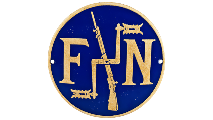
At first, this company produced only weapons and then switched to the production of bicycles, motorcycles, and cars (sports and premium). Moreover, it became the longest-lived Belgian car brand, as it was engaged in them from 1899 until the early 1940s. The FN logo reflects that time: a long-barreled gun and a bicycle part with pedals in the center section. They are crossed, indicating their equal importance to the manufacturer. On the right and left sides is the abbreviation of the full name of the brand, Fabrique Nationale. “F” and “N” are presented in the Gothic style: refined and elegant, with serifs smoothly transitioning into the legs of the letters. The background is a dark blue circle taken in a silver ring.
Nagant
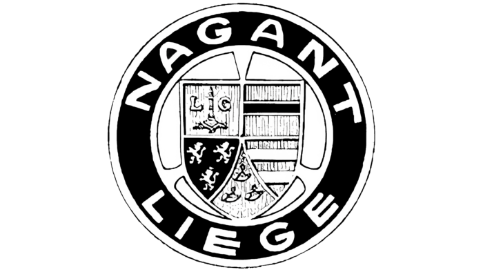
The Nagant logo, like the name of this company, is still known all over the world. After all, in addition to trucking, it was engaged in the production of small arms, the name of which became commonplace. The word “revolver” denotes a type of revolver, although it is simply the name of the founders of the company – brothers Emil and Leon Nagant. They opened their factory in 1859, and in 1931, Imperia bought it and gave up making cars. They were classic passenger cars of the early 20th century, as well as roadsters and premium cars. On their hood was an emblem in the form of a 3-sided shield divided into five parts. Each of them had heraldic elements, so the emblem echoed the coat of arms of the province of Liege. The shield was located on the background of three curved stripes. They were surrounded by a wide black line with the inscriptions “Nagant” (above) and “Liege” (below). The inscriptions were in capital letters.
Excelsior
This is one of the progenitors of the Belgian automobile industry. The company started its activity in 1903 and closed in 1929. Its main direction was roadsters and other powerful cars. The cars of the brand even participated in various high-level races. The Excelsior logo was made for them – trapezoidal, monochrome, and conceptual. The sun, which rose because of the brand name, added ideology to it. The rays were long and almost reached the curved top edge. Some of them were wide; others were narrow. Fragments of the rayed sun were also in the lower corners of the emblem. The background for the inscription was a wide band in the shape of an arch. The letters were bold, with shaped serifs.
Metallurgique
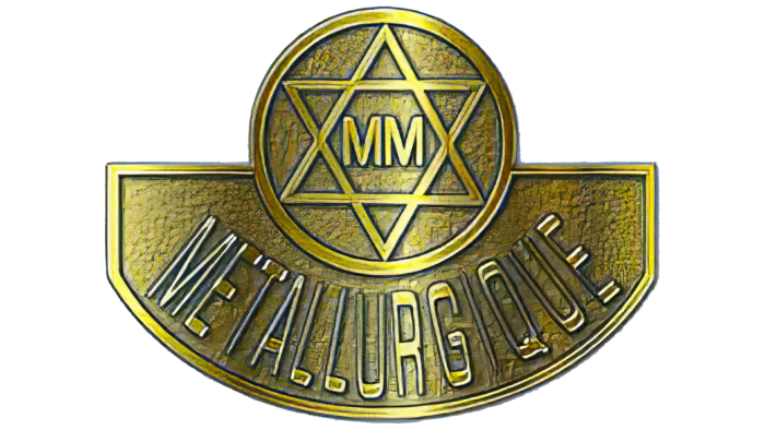
The Metallurgique emblem was prominent from 1898 to 1928 when the company was producing high-powered passenger cars. It was also one of the pioneers of the Belgian automobile industry. She chose a complex geometric figure as her personal insignia. At its top was a circle with a pentagram – two isosceles triangles superimposed on each other. In the center, in large letters, was indicated “MM”, and below – was the full name of the company. It was typed in a capital sans-serif font. The color of the logo was copper with a gradient.
Vivinus
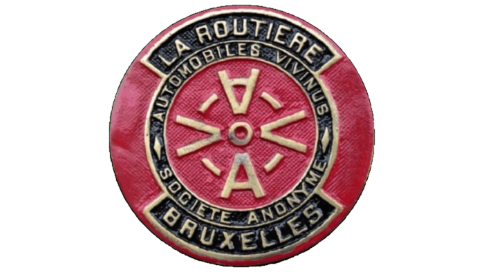
This automobile company ceased to exist in 1912. Having appeared in 1890, it first started selling cars of German brands and then switched to their independent development. The Vivinus logo was similar to a seal and was a red circle with information about the manufacturer. In the center were two letters, “A” and two, “V.” They were centered and separated by four miniature lines.
