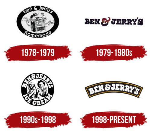
The Ben and Jerrys logo is simple and recognizable. The emblem hints at the main ingredients used to create their sweet treats. Behind the symbols lies stability and loyalty to beloved flavors.
Ben and Jerrys: Brand overview
Ben & Jerry’s is a brand of ice cream, sorbet, and other sweet products from Vermont. Since 2000, it has belonged to the British corporation Unilever, which specializes in food products. The Ben & Jerry’s logo is displayed in franchise stores.
In 1978, in Burlington, Vermont, two friends, Ben Cohen and Jerry Greenfield, started an ice cream brand with $12,000. They turned an old gas station into their first shop. Their goal was simple: make great ice cream in a good way. This idea made Ben & Jerry’s a big name in ice cream, known for fun flavors like “Cherry Garcia” and “Chunky Monkey” and for using quality ingredients.
Ben & Jerry’s stood out because it cared about more than just profit. It was one of the first to mix making money with doing good, giving part of its earnings to charity, buying from local farmers, and using eco-friendly packaging.
In the 1980s, they started opening shops outside Vermont and selling in grocery stores. People all over the country loved their ice cream and what the brand stood for. In the 1990s, Ben & Jerry’s went international, opening a shop in the United Kingdom and expanding to over 20 countries. Even when they joined Unilever in 2000, they kept their unique identity and continued their good work.
Ben & Jerry’s has always supported important causes like marriage equality, racial justice, and fighting climate change. They’re not just about ice cream; they’ve become known for standing up for their beliefs.
Today, Ben & Jerry’s is in over 35 countries, with over $1.2 billion in annual sales. They’re still based in Vermont and stick to their original mission: making delicious ice cream that makes customers and the world happy. After over 40 years, Ben & Jerry’s has shown that a company can do well by doing good and earning a special place in the hearts of ice cream lovers everywhere.
Meaning and History
Ben Cohen and Jerry Greenfield initially conceived the ice cream business as a temporary springboard to raise money for freight transportation. The partners planned to buy a truck and transport goods within a year. However, the sweet brand was so successful that within two years, the friends distributed ice cream to stores nationwide and opened branded shops. Within ten years, Ben & Jerry’s received an award for a successful small business from the President of the United States.
The full name of the company is Ben & Jerry’s Homemade Holdings. However, only the first part, which tells the story of the friendship between the two hippies who decided to start a business that brings joy to people, is used for the logo.
What is Ben and Jerry’s?
A famous ice cream brand produced in pints. The brand was founded by two friends in 1978. In addition to ice cream, Ben & Jerry’s also offers sorbet, sherbet, cookies, pancakes, frozen yogurt, and other sweet products under its name.
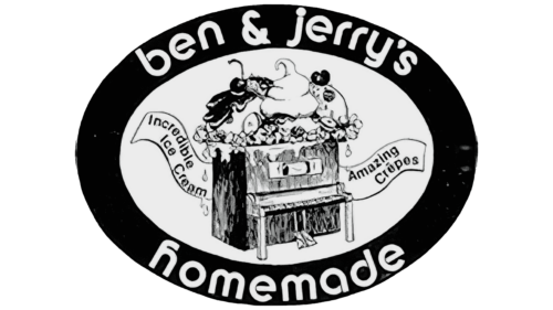
1978 – 1979
The first logo was intended to show that Ben & Jerry’s ice cream was made to perfection. The concept choice was quite fitting, considering the creators were former hippies who highly valued music.
Inside an oval frame was a piano, with ice cream from the top lid and cash register tape on the sides. The tape moved when the piano was played, and the ordered popsicle or crème brûlée appeared at the top.
Three scoops of ice cream, generously decorated with fruits and nuts and drizzled with chocolate, demonstrated the abundance of options and flavors. Napkins on the front of the instrument indicated attentive service.
The checks were engraved with “incredible ice cream” and “amazing pancakes.” The company name and a message about handmade production were placed around the oval. Before opening a kiosk in a former gas station, the partners took correspondence courses in ice cream making at the University of Pennsylvania. The inscription also indicated that each customer could create their dessert, combining its fillings and toppings.
Using first names rather than surnames for the brand emphasized the philosophy of universal love preached by hippies and the long-standing friendship between the partners. Names allowed the owners to become closer to customers and communicate with them as equals, like friends. Sweet desserts are mainly bought for children; addressing adults by their first names is quite childlike. Therefore, the name was conducive to making a purchase.
1979 – 198?
The brand became incredibly popular. People from all over the city flocked to the small shop to buy a portion. Therefore, the friends decided to continue the business. To mark their success, they established Free Cone Day on the brand’s founding date, when their cones were given away for free.
The logo was simplified, leaving only the name, as the combination of Ben & Jerry’s no longer needed additional images. The partners wanted customers to absorb and remember the main focus visually.
However, they couldn’t completely abandon the cheerful mood. To the simple names in a black serif font, they added a bright element in the form of an “&.” The lines of the ampersand were colored in three shades: red at the top, yellow in the middle, and blue at the bottom. The color scheme reminded customers of the flavors and sensations their taste buds would experience – from delight to cold.
The symbol “&” was slightly transformed. It resembled a teacup with steam rising from it and a bowl with scoops of ice cream and a spoon. This element indicated a sweet, delicious treat and a café where one could order dessert and a drink.
199? – 1998
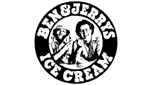
Ice cream production expanded. Franchise stores appeared, and delivery was available throughout the country in packaged containers. For the round cups of their products, a logo in the style of a vinyl record was designed. It featured a black circle with a photo of the partners in the center and a white inscription around the rim, “Ice Cream by Ben & Jerry’s.”
The logo emphasized the personalities behind the brand. The photo brought the producers closer to the customers, making them realize they were dealing with specific individuals rather than a faceless factory. The visual connection built trust, and the smiling faces conveyed the brand’s friendliness.
The black and white style alluded to timeless values and time-tested quality. During this period, the friends began to take an interest in raising funds for improving Earth’s ecology, opposing the use of recombinant hormones for animals, and supporting a children’s protection fund. As a result, the brand became a producer of tasty desserts and a promoter of ideas that improved life.
1998 – today
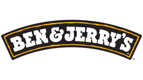
A complete image overhaul was undertaken to celebrate the company’s 20th anniversary. A new packaging design was created for pints of ice cream, and the logo was changed.
The emblem consists of the brand’s name in white font placed on a black arc-shaped background with a yellow outline. The arc and background suggest the packaging containing the portion. Like an awning, the curve represents the protection under which all products produced by the company are distributed.
Often, a blue symbol depicting a cow is displayed on the packaging, appearing after the brand began fighting for the health of dairy breeds and preserving family farms.
Two years later, the founders sold the business. Since the acquisition, the brand’s active development has ceased, stopping at what had been achieved.
Font and Colors
The primary brand colors are white, black, and yellow. The black color hints at chocolate, the yellow line reminds customers of caramel, crispy wafers, and pancakes, while the white letters symbolize vanilla ice cream. Although the company offers many different dessert variations, vanilla ice cream was chosen as a reminder of the events of 1983 when the largest ice cream at the time, weighing 27,000 pounds, was made from Ben & Jerry’s products.
The font of the inscription resembles Bixa Black and Burger Italic with sharp serifs and a rounded drop at the end of the J, similar to a scoop of ice cream.
FAQ
What does Ben and Jerry’s logo mean?
The Ben & Jerry’s logo shows a cow in front of green hills, which means a lot for the brand. It’s not just about looking fun. It shows what the company stands for making great ice cream in a way that’s good for the planet and the animals. The cow in the logo points to how important milk is for their ice cream, and they’re very picky about it. They use milk from happy cows.
Caring about happy cows shows that Ben & Jerry’s cares about animals and how they’re farmed. They ensure the milk and cream they use come from farms that treat their animals well. They believe happy cows produce better milk, making their ice cream taste great.
The green hills in the logo show that Ben & Jerry’s loves nature and wants to farm in a good way for the earth. This is reflected in how they choose their ingredients and packaging to ensure they don’t harm the planet.
So, the Ben & Jerry’s logo is a promise to their customers. It means that when you buy their ice cream, you’re getting something delicious, and it also helps support good practices for animals and the earth. Ben & Jerry’s uses this logo to tell everyone they’re serious about making top-notch ice cream without forgetting their responsibility to the world.
What is Ben and Jerry’s brand?
Ben & Jerry’s is not just about top-notch ice cream. It represents creativity, caring for society, and looking after our planet. On May 5, 1978, in Burlington, Vermont, two buddies, Ben Cohen and Jerry Greenfield, opened their first ice cream shop. From there, it became a brand known around the world. Despite its worldwide fame, Ben & Jerry’s has stayed true to its original vibe of being fun and focused on making a difference.
In 2000, the big company Unilever bought Ben & Jerry’s. People were worried this might change Ben & Jerry’s, but it didn’t happen. Ben & Jerry’s kept its independence, sticking to its ways of doing business right and supporting good causes. Being under Unilever helped Ben & Jerry’s spread even more globally.
The main offices and factory are still in Vermont, close to where it all started. The factory in Waterbury isn’t just for making ice cream; it’s a place where people can learn about the brand’s story, how they make ice cream, and what they stand for.
Ben & Jerry’s is known for its creative ice cream flavors with fun names, but there’s more. The company is really into supporting important issues like protecting the environment, fighting for justice, and ensuring farming is done well for the earth.
So, Ben & Jerry’s is all about great ice cream positively impacting the world. Its success shows that you can run a big business and still stick to your values, making products that people love and do well.
What was Ben and Jerry’s originally going to be?
Before Ben & Jerry’s was known for their ice cream, Ben Cohen and Jerry Greenfield had a different idea. They wanted to start a bagel company. They planned to deliver bagels, lox, cream cheese, and the New York Times to people’s homes on Sundays. They thought this would bring some of New York’s breakfast experience to their area and make people’s mornings easier and more enjoyable.
But when they started investigating, they found that bagel-making equipment was too expensive for their budget. This problem made them look for another option that cost less to start. That’s when they thought of making ice cream instead. The equipment for making ice cream was much cheaper than for bagels.
Switching to ice cream was a great move for Ben and Jerry. It turned their small start-up into one of the most popular ice cream brands. Their ice cream is known for being unique and high-quality. Plus, they are also known for caring about social and environmental issues.
Ben and Jerry’s story shows that they are flexible and creative businesspeople. When their first idea didn’t work because it was too expensive, they didn’t give up. Instead, they found a new idea that fit well with what they wanted to do. The story of how they started adds a special touch to the Ben & Jerry’s brand, showing that sometimes unexpected changes can lead to success.
Is Ben and Jerry’s American?
Yes, Ben & Jerry’s is an American company. It all started in 1978 when two friends, Ben Cohen and Jerry Greenfield, decided to make ice cream. They had just learned how to do it from a $5 course. They opened their first shop in a place that used to be a gas station in Burlington, Vermont. Vermont was a great choice because it’s a place where people care a lot about their community and the environment. This matched what Ben and Jerry wanted their ice cream brand to stand for.
Ben & Jerry’s wasn’t just about making ice cream from the start. They wanted their business to help the community and work on important social issues. Over time, the brand became famous for its unique and tasty ice cream and efforts to make the world a better place. They take on big issues like climate change, equal rights, and justice for all.
So, Ben & Jerry’s is a true American success story. It shows how a small idea between friends can grow into something big and influential. Even as it became a global brand, it never forgot its roots in community care, protecting the environment, and fighting for what’s right.
What’s so special about Ben and Jerry’s?
Ben & Jerry’s ice cream stands out because of how good it tastes and the quality behind it. They’re known for creating interesting flavors that mix old favorites with new, surprising ingredients. This means there’s something for everyone, whether you like classic tastes or want something different.
What makes their ice cream special is the ingredients they use. They choose high-quality stuff, prefer to buy from local and fair-trade sources, and avoid GMOs. This makes the ice cream taste better and supports good farming practices. Imagine the rich flavor of fresh dairy mixed with real fruits, nuts, and chocolates. That’s what makes every scoop of Ben & Jerry’s so satisfying.
They don’t stop at flavor. Ben & Jerry’s also throws in big chunks of goodies like chocolate, cookie dough, and brownies and mixes them to make every bite interesting.
But there’s more to Ben & Jerry’s than just tasty ice cream. They care a lot about important issues like fighting climate change, paying farmers fairly, and supporting social justice. Buying their ice cream means you’re also supporting these causes, which makes it taste even better.
In short, Ben & Jerry’s is more than just an ice cream brand. It’s about delicious flavors, quality ingredients, doing things differently, and helping improve the world. This combination is why Ben & Jerry’s is special in ice cream.
What is the most popular flavor of Ben and Jerry’s?
Ben & Jerry’s ice cream stands out for a few key reasons, and their amazing flavors are at the top of the list. They’re known for creating unique and exciting flavor combos, mixing traditional tastes with new, surprising ones. This means they have a wide range of flavors that appeal to everyone, whether you’re into classic flavors or looking for something new.
A big part of why their ice cream tastes so good is because they use high-quality ingredients. They go for local and fair trade items when they can, supporting good farming practices and ensuring the stuff that goes into their ice cream is top-notch. This includes using the best dairy, fruits, nuts, and sweets, contributing to their rich and delicious ice cream taste.
Ben & Jerry’s also adds special touches to its ice cream, like swirls of caramel or fruit jam and big chunks of chocolate, cookie dough, or brownie. These aren’t just thrown in; they’re carefully mixed in to ensure you get a great mix of flavors and textures in every bite.
Besides the flavors, Ben & Jerry’s stands out because they care about social and environmental issues. Buying their ice cream means you’re supporting efforts to combat climate change, ensure fair pay for farmers, and back social justice causes. This makes enjoying their ice cream feel even better.
In short, Ben & Jerry’s offers a special ice cream experience. It’s not just about the delicious, unique flavors and high-quality ingredients; it’s also about their effort to improve the world. This combination makes Ben & Jerry’s more than just an ice cream company.

