


![]()
BERO, a premium non-alcoholic beer brand, has introduced a new visual identity and logo emphasizing its dedication to quality and innovation. Created by Brooklyn-based CENTER, the redesign balances sophistication and approachability, reflecting the brand’s goal to appeal to a wide audience.
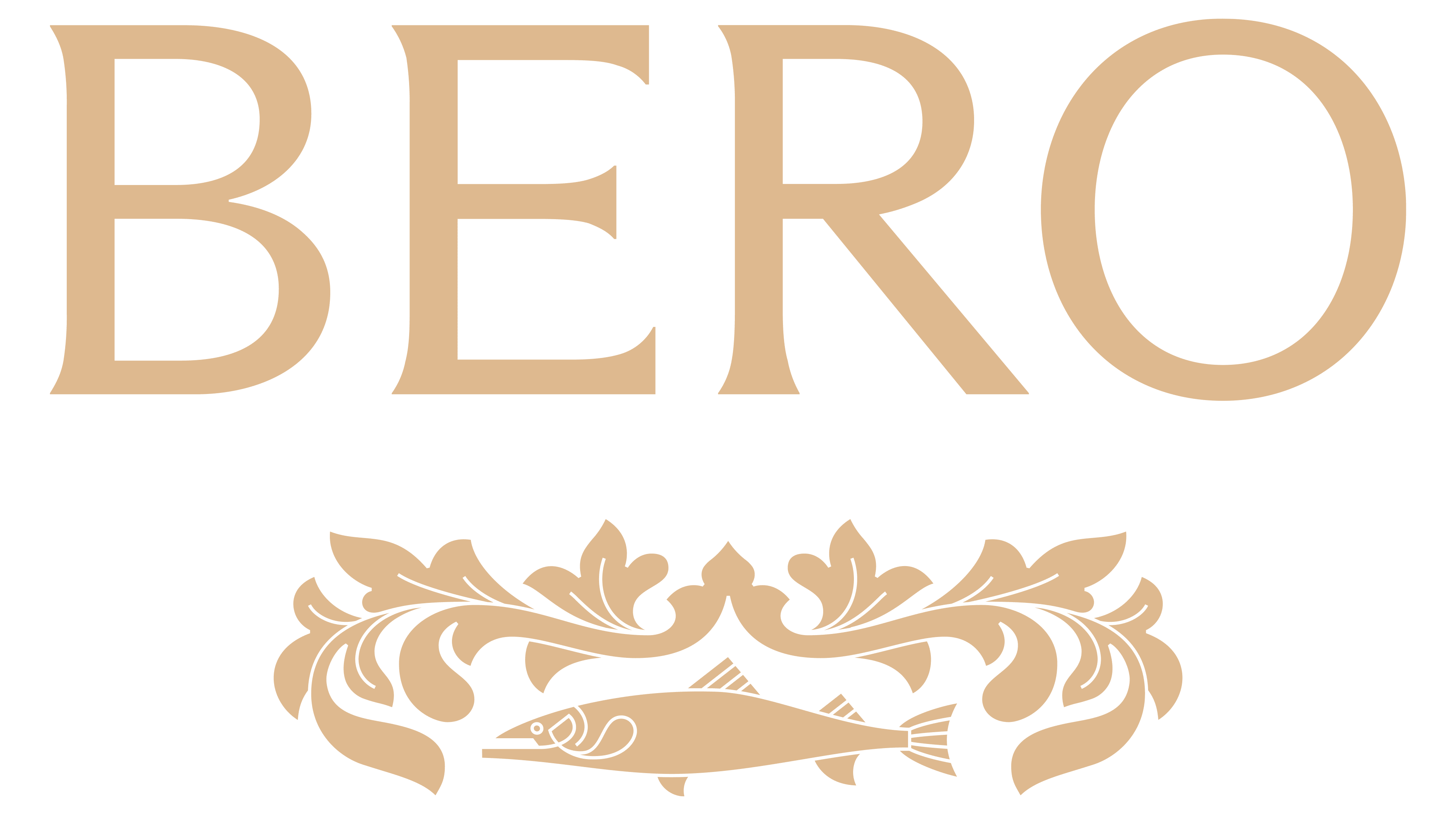
The updated logo features a serif typeface with flared accents, adding an elegant and refined touch. The chosen font, Dinamo’s Arizona Flare, gives the logo a distinctive look. Most of the letters have a smooth flow, but the rigid, unflared leg of the “R” introduces a subtle contrast. This blend of structure and fluidity mirrors the fusion of tradition and modernity at the brand’s heart.

Alongside the wordmark, a fish symbol adds a layer of storytelling. Inspired by the coat of arms of the Royal Borough of Kingston Upon Thames, the hometown of founder Tom Holland, the fish connects the company to its historical roots. Combined with an abstract filigree design, the symbol combines heritage and contemporary aesthetics. Both elements are rendered in a muted, single-color scheme, creating a cohesive and sophisticated visual impression.
The color palette is simple, with black text on a white background, giving the design a minimalist feel. This restrained approach highlights clarity and professionalism while keeping the brand name as the focal point. The clean, monochromatic style ensures the logo is versatile and impactful across different platforms.
The typography throughout the visual identity complements the logo by blending sans-serif and script fonts. This pairing adds a touch of warmth and character, balancing formality with a welcoming tone. The careful typesetting, a mix of sentence and uppercase styles, and muted color tones contribute to the overall harmony of the design.
This refreshed branding reflects a mission to change how people see non-alcoholic beer, presenting it as a sophisticated and desirable choice. The minimalist design focuses on quality, innovation, and accessibility. By incorporating historical and personal elements into a modern framework, the new identity sets the brand apart in the expanding non-alcoholic beverage market.