Founded in 1945, the Canadian insurance company The Co-operators Group decided to expand its business. In addition to various types of insurance, other comprehensive financial services have also become available. In this regard, a complete rebranding of the internal and external components of the entire business strategy was carried out. The logo has also undergone dramatic changes. This will increase the level of individuality and recognition of the company in the financial market.
The new style allows you to experience a complete brand transformation. As a result of these changes, a transition was made from the classic logo, originally designed to provide only insurance services. It was driven by a desire to invest in it, a sense of purpose, and forward-looking financial foresight. Thus, any customer who contacts the company will have the confidence of unprecedented personalization. The Co-operators Group handled this task together with the design and digital marketing agency Huge.
The new brand is based on the desire to ensure that it continues to attract relevant attention. For 44 years, it has not undergone any changes. So, having a solid foundation for development, it was decided to create a brand with a future perspective.
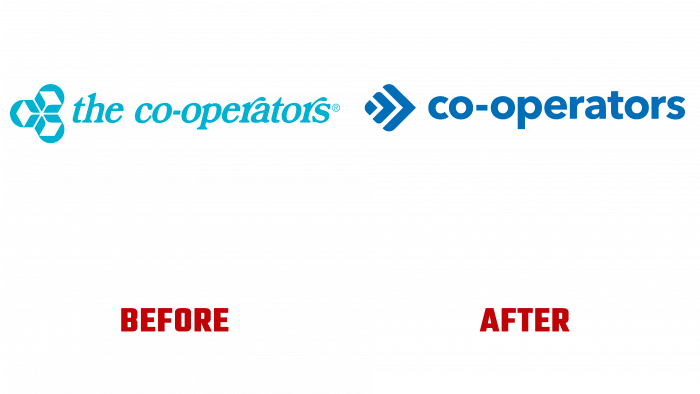
The new logo features a modern vision of an arrow-shaped oak leaf. It consists of three parts that are in harmonious movement relative to each other. This is how the humane attitude to the company’s business is expressed, rooted in the past. And the arrow marks continuous development and adherence to modern trends, thereby separating itself from other companies in this field. At the same time, she demonstrates the priority of assisting clients in their financial growth, which she puts first.
While creating a new brand identity, attention was paid to simplicity and conciseness. New digital technologies have made it possible to improve the quality of the color gamut and curves. And the reliability of the external components emphasizes the individuality and consulting approach of Co-operators. This reflected the desire to show everyone what real personal service is.
In less than a quarter of a year, the company’s branches plan to completely replace old signboards with new ones with a changed brand. The changes will last until the end of this year. The Epitaph Group, which acted as a partner, rendered great assistance in this direction. She is involved in public relations and retailing. As a result, The Co-operators Group will welcome clients with renewed vigor and enthusiasm.


