


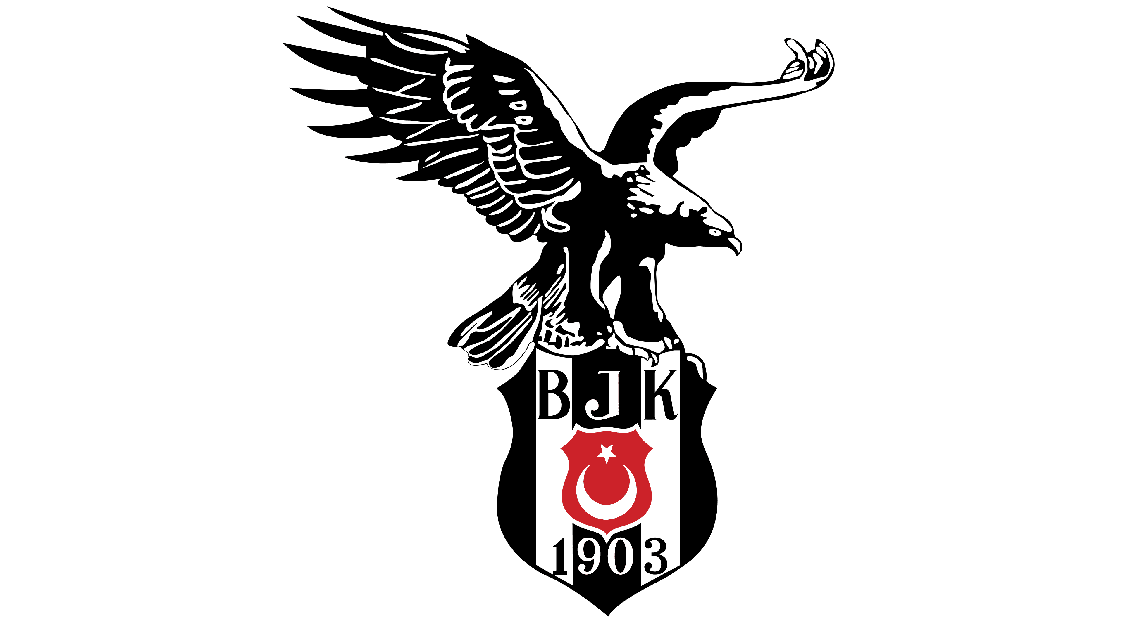
![]() Besiktas Logo PNG
Besiktas Logo PNG
The emblem of the Turkish team, Besiktas’s logo, impressively demonstrates the unity of the East and Europe, the club’s homeland. The heraldry and color scheme reflect the team’s commitment to their country and national identity through concise graphics.
Beşiktaş JK was founded in March 1903 in Istanbul and initially focused on gymnastics, boxing, and wrestling. Football debuted in August 1911 and quickly became the main direction, ahead of rivals such as Galatasaray and Fenerbahçe, which were established later.
World War I and the post-1918 occupation disrupted activity, but the club recovered and won the Istanbul Turkish League in 1918 and 1921. From 1924, it competed in the Istanbul Football League, winning 13 titles, including 5 consecutive titles from 1939 to 1943.
In 1957 and 1958, Beşiktaş won the national championship. After the launch of the national league in 1959, the club claimed the 1959–60 title, built on a series of narrow 1:0 victories. It entered European competition in 1960 and added league titles in 1965–66 and 1966–67.
A peak came under Gordon Milne in the late 1980s. In 1989, Beşiktaş defeated Adana Demirspor 10:0, a league record. The 1991–92 season ended without defeat, 23 wins and 7 draws, followed by another title in 1994–95.
In Europe, the club reached the quarter-finals of the European Cup in 1986–87. In 2007–08, it beat Liverpool FC 2:1 at home but lost 0:8 away. In 2017–18, it advanced from the Champions League group stage unbeaten.
Titles followed in 2002–03, 2008–09, 2015–16, and 2016–17. In 2020–21, Beşiktaş won another league title, maintaining its record of never having been relegated.
Meaning and History
![]()
Besiktas is the oldest club in Turkey and the first Turkish team to compete in the prestigious European Cup. Besiktas is also known for sticking to its traditions: its logo has featured black-and-white vertical lines for many decades. The same stripes appeared on the athletes’ uniforms in the second decade of the last century. Rumors circulated that the club’s symbolism was originally based on a combination of red and white, and only after the Balkan War was red replaced with black as a sign of mourning for the dead. However, the team owners debunked this myth by showing the oldest emblem of Besiktas, dating to 1903, which featured black-and-white stripes.
What is Besiktas?
Besiktas is a Turkish football club, one of the most successful in Turkey, with a large number of fans both domestically and internationally. The first Turkish club to reach the quarter-finals of the Champions League in the 1986-1987 season. Besiktas is a significant, historically important Turkish club that has had a profound influence on football culture and society in Turkey and beyond.
1903 – 1930
![]()
This is the club’s oldest logo, presented on its 100th anniversary. It proves that Besiktas originally used black in its symbolism. It features a quadrangular heraldic shield with a pointed base crisscrossed with black and white stripes. In its left half is a small Turkish flag: a red rectangle with a star and crescent.
The shield is inside a white circle framed with black and gold rings of varying widths. Nearby are inscriptions in Arabic:
- the football club’s name at the top;
- an analog of the letter “J” on the right;
- An analog of the letter “K” on the left.
- “J” and “K” are the initials of the club “Besiktas Gymnastics Kulubu.”
1930s – 1940s
![]()
![]()
During this period, two logo variants were presented, having the same colors but differing in shape and arrangement of elements.
The first version is a figured shield with a pointed base and a wide light contour. Inside it are three black and two white vertical stripes, and in the center is a small red shield with a crescent and a star.
The second emblem also features a shield but has ten corners. The stylized Turkish flag is placed in the top-left corner, and in the center is the abbreviation “B. G. K.,” outlined with thin white lines above and below. Below is the number “1903,” the year Besiktas was founded.
1940 – 1960
![]()
The figure shield’s inner side is adorned with three vertical white stripes and two black stripes. In the top-left corner is a drawing of the Turkish flag, and beneath it is a horizontal line bearing the white inscription “BEŞIKTAŞ.”
1960 – 1970
![]()
In this version, the shield contains two white and three black stripes. At the same time, it lacks an external dark contour. The stylized, rotated 90-degree Turkish flag is centered on a red mini-shield. Above it are the letters “B. G.K.,” and at the very bottom is the number “1903.”
1970 – 1980
![]()
Now, the emblem is a large rectangular shield with a rounded base. Inside, it is the same small shield but with cut corners. It serves as a base for Turkey’s national symbols. The abbreviation “B. G. K.” and the club’s founding year have not changed their placement.
1980 – 2000
![]()
The figured shield returns, indicating the club’s abbreviated name and the number “1903.” In this version, the middle black stripe is widened, and the star and crescent are slightly enlarged.
2000 – today
![]()
The logo became more compact and elegant by reducing the size of the red shield and narrowing the spacing between the letters. The dots on “B,” “G,” and “K” disappeared, and new fonts with elegant curves and serifs were used in the glyphs.
Font and Colors
The Turkish flag in the center of the logo reminds us that Besiktas is the first sports organization. The graphic sign encodes another message: the black-and-white stripes, along with the other components of the emblem, add up to the number 1319. According to the Gregorian calendar, this is the year the club was founded, which corresponds to 1903 in the Islamic calendar. For some time, a version with stars above the shield was used, in which each five-pointed star represented championship victories.
Since the inscription was set in Latin, two fonts have been used on Besiktas’s logos. The first is a standard sans-serif font, and the second is an individual font with serifs and decorative elements.
The color palette is not that simple. There’s a myth that the football team’s first official colors were white and red, and the black-and-white combination only appeared after the Balkan War, which ended in 1913. The legend says the club used black as a sign of mourning. Some written sources report the same information.
The team itself denies such rumors. On its centennial, it unveiled its first emblem, proof that its colors have always been black and white. However, red also doesn’t remain aside, as it’s an important part of the Turkish flag depicted on the shield in the center.