


A brand’s visual style develops like a person’s personality and destiny. Bright, strong, charismatic personalities are always more recognizable and successful than quiet and unassuming people who no one knows about.
Many confuse visual identity with the image used in advertising, public relations, and marketing. However, this is only a superficial similarity. The concept of visual identity is much broader and deeper.
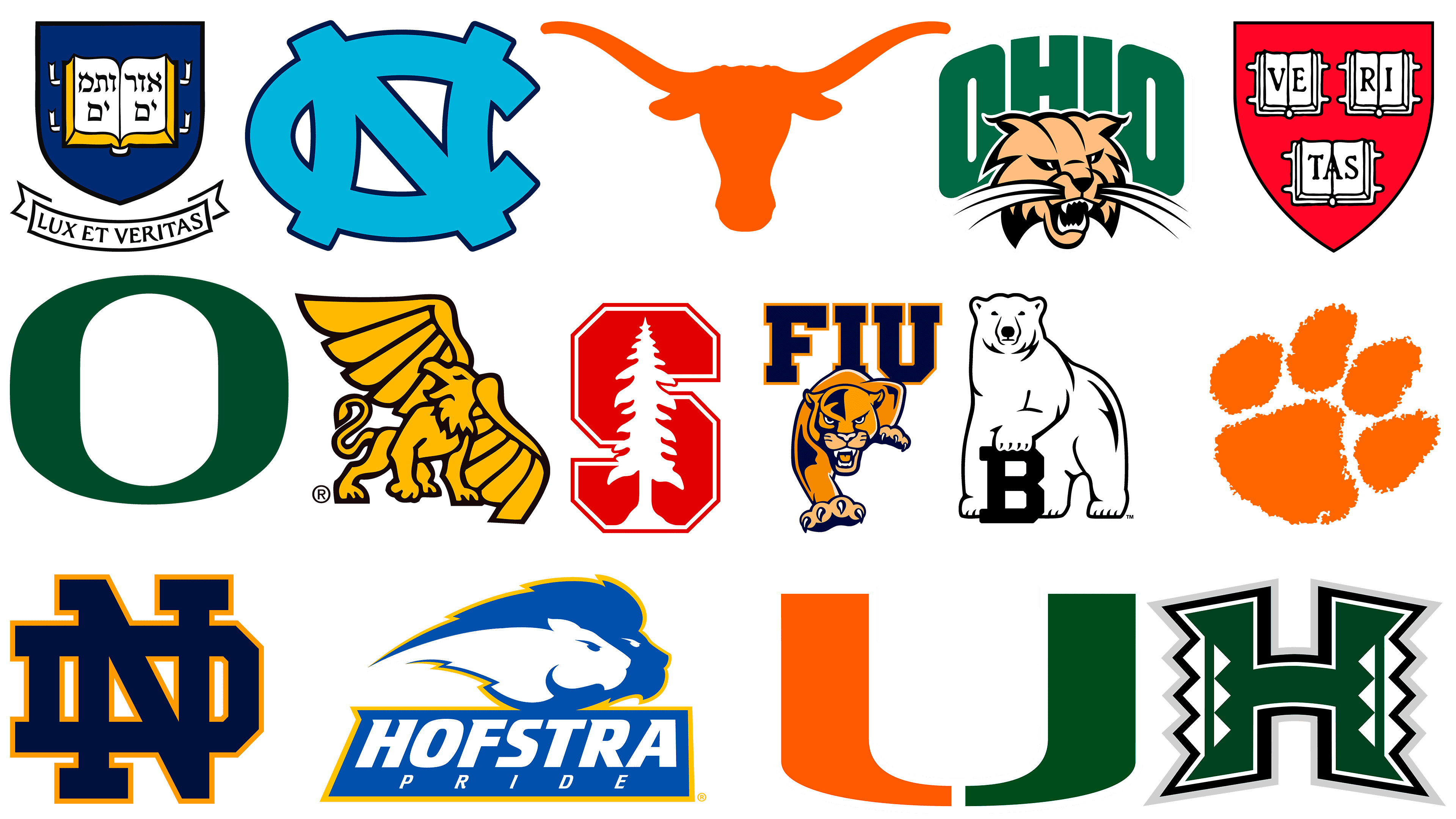
What are the best university and college logos?
Every university and college uses its own visual identity system, which includes the logo. In some educational institutions, it deserves special attention because its design sometimes contains hidden symbolism and is related to the history of the university or field.
Psychological tests have shown that a well-designed original logo is memorized in 5-7 seconds, much faster than using other points of contact with the brand, even direct interaction. This can be seen in the best logos of world-renowned educational institutions. They have a significant impact on students, both future students and those already studying at that institution. Despite external differences in design, there is an inextricable link between these symbols:
- they are all unique, clear, noticeable, and well-remembered;
- are adapted to the characteristics and brand concept of the institution;
- evoke positive associations even at first glance.
The University of Texas at Austin
![]()
The strongest and most athletic logo in the world belongs to the University of Texas at Austin. The symbol of this educational institution, a clear silhouette of a long-horned bull, is rendered in monochrome. It was created in 1961 and has remained unchanged ever since. Students say that if you look at this sign often, it gives you confidence and motivation.
The University of North Carolina
![]()
“Sea of Blue,” or Carolina Blue, is the name of the famous Dean Dome indoor university stadium in North Carolina. It was built in the eighteenth century. The logo, in the form of the intertwining letters C and N, is the centerpiece and decoration of the bleachers. This blue hue attracts the eye from the first minute, mesmerizes, and remains in the memory forever.
Ohio University
![]()
The common mascot of all this university’s sports teams is a formidable attack cat. In 2002, he replaced the red lynx, the university’s symbol since its founding. At first, many viewed this simple logo design as hostile, deeming it too aggressive. However, many saw hidden meaning in the combination of lettering and patterns. The mustache forms the bottom line of the arch text. It means that a graduate of Ohio University will win everywhere through strength, knowledge, and drive.
University of Oregon
![]()
The University of Oregon’s most concise logo is the letter “O.” The concept of this mark is ingenious in its simplicity. The letter “O” consists of a green main contour that mimics the shape of the running track at the huge Hayward Field stadium, and a yellow border that repeats the shape of the soccer field at Autzen. The green-yellow color combination is immediately eye-catching and pleasing.
University of Notre Dame
![]()
The University of Notre Dame is the world’s most recognizable logo. This monogram is gladly used by students, scientists, athletes, and alumni of one of the United States’ best universities.
The dark blue N and D logo is universal and presentable. It looks great on any branded product, attracts attention with seriousness and accuracy, and inspires confidence. Another mascot of this educational institution is Fighting Irish, a sullen Irishman who looks serious and vintage. He is used mainly by participants in sports competitions.
University of Miami
![]()
“One U among thousands of universities in the United States.” That’s what a reporter for the University of Miami’s student newspaper said about the Miami Athletics “U” logo during one of his reports.
The trademark was designed in 1973 by Julian Cole, who worked in the Radio and Television Department during the first edition, and Bill Bodenhamer, a graphic artist. At first, there was a huge uproar surrounding the idea. However, all attempts in 1979 to replace it with a more dignified version failed. Students saw a hidden meaning in it. The letter “U” resembles an athlete’s hand position before a match, a powerful ritual that promotes victory.
Clemson University
![]()
This is not just a drawing but a clear, but rough paw print of a real tiger with a scar, obtained long before the impression was made. It blends perfectly with the formal font of the university’s name. The logo’s 30° angle indicates the kickoff time of 1:00 p.m. for the soccer game.
Bowdoin College
![]()
Bowdoin College is one of the oldest universities in the United States. It was established in 1794. Until 1971, it was attended only by men. In 1913, the first logo, a polar bear, was chosen in honor of Robert Peary, a famous graduate of this college who led the polar expedition to the North Pole.
Various variations were proposed, ranging from a cartoonish running bear to an aggressively snarling bear with an open mouth, but none caught on. In 2008, the official version of the logo featured a calm white bear that placed its paw on the letter B and proudly looked ahead. This symbol inspires confidence and disposes of itself.
Hofstra University
![]()
The Hofstra Pride emblem, in the form of a family pack of lions, was designed in 2005 only for the sports department, but soon became the mascot of the entire university. A male and a female lion are rushing together in the same direction. Their eyebrows are furrowed, and their manes are ruffled, a sign of determination and strength. Pride is a close-knit team that works for the good of the group. This sign is also notable because it reflects lions of both genders. This signifies equal learning opportunities for male and female students.
Missouri Western State University
![]()
The Griffin emblem became the symbol of Western Missouri State University in 1973. The image of this mythical animal was not chosen by chance. In ancient legends, the griffin guarded treasures, and in the twentieth century, knowledge and education came to be valued as such.
But that’s not all: the outline of the griffin with spread wings resembles that of Missouri. This design is effective even if you don’t know or consider the geographic similarities.
Florida International University
![]()
The university’s original emblem, which features a gold panther next to dark blue lettering with a gold border, was created in 1987 as a sports team emblem. The Florida Roughy’s panther is an endangered species. According to the designers, the panther appears to emerge from the logo and head straight at those who look at it. Such a composition looks atypical and mesmerizing.
University of Hawaii
![]()
The University of Hawaii’s logo was created with the spirit of life in mind. In 2000, the symbol of the University of Hawaii’s athletic department, and then the entire university, became the letter “N” with a folk ornament made of tree-bark cloth called “Kapa.” It is read as HA. In Hawaiian, it translates to “breath” or “the spirit of life passed from generation to generation.”
Yale University
![]()
The American university was founded in 1701 and has produced many successful businessmen and celebrities. It has graduated 5 US presidents, including George Bush Jr. and Bill Clinton, and actors David Duchovny, Paul Newman, Meryl Streep, Jodie Foster, Sigourney Weaver, and Edward Norton. This university is considered one of the best not only in America but also worldwide.
Despite the simple font and the absence of graphic decorative elements, bright drawings, and other decorations, its logo looks bright and presentable. The Latin inscription “Lux et Veritas” means “Light and Truth.”
Stanford University
![]()
Stanford University created the font for its logo. This educational institution produced the founders of Yahoo, Google, and Hewlett-Packard. Its simple logo is a tribute to Stanford County.
The centerpiece of this famous brand is a redwood tree in the background of the letter S. In 2012, Stanford University officially changed its logo font to one better suited to electronic documents, websites, and mobile devices. The previous version was designed for static and print distribution. The old font was called Sabon. The institution had to pay license fees each time it used it in new places. Then, it was decided to create its original font. It was developed by the creative design firm Bright. The designers used the architectural elements of the university buildings as a basis for the composition, especially the main building’s arches. The famous seal, the letter S, and mahogany remained unchanged.
Harvard University
![]()
Harvard University’s symbolism is based on truth. The university’s emblem is considered one of the world’s oldest, dating back more than 200 years. It was adopted as the official seal immediately after the university’s foundation in 1636. In the foreground, the dark red coat of arms depicts three open books that form the Latin word Veritas, meaning “truth”. To this day, this image, in various variations, serves as the emblem of Harvard’s divisions and schools.
Despite their simplicity, the best logos of American universities fully reflect the educational institutions’ missions, values, and individuality, making them recognizable worldwide.
FAQ
Which university has the best logo?
Evaluating university logos includes considering design elements, color schemes, symbolism, historical significance, and visual appeal. Here are some of the best logos from prestigious institutions:
- University of Notre Dame: The logo features an interlocking “ND” monogram. It’s elegant and recognizable.
- Harvard University: The Harvard logo is iconic. It depicts a shield with the Latin motto “Veritas” (Truth).
- State University of New York (SUNY): The SUNY logo is modern and clean.
- American University: The logo features a simple monogram of the interlocking letters “A” and “U.”
- University of Texas: The logo features a silhouette of a longhorn, representing the school’s mascot.
- Michigan State University: The logo features a Spartan helmet, symbolizing strength and resilience.
- Yale University: The logo features a shield with the Latin phrase “Lux et Veritas” (“Light and Truth”).
- Stanford University: The logo features a stylized tree symbolizing growth and knowledge, and indicates the year the institution was founded, 1891.
These logos stand out for their designs and for how effectively they capture their respective institutions’ essence.
What font is used for university logos?
University logos use specific fonts to show their personality and values. Serif fonts are chosen for their traditional, formal look, which is well-suited to historical and prestigious institutions. Some brands use sans-serif fonts for a modern and clean look.
Serif fonts:
- Harvard University
- Stanford University
- Cambridge University
Sans serif fonts:
- State University of New York (SUNY)
- American University
Combination of serif and sans-serif fonts:
- University of Texas
Universities choose fonts that best reflect their values and mission.
Can I use my university’s logo?
Using a university logo usually requires permission, as these logos are registered trademarks. Using them without permission may result in legal issues.
Most university logos are registered trademarks protected by trademark law. To use the logo, you must obtain permission from the university. They will guide you on how to use the logo and for what purposes.
Universities have specific rules for using their logos. These guidelines ensure the logo is presented consistently and correctly. This includes restrictions on colors, sizes, and placement. Universities control their logos to protect their brand. Misuse of the logo can damage the university’s reputation and confuse official support.
Is it illegal to use college logos?
It is illegal to use college logos, mascots, or slogans without permission, as the institution owns exclusive rights to these elements:
- Trademark Protection: College logos, mascots, and slogans are registered trademarks.
- Permission Requirement: You must obtain permission from college officials to use a logo, mascot, or slogan.
- Usage Guidelines: Colleges have specific guidelines for the use of logos, mascots, and slogans.
- Brand Integrity: Colleges control their logos and other branding elements to protect their brand.
Using college branding without permission may result in legal consequences, such as cease-and-desist orders, fines, or lawsuits.
What makes a good college logo?
A good college logo evokes positive feelings and associations, helping to create a strong connection with students, alumni, faculty, and the community.
- Consistency: Logo design elements must align with the educational institution’s concept and mission. This includes symbols, colors, and fonts that reflect the college’s identity and heritage.
- Memorability: The college logo should be memorable and recognizable at first sight. A simple, clear design is usually more effective, making the logo recognizable.
- Timelessness: It should have a timeless quality, avoiding design trends that can quickly become dated. A classic design ensures the logo remains relevant and effective for many years, reflecting the institution’s enduring character.
- Versatility: A college logo should work well in various formats and sizes. The logo must maintain clarity and impact across websites, merchandise, official documents, and campus signage.
What is a university logo?
A university logo is a distinctive graphic that reflects an educational institution’s history, mission, and values.
The logo includes emblems, shields, or badges representing the university’s heritage and mission. Historical universities may use a traditional coat of arms, while new schools may choose a modern design. A well-designed logo attracts new students, making the brand recognizable and appealing.
University logos are used on products such as clothing and accessories. These items promote the brand and generate additional income. The logo ensures consistency across all forms of communication, including official documents, websites, promotional materials, and social media.