Music, fashion, new technologies – all people follow trends. Everything is changing so fast nowadays that we are obliged to keep up with the novelties in order to keep up with the cycle of events in the world. The creative work of a designer is one of the most important parts of business identity. A beautiful logo should not only please the eye but also convey the values of the company. High competition forces designers to react as quickly as possible to innovations and incorporate them into their work.
What are the best trends in logo design in 2021?
In 2021, a minimalist style with visual illusions such as an unusual angle, curvature, or linear perspective is in vogue. Simple geometry, disappearing letters, color transitions, negative space, and natural motifs can all be found in logo designs.
Trends for 2021 consist of completely contradictory trends: from minimalism to bright colors and saturation with graphic elements. Above all, it is worth remembering that the company logo should be unique despite all the trends. What is the point of making the emblem similar to the competitor? A logo is a distinctive feature that should be one of the main associations with the brand. Let’s take a look at the top trends for 2021 that will help you create a unique logo.
Minimalism
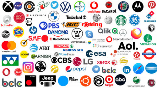
Everything ingenious is simple. Many companies rely on minimalism in combination with corporate colors. Famous brands are actively getting rid of unnecessary details and glitter, gradually moving to simple forms. Firstly, in the era of a large amount of information, they are easily remembered by consumers. Secondly, they can be quickly interpreted digitally, for example, as an icon for a mobile application.
Soft, pastel colors
Every brand, trying to make a positive impression on the audience, uses bright colors: red, blue, green, etc. The oversaturation with contrasting details makes companies that use pastel colors stand out. The use of soft colors sometimes creates the illusion of a handwritten logo. Perhaps it was the pandemic that started in 2020 that was the catalyst that influenced consumer tastes and desires. Colors such as lilac, lavender, light yellow, pink, and pastel shades of green are often seen.
Vivid colors
As we have already said, 2021 is very generous with contradictory trends, which helps to realize even the most daring ideas. One of them is the use of juicy, bright, really crazy colors. The combination of red, yellow, blue, purple, and others will make the consumer take notice. These bright colors are great if you want to change up an old logo and experiment with something new.
Removing parts of the text
A great option to play with your audience a bit is to remove some parts of the text. Add mystery to logos and allow consumers to imagine how they would complete the logo. This trend has only recently emerged, but designers are already actively using it in their work. The trend is intertwined with minimalism, which makes the logo doubly winning. The main thing is to observe the measure. Do not completely remove some letters; the logo should be readable and understandable.
Overlay elements
This trend will appeal to those who want to make the logo more voluminous without using a large number of different symbols and colors. Give free rein to your imagination: replace letters with geometric shapes, duplicate the same symbol, and play with colors. Using this trend, you can combine different elements without overloading the logo with unnecessary details. This allows you to create more vivid and clear associations.
Animated logos

Our life is a constant movement and development. A dynamic logo perfectly demonstrates how companies react quickly to all innovations and apply them to their products. With an animated logo, you will be one step ahead of your competitors and attract extra attention. You can convey the company’s values and mission in more detail through movement by choosing the right colors and basic symbols.
Thin lines
Another trend that is closely intertwined with minimalism. Thin lines look elegant and luxurious, and it seems that the brand thinks everything through. The neat lines look good on mobile devices, computers, and in print. You can also use geometric shapes or spaces to make the logo even more trendy. Simple details emphasize the uniqueness of the brand. Most often, the lines are black or dark gray.
Randomness
If you are tired of perfect pictures, you can dilute the logo with chaotic solutions. Different arrangements of letters, symbols, contrasting details, and mirroring – give free rein to your imagination. In 2021, everything is possible as long as the name of the brand is clear. Creative agencies often use such logos to attract additional attention. Show out-of-the-box thinking with the help of new forms.
Harmonious picture
Perfectionists can exhale calmly – balanced logos are still in trend. Such emblems are recommended for brands that want to convey calmness and serenity. In this case, you should use simple shapes and standard fonts. To add some creativity, you can choose geometric symbols or bold colors. Harmonious logos symbolize the professionalism and reliability of the company.
Monograms and abbreviations
Classics are always in fashion but with some additions. It is worth experimenting with colors and shapes to make the logo look more modern. Monograms give sophistication and recognizability to the brand. You can combine some of the previous trends and get a logo that will exceed your expectations.
3D logos
To update your logo without changing the design, you can use 3D variants. To achieve the effect, you should play with shadows, add touches or highlights, and give the logo a second life without losing its essence. In addition, a 3D logo can be made animated and get a unique design that will attract a lot of attention.
Unique fonts
A cool and modern solution is to create your own font. Most consumers only know the basic set presented in programs or social networks. Surprise your audience with a pixelated font or swirled letters so that the text remains readable. By choosing a font, you can express a certain emotion that will only be associated with your brand.
Gradient
Brands, one after another, are using smooth transitions between bright colors. Gradient is a great tool that allows you to add volume and dynamism without unnecessary symbols and combine different colors and shades. It is necessary to take into account the nuance that when reproducing the logo in printed publications, the quality may deteriorate significantly. When choosing a color palette, you should pay attention to the brightness of shades and their combination with each other.
Elements of nature
Many brands emphasizing sustainability use nature-related symbols in their logos. In combination with the green color, they help to achieve harmony and peace. The audience remembers any gestures related to improving their lives, so a good impression of the logo is ensured.
Characters in logo design
The use of symbols in brand logos increases consumer awareness in a unique way. They can be used to establish a strong connection with the audience and epitomize all the qualities and values that the brand promotes in an image. In addition, such logos stand out and are immediately memorable. Once the emblem with the character is implemented and approved by the audience, it can be used in commercials, packaging, billboards, or even create a separate product dedicated to the mascot.
Graphic design is a field with limitless possibilities. The designer can experiment with textures and colors or create new directions, such as imitating lettering or drawing with ink. Don’t forget to use geometric shapes: they are also at the peak of popularity. Seek, create, and be inspired – there are no limits to creativity.
FAQ
What makes a good logo in 2021?
In 2021, good logos combined simplicity with unique visual effects, embracing modernized minimalism. Key elements included:
- Simplicity: Clean and straightforward designs are easier to recognize and remember. They work well in various sizes and formats, from business cards to billboards.
- Unique Visual Effects: Subtle yet distinctive elements, such as creative use of negative space, gradient effects, or abstract shapes, can make a logo stand out.
- Versatility: A strong logo looks good in black and white and in color and is scalable without losing its integrity or readability.
- Relevance: The design should align with the brand’s identity and industry, conveying its values and message clearly to its audience.
- Timelessness: While incorporating modern elements, a good logo has a timeless quality, avoiding trends that might quickly become outdated.
- Memorability: A memorable logo captures attention and stays in the minds of consumers. Unique shapes, bold colors, and interesting concepts help achieve this.
- Balance: Good logos balance text and imagery. If the logo includes text, the font should complement the visual elements and be easily readable.
- Color Choice: Effective logos use color wisely, aligning with the brand’s identity and evoking the desired emotions and responses from the audience.
How can I make a logo for 2021?
To create a logo in 2021, you can use any graphics editor, online service, or program with ready-made templates. Here’s a simple guide:
- Develop a Corporate Identity: Define your brand’s values, mission, target audience, and unique selling points. Your logo should reflect these aspects and align with modern trends.
- Research and Inspiration: Look at logos from similar brands for inspiration. Identify current design trends that might suit your brand.
- Choose the Right Tool: Use a graphics editor, online logo maker, or design software. Popular choices include Adobe Illustrator, Canva, and LogoMaker. These tools offer templates and design elements to get you started.
- Simplicity and Minimalism: Aim for a simple, clean design. Minimalism is a key trend. Avoid clutter and unnecessary details. Focus on making the logo easy to recognize and remember.
- Unique Visual Elements: Add unique elements to make your logo stand out, such as creative use of negative space, abstract shapes, or subtle gradients. Ensure these elements are not overwhelming.
- Versatility: Design your logo to look good in different sizes, formats, and backgrounds. Make sure it’s scalable and works well in color and black-and-white versions.
- Balance and Alignment: Balance text and imagery. Choose a font that complements the visual elements if your logo includes text. Ensure everything is well-aligned and aesthetically pleasing.
- Color Choice: Choose colors that align with your brand’s identity and evoke the desired emotions. Use colors wisely to enhance the logo’s appeal and readability.
- Get Feedback: Share your logo design with colleagues, friends, or focus groups to get feedback. Consider their suggestions and make necessary adjustments.
- Finalize and Export: Once satisfied with your logo, finalize the design and export it in various formats (e.g., PNG, JPEG, SVG) to ensure it’s ready for print, web, and social media.
What makes a good logo in 2020?
In 2020, a good logo embraced minimalism with a creative twist. Key elements included:
- Minimalism: Simple, clean designs were highly favored. A minimalist logo is easy to recognize and remember. It avoids clutter and unnecessary details, focusing on essential elements that convey the brand’s identity.
- Creative Elements: Adding a creative or quirky touch made logos stand out. Unique design choices, like unconventional shapes or clever use of space, helped differentiate brands.
- Stylish Typography: Logos feature stylish typography with non-standard fonts. Custom and unique fonts added character and personality, making the logo more memorable.
- Simple Line Art: Many logos use simple line art, which fits well with the minimalist trend. Line art designs are clean and versatile and work well in various sizes and formats.
- Geometric Compositions: Geometric shapes and compositions were popular, providing a sense of order and balance. These shapes create a modern and sleek look.
- Negative Space: The clever use of negative space became a hallmark of effective logos. This technique involves creating images or shapes using the space around and between the main design elements, adding depth and interest.
- Versatility: A good logo in 2020 was versatile, working well across different mediums and applications. It needed to look good in color and black-and-white versions and be scalable without losing its integrity.
- Memorability: Memorable logos capture consumers’ attention and stay in their minds. Unique shapes, bold colors, and interesting concepts make a logo memorable.
What should stand out in a logo?
A logo should stand out by representing key elements of a company, its products, and its services. Here are the main aspects that make a logo distinctive:
- Relevance: The logo should reflect the brand’s identity and values. It should be relevant to the industry and audience, creating an immediate connection with the target market.
- Simplicity: A simple logo is easy to recognize and remember. Avoid unnecessary details to keep the logo clear and easily reproducible across different mediums and sizes.
- Memorability: The logo should be designed to be memorable. Unique shapes, bold colors, or distinctive typography can help it stick in people’s minds.
- Versatility: The logo should look good in various formats, sizes, and backgrounds. It should work well in color and black and white and be scalable without losing its integrity.
- Uniqueness: A logo should have unique elements and not be easily confused with other logos. These could include a unique icon, innovative typography, or a creative composition.
- Balance and Proportion: A well-balanced logo with the right proportion of text and imagery creates visual harmony. This balance makes the logo aesthetically pleasing and professional.
- Color: The choice of colors can make a logo stand out. Colors should align with the brand’s identity and evoke the desired emotions. Bold and contrasting colors can attract attention, while more subdued palettes convey elegance and sophistication.
- Typography: If the logo includes text, the font choice is crucial. The typography should complement the visual elements and be easily readable. Custom or unique fonts can add distinctive characters.
- Symbolism: Incorporating symbolic elements representing the company’s mission, values, or industry can add depth to the logo and communicate complex ideas quickly.
- Consistency: The logo should be consistent with the overall branding strategy. This ensures all brand elements, from marketing materials to product packaging, work together cohesively.
