![]() Beyond Meat Logo PNG
Beyond Meat Logo PNG
Seeing the Beyond Meat logo on the label, the buyer can be sure that plant-based meat will be virtually indistinguishable from natural meat. Although nothing about the emblem itself is appetizing, it has long been associated with burgers, sausages, meatballs, and mincemeat, which are enjoyed by more than just vegetarians.
Beyond Meat was founded in 2009 by businessman Ethan Brown, who, as a child, saw animals suffering on farms. He realized that it was impossible to eradicate the culture of meat-eating and decided to offer people a plant-based alternative. Ethan subsequently developed a safe technology for turning plant proteins into fiber “meat” and began producing imitation pork sausages and beef patties.
In 2009, Ethan Brown set out to revolutionize how we think about plant-based foods. He founded Beyond Meat to offer a healthier, more environmentally friendly meat alternative. His aim was clear: to appeal to vegetarians and convince meat lovers.
Starting in a small kitchen, the team worked hard to create the Beyond Burger. This burger, made from pea protein, oils, and natural flavors, was designed to taste and feel like real beef.
By 2013, Beyond Meat products, including faux chicken strips and beef, were available at Whole Foods Markets across the U.S. Their success paved the way for the Beyond Burger in 2016.
In 2016, big-name investors like Bill Gates and Leonardo DiCaprio boosted Beyond Meat’s growth. The introduction of the Beyond Burger in 2017, the first vegan burger sold alongside traditional meat in grocery stores, was a major win for plant-based eating.
Following this, Beyond Meat’s growth skyrocketed. The brand partnered with popular chains like TGI Fridays and Dunkin’ Donuts, bringing its products to a wider audience.
In 2019, Beyond Meat went public, making headlines with a highly successful IPO. Its stock jumped 163% on its first day, indicating strong demand for plant-based options.
Beyond Meat kept innovating, launching products like Beyond Sausage and expanding internationally. Despite more companies entering the plant-based market, Beyond Meat remains a top choice due to its innovation and brand strength.
Now, Beyond Meat products are common in stores and restaurants worldwide. The company continues to work with leading scientists to create new plant-based foods, expanding the industry’s possibilities.
Meaning and History
![]()
When the company first emerged, its products could easily be mistaken for natural meat, as there was no hint of vegetables on the label. Even later, in 2016, Beyond Meat’s logo resembled the style of a Texas steakhouse. The manufacturer did not want to limit itself to the vegetarian or vegan market. Therefore, it sought to attract meat-eaters and re-educate them in the spirit of plant-based food. It wasn’t until 2019 that the brand began using an emblem that hints at its focus. A bull in a superhero cape rushes to aid animals, the environment, and hungry Americans.
What is Beyond Meat?
Beyond Meat is an American company that produces vegan and vegetarian food products. The company’s product range includes substitutes for beef patties, pork sausages, ground meat, jerky, and meatballs. They are made from beans, rice, peas, and other vegetable ingredients. The production technology consists of protein extraction to recreate the fibrous structure of meat.
2009 – 2015
![]()
Beyond Meat was founded in 2009, but didn’t enter the retail market until three years later. It offered consumers a chicken meat substitute made from carrot fiber, soy powder, and gluten-free flour. The strip packs were decorated with a logo featuring two rounded-corner squares that partially overlapped.
The upper square was light brown and featured an image of a fork with tines pointing upward. The white line outlining it is bifurcated in the middle and curved in different directions. The brand name was located in the lower dark brown square. The designers divided it into two lines, centered. The sans-serif font made the lettering legible even at a reduced size.
2015 – 2016
![]()
The Beyond Meat logo was updated in 2015 after the company launched a new product, a beef patty substitute for burgers. The top of the emblem was repainted crimson, while the bottom became dark blue. The shape of the fork remained the same, whereas the font became bolder. This change helped to draw attention to the manufacturer’s name while maintaining the emblem’s recognizable design.
2016 – 2019
![]()
The designers stylized the emblem as a rectangular tag with side protrusions. On the right is a small decorative triangle; on the left is a circle imitating a hole for threading a cord. Inside was the phrase “BEYOND MEAT,” divided into two lines down the center. The letters themselves were black, with thin red outlines. The lines were spaced apart, giving the impression that the lettering was floating in the air. The interior space of the letter “O” was replaced with an image of a stylized fork.
A long row of small dots stretched to the right and left of the second word. A similar stripe was drawn above, separating the red phrase “THE FUTURE OF PROTEIN.” A bold sans-serif font was used for the company name, and a contrasting serif font for the slogan. The tag was slanted to the side, so all the internal elements were slanted as well.
2019 – 2021
![]()
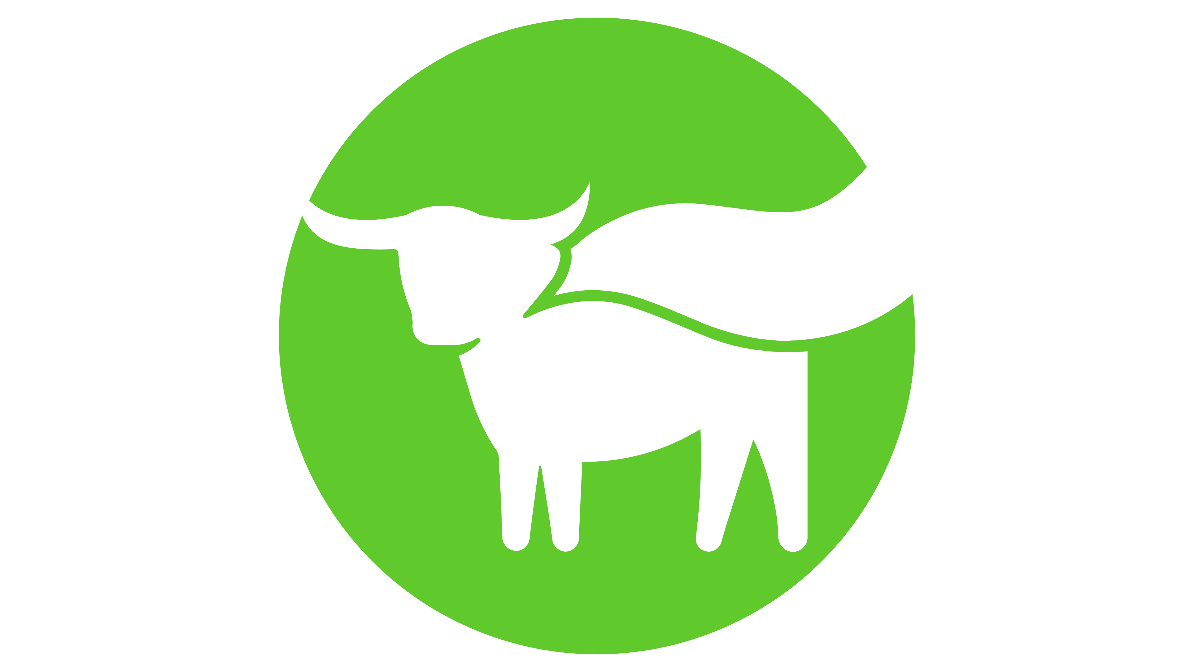
In early 2019, the natural meat substitute manufacturer engaged Los Angeles-based agency Stun Creative to rebrand. The content studio, which has previously worked with brands such as Mattel, Food Network, Netflix, ABC, and HBO, took on the idea of healthy eating that helps athletes win. This inspiring concept was expressed in the original image of a bull with a superhero-like cape fluttering behind him.
On the one hand, this hero comes to the rescue when healthy diet food is needed. On the other hand, he saves animals because people prefer plant-based meat and don’t notice the difference.
The white silhouette of a bull was placed within a green circle, whose color symbolized natural ingredients. Below it was the black phrase “BEYOND MEAT,” occupying one line. The font remained uppercase, clear, and strict, now reminiscent of TipoType’s Arazati Negra Condensada Regular. This design conveyed the company’s confidence in its work.
2021 – today
![]()
Fisk Studio and Falkon Content reworked Beyond Meat’s visual style, making it more consistent and cohesive. The team led by Juju Yeo (Art Director), Greg Fisk (Design Director), Serge Kirsanov (Creative Director), and Dexton Debori (Project Manager) reduced the font size. Still, it increased its weight, making the brand name more prominent. A bright and saturated shade of black was chosen for the same purpose. On the other hand, the green color became paler. The new font system allows the removal of the word “MEAT” and its replacement with the name of a specific product when the logo is used on packaging. This unifies the company’s extensive product line.
Font and Colors
In 2021, the Beyond Meat logo’s font was bolder than in previous versions. However, the sans-serif font still lacks serifs and is legible on both large billboards and small labels.
The color scheme includes the following:
- Green (#6AB335);
- Black (#000000);
- White (#FFFFFFFF).
Green symbolizes the natural composition of meat substitutes made from plant-based ingredients and indicates a conscientious attitude toward the environment.