 Blue Cross Blue Shield Logo PNG
The Blue Cross Blue Shield logo symbolizes a concern for the well-being of Americans and a commitment to a healthy community. It reflects the association’s mission: to improve the quality of life through affordable, high-quality health care. The understated design of the emblem demonstrates trust, professionalism, safety, and reliability in the healthcare industry.
Blue Cross Blue Shield: Brand overview
Meaning and History
After Blue Cross and Blue Shield became one, the companies combined not only their names but also their symbol systems. The result was a logo combining two graphic elements: a cross with a human figure and a shield adorned with the staff of Asclepius. The story of the first symbol began in 1933 when Van Steenwyk decided to use it for a hospital service program. This served as an example for other groups, resulting in the American Hospital Association officially adopting the Blue Cross as its emblem in 1939. As for the shield, it was informally adopted in 1948 by the Associated Association of Health Service Plans and registered with the Federal Patent and Trademark Office in 1951.
In 1982, the two organizations merged and began using a common logo incorporating both ancient symbols. The consistent use of the logo makes the BCBS brand instantly recognizable and associated with health and safety. The cross and shield are always depicted together to demonstrate the dual strength of the health insurance association.
What is Blue Cross Blue Shield?
Blue Cross Blue Shield is a consortium of health insurance providers. It is one of the largest associations in the U.S. healthcare system. It works closely with doctors, hospitals, and other healthcare providers to provide quality and timely care to those who need it. Despite the common brand, each BCBS member company operates independently and serves specific regions of the country.
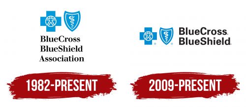
1982 – today
At the top of the emblem are two blue and white graphic symbols: a cross and a shield. The first looks like a bold “plus” sign, in the center of which is a circle connected to the silhouette of a person. The body with arms and legs stretched forward resembles a simplified version of the drawing of Homo Vitruvianus, created by Leonardo da Vinci to demonstrate symmetry. The shield, in turn, has a triangular shape with the top bent inward. It depicts the staff of Asclepius: a snake coiled around a stick. This is a traditional medical symbol.
Below it is a black inscription, “BlueCross BlueShield Association.” It consists of three lines, with the first two lines left-aligned and the last line centered. The text uses a contrasting font with thin, elongated serifs. Its presence visually balances the drawn part of the emblem.
2009 – today
In this version of the emblem, the cross and shield are located in the left part and painted in the traditional blue color. The lettering remains black but is now located on the right side and is divided into just two lines: “BlueCross” and “BlueShield.” There are no serifs in the new font, making it clearer and more confident. Beneath each component of the logo is an “R” in a circle, the mark of a registered trademark.
BCBS uses the staff of Asclepius rather than the Caduceus, as it is the true symbol of medicine. The snake, in this case, is associated with eternal youth, as it can shed its old skin. Its venom in moderate doses is used in some medicines. The staff represents the support needed by the elderly, sick, and infirm.
Font and Colors
The typography of Blue Cross Blue Shield is quite varied. It includes two types of fonts:
- A bold serif font, roughly similar to UnB Pro Bold by Universidade de Brasilia or Ultimate Serial Bold by SoftMaker;
- A contrasting serif font that has much in common with Walbaum FS Medium from FontSite Inc.
The dominant color of the emblem matches the name of the association. The designers chose a pleasant light blue shade, which blends well with the black lettering. White is used as a complementary color.


