Gold medals and cups – that’s what the club is waiting for—the Borussia Dortmund logo as an image of victory. The team is always ready to please their fans. The emblem shows: here, they know how to handle the ball and regularly hone their skills and skills.
Borussia Dortmund: Brand overview
| Founded: | 19 December 1909 |
| Headquarters: | Dortmund, Germany |
| Website: | bvb.de |
Borussia Dortmund is one of the richest and most renowned sports clubs in Germany. On December 19, 1909, it appeared when a group of seminarians gathered in the bar Zum Wildschütz. The young people did not like how Pastor Dewald led the church team, so they decided to create their own – the Ballspielverein Borussia.
The word “Borussia” is translated from Latin as “Prussia,” but the sports organization’s name has nothing to do with this historical state. The founders of the club drank the local Borussia beer, which became their main source of inspiration.
Meaning and History
It is believed that the first Borussia Dortmund emblem was not officially adopted until after the Second World War. Before this, the team existed in an uncertain status: it arose based on the youth section and then merged with three other Dortmund organizations. As a result, the old logos, which were in use before 1945, no longer refer to the professional football club Borussia Dortmund, but its predecessors.
What is Borussia Dortmund?
Borussia Dortmund is the short form for the German football club Ballspielverein Borussia 09 e. V. Dortmund. This professional-level club is based in North Rhine-Westphalia and participates in the Bundesliga. The team has won the league championship eight times, the DFB-Pokals 5 times, and the UEFA Cup Winners’ Cup, Intercontinental Cup, and UEFA Champions League once each.
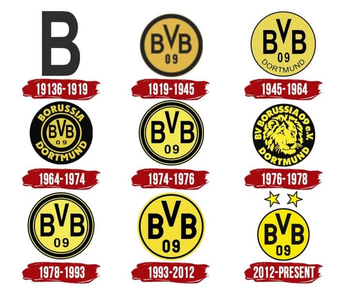
1913 – 1919
The earliest emblem contains no complex elements. It depicts a black sans serif “B” in regular type on a white background.
1919 – 1945
In 1919, a new logo appeared, which became the first in a cycle of round badges with the words “BVB 09”. The letters represent an abbreviation for the first words of the name BV (Ballspielverein) Borussia Dortmund. The number is an abbreviation for the year the club was founded: 1909. The inner part of the circle is orange, the frame is black, with thin khaki outlines.
1945 – 1964
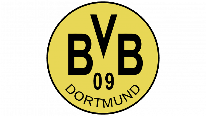
The club was restored immediately after the disbandment. Returning to service, he received a new name – SG (Sportgemeinschaft) Borussia 1898 Dortmund. Despite this, the abbreviation “BVB” has not disappeared anywhere. Along with the numbers “09”, she remained inside the circle, which has now turned yellow.
The wide black outline was replaced with a narrow one, which increased the free space. This allowed the word “DORTMUND” to be added to the already existing “BVB 09” lettering. It’s at the bottom and is written in the same font as the main text.
1964 – 1974
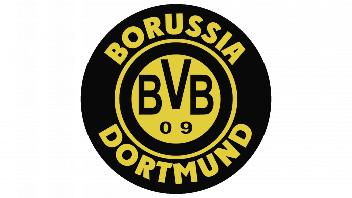
In 1973 the club won the title of champion. To celebrate this greatest event, he repainted his logo black – the color of strength, leadership, and indestructibility. In this case, the image became multi-part. In the center was a small yellow circle with the letters “BVB” and the numbers “09”. It is located within a large black circle and is separated by a yellow ring from the word “BORUSSIA DORTMUND.” It is not known how successful the design was: despite the symbolic color, the team managed to get only one title over these ten years.
1974 – 1976
In 1974 the background turned yellow again and the inscription black. All characters are widely spaced: they have more free space because the word “DORTMUND” has disappeared. The circle is framed by several black and yellow rings.
1976 – 1978
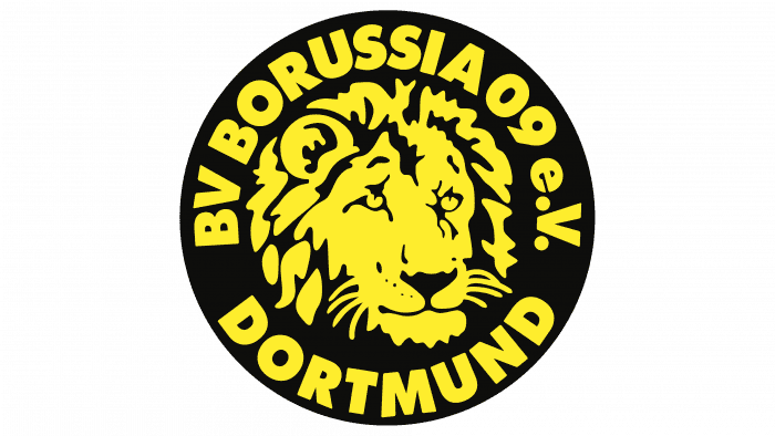
In the second half of the 1970s, the team decided to experiment with their image and use the Samson trademark instead of the logo. This was the main condition of the sponsorship agreement. As a result, the black circle’s central part was occupied by the main symbol of the tobacco manufacturer – a lion with a shaggy mane. The artists depicted the head of an animal and surrounded it with the inscription “BV BORUSSIA 09 e.V. DORTMUND “.
1978 – 1993
To the delight of the fans, the lion logo only lasted two years. The agreement with Sansom ended, and the club returned to the yellow background badge used in 1974-1976.
1993 – 2012
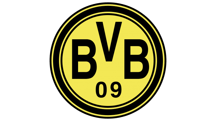
In 1993, designers simplified the edging of the circle by removing some of the rings. The initials and the year the team was founded remain unchanged.
2012 – today
The frame is even simpler in the current logo than in the previous one: it consists of only one black line. But above the circle, two yellow five-pointed stars appeared, added in honor of the next title.
Borussia Dortmund: Interesting Facts
Borussia Dortmund, or BVB, is a famous soccer team from Dortmund, Germany. They play in the Bundesliga, Germany’s top soccer league.
- How It Started: The team was created on December 19, 1909, by some young people who didn’t like the local church’s soccer team. They chose the name “Borussia” because it’s another word for Prussia, where Dortmund was back then.
- Their Stadium: They play games at Signal Iduna Park, the biggest stadium in Germany. It can hold over 81,000 fans. The coolest part is the “Yellow Wall,” a huge section for standing fans that looks amazing and gets loud.
- Winning Big: Dortmund has won the Bundesliga many times, especially in the 1990s and early 2010s. They also beat Juventus to win the UEFA Champions League in 1997.
- Tough Times: Around the mid-2000s, the club almost broke. But they managed to fix their money problems and became successful again.
- Growing Stars: Dortmund is great at training young players who become famous worldwide. They’re known for giving young talent a chance to shine.
- Big Rivalry: They have a big rivalry with FC Schalke 04, another German team. It’s a huge deal because the two cities are close, and both teams have been around for a long time.
- Fans Rule: The team is mostly owned by its fans, which is rare. Many fans show up to games and support the team no matter what.
- Playing Style: The team is known for playing fast and exciting soccer, especially when Jürgen Klopp was the coach. He introduced a style called “Gegenpressing,” which involves quickly returning the ball when the team loses it.
- Helping Out: Besides soccer, Dortmund works on projects to fight racism, include everyone, and help out in their community. They’ve even won awards for it.
Borussia Dortmund is not just about winning games. They have a big heart, cool fans, and they care about making a difference.
Font and Colors
Borussia Dortmund has been using a simple yellow and black badge for many years, which is traditionally circular. Inside are the words “BVB” and “09”. Everything is clear with the numbers: they reflect the year the club was founded. But the abbreviation can be deciphered in different ways. If you believe the official version, this is an abbreviation for the phrase “Ballspielverein Borussia.” But fans think differently: in their opinion, “BVB” means “Borussen vom Borsigplatz” because the team’s founders drank Borussia beer on Borsigplatz.
The lettering is in a geometric sans serif font. It has always been used – since 1909. The color scheme is simple: black elements are placed on a yellow background. This distinguishes the Borussia Dortmund logo from the badges of other German football clubs.
Borussia Dortmund color codes
| Golden Yellow | Hex color: | #fde100 |
|---|---|---|
| RGB: | 253 225 0 | |
| CMYK: | 0 11 100 1 | |
| Pantone: | PMS 108 C |
| Black | Hex color: | #000000 |
|---|---|---|
| RGB: | 0 0 0 | |
| CMYK: | 0 0 0 100 | |
| Pantone: | PMS Process Black C |
