Boston College Logo

Boston College LogoBoston College Logo PNG

The emblem takes viewers back to its origins and shows that the college has always been under the auspices of the church and the crown. Education in an institution promotes development, teaches you to choose the right path in life, and leads to honors and glory. This is what the Boston College logo is trying to convey.

Boston College: Brand overview

Founded:March 31, 1863
Founder:John McElroy
Headquarters:
Chestnut Hill, Massachusetts, United States
Website:bc.edu
Boston College is an institution of higher learning owned by the Jesuit Society. Legally, it is a college because it has chosen to maintain a historical connection to its roots. But in fact, it is a university with a broad educational and deep research focus, which is why it is rated R1. John McElroy founded it in 1863 in Chestnut Hill, Massachusetts. It is now the largest institution, with eight schools and colleges. The institution has undergraduate, graduate, and doctoral degrees. It also has its athletic teams, which carry the Eagles name, compete in NCAA Division I, and represent the Atlantic Coast Conference. The Boston College field hockey players are particularly famous: they have won five national championships. The main campus building is an important architectural landmark, an early example of Gothic Revivalism in North America.

Meaning and History

Boston College Symbol

In 1825, a Jesuit from Maryland named Benedict Joseph Fenwick received the position of the second bishop of Boston. He immediately envisioned the opening of a college that would educate a new generation of leaders to serve the spiritual and civic needs of the diocese. Two years later, the clergyman established the school, setting it up in the basement of the local cathedral. However, his relations with the city’s elite deteriorated because he had to leave the existing school and open the College of the Holy Cross 72 kilometers away in Worcester, Massachusetts.

The concept of establishing a college in Boston was continued by John McElroy, who also saw a great need for it. Having received the administration’s approval, he began the process by raising money to purchase land for construction. In 1857, the minister bought the South End near Boston. The first class appeared in 1859. It was started without much celebration in the two college buildings. Two years later, it was closed for several reasons: disagreements over management, funding, and the Civil War. Boston College officially reopened many years later, in the spring of 1863, essentially after 30 years of existence.

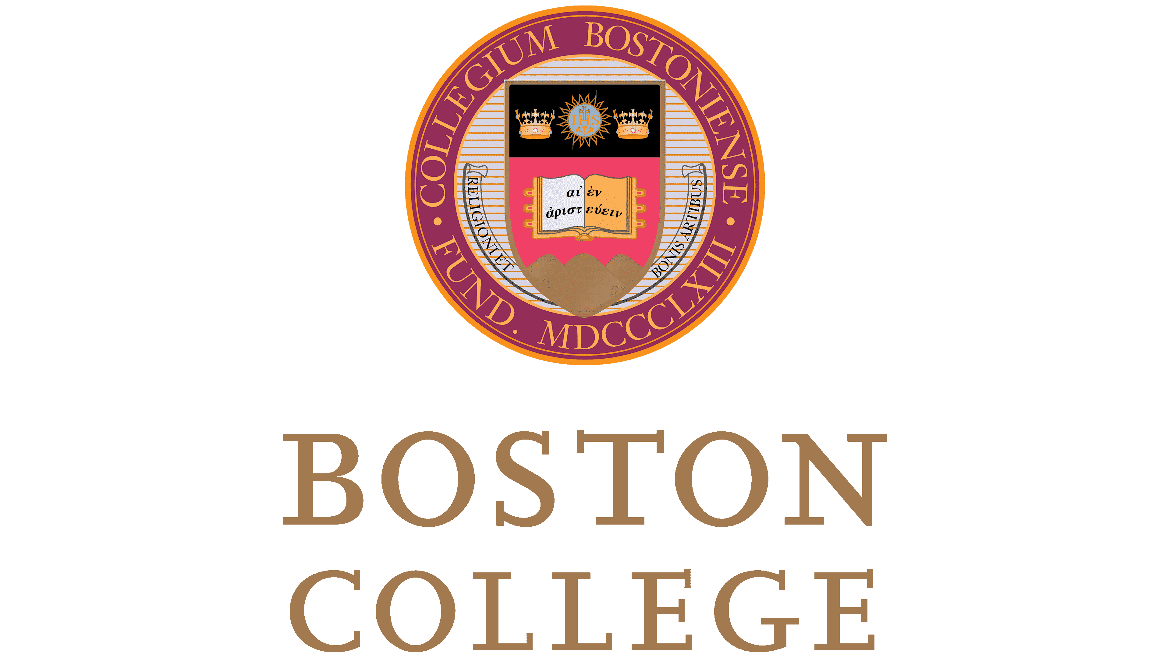
Interestingly, the institution’s identity does not distinguish between the academic seal and the university-wide logo. To this end, it uses the same emblem based on its historical roots. Its basic elements are artificial and non-man-made objects. The former include crowns, a shield, and a book; the latter include the sun and mountains. There is also a divine, higher beginning – a reference to the name Jesus Christ and his crucifixion.

The identity mark is circular; it is a classic rondel with an accented middle and concentric circles. In the center is a shield divided into two independent zones. At the top of the black rectangle is the sun with the inscription “IHS,” a cross and two crowns – the main attributes of monarchical authority. In the lower area, painted red and pink, are three high mountains and an open book above them. In it is written the motto of the university in ancient Greek.

To the right and left of the shield, in the shape of an inverted arch, extends a ribbon with the words “Religioni et Bonis Artibus.” It is placed in a circle ruled by thin horizontal lines. It is followed by a broad border band with the name of the school in Latin and the year of its foundation in Roman numerals. Miniature dots separate inscriptions. A gold ring runs along the outer edge of the seal.

There is also another type of emblem – more modern. It shows the main logo of the university, and next to it (on the right) is its name in English – “Boston College.” It occupies two lines and is written in capital letters with long serifs.

Boston College Eagles Logo

Boston College Eagles Logo History

The Boston College Eagles are the athletic department of Boston College, a private Jesuit research university that opened in 1863 in Chestnut Hill, Massachusetts. It comprises 29 teams, including baseball, hockey, soccer, tennis, and basketball (almost all doubles – men’s and women’s). Membership in several prestigious organizations: Atlantic Coast Conference, Eastern Association of Women’s Rowing Colleges, Hockey East Conference. Participates in NCAA Division I (FBS). The head department is Martin Jarmond.

Over the years, the athletic association’s logo has evolved from a cartoon sign to a stern emblem. The 1946 version depicts a disproportionate eagle, which stands in the pose of the letter “X” between the “B” and “C.” In this form, the logo existed until 1962, when it received a new design. At that time, the artists changed the arrangement of the elements, lining them up in a staircase – now they are read from top to bottom. The eagle became small and almost invisible against the background of large yellow letters with burgundy edging.

The modern emblem appeared in 2001. It echoes the previous version but has a different stylistic design. For example, the “B” and “C” that stands for “Boston College” are wider, clearer, and more streamlined. They have no sharp corners, are slightly slanted to the right, and have no serifs. The flying eagle is enlarged and placed in the center.

1946 – 1961

Boston College Eagles Logo 1946

The logo shows a fledgling eagle with its wings spread out and its paws wide apart between the letters “B” and “C.” The bird’s head is turned to the right. The gaze is menacing, the beak is powerful, and the paws are massive and clawed. The abbreviation of the university’s name is made by symbols of strict geometric shape. The main colors refer to the beige palette: the characters are light, the edging is dark. The top of the eagle’s wings, head, neck, and some feathers are also painted light beige; everything else is dark brown.

1962 – 2000

Boston College Eagles Logo 1962

The lettering style has been preserved – it is still austere and serious, with geometrically proportional shapes and cut corners. They appear in bright gold, surrounded by burgundy trim all around the perimeter of the text characters. They are arranged diagonally and read from top to bottom. Against their background is a bald eagle, depicted more realistically than before. The bird is represented in flight, but at the moment of landing, with its powerful paws extended forward, ready to grab its prey.

2001 – today

Boston College Eagles Logo 2001

Elements of the emblem remained the same as before – only their design has changed. The letters slightly tilt to the right, expressive corners, and a double border with beige and black stripes. The eagle became even more realistic, with long wings, a stern gaze, and a sharp beak. The designers changed the shape of the bird’s legs and shortened the tail.

The university soccer team was formed in 1893. It now participates in the FBS, National Collegiate Athletic Association, and the athletic division of the Atlantic Coast Conference. Steve Addazio coaches the athletes.

Since 2005, the men’s basketball team has competed in the Atlantic Coast Conference. Under the direction of Jim Christian, they play their home games at Conte Forum. The women’s basketball team in NCAA Division I. It made its debut competition in early 1973.

The University football team was formed in 1893. It participates not only in FBS, National Collegiate Athletic Association, but also in the athletic division of the Atlantic Coast Conference. Coaches young athletes – Steve Addazio.

Since 2005, the men’s basketball team has participated in the Atlantic Coast Conference. Under the leadership of Jim Christian, they play their home games at Conte Forum stadium. The women’s basketball team belongs to the NCAA Division I. It made its debut in early 1973.

Boston College: Interesting Facts

Boston College (BC), located in Chestnut Hill, Massachusetts, is a well-known private Jesuit university. It’s celebrated for its academic strength, community involvement, and sports achievements.

  1. Jesuit Roots: Started in 1863 by the Society of Jesus, BC is part of the Jesuit tradition in the U.S. This tradition values a thorough education, helping others, and seeking justice.
  2. Beautiful Campus: The campus is famous for its Gothic buildings, especially Gasson Hall. Its design is inspired by Oxford and Cambridge, adding to its academic feel.
  3. Strong Academics: BC has many arts, sciences, business, and more programs. It’s known for high academic standards and a focus on liberal arts.
  4. Sports Programs: BC’s sports teams, the Eagles, compete in top leagues, especially football, hockey, and basketball. They’ve won several national titles, particularly in hockey.
  5. Alumni Network: BC’s over 180,000-strong alumni include notable figures like John Kerry and Amy Poehler. This network is a big support system for students and graduates.
  6. Helping Others: True to its Jesuit values, BC emphasizes giving back through volunteer work and service programs, aiming to impact society positively.
  7. Financial Aid: BC ensures education is reachable for all admitted students by meeting 100% of their financial needs through various aid forms.
  8. Cultural and Research Centers: The campus houses the McMullen Museum of Art and the Burns Library, offering rich resources in art and literature.
  9. Going Green: BC is active in environmental efforts, with initiatives in energy saving, recycling, and sustainable dining.
  10. The “BC Bubble” describes the tight-knit campus community and the push for students to explore beyond campus life.

In summary, Boston College stands out for its blend of strong academics, active community, and commitment to values and sustainability, making it a distinguished institution in American higher education.

Font and Colors

Boston College Emblem

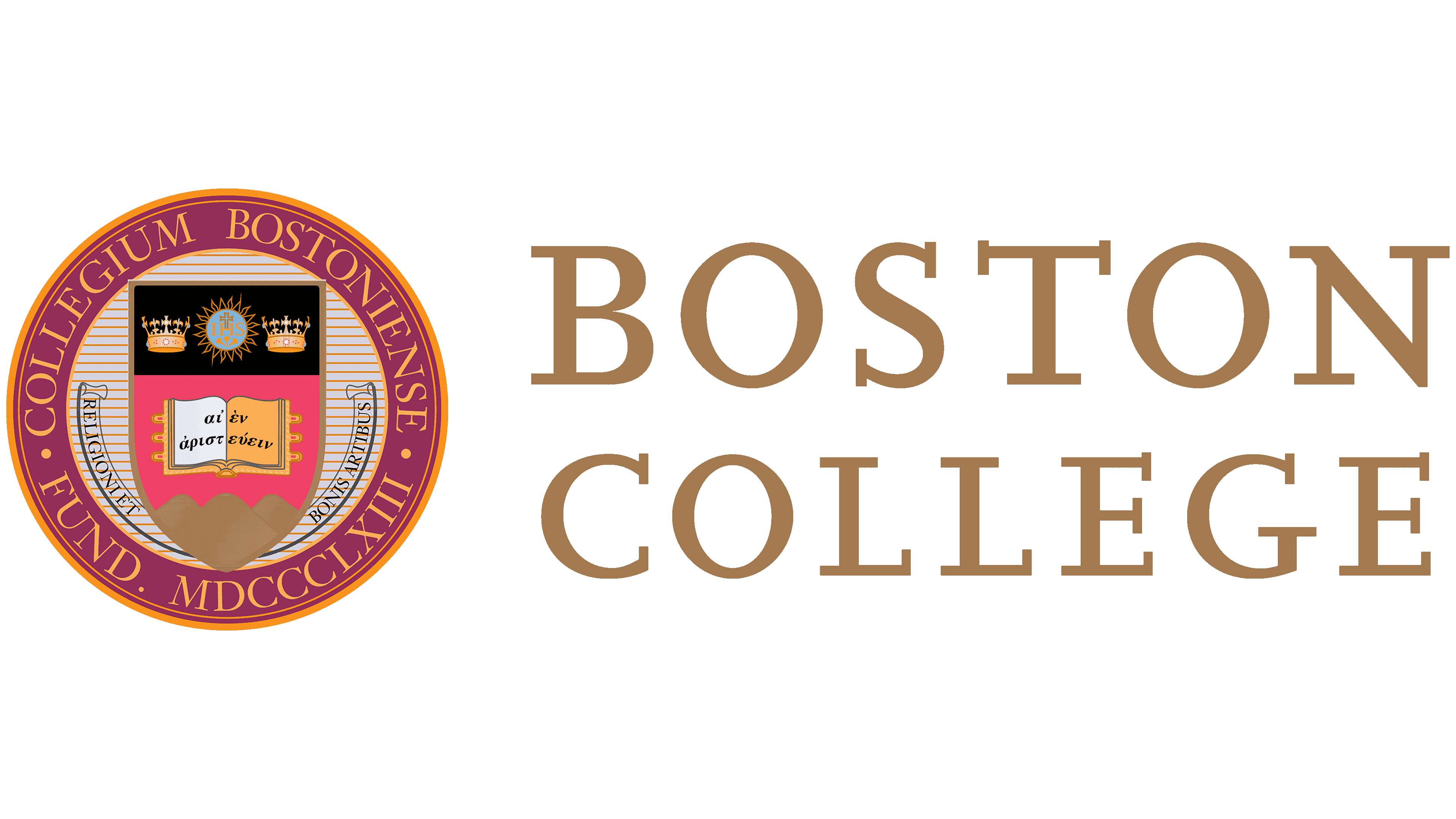
The academic and athletic logos of Boston College have some similarities: they have identical colors. Both use the main colors of the university – gold and burgundy in several shades. But in terms of imagery, the logos are naturally different because they have different applications and different concepts.

For the lettering in the logos, the designers chose Scala, the official font of Boston College since the 1990s. It is based on the humanistic styles of Renaissance typography and emphasizes the university’s Western origins and its Roman Catholic roots.

The primary colors of this institution of higher learning are gold and burgundy with a touch of purple. They are present in all the attributes of the identity. In addition, they use blue, beige of several kinds, brown, silver, and black.

Boston College color codes

Antique RubyHex color:#8c2232
RGB:140 34 50
CMYK:0 76 64 45
Pantone:PMS 7427 C
LionHex color:#dbcca4
RGB:219 204 164
CMYK:0 7 25 14
Pantone:PMS 468 C
BlackHex color:#000000
RGB:0 0 0
CMYK:0 0 0 100
Pantone:PMS Process Black C