The concentration of expression, strength, and fire in the Boston University logo speaks of the vigorous activity, constant events, and events organized at the university. According to the emblem, only students with an active lifestyle will be able to study here.
Boston University: Brand overview
| Founded: | 1839 |
| Headquarters: | Boston, Massachusetts, United States |
| Website: | bu.edu |
Meaning and History
The university was formed by the Methodist movement in Newbury, Vermont, whence it moved to Boston. At first, it was a theological school formed by a group of ministers and parishioners of Old Bromfield Street Church in Boston. Then it was transferred to Concord, where it remained for about twenty years. Then the school changed its location and legal status several more times, being either a Methodist Institute or a Theological Seminary.
In 1869, the school officially became Boston University, aided by three trustees after whom the three dormitories on one of its campuses are now named. They are Isaac Rich, Lee Claflin, and Jacob Sleeper. They, too, are considered founders of BU. Because of the difference in the dates of BU’s appearance, the seals of some departments indicate the year 1839, while others indicate the year 1869. In both the first and second cases, they are correct.
Despite its pastoral orientation, this institution has always been open to all, regardless of race, gender, or religion. The only exception was the school of theology, which did not admit women. It was the first university in the United States to award a doctorate to a female student. It was also a pioneer in the field of jurisprudence, as its graduate was the first in the country to be admitted to the bar. It was also the first black female psychiatrist to graduate from the university, making a major contribution to the study of Alzheimer’s disease.
Unlike the seal, the university-wide emblem is simple in form and concise in content. It is a red rectangle with a double border and the university’s name in the middle. The inscription is grouped in two lines: “Boston” at the top and “University” at the bottom. Both parts are the same length, although they have a different number of characters. To achieve the same size, the designers had to increase the letters in one word and decrease them in the other. But their typeface is identical: the classic upper case with serifs. The thickness of the lines in characters varies: somewhere they are narrow, somewhere they are wide. This adds expressiveness to the inscription.
Seal
The Boston University seal appeared in 1869. It looks like a classic rondel, consisting of a center with key elements, a stripe with the name, and several dividing rings. In the middle is a view of the city from the open water (the Charles River or the Atlantic Ocean). In the distance are contoured pointed buildings standing very close together, sailboats and a boat. The drawing is taken in a circle with a spiky edge and placed in the center of the cross of the Methodist church with distinctive thickening at the ends.
This is followed by a decorative ring with ornamentation and a wide space with the Latin words “Universitas Bostoniensis” and the indication in Roman numerals of the year of the university’s appearance. The letters have miniature, almost imperceptible serifs because, in some places, they look like extensions. A solid, bold border completes everything.
Boston University Terriers Logo
Boston University Terriers is an association of teams owned by Boston University, one of the oldest universities in the US, founded in 1839. It is among the four NCAA members that do not sponsor baseball or volleyball. Its major disciplines are ice hockey, rowing, basketball, and others. The program involves 24 teams – 10 men and 14 women. The most successful among them is hockey. The athletes are based in Boston, Massachusetts, and play in “Division I of the National Collegiate Athletic Association.” They represent the Conference Patriot League, EARC, and Hockey East. Drew Marrochello leads the department.
Boston University’s history is tied to Rhett Butler’s name, which was the reason for the official mascot, Rhett the Boston Terrier. He is named after the actor because “no one loves Scarlet more than Rhett” (from Gone with the Wind). While “Scarlet” is not just a name, it is also Scarlet’s scarlet color, which is their official palette.
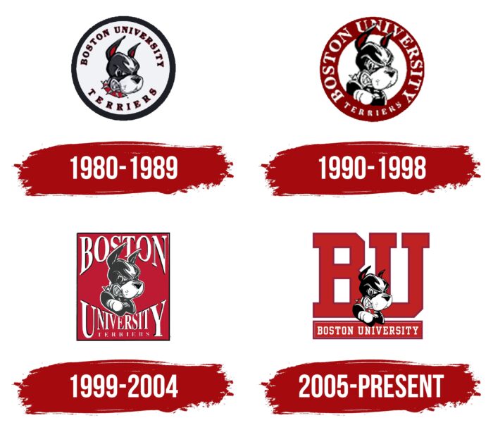
The team’s logo is based on the image of a terrier. In the 1980s logo, he is drawn surrounded by the full name of the athletic department, which is encircled by a thin black line. The dog has a menacing grin, wary ears turned upward, and a spiked collar. These hints that the Boston teams are determined, angry, and always ready to attack.
1980 – 1989
During these years, the image of a small but very angry terrier was used in the Boston University team logo. This dog named Rhett is the mascot of the Boston University Terriers. Its nickname is associated with the name of the actor Rhett Butler, who played the title role in the movie “Gone With the Wind.” The round emblem features a dog at the very center. Around him on a white background is the inscription – the name of the team and the school. All elements are encircled and surrounded by a gray stripe. Rhett has a fearsome face, sharp teeth, pointed ears, and a red collar with large spikes. The head shows a white marking in the shape of a broad arrow.
1990 – 1998
In 1990, the management started to redesign the logo. So the result was a version in the form of a classic rondel – with an accent middle and a wide band around the whole circle. In the central part, there is a growling terrier with clenched sharp teeth, as if it is ready to rush at the rivals at any moment. The black nose is visible on the white muzzle, and one paw of the dog rests on the rim. The animal’s eyes look menacing and expectant, his eyebrows are frowned upon, and his ears point upward. On the red trim is the name of the university.
1999 – 2004
The designers changed the logo’s shape, choosing not a circle but a rectangle. In the middle of it is Rhett with the same smirk as before. The changes were mostly to the appearance. The terrier now looks out from the lettering “Boston” and “University Terriers.” But the first two words are so mirrored that they are misleading. At first, it seems as if it’s the same thing at the top and bottom because the elements are identical in design, but after a closer look, you realize that this is not the case. Thanks to the enlargement of the outermost characters and the reduction of the central ones, the inscriptions are shaped like arches, and the dog looks out of them.
2005 – today
The developers gradually concluded that it was necessary to replace the background and use an abbreviation. So now the terrier is on the background of the signs “BU.” And the unfolded name, encoded in the monogram, is located at the bottom, under Rhett’s paw.
All versions feature the university’s mascot – a terrier dog. In two logos, it was on a rectangular background; in the other two – on around one. The colors of the collar also changed, evolving from gray to scarlet. The letters have dark maroon trim.
Boston University: Interesting Facts
Boston University, located in Boston, Massachusetts, is recognized for its high academic standards, diverse student community, and well-known alumni.
- History: Founded in 1839 as the Newbury Biblical Institute in Vermont, it moved to Boston in 1867 and is now a top private research university in the US.
- Student Body: The university has a large, diverse student body across the US and over 100 countries.
- Famous Graduates: Notable alumni include Martin Luther King Jr., who got his Ph.D. in 1955, along with Julianne Moore, Geena Davis, Howard Stern, and poet Louise Glück.
- Nobel Laureates: Its community has produced several Nobel Prize winners in economics, literature, and peace.
- Mascot: The mascot is Rhett, the Boston Terrier, named after Rhett Butler from Gone with the Wind. This dog highlights the school color, scarlet.
- BU Beach: This green area is ideal for relaxation and studying. Despite being located in an urban setting, it offers views of the Charles River.
- Silber Way: Named after John Silber, the university’s president from 1971-1996, who led its significant growth and academic improvement.
- Research: Houses leading research centers like the Photonics Center and the Center for Space Physics, pushing forward in various scientific fields.
- BU Bridge: This bridge is unique as it allows a boat, a train, a car, and an airplane to cross paths at the same location.
- Boston Marathon: The campus is involved in this annual event, with students and faculty supporting runners, enhancing its community spirit.
Boston University stands out for its educational excellence, rich history, and lively community.
Font and Colors
Since Boston University has an abbreviated name BU, a corresponding logo was also designed. The university’s abbreviation is in the same font as the academic emblem and is placed in a miniature rectangle. It also has a double red-and-white frame and thin serifs on the letters. Whereas in the athletic emblem, they are wide and large.
Although the official university font is called Whitney, the identity uses the Scala typeface. It was introduced in the late 1990s and is based on Renaissance humanist typography. With this, the designers emphasized the western roots in the university’s origins and the Roman Catholic influence on it. Boston University’s emblem palette consists of Scarlet red and neutral white.
Boston University color codes
| Racing Red | Hex color: | #cc0000 |
|---|---|---|
| RGB: | 204 0 0 | |
| CMYK: | 0 100 100 20 | |
| Pantone: | PMS Bright Red C |


