The Boys & Girls Clubs logo is a demonstration of strength, determination, and unity. It shows how important support is – both in achieving dreams and in self-development. Going hand in hand means stepping up to a new level, keeping pace with the environment, living a common idea, and striving for a strong friendship.
Boys and Girls Clubs: Brand overview
| Founded: | 1860 |
| Founder: | Elizabeth Hamersley, Mary and Alice Goodwin |
| Headquarters: | Atlanta, Georgia, United States |
| Website: | bgca.org |
Meaning and History
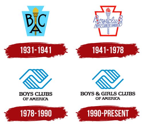
The BGCA (Boys & Girls Clubs of America) youth movement started in Hartford, Connecticut, at the initiative of sisters Alice and Mary Goodwin and their like-minded associate Elizabeth Hammersley. Initially, only young boys were included, so it was called Federated Boys’ Clubs. The first organization appeared in 1860; by 1906, there were already 53 of them. In 1931, they had grown so much that the leaders had to rename them again: this time to Boys’ Clubs of America. The current name emerged in 1990.
Alongside the name, the visual identity of the youth organization also evolved. It has come a long way from a universal geometric shape to a deeply conceptual symbol. The designers placed emphasis on unity, as many BGCA branches emerged across the United States over time and required common guidance. The emblem has always been and remains the same for all.
What is Boys and Girls Clubs?
Boys & Girls Clubs (shortened as BGCA) is a non-profit organization operating in the United States. Its mission is to teach young people various skills, develop talents, and enhance their knowledge. It has many local branches, with its headquarters located in Atlanta, Georgia.
1931 – 1941
After a rebranding that resulted in the name Boys’ Clubs of America, the organization changed its logo to a more contemporary one. It consists of a geometric shape resembling a trapezoidal amphora. The abbreviation of the youth movement is written in black letters: “B” on the left, “C” on the right, and “A” in the center. A vertically placed burning torch, drawn in an antique style and painted yellow, is also featured. The background is blue. The logo symbolizes progress, the pursuit of knowledge, and the love for personal development.
1941 – 1978
The redesign resulted in an outlined emblem with a red border and an “empty” center. The feeling of emptiness comes from the white color, which replaced the blue. The content of the trapezium changed as well: it now features a connected inscription with wavy elements and rings. The word “BoyscluB” has two capital letters – at the beginning and the end. They are almost identical, differing only in the lower curls directed to different sides with a transition to the second line, where the organization’s full name is written in uppercase letters. The torch, like all inscriptions, is repainted in blue, and the fire in the bowl has become red.
1978 – 1990
After another rebranding that changed the name to Boys Clubs of America, the logo was completely transformed. Designer Saul Bass was involved in the creation of the new symbol.
- Firstly, it received a clear division into two zones – graphic and text.
- Secondly, all previous elements disappeared.
- Thirdly, it obtained a modern and, most importantly, conceptually accurate design.
The emblem features two connected hands, or more precisely, palms. One is placed higher than the other, creating the impression that they are tightly clasped. The hands are formed from triangular elements and wide strips with rounded ends representing fingers. They are drawn with one line and form long ridges. At the bottom is the organization’s name, typed in black uppercase letters with serifs.
1990 – today
The renaming of the youth alliance to Boys & Girls Clubs served as a reason for adjusting the logo. A new variant of the name was introduced. The designers arranged it in two rows, but the font and writing style remained the same – black capital letters with serifs. Only the color of the top element was changed: after the adjustment, the blue became slightly lighter.
Font and Colors
The organization’s guidelines state that writing “and” instead of “&” is prohibited: only the ampersand should be used. The name is set in bold Arial font. The letters are squat and wide. In the top row, they are slightly larger than in the bottom row.
The hand symbol’s color can be one of two: either BGCA Blue or Bold Black. Both are present in the logo and can alternate, replacing each other. The preferred background is white.
Boys and Girls Clubs color codes
| Rich Electric Blue | Hex color: | #0092d2 |
|---|---|---|
| RGB: | 0 146 210 | |
| CMYK: | 100 30 0 18 | |
| Pantone: | PMS 801 C |
| Raisin Black | Hex color: | #231f20 |
|---|---|---|
| RGB: | 35 31 32 | |
| CMYK: | 0 11 9 86 | |
| Pantone: | PMS Neutral Black C |
