


In an arsenal of marketing tools, a brand mascot can be a powerful way to humanize a business. A well-designed mascot can transform an unremarkable company into one with character, talent, and recognizability. This is evidenced by the enduring appeal of iconic figures such as “Michelin Man” and “Pillsbury Donut,” whose roles have transcended mere brand representation to become cultural symbols.
Using a brand mascot is not a one-size-fits-all tool for all corporations. Its effectiveness depends on many variables, such as the target audience and business goals. Organizations that have successfully used mascots often note that these characters help create a more subtle, emotionally rich story, thereby increasing customer engagement and loyalty.
A mascot can be an important asset when seeking an element that adds depth and personality to a brand. More than just a superficial design element, it can play an important role in communicating a company’s ethos, mission, or unique selling proposition in an accessible way. A mascot’s long-term impact is usually evidenced by its ability to evolve while retaining its essence, thereby contributing to the brand’s long-term development and recognition.
A common trait can be observed when examining some of history’s most successful brand mascots. These mascots have served as emotional touchpoints for consumers and have played an important role in building brand awareness and driving business growth. These mascots often became as integral to the brand’s identity as its products or services through strategic design, compelling storytelling, and consistent messaging. The decision to create and invest in a brand mascot should not be taken lightly, but should be seen as a strategic move for companies looking to establish a deeper connection with their audience.
Captain Morgan (Captain Morgan rum)
![]()
Captain Morgan, arguably one of the most famous mascots in the beverage industry, originated with Dom Maitz, an artist known for his science fiction work. The character was not just a figment of the imagination but was inspired by a real historical figure.
Using a pirate captain as a brand ambassador for rum is a clever marketing strategy. It harmonized the adventurous spirit of pirates with the rich history of rum, a drink often associated with navigation and piracy. Captain Morgan has moved beyond its original role as a mere brand symbol. It has become a symbol of premium rum, cementing its place on store shelves and in collective cultural memory. The enduring popularity of this character demonstrates that a well-designed mascot can increase a brand’s market presence and consumer recognition.
Charlie the Tuna (StarKist)
![]()
Mascots serve as recognizable figures that embody a brand’s essence and values. Charlie the Tuna, who became iconic, was just that for the StarKist brand. Introduced to the world in 1961 by Tom Rogers, this sophisticated fish quickly became the face of StarKist, which later became part of the South Korean conglomerate Dongwon Industries.
In the 1960s and 1970s, Charlie’s Tuna was featured in 85 StarKist commercials in the United States, helping to firmly establish it in people’s minds. Despite his immense popularity, the character was shelved for a period, but in 1999, he returned triumphantly. This revival was a nostalgic gesture and a strategic move to emphasize StarKist’s entry into the market for healthier tuna products.
StarKist’s portrayal of Charlie was not just coincidental. The character was carefully crafted to emphasize sophistication and discerning taste. Wearing glasses and constantly seeking validation for his refined taste, Charlie embodied the idea that StarKist is not just a tuna brand but a brand for those who value quality and taste above all else.
Chester Cheetah (Cheetos)
![]()
Chester, the symbolic “cool cat” who represents the Cheetos brand, may not be universally recognized everywhere, but in countries like the United States, his popularity is undeniable. Its introduction in 1986 was a strategic move by the company to demonstrate the modernity and appeal of its cheese snack.
This memorable feline figure has undergone various evolutions, each aimed at resonating more effectively with the brand’s target audience. These changes were driven by a desire to remain contemporary and aligned with established consumer preferences.
Despite all the changes and additions to the image, Chester’s essence remains the same: he is the epitome of cool. This unwavering constancy of his character has ensured his steady position as one of the top and most effective mascot logos in the snack food sector.
Coco the Monkey (Kellogg’s)
![]()
Regarding memorable mascots, Kellogg’s certainly has an impressive portfolio, and Coco the Monkey, the face of Coco Pops cereal, is no exception. This cheerful primate, dressed in clothes bearing the cereal’s name, has won over audiences across continents, especially youth.
The character has had a longer-lasting spread in the UK than in the US. In the initial stages of developing marketing strategies, Kellogg’s experimented with different animal mascots for its cereal. After these experiments, the company chose Koko the monkey as the permanent symbol for its chocolate-flavored cereal in many markets.
Dressed in a Coco Pops-branded T-shirt and cap, this character embodies playfulness and excitement, perfectly matching the cereal’s target market of children. Coco, the monkey, is no longer just a mascot and has become a symbol synonymous with the joy and fun that cereal brings to breakfast around the world.
Colonel Sanders (KFC)
![]()
Certain figures leave an indelible mark on consumers’ minds when it comes to brand mascots, especially in the fast-food sector. Colonel Sanders, who is associated with KFC, is a testament to this phenomenon.
Created as a reflection of the company’s founder, Colonel Sanders, the image serves a multifaceted function. Going beyond symbolic representation, the mascot gives the brand a sense of familiarity and reliability. It emphasizes that KFC is not just a faceless corporation but has roots and a history that the Colonel personifies.
Colonel Sanders’ pleasant, friendly face was posthumously used in KFC’s marketing efforts. This image was crucial in strengthening the brand’s connection with the audience.
The symbolic image of the Colonel in a white suit and black tie does more than just promote the product. It paints a picture of tradition, reliability, and quality. This strategic move has allowed KFC to position itself as another fast-food outlet, offering customers consistent quality and a sense of nostalgia.
Cornelius (Kellogg’s)
![]()
The bright green rooster adorning a box of Kellogg’s Corn Flakes is more than an emblem. Known as Cornelius, often shortened to “Corny,” he has become an integral symbol of the famous breakfast brand. Initially, Cornelius was not the official face of Kellogg’s, but over time, his importance in the brand’s imagery became undeniably apparent.
Debuting in 1957, Corny quickly became a familiar emblem of Kellogg’s Corn Flakes. His association with the brand symbolized a simple breakfast choice and the dawn of a fresh, promising day. The rooster, traditionally associated with dawn, underscores the company’s message of starting the day with energy and vigor. Through Cornelius, Kellogg’s has captured the essence of its product by intertwining it with the importance of a nourishing start to the day.
Geico Gecko (Geico)
![]()
Geico introduced an intriguing mascot: a live gecko. The decision to choose this particular reptile as the face of the brand was because customers often misinterpreted the company’s name.
This small, charismatic reptile is firmly embedded in the Geico brand. Since its introduction at the dawn of the millennium, the Geico gecko has been featured in numerous advertising campaigns.
This gecko does more than just entertain. Despite the frivolity of its antics, they are based on reliability and authority. The mascot skillfully combines humor with the seriousness of insurance, attracting attention and convincing the audience of Geico’s competence in this area.
While the gecko brings fun and accessibility to the insurance world, it does not detract from the brand’s core promise of reliability. This dual role of attracting consumers and maintaining the brand’s reputation demonstrates the effectiveness of a well-designed mascot. Through this strategy, Geico has successfully expanded its audience and resonated with those seeking authenticity and quirkiness in its brand communication.
Green Giant (B&G Foods)
![]()
The green giant, towering above the rest of the human race with his friendly personality, is an unmistakable figure in branding. Often referred to as the “Jolly Green Giant,” this colossal character debuted in 1928, a landmark year for other iconic figures such as Mickey Mouse. His appearance was no accident; it was a strategic move that played a crucial role in positioning the brand.
With his friendly smile and bright color, the green giant was an instant success. It particularly resonated with young consumers, who are often disinclined to include vegetables. B&G Foods, realizing how difficult it is to promote vegetables to young people, found its solution in this character. They used it to convey the benefits of greens to consumers more convincingly. This character has evolved but has consistently symbolized healthy eating and the joy of nature’s bounty.
Julius Pringles (Pringles)
![]()
The mustachioed face that adorns Pringles cans worldwide is not just an emblem; it’s a character named “Julius.” This distinctive mascot, uncannily similar to the crisp he represents, has a pronounced mustache and an elegant red bow tie, making him instantly recognizable.
Julius’ design strikes a balance between sophistication and quirkiness. The mustache gives him an elegant look and is aimed at mature snack connoisseurs, while the playful facial expression and bow tie are aimed at the brand’s wider audience. With this combination, the brand appeals to a wide audience, from kids looking for a snack to adults seeking a quality product.
The genius of mascot Julius is that he conveys Pringles as a brand that adheres to quality standards while ensuring that every bite from the can is satisfying and enjoyable.
Kool-Aid Man (Kool-Aid)
![]()
One of the most iconic brand mascots in the annals of American marketing is the Kool-Aid Man, who made a spectacular debut in 1954. He was originally called the “Jug Man.” This character, with an infectious smile filled with brightly colored liquid, represented the essence of the brand’s flavored drink mix.
This character was instrumental in creating a pleasing, irresistible, and brightly colored mix that attracted a young audience. The design and marketing strategies aimed to make Kool-Aid Man synonymous with coolness and youthfulness, making the product an interesting option in the beverage industry.
Kool-Aid Man has become more than just a symbol; it has become an integral part of the brand. His unique look has made him almost ubiquitous, and it’s rare to find someone unfamiliar with this fun icon. The longevity and influence of the Kool-Aid Man demonstrate how an effective mascot can enhance a product’s appeal in the marketplace and secure its rightful place in cultural and marketing history.
McGruff the Crime Dog (National Crime Prevention)
![]()
Various national organizations have appreciated the significant impact that brand mascots can have on their communications efforts. A prime example is the National Crime Prevention Council. Although the Council’s core mission was not product-oriented, it was critical to communicate its message effectively and in an appealing way, especially to younger generations.
The mascot McGruff the Dog was introduced in 1978 to address this need. In the 1980s, this iconic canine became known to the public. The image of the vigilant watchdog was intended to symbolize measures against criminal activity. This essence was best captured by the phrase in which the dog metaphorically “takes a bite out of crime,” a motto that resonated widely and became integral to the initiative. Such a mascot has been invaluable for organizations like the National Crime Agency.
Michelin Man (Marshmallow Man)
![]()
Michelin’s world-famous ‘marshmallow man’ has occupied a unique place in the world of brand mascots. Although his presence in the Michelin logo has become less permanent, his importance in the organization’s branding narrative cannot be overstated.
This iconic figure, dubbed the “Bibendum,” first appeared in the last years of the nineteenth century. Over time and as its popularity grew, this figure became known as the “Michelin Man.”
At first glance, this mascot’s design resembles a cluster of marshmallows. But if you delve into its concept, it becomes obvious that it symbolizes tires.
Mickey Mouse (Disney)
![]()
The iconic figure of Mickey Mouse, with his distinct three-circle silhouette, has gone beyond just a cartoon character to become a Disney brand symbol. Although he could not initially be categorized as a traditional mascot, his continued presence across Disney merchandise and products underscores his role as a brand ambassador.
Mickey Mouse was born in 1928 as a fun and friendly character who charmed audiences with his animated adventures. Over the years, the influence of this fun-loving rodent has gone beyond just cartoons. He represents Disney and is a celebrated figure in global pop culture. His influence extends from television programs and literature to the film industry.
Clean (Procter & Gamble)
![]()
The bold, imposing figure of Mr. Clean has been synonymous with household cleaning for more than 6 decades. First appearing in 1958, the character was the brainchild of Procter and Gamble, designed to set him apart from the many competing products on the market. With his shiny bald head, white T-shirt, and unwavering smile, the image was meant to exude confidence and reliability.
In the oversaturated cleaning products market of the time, distinguishing the brand from many others was not easy with the launch of Mr. Clean. Clean, Procter & Gamble managed to do just that. Within six months of the iconic mascot’s introduction, the company experienced a significant sales spike, which eventually led its product to take the top spot on store shelves.
What’s truly striking about Mr. Clean is his enduring appeal. Unlike some mascots that fade over time, Mr. Clean remains a constant figure for Procter & Gamble.
Mr Muscle (C. Johnson & Son)
![]()
A significant figure in the cleaning products industry, Mr. Muscle stands alongside other famous mascots, such as Mr. Clean. Originating in the UK in 1986, this British brand incorporated the character into its marketing strategy to resonate more deeply with consumers.
While both of these characters are icons in the cleaning industry, Mr. Muscle’s evolution has its own specificity. The brand presented a less bulky version of Mr. Muscle in the first ad campaign. The brand emphasized that the real power lies in the effectiveness of its products, suggesting that even those without huge muscles can achieve remarkable cleaning results.
As branding strategies evolved and market dynamics changed, Mr. Muscle has transformed. Yet the core message has remained the same throughout these changes: Everyone can harness the power to tackle tough cleaning tasks with the right tools.
Mr. Peanut (Planters)
![]()
Elegantly dressed in a monocle, hat, and cane, Mr. Peanut is a testament to the enduring appeal of the Planters brand. This iconic figure, who has adorned the brand’s products and advertising for over a century, has become synonymous with quality and distinction in the world of nuts.
The origins of “Mr. Peanuts” are as intriguing as his clothing. Contrary to expectations that a seasoned designer could create such a meaningful brand mascot, the character was brought to life by a 14-year-old’s imagination.
Appearing a decade after Planters was founded, Mr. Peanut was more than just a mascot. He embodied the brand’s spirit, giving it elegance and lightness. He humanized the company, making it more accessible and memorable to consumers.
Although there have been temptations to modernize or change the beloved figurine over the decades, consumers have consistently advocated for keeping the original design.
Pennybags (Monopoly)
![]()
Among the brand’s mascots, Rich Uncle Pennybags, colloquially known as “Mr. Monopoly,” is a prominent figure in the famous board game Monopoly. While board games don’t typically use mascots as central figures, Monopoly’s transition to the role of Uncle Pennybags was undoubtedly a watershed moment.
Over the decades, the “Monopoly Man” has gained worldwide recognition and become synonymous with the game. His iconic presence with his hat, cane, and distinguished demeanor helped elevate the status of Monopoly. Today, it is not just a board game but a cultural landmark.
Poppin’ Fresh (Pillsbury)
![]()
In marketing, mascots are an important tool for humanizing a brand and making it more relatable to the consumer. One iconic figure that confirms this trend is Poppin’ Fresh, known as the “Pillsbury Doughboy.” Since his introduction in 1965, this lovable character has become synonymous with the Pillsbury brand.
Constantly appearing in numerous commercials, Poppin’ Fresh played a key role in cementing the Pillsbury brand in consumers’ minds. Through his hilarious antics, this adorable mascot embodies the joy and warmth that Pillsbury baked goods are designed to bring to households. Every giggle, every poke at his belly, is a story of culinary delight waiting to be unraveled.
Clad in a chef’s cap and scarf, Testovar Pillsbury doesn’t just represent the brand; he symbolizes culinary tradition. His attire emphasizes the brand’s deep connection to baking and the culinary arts. It’s a subtle but impactful reminder that Pillsbury is not just a commercial enterprise but an integral part of many cuisines and culinary traditions.
The appeal of Poppin’ Fresh is not limited to Pillsbury alone. Its charm and popularity have often been featured in commercials for other brands. With Poppin’ Fresh, Pillsbury has masterfully demonstrated how a well-designed mascot can enhance brand memorability.
Quicky (Nesquik)
![]()
One of the most prominent rabbit mascots in branding is Quickie. While several rabbit-themed logos exist, Quickie has carved out a special niche. Its design is based on the “quickie” theme, conveying that making a delicious chocolate drink is quick and effortless.
The dynamic and colorful Quicky logo serves a dual purpose. It emphasizes the drink’s simplicity to make and suggests that those who consume it will feel a burst of vitality and enthusiasm. The idea is simple: a drink that is quick to prepare and energizing once consumed.
The genius of Quicky’s persona ensures the product’s convenience, making it ideal for those on the go; he also energizes consumers, positioning the chocolate drink as the perfect mood booster.
Ronald McDonald (McDonald’s)
![]()
Few brand mascots have achieved as much recognition as Ronald McDonald. While his recognition may have diminished in McDonald’s modern branding, his legacy as an iconic figure remains intact.
As the hilarious clown representing the McDonald’s fast-food chain, Ronald McDonald played a key role across various marketing platforms, from television commercials to product packaging. He was not the only character representing the brand; he was part of an ensemble. Alongside him were characters such as Grimace and Hamburger, each bringing their twist to the brand narrative.
The choice of the clown as McDonald’s symbol was not arbitrary. Clowns, traditionally symbolizing happiness and entertainment, aligned well with the brand’s mission to bring joy to its customers. In Ronald McDonald’s image, McDonald’s embodied its brand ethics, emphasizing that every visit to the restaurant should bring joy and pleasure.
Snap, Crackle, and Pop (Kellogg’s)
![]()
Branding strategies often rely on memorable mascots that attract audiences and cement the product in consumers’ minds. One example of Kellogg’s work is the Snap, Crackle, and Pop trio, which has become synonymous with rice cookies.
Kellogg’s introduced the public to these animated characters in 1933, who personified the distinctive sound of pouring Rice Krispies Treat cereal with milk. Their names added an element of fun and an auditory affirmation of the product’s unique properties.
While their importance may have diminished in recent branding changes, the impact of Snap, Crackle, and Pop on Kellogg’s during their heyday was undeniable. Their fun imagery and playful interaction between cereal and milk made Rice Krispies widely known.
The Energizer Bunny (Energizer)
![]()
In branding and advertising, companies often look for unique mascots to anchor their products in consumers’ minds. Inspired by the innate liveliness of rabbits, especially young rabbits known for their irrepressible energy, Energizer took this concept and introduced a live rabbit as the face of its brand. Introduced to the public in 1989, the Energizer rabbit quickly became a symbol of undying energy, reflecting the core values of the brand’s batteries.
Consistency in branding is essential; the animated rabbit’s appearance has remained largely unchanged, retaining its iconic features. Its bright pink fur – a hue often associated with love and happiness creates an additional layer of brand association. The whimsical flip-flop touch makes this bunny stand out and adds a playful, fun element.
While many brands change their logos or mascots over time, Energizer stays true to its recognizable bunny.
The King (Burger King)
![]()
In the fast-food industry, brand mascots influence consumer behavior. As with McDonald’s, which has its iconic figures, Burger King’s regal mascot, affectionately referred to as “The Burger King,” may not be the centerpiece of modern marketing campaigns. Still, it remains in the minds of many. This symbolic character first appeared on the signage of a Burger King establishment in Miami, Florida.
The image was not only iconic but also mesmerizing. The mascot, depicted sitting on a throne of hamburgers, was beaming with delight.
Burger King’s image has undergone several transformations over the years. The 1976 illustration, characterized by a Tudor-style design, is still associated with the brand by many. Notably, King’s essence was not just about fast food. It carried a deeper meaning.
The Laughing Cow (Laughing Cow)
![]()
The Laughing Cow holds a special place in the world of brand mascots. This cheerful red cow has been synonymous with the brand since 1921. Its striking presence has ensured brand recognition and memorability over the years.
The decision to integrate a character that epitomizes the brand name is a strategic one. The omnipresence of the Laughing Cow is evident in the range of products labeled Laughing Cow and across the entire spectrum of promotional materials and campaigns. This branding consistency has been crucial in strengthening the company’s market presence. The infectious laughter of the red cow is a testament to the power of a well-designed mascot.
The M&M’s (Mars)
![]()
In contrast to the traditional approach of a single mascot, Mars, Inc. took an innovative path for its M&M brand. Since 1995, M&M’s characters have been a variety of colorful, anthropomorphic candies, each designed to embody an individual. Among them, the Yellow and Red M&M’s are particularly recognizable figurines.
These mascots fulfill multiple functions for the brand. Not only do they embody the company’s ethos, but they also emphasize the variety of flavors and styles in which the candies are presented. For example, the yellow M&M’s character is made slightly “nutty,” reflecting the peanut base of this candy variant.
M&M’s characters have played an important role in giving a memorable and enjoyable look to a product that is essentially simple. They add interest and engagement, enabling customers to interact personally with the brand.
Each character has quirks, reflecting the myriad variations in a bag of M&Ms. Their distinct personalities enrich the shopper experience, making the process of consuming M&Ms not just a candy treat but an interaction with the characters who personify them.
Tony the Tiger (Kellogg’s)
![]()
Turning to the world of mascots, Kellogg’s boasts several iconic characters that have stood the test of time. Tony the Tiger Cub is one of the most iconic figures. This energetic tiger cub has captured many hearts since birth with his unique catchphrase.
Appearing in 1951, Tony quickly became famous and carved a niche for himself on the world stage. His consistent design and look set him apart in Kellogg’s extensive line of mascots, which has remained virtually unchanged over the years.
Tony’s designs, with their bright hues and catchy slogans, resonate particularly well with younger audiences. The character is a testament to the enduring power of a well-designed mascot to build brand awareness and loyalty. Tony’s ongoing image has cemented his role as a mascot and a key part of Kellogg’s brand identity.
Toucan Sam (Froot Loops)
![]()
Many brands, especially in the food and cereal industry, leverage mascots to reinforce their brand identity. One prime example that supports this strategy is Toucan Sam. This colorful bird has represented Froot Loops cereal since 1963 and has quickly gained consumer love.
One of Sam’s hallmarks is his amazing ability to pick up the scent of Froot Loops cereal, regardless of distance or location. This intriguing ability emphasizes the appeal and uniqueness of the cereal itself. Toucan Sam’s bright, cheerful image is a great strategy for brands looking to resonate with younger demographics. An interesting detail is the multicolored stripes on Sam’s beak. Each color echoes the different shades of Froot Loops cereal, symbolizing the variety and riot of flavors.
Sam’s toucan beak stripes underwent minor changes as new flavors were introduced. Thus, this mascot is an interesting brand ambassador that reflects the cereal’s journey.
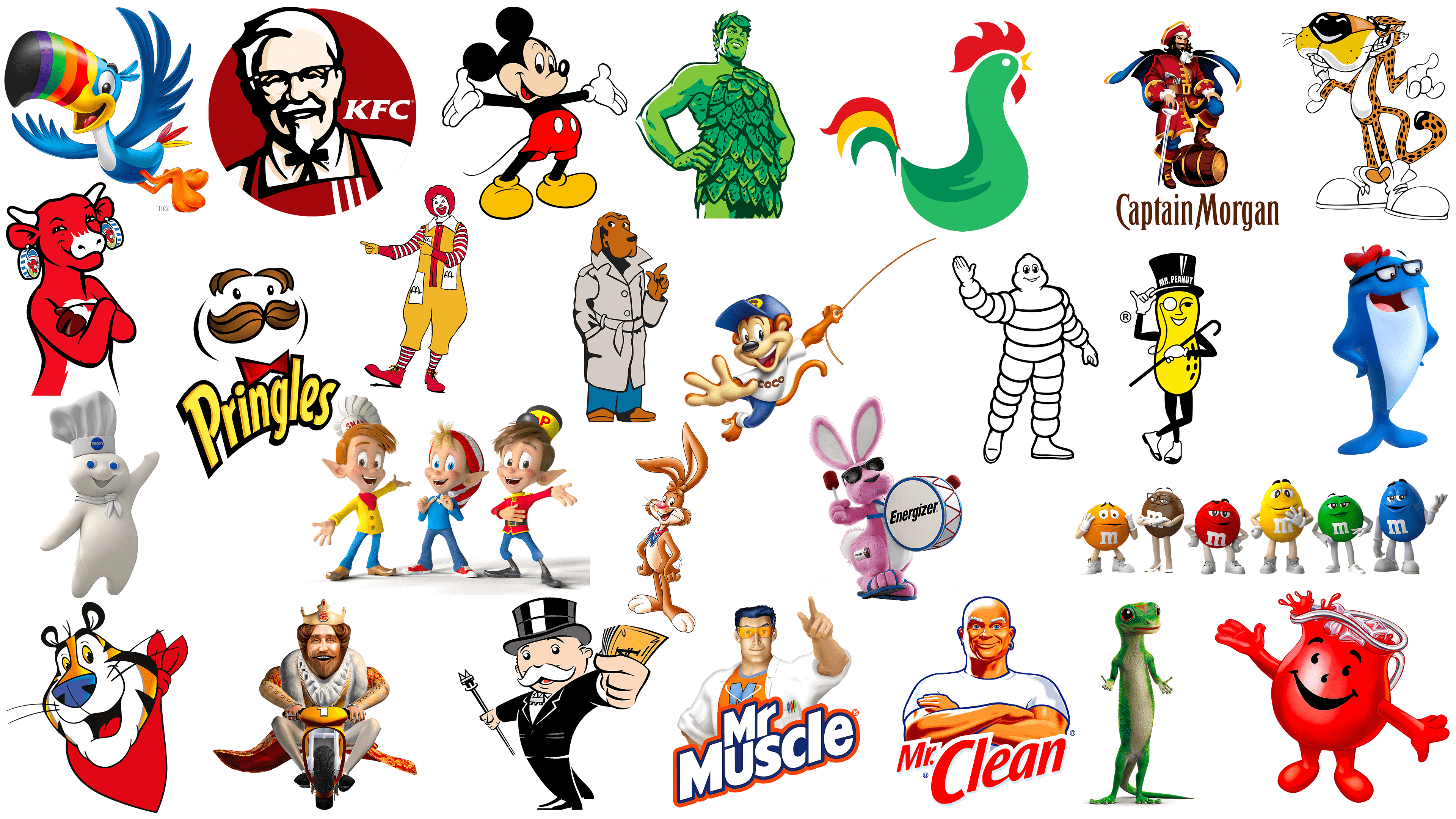
Meaning of famous mascot logos
The world of branding is replete with memorable mascots, each carefully crafted to breathe life into the companies they represent. These iconic figures have been instrumental in making their brands famous, capturing consumers’ attention, and laying a solid foundation for long-term customer attachment.
Over time, these mascot symbols have not remained unchanged but have undergone significant changes to align with modern perceptions. Despite these aesthetic changes, the essence of the figures remains the same. The changes are evolutionary steps to keep the mascots relevant while maintaining their original purpose.
Through charm, humor, or appealing appearance, mascots play a key role in highlighting the ethos and virtues of the brands they represent. By doing so, they not only reinforce the brand’s presence in the market but also help deepen the emotional connection with consumers.
The best brands’ mascots do more than entertain and attract attention. They act as brand ambassadors, communicating the mission, making them more accessible and, most importantly, more memorable in consumers’ minds.