Established in 1970, formerly known as the Juvenile Diabetes Research Foundation (JDRF), Breakthrough T1D has rebranded to reflect its mission and scope better. As the leading global type 1 diabetes research and advocacy organization, Breakthrough T1D aims to improve the lives of those with type 1 diabetes and drive toward cures. This is achieved by investing in research, advocating for policy changes, and educating and empowering those affected.
The new name, Breakthrough T1D, emphasizes the organization’s mission. Developed with Siegel+Gale, the rebranding process took nearly two years and was driven by data and insights. The result is a powerful brand highlighting Breakthrough T1D’s role in type 1 diabetes research, advocacy, and support.
The old name, JDRF, was closely associated with juvenile diabetes, a term reflecting a time when type 1 diabetes was mostly diagnosed in children. Many adults are newly diagnosed today, making the old name less representative. The new name addresses this shift.
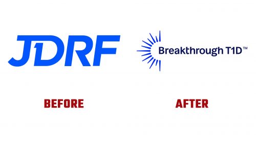
The old logo embedded “T1D” within the “J” and “D,” a clever but complex design. The new logo introduces a sun-like spark, symbolizing optimism and hope. The typography softens the logo with curvy terminals, balancing modernity and approachability. The wordmark’s design has varied terminal styles, which can appear inconsistent.
The animated spark adds a dynamic element to the logo, though the standalone “B” lacks visual weight for a strong monogram. A shorthand like “BT1D” could offer better clarity.
The brand identity uses a bold yet soft color palette, featuring a cohesive gradient of navy blue, light blue, pink, and white. These colors convey trust and compassion. The primary typeface, Caladea, offers a professional yet approachable feel.
The identity includes an icon set with rounded caps and thick strokes. Adopting the spark’s thick-to-thin construction might have provided a more cohesive look. The overall aesthetic balances a clinical presence with photography emphasizing human connections, showcasing individuals and communities impacted by type 1 diabetes.
The rebrand aligns closely with the mission to catalyze breakthroughs in type 1 diabetes research and advocacy. The new name and logo encapsulate the organization’s broader approach.
The updated website and marketing materials reflect the new identity, blending a clinical approach with warmth and hope. The user-friendly design ensures visitors can easily access information, resources, and support networks, reinforcing Breakthrough T1D’s role as a trusted authority.


